5 Mobile Checkout Flows to Maximize Conversions and Profits
A few weeks ago, I wrote this blog post about different onboarding flows. Today, let’s talk about onboarding’s counterpart: checkout.
I’m going to walk through 5 examples of well-established checkout flows of major retail and e-commerce apps to talk about what works and what doesn’t.
As with onboarding, what works for other apps may not work for your app. The purpose of this blog post is to look at execution approaches to generate ideas to A/B test in your app. The context and user base of every app is different so the checkout flows need to optimized for your specific situation. Apps that have a lot of user trust may not need to tell their users about security with credit card info. Apps that have a high rate of repeat users may not have to worry much about complexity of entering user info for the first time because most purchases are not made by new users. It all depends on your app.
1. Groupon
I think Groupon has one of the most well done check flows. It’s incredibly simple, and I never feel lost about what to do next. Of particular note is how the buy button is constant on the page. In the image below, I’m looking to buy a new deal. The first screen shows what I see when I land on the detailed view of the deal. The second screen shows what I see as I scroll down the page.
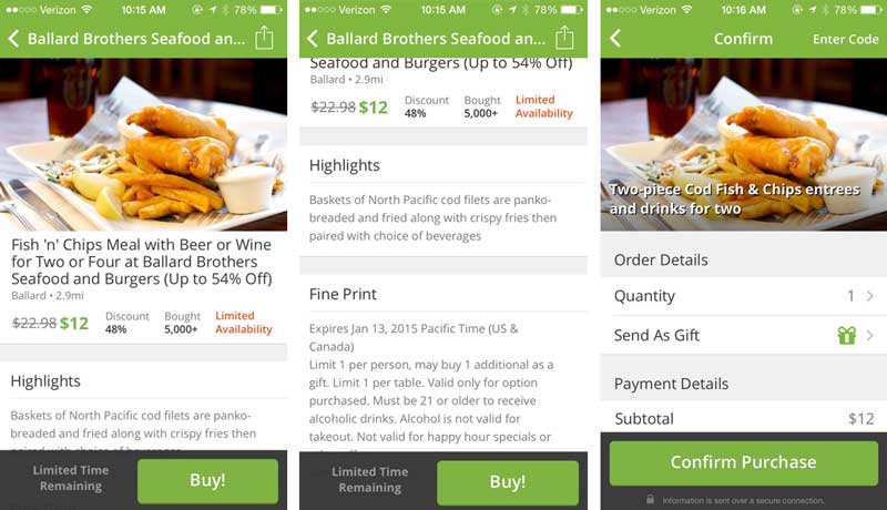
You’ll notice as I scroll that the buy button stays at the bottom of the page and doesn’t move. There is also copy next to button that tries to compel me to buy. After I click on buy, the app immediately takes me to a confirmation page. Since I’m a frequent Groupon user, all my info is already there. Completing the purchase is incredibly easy. If, however, this were my first time using the app, entering in each line of information is not confusing.
Another thing to note is that Groupon has removed the cart for mobile buyers. On their website, the buy button takes you to your cart where you can choose to continue shopping or check out. This is skipped on the mobile app. They have tested this and found that mobile users are usually looking for just one thing at a time.
2. Amazon
Amazon has been improving their app a lot over the last year or so. I remember a year ago when I could barely figure out how to find what I was looking for, let alone buy it. Now, their checkout is fairly streamlined.
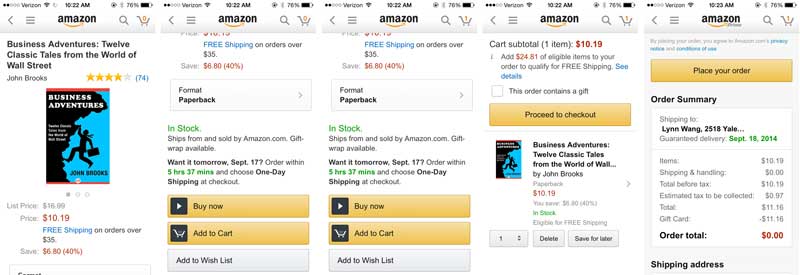
The first screen above shows you what I see after I’ve clicked on an item. The ratings and value are prominently featured because those are Amazon’s main selling points. I have to scroll down a little to see the purchasing options (second screen). What’s really interesting is that I have to scroll even further to read a description of the book (not shown).
While Groupon’s app only gave me one buying option, Amazon gives me three. I chose “Add to Cart”. You’ll notice that the button didn’t change at all after I clicked it (third screen). Some apps will smartly let the user know that the item has been added to the cart, but this app does not. The only indication that the item was added is that my cart icon in the upper right corner now has a “1” in the cart. When I click on that icon, I’m taken to my cart (screen 4) where I can modify my cart and check out (screen 5).
I also looked at the iPad version of their app for comparison (below).
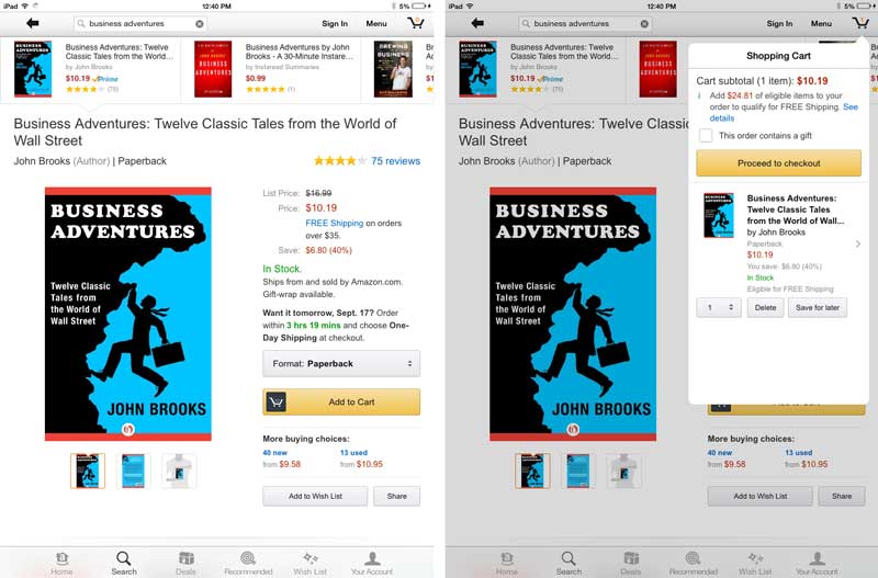
You’ll notice that the “Buy Now” option is gone. And because there is more screen real estate, the adding to cart causes a popup to show on the screen so that your recent addition is really clear. To get rid of the popup, you simply click anyone else on the screen. Again though, I wonder about how technology savvy the average user is. Is it intuitively obvious that tapping else where closes the popup?
One more thing to note is that the reviews for this app include many, many complaints about the number of times a password needs to be entered. This is another major issue that retail and e-commerce apps have to deal with: the balance between security and ease.
3. Evernote
For a quick change of pace, I’ve decided to throw a non-ecommerce app into the mix just to show a different variety of checkout–the upsell purchase. Here, I’m looking at the homepage of the free Evernote app.
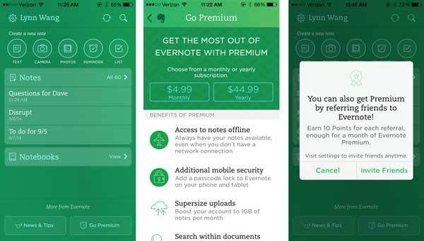
At the button of the home screen above, you can see the prompt for me “Go Premium”. The button is the same color as the everything else on the screen, so it doesn’t stand a lot, but it is always there when I open the app. When I click on it, the app takes me to screen with two purchase options and reason to upgrade (second screen). Very standard stuff. If I click on one of the buttons, it opens an App Store prompt.
The interesting thing about this flow that I want to point out is what happens when I tap the back arrow at the top. The back arrow takes me back to the homepage but with a popup that tells me about yet another alternative to getting the premium version (screen 3). This is pretty brilliant. The app knows that I was interested, but maybe I thought the price was too high or I just wasn’t ready to decide yet. It basically says, “Oh wait, there’s this other option we didn’t tell you about. What about this?”
4. Home Depot
This is the Android app for a a very traditional brick and mortar establishment. This means that their priorities are different than an online only business like the three apps mentioned above. The first thing you’ll notice is that the app asks you for location information to determine the store nearest you before you even start browsing.
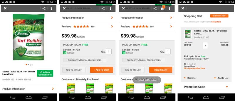
When I click on an item, above the fold is a image of the product, a message telling me that it’s available in my local store, and a teaser to product info at the bottom (first screen). I have to scroll in order to see reviews and add it to my cart (second screen). And even after I scroll to the section where I can add it to my cart, the app reminds me that pickup is free.
After click “Add to Cart”, I get three confirmations that the item was successfully added. A message pops up, the button copy changes, and the cart icon changes. Unlike the Amazon app, there is no way for me to wonder if I added the item. This also makes proceeding to check out much easier because the button tells me what I should next. In the Amazon app, I have to be familiar enough with online shopping to know to click on my cart (maybe all of Amazon’s shoppers are extremely tech savvy and this is not a problem).
At checkout, I’m again encouraged to select in-store pickup as my delivery option, but I can choose shipping as well (screen 4).
5. KAYAK
One of KAYAK’s most interesting A/B tests was regarding messaging on their checkout screen. Users often worry about payment security when purchasing things online and on their phones. KAYAK wondered if users were more likely to complete checkout when they were reassured of the security or if the warning would simply remind them that there could be security issues. So they tested it.
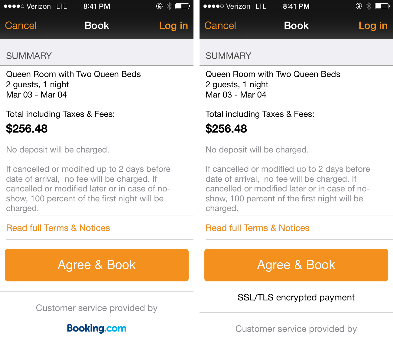
It turned out that the security warning was better and increased checkout completions. They could not have known this without first A/B testing it because some apps will experience the exact opposite results. Every app’s users are different and have a different relationship with the app, so these types of messages must be tested.
Conclusion
There are many components to an optimized checkout flow. The key is to A/B test each theory:
- Messaging next to the buy button
- Location of the buy button (e.g. before product details or after, fixed on the screen or not)
- Behavior of the buy button after clicking (e.g. confirms the users action when an item is added to cart?)
- Checkout options (e.g. add to cart, buy now, save for later, etc.)
- Button color and copy
- Number of pages in the flow
- Purchase options (e.g. credit card, PayPal, Amazon Checkout, pay at in-store pickup, etc.)
These are only a few ideas. I’m sure if you had a conversation with your mobile, you’ll brainstorm many more ways to improve your app, but I hope this article was useful to get the ideas going.
Thanks for
reading!
More articles you might be interested in:
Reducing Call Center Costs with a Mobile App?
Executives face an ongoing challenge of creating amazing customer experiences while also keeping costs at bay. This tug of war between satisfying customers and reducing costs takes center stage in stores, branches, and call centers. In particular, organizations have typically...
Read MoreHow to Increase App Upgrade Revenue with A/B Testing
ChordShaker, an iOS app that makes learning guitar chords easy and fun, increased their revenue from upgrades by 20.1% with an A/B test of a simple copy change. With Apptimize, this change took only a few minutes to set up...
Read More7 Things to A/B Test in Your Mobile App
We hear from customers that planning out your second, third, and fourth A/B tests is one of the hardest things to. Many app managers have a first test in mind when they start experimenting and planning out a series of...
Read More