Mobile UX: Optimizing the Onboarding Experience
The onboarding flow is arguably the single most important part of the mobile app. A new user’s first time experience determines whether they come back again and again or close the app right away and eventually delete it. Optimizing other parts of your app is only useful after the introductory flow is capturing as many users as possible.
Instead of telling you what works or doesn’t, I’m going to walk through 7 examples of how others have implemented onboarding. Just because something works for one app, does not mean it’ll work for yours. And just because something doesn’t work for one app, does not mean it can’t be great for yours. This is something you’ll have to test within the context of your app and your users. The purpose of this article is give you examples to learn from and ideas to think about.
To learn more about onboarding, check out our comprehensive guide:
The Ultimate Guide to User Onboarding for Mobile.
The Ultimate Guide to User Onboarding for Mobile.
1. Hyperlapse
This is Instagram’s hot new app that launched last week. I thought I’d download it and take a look. The onboarding experience is very standard. It gives you a quick four page tutorial of what the app benefits. The creative twist it employs is that the background image on each tutorial screen is a beautiful Hyperlapse video. So it not only tells why you should use the app but also demonstrates the product in the videos.
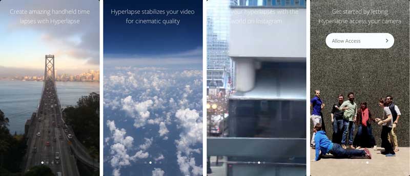
It does not give instructions on how to use the app in the sliding tutorial (which some tutorials do). The functionality of the app is simple enough that a “push this button to record” message can effectively show you how to use the app. It also surprisingly never asks you to log in. To share, you simply use your Facebook or Instagram app. It automatically links to the app of the service that you select. If you don’t have Instagram or Facebook installed on your device, it takes you to the App Store to download it.
Hyperlapse has the luxury of not needing your user information because it’s made by Instagram. Instagram/Facebook already has all the user information they could ever want about you so they completely forgo the process of asking you to register for Hyperlapse. Most other apps don’t have this luxury. If this app were made by a company that did want to collect user data, a registration step upon sharing would probably work nicely.
2. Cymera
I had not heard of this app before, but I downloaded it because it was in the “Popular Apps & Games” section of the Play Store. We see the popular pre-start tutorial that gives a brief summary of the benefits of the app. And then you’re asked to log in.
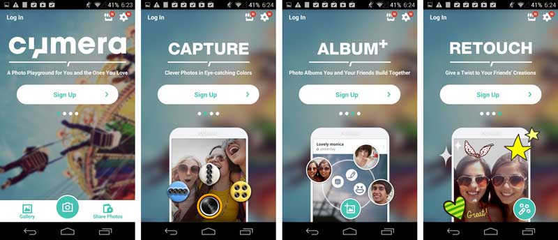
After I registered, I was not pushed to do anything. I landed on the home screen which included a feed of photos/albums. I had several options for my next action including create an album, take a picture, find friends, and browse the stock album. I chose to create an album because it stood out to me first. I added a new photo to this album by taking one of whatever was in front me (Brian, one of business development managers). Immediately, the how-to overlays popped up.
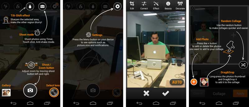
I learn about how to take a photo. After I take the photo, the app highlights the different ways for me to edit my photo. At every screen that is new to me, the app points out the important features that I might have missed. This is very useful, but very dense. It’s a bit hard to take in all the features on each screen, so it’s a little overwhelming. However, I don’t really need to digest everything at once. Each tutorial overlay reminds me that there are lots of features I should explore. I check out a few of the feature each time, but I’ll probably go back and explore more with time.
If I managed the Cymera app, I would test each overlay. What is the right quantity of information to point on on each screen? Which features should I highlight? Should I add instructional overlays to the pages that don’t have them?
3. Facebook
This is a classic example of what works for others may not work for you. In both their Android and iOS apps, the very first screen is nothing but a login page. Facebook is famous for their A/B testing, so you know they experiment A LOT. I assume that this first screen is A/B tested ad nauseam.
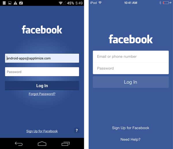
Yet, for most other apps, this would be a terrible first screen. There is no description of what the service does or any guidance on how to use it. They (rightly) assume that anyone who downloads the app is already familiar with Facebook.
Human Interface Guidelines specifically warn against using this type of first screen. But those are just guides for most apps. Prompting users to log in immediately can sometimes work better than giving users a taste of the product if they already know what they’re looking for and just want to log in as quickly as possible.
4. Product Hunt
I’ve known about Product Hunt for a while and am an active member of the community, but I didn’t realize they had an app until I saw it featured in the App Store. Product Hunt takes a different approach than the apps we’ve talked about so far. There is no tutorial and no registration barrier. Once you’ve downloaded and opened the app, it immediately takes you to a feed of the top trending products.
You get to browse the app at your leisure until you want to make a comment or suggest a product. At that point, Product Hunt asks you log in.
The main upside of this model is that users can immediately play with your app. There is absolutely no barrier to entry which can help a lot to reduce the initial bounce rate. However, there can a couple of downsides to this, depending on what your app does. Product Hunt’s app is really simple. It’s pretty easy to understand how to use the app without any guidance. This may not be true for all apps. It’s also appealing to consume content from Product Hunt’s community without being pressured to contribute right away. Consumption of more content will probably encourage me to contribute later down the road, so it makes sense that consumption is easy and barrier-free. However, some apps rely on the social network and cannot provide value without some type of sharing. In those cases, it’s crucial to ask users to register first.
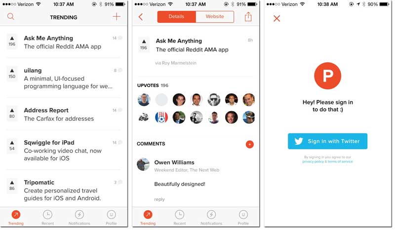
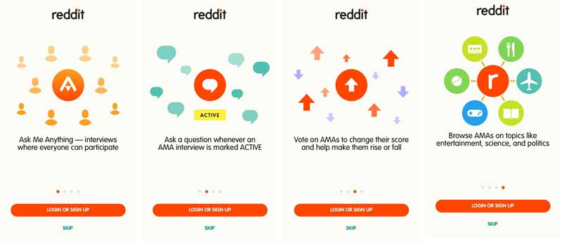
5. AMA (Ask Me Anything)
AMA (made my Reddit) takes the opposite approach of Product Hunt. The idea of AMA is to ask people random stuff. Someone tells you a little about themselves, and members of the Reddit community can then ask that person questions about anything. Like Product Hunt, it’s pretty easy to consume content without logging into the community. You can simply read what other people have asked. AMA can let you do this, but it first creates a gate to encourage you to sign in.
As you can see in the screenshot, you can skip registration, but the barrier is there. AMA has made a decision that registration is important to them somehow. Either the data collected is valuable for marketing communications or joining the community from the beginning improves the experience for better engagement of those who do get through.
6. Domino’s
I think it’s fair to say that most Americans have heard of Domino’s Pizza. Therefore, it’s again one of those apps that doesn’t really need an introduction. Users download it becuase the want to order pizza, so the first screen of the app prominently gives you two options to order pizza.
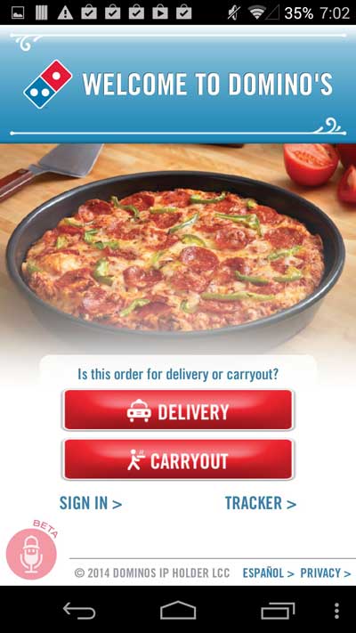
Unlike the previous apps we’ve talked about, signing is on the first screen, but it’s not the primary action the app wants you to take. The most important thing is that you order your pizza. As you go through your order, you’re encouraged to log in to save your information for YOUR benefit. Logging in will expedite the ordering process in the future. Oh and it’ll also give Domino’s valuable marketing information, but the benefit to the user is emphasized.
7. Lettrs
Lettrs reminds me of PostSecret (without the secrecy). The letters have a romantic look and feel while the messages vary from weird to deeply personal. It kind of brings me back to my days in college when PostSecret was hot, and you could flip through their books at Urban Outfitters if you didn’t feel like shopping any more.
Lettrs merges benefits and instructions into one, fairly long, tutorial.
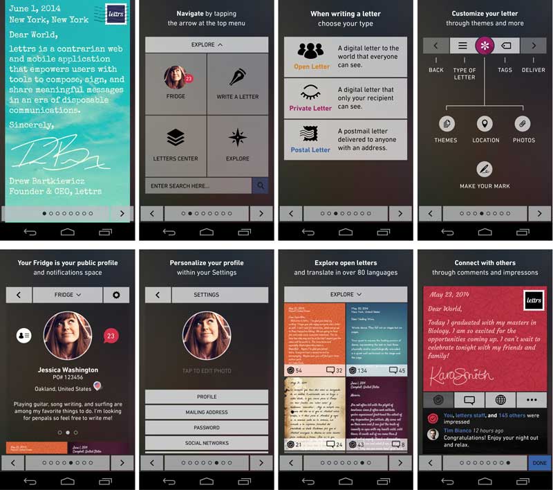
I personally find this tutorial to be unnecessarily long. Lettrs’ functionality is actually really intuitive. I don’t need be to told to hit the “explore” button to explore. Or that the letter templates shown to me are letter templates I can choose to use. That being said, maybe I only think the UX is intuitive because I saw the tutorial first.
After swiping through 8 tutorial screens, I land on the registration page. I have to admit. If I were not intending to write this blog post, I would definitely have bounced. I click on Facebook as my option to log in. It sounds simple enough, right? I should now be allowed to play with the app, right? Wrong. I now need to enter my email and zip code. Why??
Conclusion
At the end of the day, all these onboarding flows can be great or terrible for your app (and theirs for all I know). The point is that they should all be A/B tested to maximize retention and engagement.
To learn more about onboarding, check out our comprehensive guide:
The Ultimate Guide to User Onboarding for Mobile.
The Ultimate Guide to User Onboarding for Mobile.
Thanks for
reading!
More articles you might be interested in:
Why the Growth of Mobile Apps Makes In-App Experience Even More Important
The astonishing growth in smartphone adoption in the past few years has been matched only by the equally impressive growth of mobile apps. As of January 2017, the iOS App Store contained more than 2.2 million apps for Apple mobile...
Read MorePersonalizing Mobile User Onboarding
Feel like going to the Giants game at the last minute? Gametime is an app that let’s do just that and buy last minute tickets with just two taps on your phone. It avoids the hassle of printing or picking...
Read More6 UX Mistakes to Avoid When Designing a Native Mobile App
It’s hard enough to get to people to download your app. Why spend all that time, money, and resources generating a download only to have the user close and delete the app? Avoiding these 6 pitfalls when designing your native...
Read More