6 Methods to Reduce Friction in Your Mobile Funnel
Converting users into customers can be a difficult task for many apps. Often on the go, users can be easily derailed by the slightest bumps, whether they be physical distractions or friction in the funnel. This week, we’re sharing 6 of the best methods to help convert mobile users into customers, and how you can apply the learnings to your app.
1. Utilize Native Payments
Users often have trust issues when it comes to payments. If you’re not a major household name like Amazon, or Paypal, it can be difficult to build enough trust with users for them to willingly give you access their credit card information. That’s where native payments come in handy.
When HotelTonight originally tested native payments, they already had an incredibly slim funnel,
only requiring 3 taps and a swipe to get users from the home page to completion. Even so, the team wanted to further hone their competitive edge and they tested how Apple Pay stacked up against their own easy-to-use system. The result? Apple Pay gave them a huge boost in bookings, increasing it by 26%.
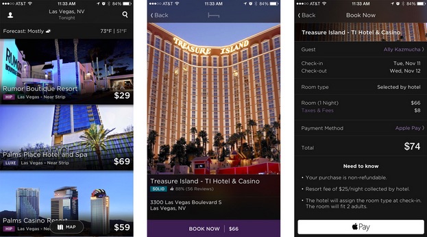
Why? The HotelTonight team believes that the familiarity and trust of Apple Pay helps alleviate most concerns about security. Built-in payment systems often already have users’ credit card information from other purchases, and the companies are much more likely to have users’ trust.
Using Apple or Android Pay makes it even easier for users to get what they want out of your app, without giving up sensitive information. Without it, you’re just giving users adding friction to the process and giving them another reason to drop out of the process.
Learn more about the Apple Pay test and more by clicking here.
2. Surprise and Delight Users Before Critical Conversions
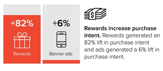
During moments of achievement, users experience 40% more excitement, something that you should be looking to harness. Furthermore, the researchers also found that the excitement translated into a 82% lift in purchase intent when paired with a reward. Whether your users have finally researched the perfect product or have found the perfect restaurant to book, these moments of achievement can be harnessed if you utilize the right techniques.
One of our customers, a restaurant booking app, did just that. The team wanted to improve the number of tables booked through the service. To do so, they decided to highlight deals for reservations at certain restaurants. Originally, the team integrated an e-commerce model, displaying the discount next to search results, which they believed would work well. Unfortunately, this model actually decreased the amount of bookings they received, and decreased the return rate.
The team realized through testing that their users were actually turned off by the deals, believing them to hurt the editorial integrity of the app. The company tried again, using a surprise and delight tactic, offering discounts right before critical conversions.
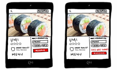
Instead of displaying them in the search results like most ecommerce apps, they displayed the discount at the final booking page right before a user pressed the submission button.
The result? Users channeled that excitement into an intent to purchase, which drove bookings up by 28.1%.
Using a surprise and delight technique such as this can take full advantage of users’ increased excitement during achievement moments, and help greatly increase key purchases and conversions.
Read more about the test here.
3. Remove Extraneous Steps
On mobile, speed and efficiency are key. Users are looking to get tasks done quickly, as they’re often on the go. Whether commuting to work or checking their phone at a party, mobile users easily become disengaged by any number of distractions. Additionally, network connectivity can often be a problem as users check their phones in all sorts of locations. Decreasing the amount of steps makes it easier and faster for users to achieve their goals, and decrease the chances of them being interrupted.
A lot of apps port over web checkout flows onto mobile apps, without accounting for the significant differences. Groupon, on the other hand, is a great example of how company should adapt their web checkout flows for mobile, and make it easy and quick to make a purchase.
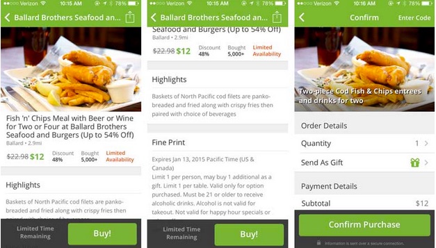
The app does a great job of having an ever prominent buy button for any deal. Even as a user scrolls down, the accompanying copy and buy button stay present on the bottom of the screen. No matter what a user is looking at, they don’t have to go searching for the next step and can immediately move forward which allowing for quick, decisive action.
The other thing that Groupon has done really well is to get rid of the cart. On the Groupon website, the purchase button takes you to your cart. On mobile, users are generally looking for just one deal at a time, so Groupon opted to skip the process entirely.
For more analysis about ecommerce checkout flows *Check-out* our post here
4. Don’t Make User Logins a Requirement
Logging and creating accounts are a pain. While you can do things to make the experience less jarring, it still doesn’t change the fact that users are generally reluctant to go through the process.
While logins were originally designed to segment multiple users accessing the same computer, mobile phones are personal, and rarely shared with others. As a result, the main benefits for mobile are the ability to sync across platforms and additional data security, features that aren’t absolute necessities for every single app.
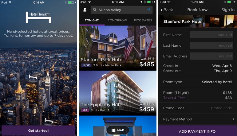
One company that has tested this out is HotelTonight. The team decided to see how removing logins would affect the number of bookings. They saw that when users no longer deterred by the hassle of creating a new account, bookings increased by 15%.
That isn’t to say the company did away with logins entirely. Instead, they made them optional, allowing users to gain additional (non-core) functionality such as syncing, viewing promotions, and utilizing credits.
Instead of inexorably tying logins to core features, test how making them optional affects purchases. You might find that it improves the overall user experience, and turns more of you users into customers.
5. Determine the Optimal Number of Search Results
One easy mistake is to give users too many choices. More choices = more customers right? Fortunately or unfortunately, that’s not the case. While it may seem like a good idea to increase the amount of choices, this method can actually end up backfiring. Google actually ran a test to determine the optimal number of search results for their search engine and discovered the ideal number that provided the most value to their users.
They found that too few results led to readers being disappointed in the breadth of results. Too many, on the other hand, subjected users to decision fatigue which overwhelmed them with choices. In the same way, some of our customers have discovered an optimal range (typically between 10 — 20 results depending on the formatting) that doesn’t over or underwhelm users.
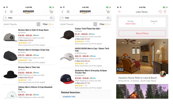
The key is to figure out what the best number of search results is for your specific app. For example, Airbnb has found their optimal amount of results to first load is 20, while Amazon halves that number at 10. Each app will vary depending on what users are searching for, as well as the format it’s displayed in. Use A/B testing to try out different numbers of results, and figure out which one best converts users.
6. Spend a Few Minutes to Test Your Call-to-Action
You can and should definitely make time to test your call to action. At critical conversions, your CTA can make or break what next steps happen for a large number of users. We’ve seen app after app test out their CTAs for large impacts with minimal effort. Here are some of the tests:
Clever Lotto, a German lottery app, tested out 4 variants of their CTA and found the winning variant increased purchases by 35%. The best part? It only took them 5 minutes to set up the test and they’re still reaping the benefits.
ChordShaker tested out their CTA along with small copy changes and increased their conversions by 28.8%.
These tests aren’t hard to run, but their impact can be surprisingly high. You could also test out the entire UI for a CTA just like Glassdoor did.
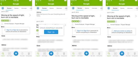
The team at Glassdoor wanted to test out new formatting and copy to see which was most effective in driving signups. They created 4 variants that had combinations of different copy and formats to see which one would have the highest impact on converting users. The winner ended up improving their conversions by 8%.
To read more about Glassdoor’s CTA test, click here.
Conclusion: Turning Users into Customers
These are just a few of the ways you can decrease friction and optimize the funnel in your app to transition more users into customers. While these methods generally apply to most apps, you should always test out changes to see the actual effects on your users. Like we saw with the team trying to highlight deals for restaurant recommendations, our assumptions can sometimes backfire and have the exact opposite effect of what we were hoping.
Thanks for
reading!
More articles you might be interested in:
5 Efficient Methods to Validate Mobile Products and Features
Before you deploy a feature to a userbase of thousands or even millions, how do you validate that the product or feature you’re building will appeal to your users? We dig into 5 techniques you can use to efficiently evaluate...
Read MoreHow VSCO & Twitter Deploy New Features to Millions of Mobile Users
How do you update an app without breaking the user experience when you have over 20 million users? 200 million? When it comes to mobile apps, the stakes are higher than they ever were on web. Mobile users have an...
Read MoreHow to Gain and Engage Mobile Users
Is paid user acquisition the only way to get substantial users in this mobile ecosystem? Why even pay for downloads if those users don’t stick around? What are the best ways to create virality? Apptimize CEO, Nancy Hua, speaking at...
Read More