The Ultimate Guide to the Hamburger Menu and Its Alternatives
The hamburger menu has gotten a lot of flak over the years, some for justifiable reasons and some not. One reason for its controversy is simply that it’s so darn popular on all kinds of apps. An overwhelming majority of the posts we’ve seen online only seem to be a one-sided bashing of the popular UI element, when in reality they’re a very useful tool to incorporate into your app. There’s a reason a lot of the top apps still utilize them in one form or another.
So here’s what we’ll do instead. We’re going to lay out all the pros and cons of the hamburger menu, arm you with the right questions and evaluation criteria to find the right solution, and provide you with 7 of the best alternatives to the hamburger. Let’s get started.
Hamburger Menu Cons
Hamburger Menus Don’t Showcase Features Well
One of the biggest downsides to using a hamburger menu is that it doesn’t showcase an app’s features very well. 25% of apps get deleted after first use, suggesting that many apps aren’t quick enough to demonstrate the value they’ll provide in users’ lives.
That’s why onboarding is so key. “If you don’t nail onboarding, your developers may as well have been drinking beers instead of building those features that no one saw.” – Apptimize CEO Nancy Hua. When users first enter an app, they’re looking for obvious cues as to what features and value are available to them. Hiding those features in a navigation drawer such as the hamburger makes them difficult to discover and forces users to go searching for them.
Putting Features in a Navigation Drawer Signifies That They’re of Lesser Importance
Putting important features in your navigation drawer is like putting your star players on your B team. Navigation drawers, just like physical drawers, are where we store stuff that we don’t need at the moment. The result is that if it’s out of sight, it’s also out of mind. If it wasn’t important enough to be put on the home screen, it must not be that important.
Click Rates for Hamburger Menus in the Top Left Are Low
The top left of a phone screen is generally reserved for meta information (name of device, wifi indicator, back navigational button, apps running in the background, battery life, search, etc.). It’s not a core section of the screen like the center (where your eyes naturally fall) or at the bottom (which are the easiest spots to reach with your fingers). Naturally, the implied message is that things at the top of the screen are to be glanced at, not clicked on.
Navigational Buttons at the Top of the Screen Are Hard to Reach
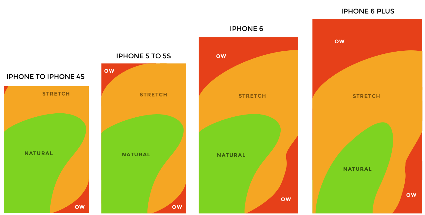
Try this: grab your phone and unlock it as you normally would, then try and reach the top left corner with your thumb, without re-adjusting your grip. It’s pretty difficult unless you have very large hands. Even with smaller smartphones, our fingers generally can reach the bottom ⅔ of the screen without adjustment, but require us to adjust our grips to access the top ⅓. Screen sizes are only getting larger, and even iPhone’s readability feature doesn’t make it that much easier. Users go towards the path of least resistance, and oftentimes that means they’ll avoid clicking on the hamburger.
It Clashes with Navigational Buttons on iOS
The hamburger menu placement on the screen is the exact same as the default for the back button: the top left corner. When both icons are needed, you’ll either have to squeeze both of them in next to each other, or sacrifice some usability by deleting one.
It’s Not All Bad! The Pros of Using the Hamburger Menu
It’s not all bad! There are good reasons that so many apps out there are using the hamburger menu as well. The menu style is prolific for good reason.
It Makes UI and Navigation Much Cleaner

One of the worst things you can do when designing an app is to overload your users with choices, creating decision fatigue. The hamburger menu helps get everything tucked away neatly. This keeps users from getting distracted from the core functions that you want your users to see. It’s only a problem if you want users to actually use the features within the hamburger menu.
The Hamburger Icon is Generally Well-Recognizable
“Why kill a ubiquitous icon, which our users know and understand, and replace it with a new iteration for them to learn all over again.” – Oliver McGough
It’s very difficult to get widespread adoption of a UI icon. Aside from the home button, the mouse pointer, the print logo, and power buttons, how many do you know? Even seemingly innocuous icons such as the star or the heart icons can have a wide range of different interpretations. For some apps they might mean bookmarking a page or post for later reference, while in others they may just signify a like, which users may be hard pressed to find later on. As a result, these and many other icons can be difficult to interpret precisely when using new apps.
The Hamburger Allows for Direct Navigational Access
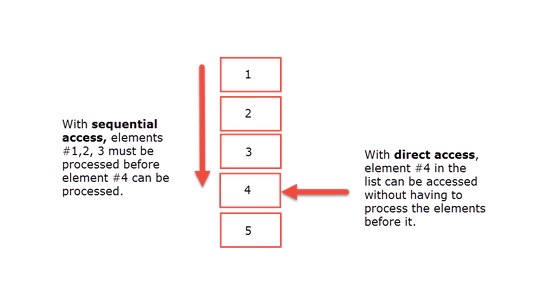
The hamburger allows for direct access, which means that allows a user to access a “preferred item, instead of forcing users to go through your content in serial order.” -Nielsen Norman Group. This means that users can click directly to the pages they want, instead of having a preset order that they must process before getting to the desired screen.
The big advantages of this are usability and speed. With direct access, users can quickly get to the screens and features they want to access with only a few clicks. In contrast, having sequential access forces users to go through a preset list, which requires them to scroll through irrelevant screens before arriving at their desired destination. On mobile, users have a greater sense of urgency, expecting speed and quick access to functionality even more than on web. Sequential access doesn’t always cut it.
When Should We Switch from the Hamburger?
We know the hamburger isn’t the optimal solution, and it can be improved. However, it’s important to ask yourself and your team what your goals are and whether the change would be worth the effort. The most important question of all:
Is it important to drive users to the features in the hamburger menu?
If your answer is no, your app is probably fine as is. When users are looking for increased functionality, they’ll likely head over to the hamburger menu to tweak settings or figure out the full potential of the app.
If the answer is yes, you’re in luck because we’ve got 7 alternatives for you. First though, we need to talk about the criteria you should use to evaluate each one, and determine the optimal solution for your app.
Navigation and UI Criteria
What we need to keep in mind is that one design doesn’t work for every app. Each of the priorities and constraints will be different, so pick one or more solution that you think works best and satisfies your criteria. Below are the questions you should ask yourself when considering an alternative to the hamburger menu.
- Which is more of a priority? Screen real estate or immediately viewable features?
- Are the core functions visible on the landing page/home screen?
- Does this UI navigation showcase the core features I want users to see?
- Does the navigation UI give indications as to which page the user is on?
- Are the navigational buttons easy to reach with my right thumb without changing my grip?
- Are the icons intuitive and easily understandable?
- Does this navigation allow for direct rather than sequential access?
Hamburger Menu Alternatives
1. Floating/Prominent Hamburger Menu
Pros:
Cons
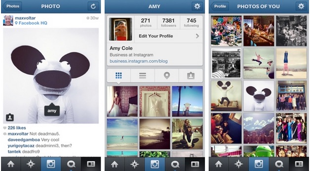
If you still like using navigation drawers, there’s a better way to drive users toward actually using it: The floating hamburger menu.
The floating hamburger is an app drawer that has been relegated to a more prominent position on users’ screens. This has a few significant effects: Users now see clicking on this button as a core feature of the app, increasing its perceived importance. It also allows teams to showcase more than a few features, as well as have an easily accessible navigational drawer that can take them anywhere in the app.
My personal favorite? This beauty.
We actually tested a variation of the floating hamburger icon with Vevo and found that using their logo for the icon, rather than the typical hamburger, actually increased conversions significantly.
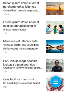
2. Tabbed Menus
Pros:
Cons:
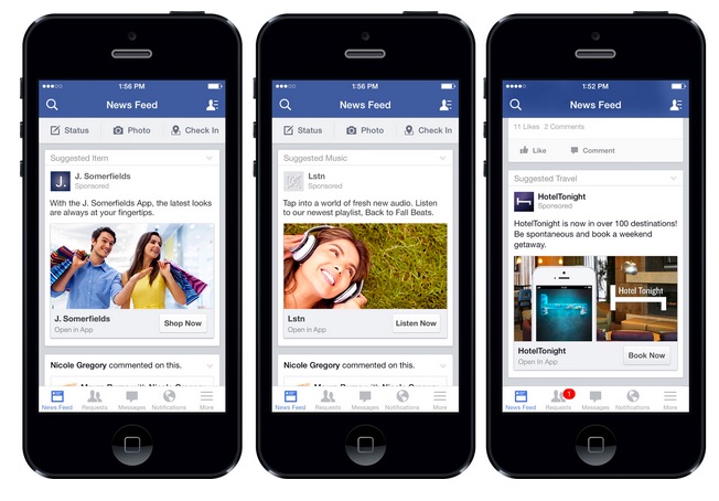
This has become the go-to alternative for teams who wanted to ditch the hamburger menu. It’s been adopted by Facebook, Flipagram, Buffer, and many others for good reason. The tabbed menu at the bottom allows users to see the core features and functionality immediately on the home screen, as well as tells users what page they are on at a glance. Direct access is key here, as users can rapidly switch to different features using a single click and without the need to return to the home screen.
3. Top Tabbed Menus
Pros:
Cons
Similar to tabbed menus on the bottom of the screen, tabs at the top of the screen are a decent alternative. They allow users to have direct access to different features, as well as receive visual cues as to where they are within an app. They may also be more intuitive, as they work similarly to tabs on a browser. However, since they’re located on the upper ⅓ of the screen, they’re not quite as accessible as tabs on the bottom screen are. I have yet to see them used alone, as most apps opt to add them as additional navigation in conjunction with another system.
4. Swipe Pages
Pros
Cons
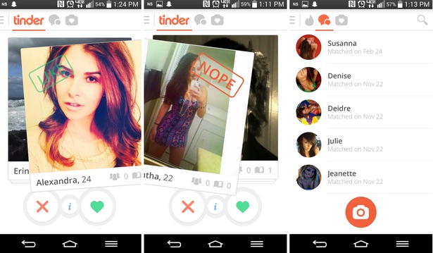
Many apps such as Tinder are embracing the ability for smartphone users to swipe left and right. Rather than use valuable screen space for specific navigation buttons, they’ve opted to use swiping to access different app functions (except on its main page, where you swipe right or left to like or reject a match).
This works really well in Tinder’s app, allowing users to continue taking advantage of the swiping left and right functionality and help compartmentalize feature groupings. Tinder also utilizes a bar on the top of the screen with icons, indicating what each page does, keeping users from getting lost.
A drawback of this method is that users have sequential access rather than direct, which slows the navigation process. It can also interfere with the main screen’s UI, for example, users clicking on items when they intend to swipe or vice versa.
5. Labeled Menu Button
Pros:
Cons:
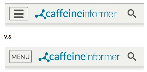
James Foster of Exisweb ran a few very interesting A/B tests to see if simply tweaking the hamburger menu icon would significantly increase usability and reduce confusion. He found that icons labeled with the word “Menu” significantly increased the amount of clicks as compared to a normal hamburger menu, by as much as 20%.
If you’re not looking to make a big change to your app, but want to increase usability, this would be a good alternative. The Nielsen Norman group also recommend labeling the hamburger menu for increased conversions.
6. Slide Out Navigation Tabs
Pros:
Cons:
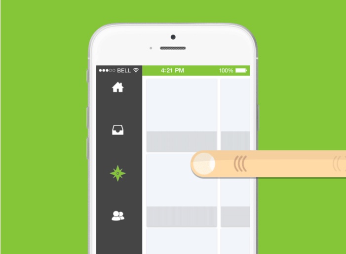
Benjamin Berger has a clever idea for slide out navigation tabs. Using gesture control, users can simply swipe right to pull up the navigational drawer. It allows users to maximize screen real estate, as well as easily view the drawer without requiring a user to change their grip. The big drawback from this would likely be the interference with page UI.
7. A combination of a few versions
Possibly the best option is to incorporate multiple UI elements that take advantage of both the cleanliness of a navigational drawer, along with the usability of other alternatives. Oftentimes apps still have a bunch of features that users occasionally want, but not often enough to feature on the homescreen. Having an app drawer combined with other navigational elements gives users the best of both worlds.
Facebook is the most commonly cited example of this. Within their navigational tabs, they include a hamburger menu as a tab to access all their other features.
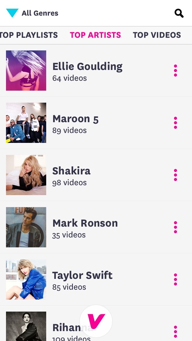
Vevo’s app has many different categories it can sort by: Music Genre’s, Top _____ lists, and functionality. As a result, it combines the floating hamburger menu, a carousel menu at the top of their app, and a hamburger menu style icon labeled “all genres” to help users sort through the content.
Concluding Notes
Whatever option you choose, make sure it’s the right decision for your app. Navigation within an app is even more critical for mobile, where users expect speed and efficiency. Make sure that you’re testing these methods with both user testing and A/B testing to ensure that any assumptions you may have about the new design changes are actually affecting user behavior and perception in the way that you want.
Like this post? Sign up for our newsletter below where we deliver weekly posts about mobile optimization tactics and the best curated mobile content from around the web each week.
Thanks for
reading!
More articles you might be interested in:
The Ultimate Guide to User Onboarding for Mobile
In this monstrous user onboarding guide, we'll break down everything you need to know about and techniques to use to deliver value and drive retention: What key metrics you should focus on, applying behavioral psychology to drive the right behaviors,...
Read MoreThe Up-To-Date Guide for Mobile Product Management Resources
A Curated Directory of the Best Techniques, Case Studies, Articles, Blogs, Events, and a Helluva Lot More. There are some great product management resources out there, but when looking specifically for mobile product resources, you may find yourself a little...
Read More