Why Vevo Got Rid of Onboarding Tutorial Screens
How We Optimized Our Native Mobile Login Flow
By Corinne Almirol (Sr. Product Manager, Vevo) and Jon Li (Sr. Product Director, Vevo)

So you want more registrations. You want users to log in so that you can start a relationship with your customers. You want them to them to connect with your content, your other apps, your other users, your ads, et cetera. You want their email address so that you can can market to them, engage with them, and personalize the best experience. This is all fantastic and likely true.
At Vevo, however, there is only one reason to register: to create playlists.
Playlists are engaging. We know they drive a lot of video views. They work for our growing living room experience. And we know that the hook for people to enjoy our living room experiences on Roku, Apple TV, Sony Playstation, Xbox, and Samsung’s Smart TV is through their mobile phones.
So we push registrations.
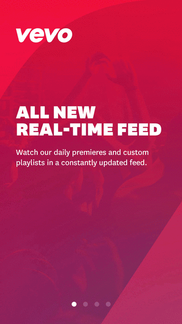
For most apps, the current trend is to display an onboarding funnel (e.g. a four-slide tutorial) that ends with a registration page.
At Vevo, this is exactly what we did … at first.
Does this trend get the best conversions? At Vevo, we wanted to question this trend by putting the onboarding tutorials to the (A/B) test.
Experiment Design – Putting Onboarding Tutorials to the Test
We know that onboarding is one of the most important parts of the app. After all, if a user doesn’t get through onboarding, they won’t see the rest of the app. It’s not uncommon for users to uninstall within the first 30 seconds if they can’t quickly understand the value of your app. A recent study found that 20% of all mobile applications are only used one time.
“If you don’t nail onboarding, your developers may as well have been drinking beers instead of building those features that no one saw,” said Nancy Hua, CEO of Apptimize.
The Hypothesis: Removing the tutorials would increase logins and signups.
Through a combination of user tests and analytics, we found that most users were just swiping through the tutorial without reading any of the copy. Well if they were ignoring the tutorial and logging in straight away, would the registration rate be higher if we just gave users what they wanted sooner? After all, we knew that most users who download the Vevo app already know what the app does and are specifically using the app to watch music videos.
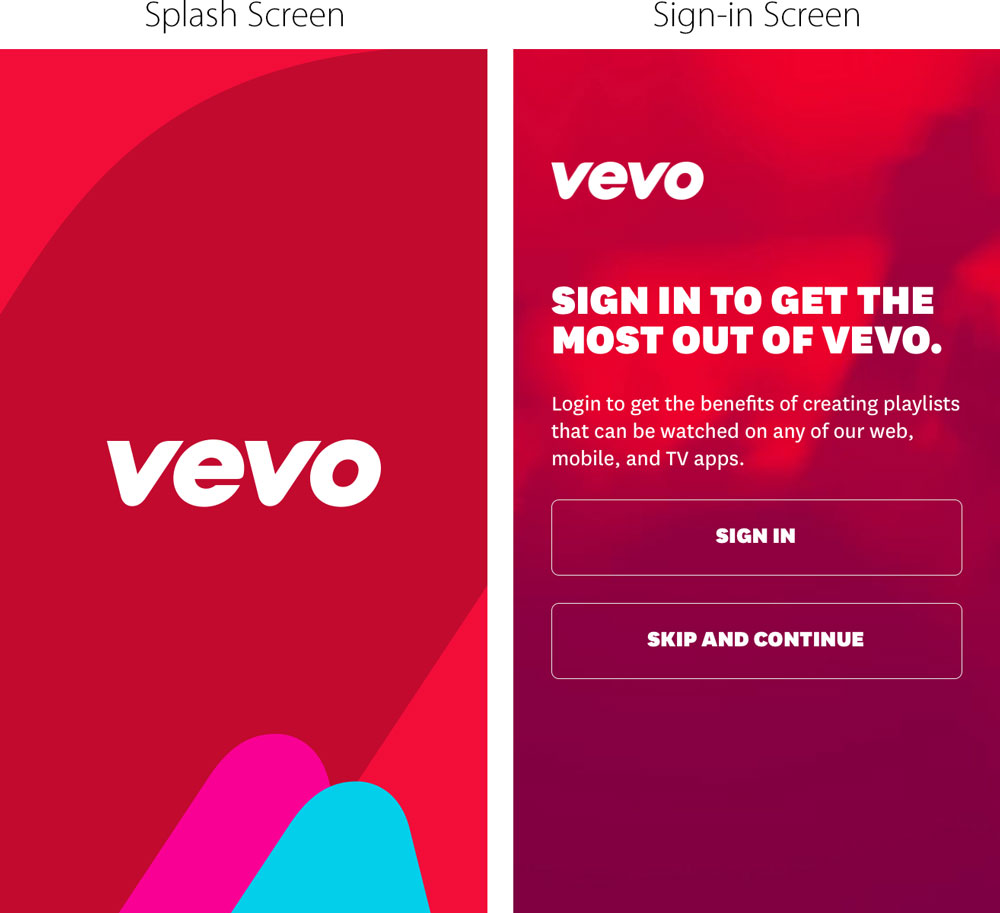
We knew we couldn’t just watch every single statistic to see if any went up. That wouldn’t be very scientific. So we decided to track the following numbers: To test the hypothesis, we set up an A/B test with versions of the app–one with the original tutorial and one with the tutorial removed such that the first screen of the app after the splash page was the login screen.
We then tracked the following metrics to determine which version was better:
- Clicks on the sign-in button
- Clicks on the skip button
- Successful signups
- Videos watched – In addition to tracking the simple conversions on the signup page, we wanted to make sure that in removing the tutorial, we weren’t taking away from the core functionality of the app. We also wanted to make sure that users from both versions of the app were still continuing to use the app in the way we expect.
- User retention – percentage of users who returned to the app in 1 day and 7 days (automatically tracked by Apptimize)
15% of all new users would be shown the original version of the app. Another 15% would be shown the new version of the app (no onboarding tutorial in the beginning).
Apptimize’s A/B testing framework allowed us to quickly set this up and track the results throughout the duration of the experiment. It also ensured that we didn’t make the mistake of running multiple tests on users, or allocating different amounts of users to the control and test groups. Both of these would have introduced confounding factors, and could skew our results for inaccurate conclusions.
What We Learned – Onboarding tutorials are NOT for every app.
We ran the experiment for 28 days, with over 160,000 participants to ensure that changes were statistically significant. The results were very surprising, and contrary to popular belief.
- No. of completed logins increased by 9.69%
- No. of completed signups increased by 5.85%
- No. of users skipping stayed the same
- No. of videos watched per user stayed the same
- No. of users returning in 1 and 7 days stayed the same
While the new version had a huge impact on the number of logins and signups, the number of skips didn’t have a statistically significant change, which means that the total number of people who dove into the app actually increased. The variation also didn’t affect any of our engagement or retention metrics, indicating that the new flow didn’t turn off users in any way.
We’re definitely not recommending that every app simply ditch the tutorial. This is certainly not going to be the optimal user flow for all apps. But we learned that you can’t just take standard “best practices” for granted either. Thorough A/B testing helped us improve and further optimizations will make our app even better.
Want to find out more about how to create an amazing onboarding process for your app? Check out our guide: The Three Questions Your Mobile Onboarding Needs to Answer to learn about 16 powerful techniques that the top apps use and how to create the optimal flow for your app.
Thanks for
reading!
More articles you might be interested in:
7 Reasons Why Mobile Onboarding Is Your App’s 80/20
The Pareto Principle. It says that 80% of the effects come from 20% of the causes. Simple right? If you’re playing tennis, that 20% is probably footwork to make sure you’re in the perfect position to make a shot. When...
Read MorePersonalizing Mobile User Onboarding
Feel like going to the Giants game at the last minute? Gametime is an app that let’s do just that and buy last minute tickets with just two taps on your phone. It avoids the hassle of printing or picking...
Read MoreVevo Iterates Faster with Apptimize
Vevo has been one of our most amazing customers for a long time. They are constantly trying new things, experimenting, and bringing a better user experience to their iOS and Android app users. Apptimize is proud to help them do...
Read More