The 4 Best Mobile User Onboarding Flows We’ve Seen So Far

We look at a lot of apps on a daily basis here at Apptimize. Some are good, some are bad, and the average is not too pretty.
Still, we come across quite a few gems; teams that have put an extraordinary level of thought and care into their products.
Today, we’re sharing our favorite mobile onboarding user flows, curated by Apptimize team members. Out of the thousands and thousands of apps we’ve looked at, these 4 apps were far ahead of the pack. The best way to show off all the goodness is through an app teardown like those Samuel Hulick does at UserOnboard, so I’ll do my best to do him justice.
Robinhood
Robinhood’s onboarding flow is my favorite by far. When it comes to financial apps, giving up private information such as bank account numbers or passwords can be a huge hurdle to overcome.
That’s what makes Robinhood’s onboarding so impressive. Rather than sticking with the traditional onboarding screens or progressive onboarding techniques, the team has clearly thought about part of the app from the get go.
Robinhood actually allows users to try out most of its functionality before ever having to give a shred of information. During this process, users see what the app is able to do, and can make a fake trade to test out the UI. Overall it’s a fantastic and aesthetically pleasing onboarding flow.
Lookout
What I really love about Lookout is their in-your-face value propositions that they have each user go through. Their onboarding poses a series of questions and asks them to select an answer that conveys the value of their app.
The 4 questions they use are all specific use cases that their userbase is likely to run into. By forcing users to engage with these situations and choose an answer, they’re able to clearly convey “here are 4 reasons why you should be using Lookout.”
In doing so, they force users to engage with the ideas they’re trying to get across, and clearly convey “here are 4 reasons you should be using Lookout.”
Inbox
With the last 2 apps, Sam Hulick already has great teardowns, so I’ll just summarize the main takeaways you should know.
Inbox’s onboarding is inherently complicated because its goal is to fundamentally change the way we use email. As a result, it has to teach new UI patterns, new workflows for email, as well as build a new habit.
In its early stages of onboarding, the app stresses it’s message “The inbox that works for you.” Throughout the process, it has to continually reinforce that this is build around how users want to do email, rather than the monster it has become.
It does this by introducing one function at a time. First, they go through the reminders feature and show how you can snooze it, which introduces a second feature that users are unfamiliar with. Inbox shows off how the animation works, so that users dropped into the system have a clue about what to do.
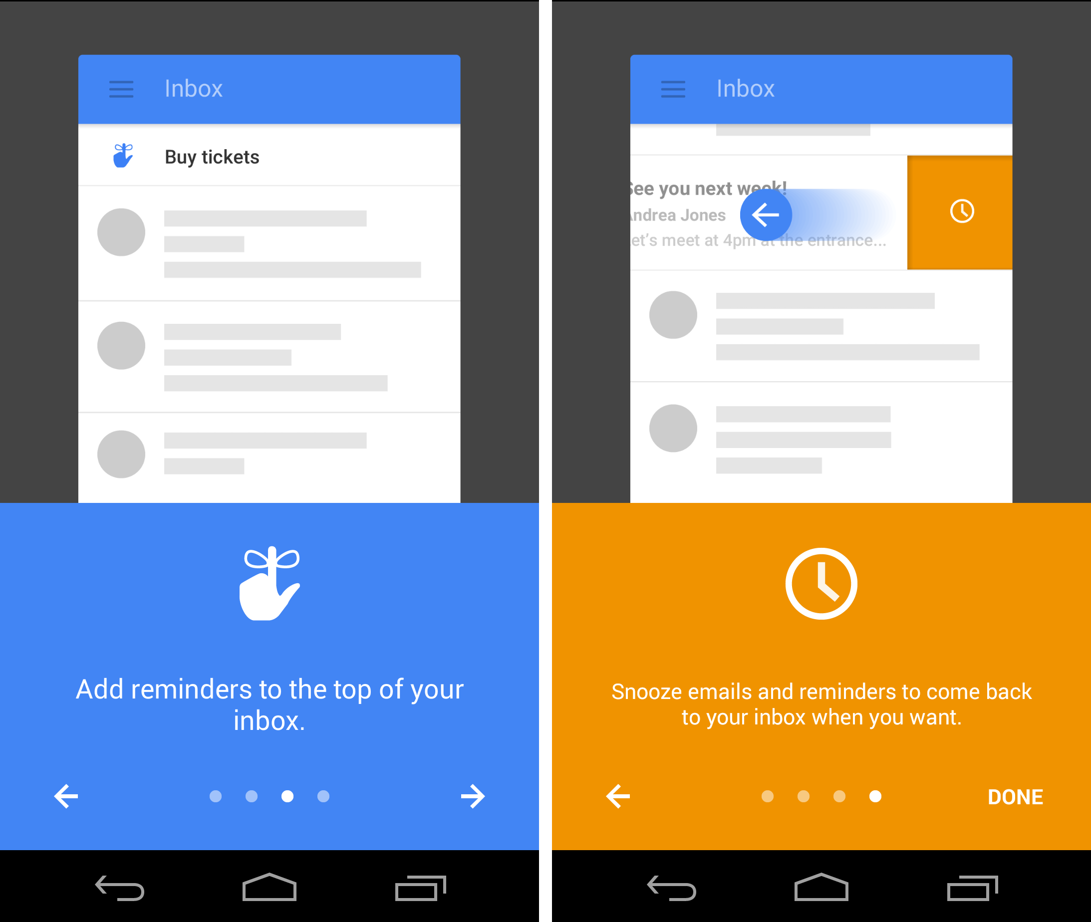
Once on the home screen, users are free to choose their next action. They can compose an email, swipe left/right, or explore freely. After doing so, users are shown an explanation screen that talks about the action they just took.
Overall, Inbox does a great job of breaking down the new email flows they want users to use. By showing users the patterns then allowing them to explore freely, they give users a chance to explore and learn the app on their won
Peach
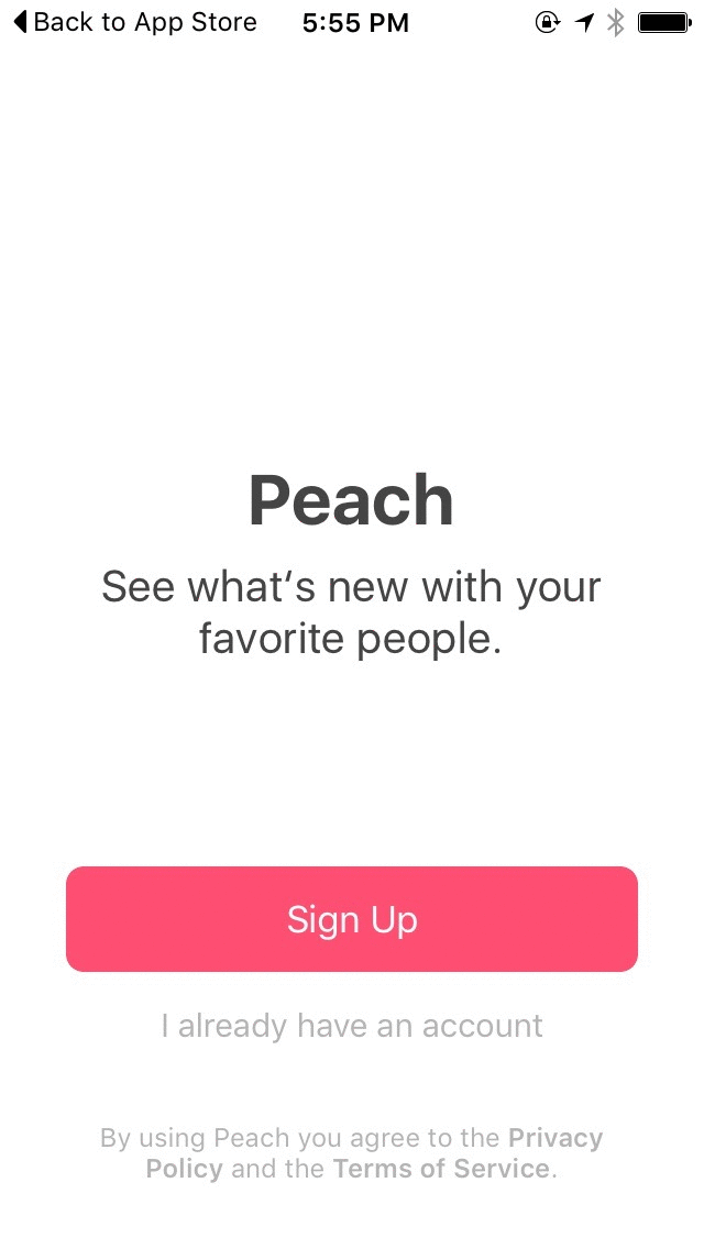
Again, Sam Hulick already has an awesome teardown going over Peach’s onboarding flow, which you can find here. Peach, being a messaging app, also introduces its feature and functionality by getting users to explore and try on their own.
The first thing users are required to do is register for an account. While I wouldn’t recommend this for most apps, messaging and social apps can be a bit different. That is, to gain critical functionality like connecting with friends, username registration is quite important.
I’ll skip over a few areas and talk about what happens when users are dropped into the home screen. Being a messenger app, it actually takes you to your “space” or a messaging window. There, users are prompted to type in a few different commands, such as “gif” which pops up a gif search button. This brings up the Giphy integration allowing users to choose different gifs to send as a message.
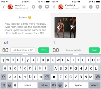
Once the action is completed, they explain what these “magic words” are, and have users try out a few of them like “draw” or “tv” or “here.” Since these commands are what help distinguish Peach from its competitors, having users try them out early on is a strong value add.
Another small detail is how the “magic words” buttons pop up whenever users are typing in a nondescript way. One of the biggest problem with shortcuts like these are that users forget they exist. By having a non-intrusive button pop up as the users are typing, it gives a simple reminder that thy are available for use, without disrupting typing flow.
Thanks for
reading!
More articles you might be interested in:
User Onboarding at Different Stages of Growth
Sean Ellis defines startup growth in 3 stages. There’s Product/Market Fit Stage, in which you’re trying to match pain points/value props with a specific persona. Then there’s Organic Growth Stage, where you’re growing by word of mouth. And then there’s...
Read MoreBest Practices for Refining Mobile Onboarding Flows
If you’re not retaining your users, all other effort is a waste of time and money. – Nancy Hua Click To Tweet By now, you know that onboarding is the most important element of mobile growth. You know that it...
Read MorePersonalizing Mobile User Onboarding
Feel like going to the Giants game at the last minute? Gametime is an app that let’s do just that and buy last minute tickets with just two taps on your phone. It avoids the hassle of printing or picking...
Read More