5 Onboarding Mistakes You Might Not Even Know You’ve Made
By Hannah Levenson of Appsee
Almost any app in today’s mushrooming mobile market employs some sort of onboarding tactic. Yet just because an app has utilized inline hinting or a tutorial does not mean it can simply check off the task of onboarding as “done”. In reality most apps are actually making small yet grave errors when it comes to onboarding their users. Why do we use the word “grave”? To put it simply, you only have one chance to make a potent and lasting first impression-mess it up in the tiniest way, and you dramatically increase your risk of losing users right from the get-go. No one likes to lose users, yet right now you could be losing a lot more than you should be due to a flawed onboarding experience. Eek! That is why we have taken the initiative to pinpoint five risky onboarding mistakes, to help you effectively optimize one of the most critical facets of your app’s user experience.
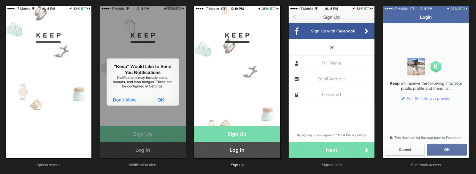
Asking users to sign-up and/or approve permissions as soon as they open your app
Cue the ominous “sigh.” When you ask your users to sign up or accept an in-app permission within the first second of their first experience with your app, you are totally jumping the gun. Why? Basically, this the very first interaction your users have had with your app which means that they have not yet had a chance to explore or assess your product’s value for themselves. It is essentially like asking someone to marry you before the first date! Now even though app users download an app with a certain level of their own volition, that does not mean that you should assume that they are fully comfortable with instantly signing up and/or accepting in-app permissions.
Moreover, today’s on-the-go users put a lot of their information on their mobile devices, thus the act of asking for access to certain elements on users’ phones has a tendency to quickly trigger a sense of apprehensiveness (especially during an initial in-app experience). To avoid “scaring” off your users, aim to ask them to sign-up and approve permissions after your onboarding slides (or other onboarding initiative). This small yet valuable adjustment will provide your users with more context and value before deciding whether to sign-up or “allow” an in-app permission. What should this provide you in return? A notably higher conversion rate for these events and ultimately higher retention rate. At the end of the day, users are downloading your app to understand what it can do for them, not what they can do for you. Exercise restraint, and only request actions of users once you have solidly conveyed your value proposition.
Source: uxarchive.com
Being prone to hyperbole
Basically, “to exaggerate is to weaken.” Make sure that your app lives up to any bold/big benefits that you claim, otherwise your app could end up creating a mood of disappointment. We understand that it’s easy to fall into the marketing trap of using grandiose words/phrases to try in pull in users- but don’t forget, your users have already downloaded your app. They are no longer at the top of the funnel. Instead, focus on helping them understand the precise value/capabilities they will obtain from staying with your app. For example, it can be comfortable to proclaim that your app will cause users to “Be Inspired, Be Entertained”, such as Frontback’s app, but does your app really have the ability to elicit those feelings? Moreover, do you think that line will resonate with the user or will they just quickly swipe past that screen? We don’t need to remind you how precious screen real-estate is in the mobile realm, use it to your advantage, but be savvy about it.
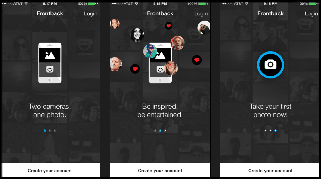
Source: uxarchive.com
Not providing users with a means to skip past your onboarding slides or reference previous slides
Maybe your user is already familiar with your app or has downloaded it before. Or maybe your user is just downright impatient! If this is the case, those users will most likely want to just get straight to the main functions/experience of your app and not have to scroll through multiple slides of an onboarding intro. If you inhibit users by not supplying them with a way to “skip ahead” then they might become annoyed with your app. This is the last sentiment you want to trigger during an initial experience. This rule of thumb also applies to in-line hinting, a type of “Progressive Onboarding” tactic. Ultimately, people do not launch apps with the primary motivation of reading instructions. They launch an app to complete a task as quickly as possible and with the least amount of effort involved.
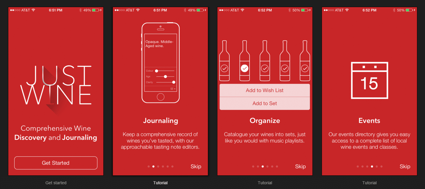
Instead of obligating a user to scroll through 6 slides, Just Wine consistently offers a “skip” button on each slide. Source: uxarchive.com
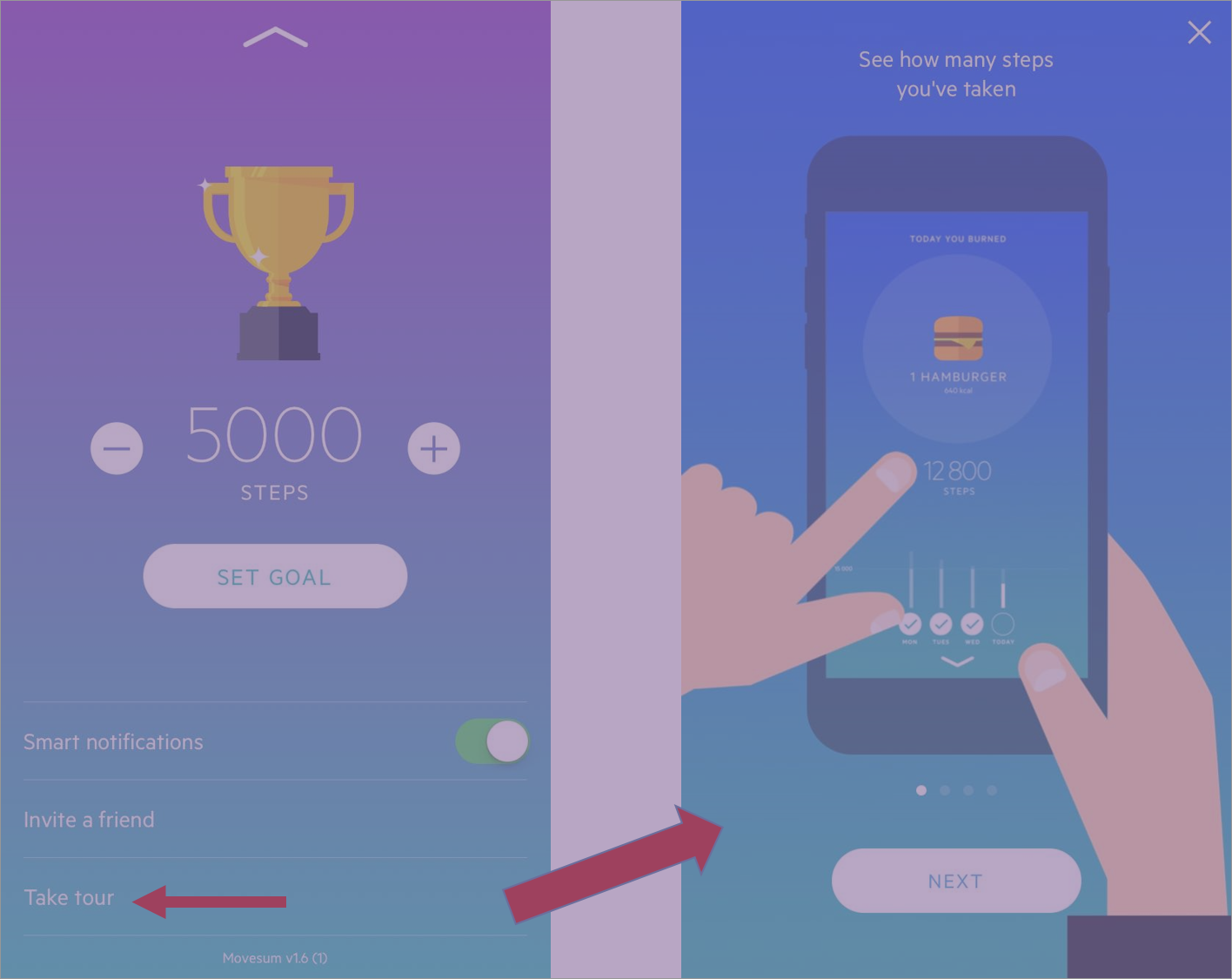
On an additional note, you also do not want to force a user to perfectly remember all of your onboarding points at first view, especially if you are explaining important and unique functions, gestures, benefits etc. By including a specific tab or button for referencing your onboarding tutorial, users can feel more confident in your product and ultimately engage with more facets of your app. To put it simply, “knowledge is power”- thus the more users know about what your app has to offer them, the more likely they are to keep coming back.
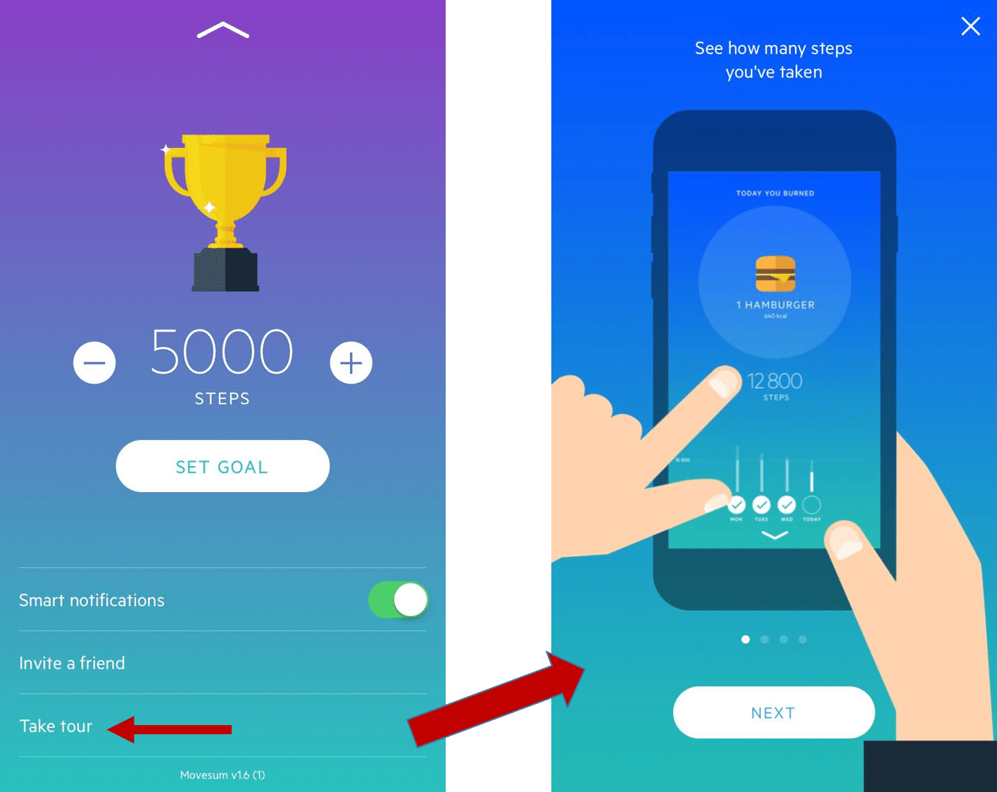
Movesum app allows users to easily return to their onboarding screens to review how to navigate through its UI.
Listing obvious functions
When it comes to explaining functions to your app’s users you should prioritize highlighting and explaining complex functions during user onboarding instead of easy, intuitive functions and icons. It might sound like such a given, but we still see a lot of apps slip up with this. For example, do you really think the hamburger menu or search bar need to be explained? For the average app user they probably do not need to be explained (unless your users are senior age or kids, then that’s a whole different ball game). It is also important to bear in mind that the average users’ attention span is fleeting and the last thing you want to do is lose their attention by coming off as redundant. Focus on the functions that differentiate your app from the plethora of others out there. However, if your functions are not “so unique” that is totally fine. In this case, you should prioritize highlighting the overall value and benefits of your app.
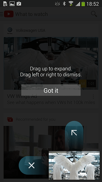
YouTube for Android focuses on a unique gesture function during its onboarding. Source: uxplanet.org
Not tracking and analyzing your onboarding screens
You can read up on tons of onboarding best practices and extensively interview your user base, but at the end of the day how do you actually know whether your onboarding initiatives are fully working and optimized? Furthermore, what are your users actually doing within your app? Maybe some users are encountering an unresponsive gesture during your onboarding slides, or maybe your users are struggling to sign-up? How do you effectively keep tabs on
these user experience issues? This is where the power of qualitative analytics like Appsee comes into play. For example, with qualitative tools such as touch heatmaps, you can see exactly where users are tapping on each screen and where they are experiencing gesture errors. Thorough qualitative data like this will allow you to gain extremely actionable insights regarding your onboarding experience and optimize and troubleshoot accordingly. Remember that when we speak of your onboarding process, we are talking about the user’s first impression of your app- one of the biggest determinants of whether they keep your app or uninstall it. If you are being nonchalant about your analytics and/or only analyzing your users’ onboarding experience on a surface, quantitative level, you are probably missing out on some key opportunities for optimization.
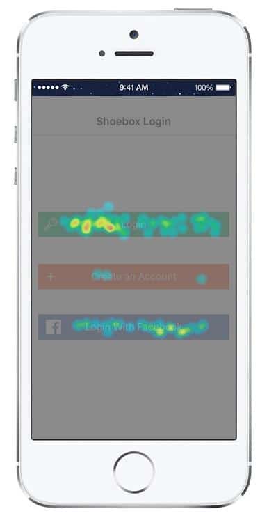
Example of Appsee’s touch heatmaps on a login screen.
Wrap-up
Do not discount the potency of your app’s onboarding process. At the end of the day, an effective onboarding experience will activate your users and lead them to that crucial Aha! Moment where they realize the value in your product and decide to return. While there is not a universal recipe for building the best onboarding experience, a good starting point would be to consider or troubleshoot these mistakes and accurately and extensively monitor your users’ behavior.
Thanks for
reading!
More articles you might be interested in:
Leverage User Onboarding to Create Personalized In-App Experiences
An endless content repository is a double-edged sword. If users can’t find what they are looking for or discover content they are interested in, they are almost guaranteed to abandon your app. Many apps aim to improve user retention by helping...
Read MorePersonalizing Mobile User Onboarding
Feel like going to the Giants game at the last minute? Gametime is an app that let’s do just that and buy last minute tickets with just two taps on your phone. It avoids the hassle of printing or picking...
Read MoreDo We Really Need App Logins?
86% of users are bothered by having to create new accounts on websites (Web Hosting Buzz). Is your onboarding process causing unnecessary bounces? Sign ins were first used in the mid 1960s at MITs time-sharing computer named CTSS to segregate...
Read More