The First 4 A/B Tests Every App Should Run
Every mobile app should be A/B tested to optimize the in-app user experience. However, getting started can be a little daunting. Here are 4 great tests that every should run. We chose these because they are:
- easy to set up – should only take you about 5 minutes to set up these tests with Apptimize
- low risk – small chance that these changes will cause you to lose users or get negative app reviews
- proven – other Apptimize customers have seen lift in metrics from running similar tests
Most important, these tests all require ZERO programming to implement with Apptimize.
1. Share Icon
For many apps, social media is a key tactic for getting new, high-value downloads. Yet, very little testing has gone into the look and placement of the share icon. The typical thing that many apps do is to put a very familiar share icon in a small corner along with several other icons.


Consider A/B testing the icon itself. Traditional thinking on the icons say that you should use something recognizable, but this may not necessarily be the best strategy for your app. SafeTrek, a proactive mobile protection app, changed their share icon to a heart to represent the idea of sharing life with friends and saw a 135% increase in shares. The team knew that the new icon could potentially be confusing because users would probably not realize that the action of the icon was to open a popup with sharing options. An unfamiliar icon might induce more clicks to the share icon but runs the risk of reducing the actual number of completed shares.
Safetrek took the risk and decided to test it. After all, the change was really easy to make and had very little chance of creating user backlash. At worst, some users are confused, and they revert back to the original icons. It turned out that the heart icon got clicked 128% more and completed shares increased by 135%.
Also consider testing:
- the placement of the share button
- the size of the icon
- the icon color
- removing other calls to action around the share button to reduce option overload
2. Call to Action Copy
Copy changes are incredibly easy to make, yet a different phrasing can greatly influence user behavior. For example, we have one retail customer who allows users to customize items before purchasing. App users select the item they want to buy and then progress through a series of personalizations before buying the item. The app allows users to login in order to save the item for later purchase or to track delivery.
The original app had a login page that was simply labeled “Login”. The benefit of logging in was stated underneath. The team hypothesized that users read the name of the page first and may not be really understanding the benefits of logging in. They decided to test renaming this page to “Save Your Cards”.
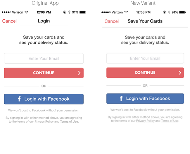
This simple change in the call to action increased conversions by 15%.
Also consider testing copy to:
- highlight different benefits
- clarify what happens after they click
- emphasize security (or test removing security messages)
3. Highlighting of Preferred Actions
As product marketers, we often struggle with providing users the right number of options. It’s tempting to give users every option, but all the research shows that providing more options can sometimes negatively affect the customer’s ability to choose any option. But not providing enough options can limit your customer’s ability to find what they’re looking for.
A great way to solve this problem is to give users more options but direct them to a one option that you want them to take or highlight the one option that most users are looking for. Even if you already do this, we challenge you to experiment with the preferred action because the answer might surprise you.
You can highlight preferred actions by testing orientation like in the Starbucks example below.
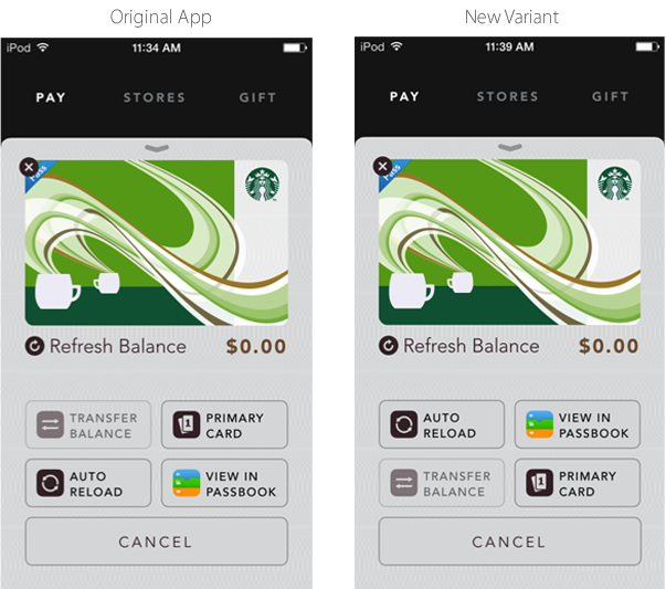
You also change the color of a certain navigation headers to highlight one category. Or you can test the relative size of some buttons versus others.
4. Button Color and Size
Button color and size is often the first thing that comes to mind when people talk about A/B testing. The thing about color (and size) is that there is no best color. It’s all relative to your design palette and the other calls to action on the particular page the button is on.
KAYAK tested many colors before they settled on orange and found that a larger book button increased purchases significantly.
Also consider testing:
- a button color that’s dramatically different from the rest of your app
- pushing users to one call to action that’s highlighted above the others (see test tip #3 above)
- larger buttons
Thanks for
reading!
More articles you might be interested in:
Webinar: Easy Optimizations Every App Should Make
In our inaugural webinar, AbdulAziz and I walk through the ABC’s of A/B testing: A is for Arrangement B is for Buttons C is for Copy Check out the webinar to see how to leverage these ABC’s in your app....
Read More7 Things to A/B Test in Your Mobile App
We hear from customers that planning out your second, third, and fourth A/B tests is one of the hardest things to. Many app managers have a first test in mind when they start experimenting and planning out a series of...
Read More5 Easy Ways to Improve Your App with A/B Testing
Here are 5 ideas for relatively easy to implement tests to visual aspects of your app. You most likely won’t need to rework user flows or do a lot of complex coding. These are layout and design changes that can...
Read More