This Is How You Find Your App’s Aha! Moment

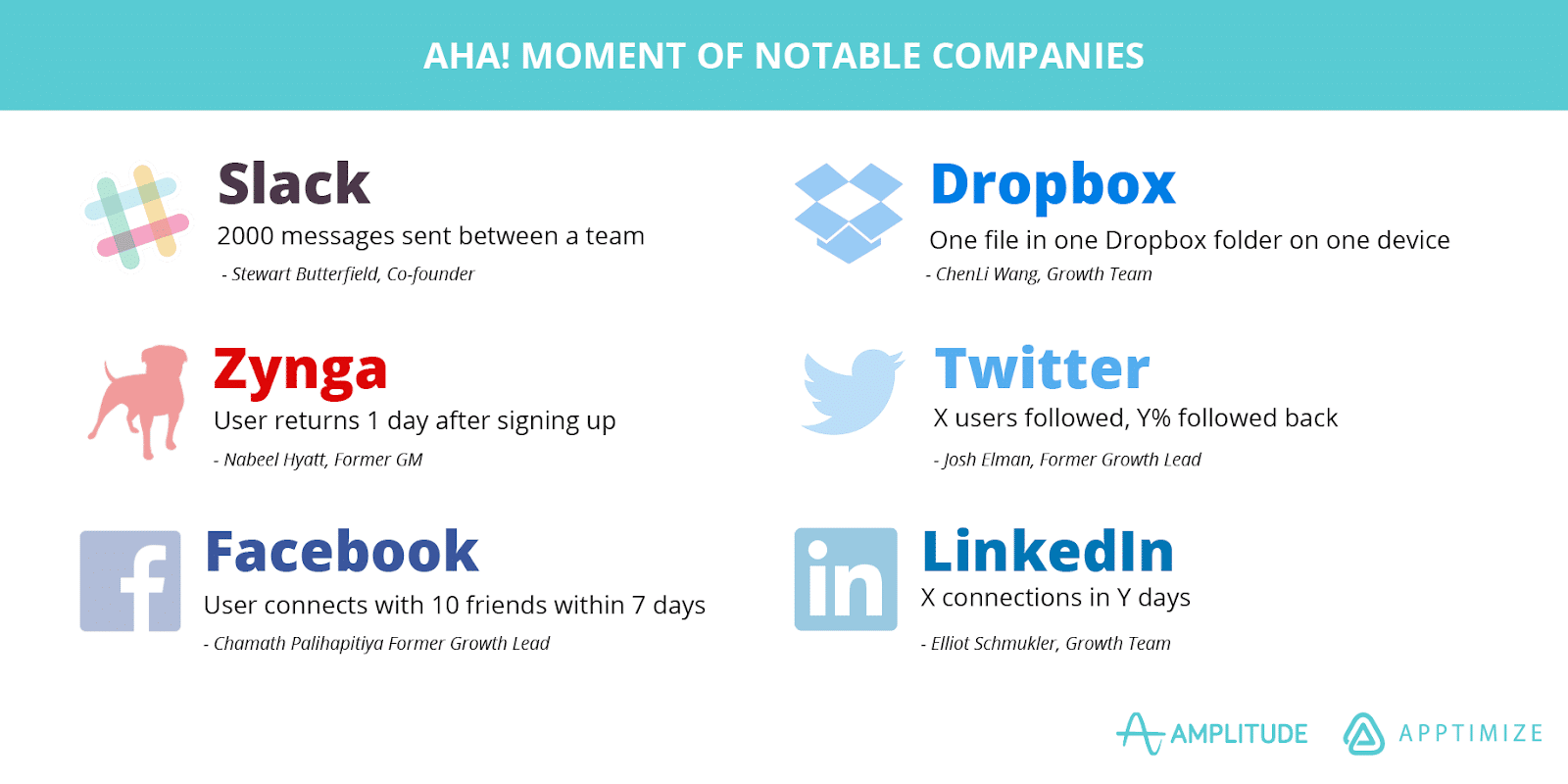
These are the key growth actions that Slack, Facebook, and Dropbox relentlessly pursued. The Aha! moments.
For Chamath, the former growth lead at Facebook, getting users to reach 7 friends in 10 days was the “single sole focus.” Their Aha! moment was critical to the incredible success of Facebook’s growth team, giving the team direction and a single metric to relentlessly pursue.
That’s a critical reason why so many growth teams have made it a point to define the Aha! moments for their products. It’s an effective focal point for them to concentrate their efforts on.
What Is the Aha! Moment?

The Aha! moment is “a set of actions that separates customers who find value in your product from those who don’t,” says Benn Stancil of Mode Analytics.
The Aha! moment is representative of a turning point for users when they realize the value in a product and set themselves up to return. Once teams figure out which actions separate users who retain vs those those don’t, they can give retention a huge boost by driving users toward these actions to set them up for success.
Important Qualities of an Aha! Moment
For an a indicator to qualify as an Aha! moment, it must properly represent the tipping point for the majority of your users. This means that both:
Most users who took the action(s) retained
AND
Most users that retained took the action(s)
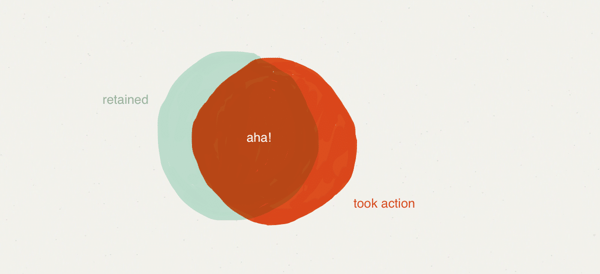
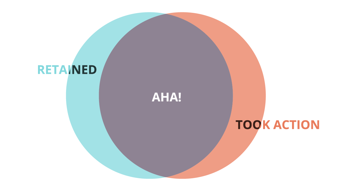
As you can see in the graphic by Stancil, the Aha! moment is the intersection between users who retained and users who took the actions.
It’s important to note that this metric isn’t a perfect threshold for all of your users. It’s simply a value that represents the tipping point for the majority of your users. To convert some users may take require further actions, while others need less. Just like with customer personas, we’re trying to account for the typical user, not every use case.
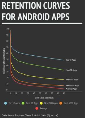
The Aha! moment should also be specific, measurable, and relatively early in the funnel of a user’s experience. As we can see in the average Android retention curves, the average app has an alarming rate of drop off after just the first day. The closer to the top of the funnel, the more we can minimize drop off among new users.
Alright alright. That all sounds great. Now how do we actually find it? We’ve built on Stancil’s process for finding Aha! moments with an example app and show you step-by-step how to do it.
Step 1: Find Out What Normal Retention Looks Like
If we want to figure out how to improve retention using an Aha! moment, we need to start by finding a baseline. To do this, we’ll use acquisition cohorts.
What acquisition cohorts do is divide users by when they signed up for your product. With a consumer app, a good way to benchmark retention is to break down cohorts by the day they downloaded your app.
Cohort analyses help you sift through the noise in your app that can be distorted by growth. If your app is growing rapidly, the number of new signups will mask the dropoff in your DAU/MAU numbers. using cohorts, you can isolate these variables to see how well your app is retaining users.
Let’s take a music app as an example.
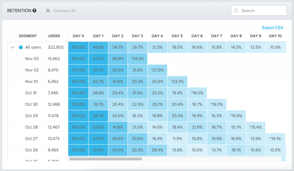
The chart above segments users into cohorts by acquisition date, and shows the number of users who retain in a cohort day in the first 10 days. Using this data, we easily see the drop off rates and retention over time.
The best way to visualize this data is to chart it on a retention curve. Using this, we can see how many users who downloaded your app on any given day are retaining over the course of 30 days.
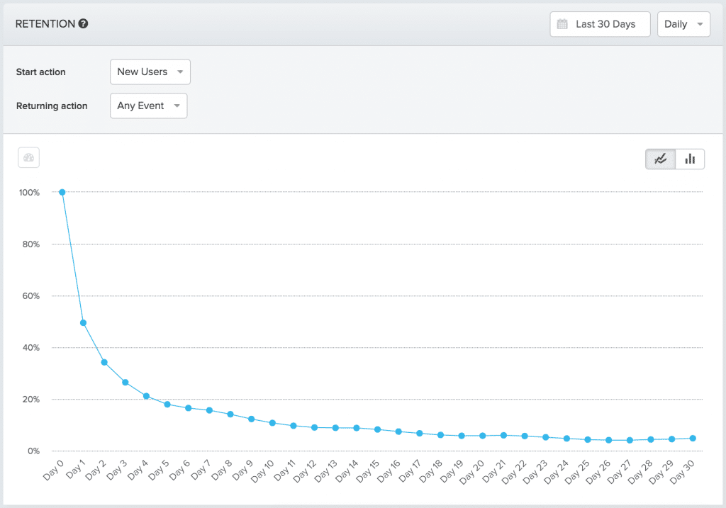
Looking at the retention curve, you may notice that ~50% of users are lost after just one day. Each successive day has a smaller drop off rate as users settle into the app, but the initial drop off is steep. As we saw in the Android retention curves above, these levels of abandonment are quite common. To get a benchmark to see how your app stacks up, check the retention rates below:

Step 2: Create Retention Hypotheses
Now that you’ve gotten a baseline for retention, it’s time to start figuring out what actions affect those retention rates. Since the Aha! moment should be near the top of your funnel, start by figuring out what actions a user takes in your app from first open.
For a Music app, this may include registration, playing a song, searching for an artist, reading the info tab, favoriting a song, etc.

Look at two different subsets of users: (1) users who are retained/saw value v.s. (2) users who download the app and soon drop off. Do you notice any differences in behavior between the retained and churned users? Conducting user tests where testers narrate their first impressions may be a good way for you to gain some insights.
In the case of our example music app, we might see that users who retain typically:
- favorite multiple songs
- create playlists
- click on multiple “featured artists” pages
while users who drop off typically do not (or don’t do these actions as often).
We can then hypothesize that if users complete one of the actions such as favoriting more songs, their retention rates will increase.
Step 3: Do These Actions Affect User Retention?
What we want to do now is figure out if any of our hypotheses about improving retention hold true. The best way to do so is by using behavioral cohorts.
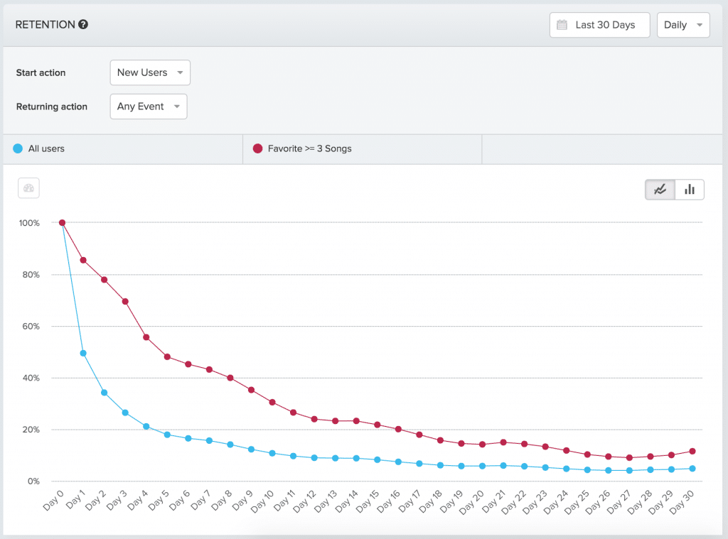
Unlike acquisition cohorts, which simply group users based on their start date, behavioral cohorts group users based on the actions they take in your app. Behavioral cohorts allow you to truly understand which actions are driving value and retention for your users. In the case of the music app, we hypothesize that favoriting songs is important for retention, so we can create a cohort of users who favorite at least 1 song within their first day of using the app.
Using your analytics platform, you can create a retention curve for users in the behavioral cohort. Chart it alongside your baseline retention curve and compare whether favoriting a song has any effect on retention.
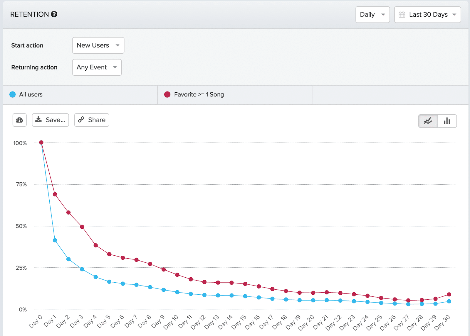
In the retention graph above, we can see that favoriting 1 song seemed to have a positive effect upon retention. However, while it seems to improve day 1 retention, you can see that over the course of 30 days, its effects seem negligible as it evens out with the baseline.
What we want to determine now is how many times a user needs to complete the action for optimal retention. Is it favoriting 1 song? 2 songs? 3? What will give us the most significant increase in user retention rates?
Step 4: Find the Optimal Number of Actions
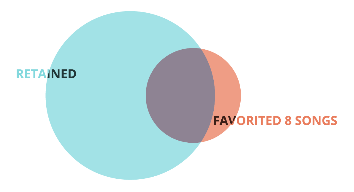
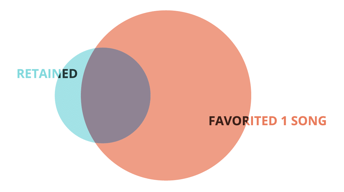
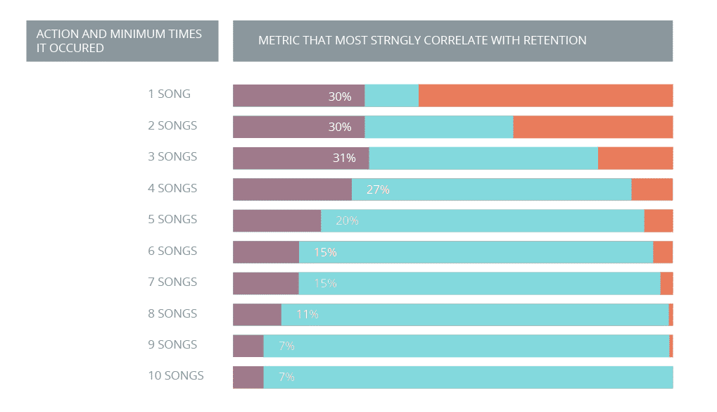
So now we know which actions had an effect on retention over time, but we want to determine how many times an action must be completed for optimal retention. Going back to Stancil’s venn diagram, our goal is to find “an action that’s taken by most people who retain and isn’t taken by most people who are lost.”
If we cohort users by how many times they took an action and find the percentage of users that have retained, we can see how retention rates change as usage increases.
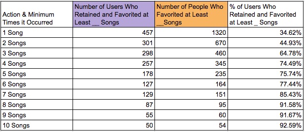
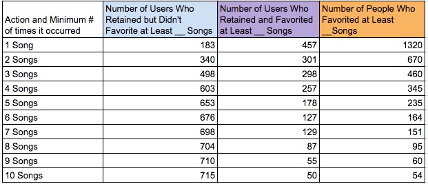
If we chart the percentage of people who favorited a certain number of songs, we’d get data that looks like this:
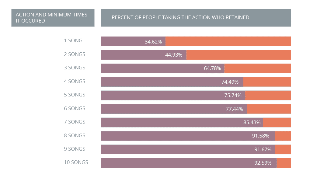
While looking at this chart, you might be inclined to conclude that you should push users to favorite at least 8 songs, given that users who do so retain at a a very high percentage (91.58%). However, in his blog post on the topic, Stancil reveals that “this only shows how many people in the orange “took action” circle are also in the the teal “retained” circle. There could be lots of retained users who didn’t [favorite 8 songs].”
If we chart out the total number of users who favorited songs, we can see that not many users are favoriting 8 songs.
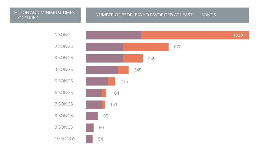
Conversely, we can also see that while many users favorited 1 song, most of them did not retain.
The bigger issue is that most users who retained didn’t favorite 8 songs. What we want to find is the sweet spot that has the most overlap for our Aha! moment.
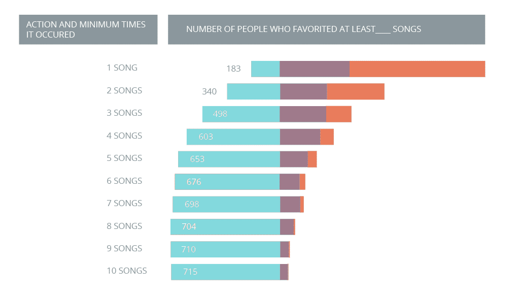
If we add the data for the number of users who retained, but didn’t favorite at least __ songs, we get the following:
Now, looking at the bar chart below, we can see the venn diagram start to take shape.
Because we want to find the maximum overlap between the two groups, we’re not looking for the largest number of users in the overlap. We’re looking for the highest percentage of overlap. In this case, the graph above simply doesn’t have enough data.
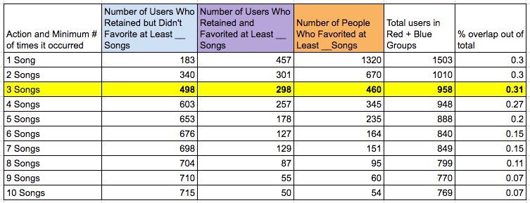
Below is a stylized version of the bar graphs that show percentages of each group. The purple shows the overlap of users in both groups.
Using the table, we can see that favoriting 3 songs had the biggest percentage of overlap. This means that favoriting 3 songs is the optimal amount of actions for a user to take in order to increase retention.
Step 5: Charting the Effects
Now that we know the optimal number of actions a user should take to correlate to retention, we want to check again if there are any indicators of significant increases over the baseline retention curve.
What’s really important to realize is that what we’re observing is correlation, not causation. That is, we can see that users who favorite three songs tend to retain at higher rates, but what we really want to find out is if favoriting 3 songs causes users to retain at higher rates. To do that, we need to run some experiments using A/B testing.
Step 6: Determining Causation and Driving Users Toward Aha!
While the above steps help us arrive at a possible Aha! moment, the data is still correlation, not causation. To truly determine whether our indicator is an Aha! moment or not, we have to run A/B experiments that drive users toward our leading indicator to see how it affects user retention.
We want to see whether pushing users to favorite more songs will improve retention rates. There are a number of possible ways we could drive this user behavior:
- Making the favorite button more prominent:
- Adding a tooltip to remind users to favorite songs they love
- Use onboarding screens to stress favoriting songs helps curation
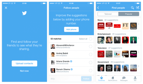
In Twitter’s mobile app, their onboarding flow purposefully drives users toward their Aha! moment of following other users. As soon as users register for an account, the app prompts users to follow their friends and other famous figures.
Each app is different, so figure out different methods for your specific app. In our example, we’re going to add a tooltip to the media player that reminds users to favorite a song.
Once you’ve decided on your method, you can use a mobile A/B testing platform such as Apptimize to help run the experiment and deploy 2 different versions of your app to a portion of your actual users. Make sure you have 2 segments: a control group (to get a baseline) and a variant group (who will receive the new treatment). This helps eliminate bias in your experiment so you can get reliable results.
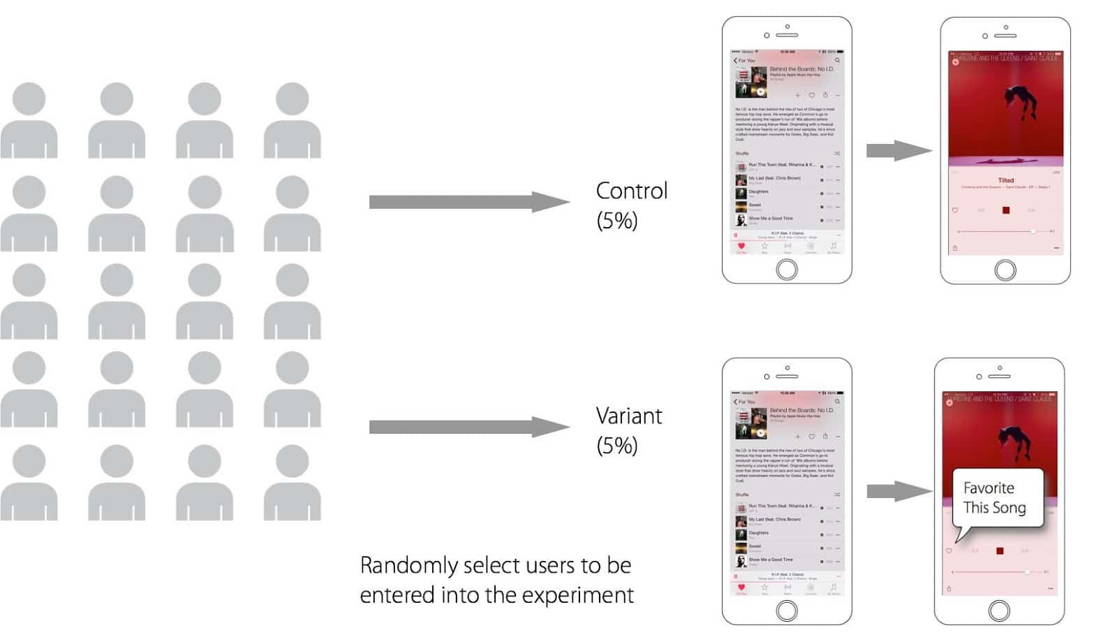
A good A/B testing platform will help you determine the number of users to test on, how long to run it, and how to allocate users to the two groups.
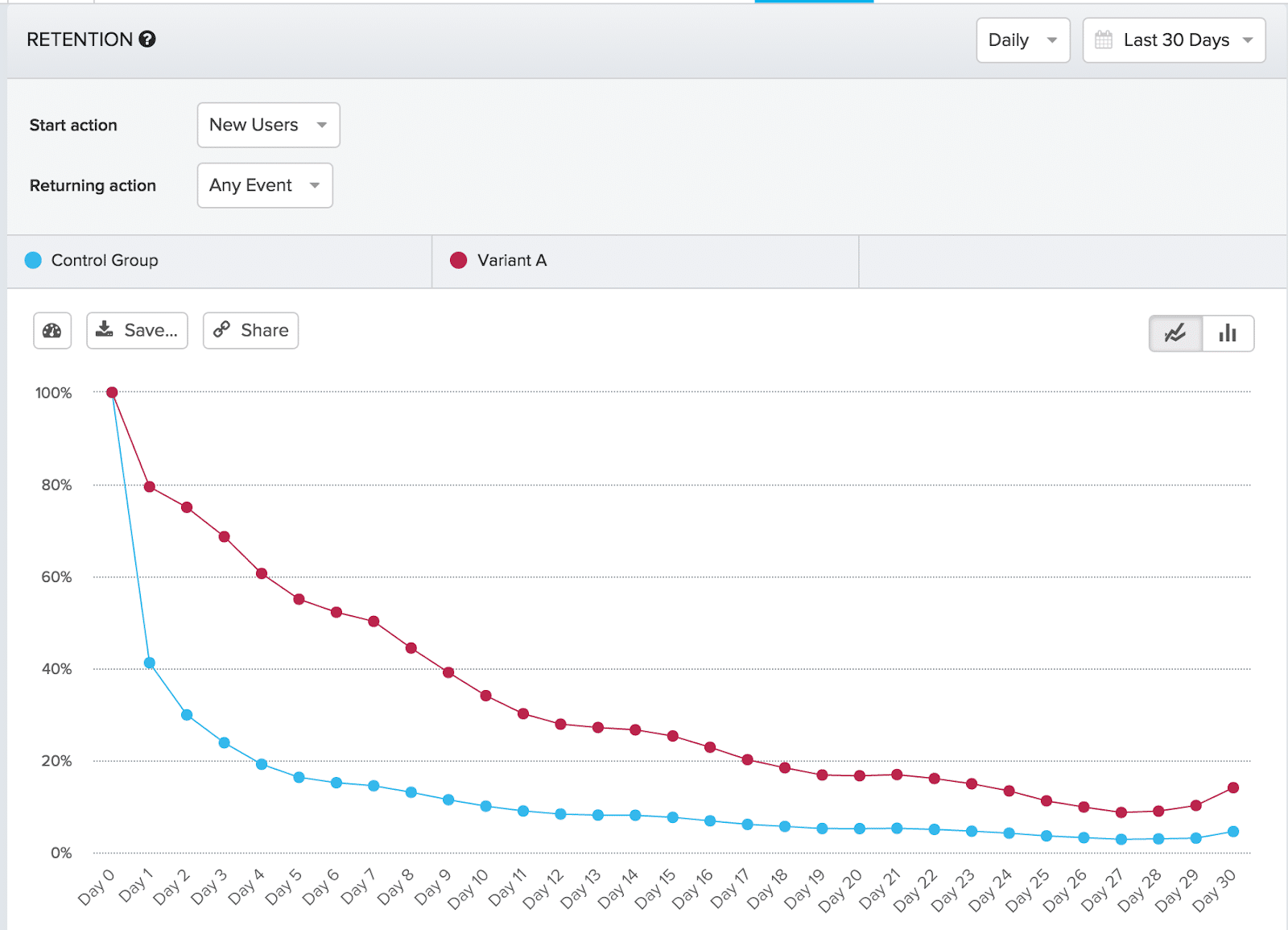
Once you’ve run your experiment, you can graph the data of the control group alongside the data of the variant. Is there significant improvement?
Ideally you’ll want to run multiple tests trying different ways of driving users to your leading indicator. This is because there may be other reasons our tooltip improved retention rates. Running a series of similar tests will help you determine whether it is truly an Aha! moment.
For a real-life example, you can check out Vevo’s onboarding A/B test. In the post, Vevo shares their thought process for the experiment, how they set up the experiment, and what they learned as a result.
We know this post is a bit long, that’s why we’ve created a handy step-by-step checklist you can use while working with your team. We give a quick overview of the steps to take to ensure that you and your team get accurate results.
Download your step-to-step guide on how to find your app’s Aha! moment here.
Thanks for
reading!
More articles you might be interested in:
A Primer on Mobile User Retention
Solid mobile user acquisition channels? Check. Onboarding? Could use some tweaking. User retention? …..needs work. If you’ve got decent traction for your app already, retaining mobile users likely is your top objective. Yet retention is often this nebulous term everyone...
Read MoreHow to Optimize App User Flows Without Re-deploying to the App/Play Store
You might have thought that real-time changes to flow and features were not possible. After all, code changes are almost always required to make substantial changes to your onboarding tutorial or turning different features on/off. You can actually continuously optimize...
Read MoreHow Will Amazon Fire Affect Your App’s Users?
Amazon’s unveiling of their new phone has set the tech news world aflame today (yes, bad pun intended). While this is exciting news, app owners must wonder how this phone is going to affect users’ experience in every other retail...
Read More