3 Optimized Onboarding Flows from Top Travel Apps You Can Test Today

What’s the best way to onboard users to your travel app so that they’ll stick around for a long time? The short answer is it depends.
It depends on your app’s core function, your ideal user’s behavior, and your features’ complexity. Frustrating as this answer may sound at first, it actually holds good news for new companies trying to break into the crowded travel app space.
Consider this: Established industry giants like Expedia and Priceline have massive advertising budgets that they can tap into for new user acquisition. In 2014 alone, Priceline’s advertising budget was a whopping $2.6 billion, while Expedia’s was $1.6 billion.
Thankfully, advertising budgets aren’t the reason users stick to a travel app: great user experience is. And great user experience begins with a smooth user onboarding flow tailored to your app.
To show you how that works, we’ve selected three onboarding flows from three well-known travel apps that achieve great results despite having nothing in common. For each flow, we’ll explain why it works with the specific app and what the company tested (or considered) before creating it.
Once you understand how and why these onboarding flows work, it will be easy for you to understand how to build the perfect onboarding flow for your app and know what to test in order to optimize it for your user base.
1. Hopper: Let Your Core Function Shine
Onboarding tutorials are great, but sometimes users just want to get straight to the action. Especially when they perceive your app’s core function as something overly familiar, like searching for flights.
And that’s what Hopper realized, the app that was named by Google as one of the most beautiful apps of 2016. Despite a stunning onboarding sequence, most users didn’t allow push notifications from the app, which significantly lowered the benefits the app could deliver to them.
People didn’t understand that the app’s core “watch a flight” function went far beyond a simple flight search by providing falling and rising price alerts via a push notification.
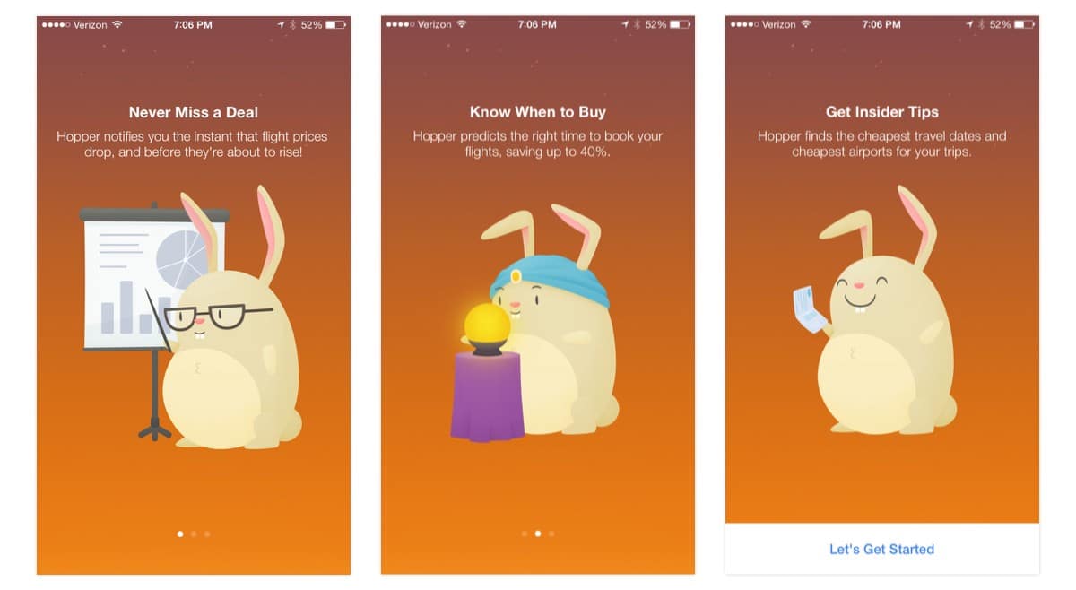
Hopper’s original three screen onboarding tutorial
So the Hopper team decided to cut down the onboarding process. Sounds counterintuitive, but it worked.
Hopper replaced its onboarding sequence with a new two-screen flow that couched the push notification permission request in the app’s specific capabilities. According to Pantelis Korovilas, Hopper’s Lead Product Designer, the redesign team had three main goals in mind:
- Get users to pay closer attention to welcome screen copy by asking for notification permissions early—and explaining why Hopper needs them.
- Build awareness of how notifications and the core action of “watching flights” in-app were tied to saving money on Hopper
- Increase permissions acceptance rate
After an initial “Welcome” screen that gives the app’s overall context, the second and last onboarding screen fully explain the “watch” feature and shows an example of a notification in action. At the same time, it asks people to enable push notifications.
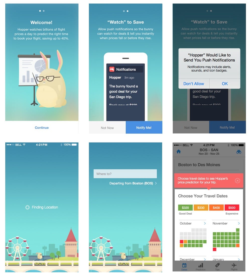
From then on, it’s straight to searching flights!
This new, more “practical” onboarding sequence brought Korovilas and the Hopper team the results they were hoping for:
“A larger proportion of qualified users (users who have allowed notifications, thus benefiting from this powerful app feature) on the app.”
2. Hotel Tonight: Cut to the Chase
Hotel Tonight is a mobile app that uses geolocation to help customers find last-minute hotel deals. Over the past year, this profitable company has facilitated over $300 million in gross revenue bookings.
But there’s something strange about the app. It has no onboarding flow at all. Just a couple of notifications for allowing location access and push notifications, and that’s it.
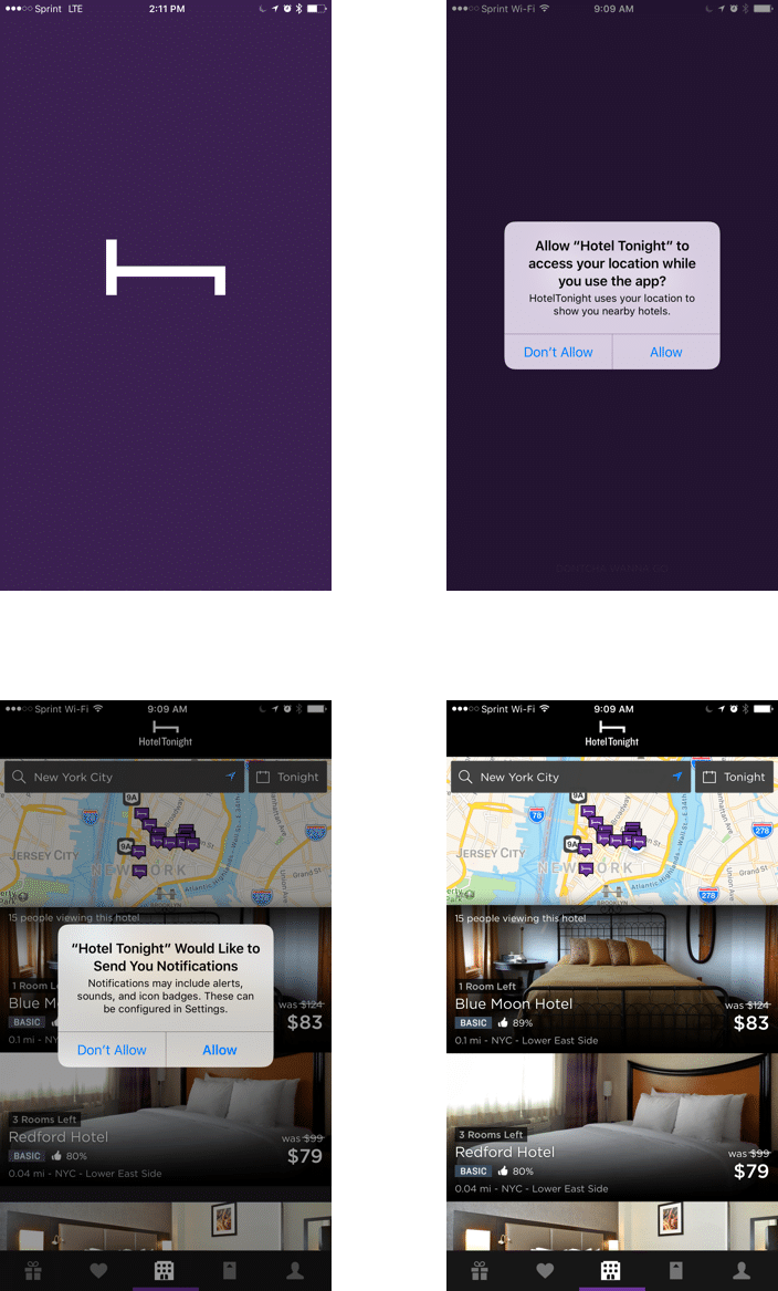
This is no oversight or accident. The Hotel Tonight team has put its app through rigorous testing before arriving to its current flow.
Audrey Tsang, the company’s former Director of Product, told Apptimize that the ability to rapidly A/B test has allowed the company to “move faster, iterate faster, and take a few more risks.” This includes skipping the traditional onboarding flow.
When testing the app, Amanda Richardson, Chief Data and Strategy Officer at HotelTonight at Hotel Tonight, discovered that their business model was more suited to e-commerce, where people add something to a shopping cart and then create an account, rather than the other way around, as is usually the case with most travel apps.
According to a Google study, 65% of users searching for something on mobile are looking for the most relevant information regardless of brand. If an app doesn’t satisfy their needs, they are 40% less likely to come back. Hotel Tonight users are not trying to sign up for an account right away. They want to find deals on hotels, and Hotel Tonight’s onboarding flow takes them there, right off the bat.
3. Google Trips: Simplify Complex Features
Cutting down the onboarding flow or even eliminating it altogether isn’t always the right answer, especially when your app offers highly complex features that users aren’t likely to be entirely familiar with. That’s why Google Trips still presents a classic three-step onboarding tutorial to new users.
Google Trips is a free mobile app that helps people plan and manage trips. You can use it to book hotels, read restaurant reviews, organize your tickets, manage reservations, and find tourist attractions.
The app integrates with your Google Account to make all the places you’ve saved on Google Map and all the tickets and reservations that have been emailed to you automatically available in Google Trips. And since these automations can take first-time users by surprise, the app offers a short introductory tutorial.
Despite the apparent simplicity of the onboarding tutorial, Google Trips is actually a pretty complicated mobile product—it draws from other Google services like Gmail and Google Maps to work.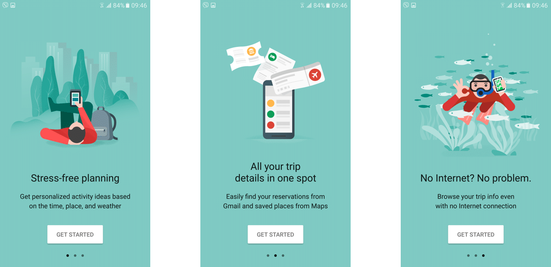
The tutorial sequence is helpful for explaining the uses of the app to new users in a simple and easy-to-understand way. Instead of describing how features work (which could be overwhelming), the tutorial frames everything around user benefits (“stress-free planning” and “all your trip details in one spot”).
The Perfect Onboarding Flow for Your App
If you’re designing, or redesigning, your travel app (or any other kind of app for that matter), remember that user experience matters greatly to how “sticky” your app becomes. And the first thing a user experiences in an app is the onboarding sequence.
- How common or uncommon is your app’s core function?
- How does your user behave and engage with your app in real time?
- Does your app introduce any complex features that could cause overwhelm (and app abandonment)?
When you have the answer to these three main questions, you’ll practically have in place the main wireframe for the perfect onboarding flow for your app.
Don’t give users a “standard” onboarding process based on other apps. Give them the onboarding flow they need to succeed with your app.
Apptimize is the best-in-class mobile growth platform for Enterprise and SMBs, powering 1.2 billion app downloads across 75 countries.
Thanks for
reading!
More articles you might be interested in:
How the Largest Apps by Revenue Ace User Onboarding
Onboarding users to your mobile app isn’t just about teaching them how to use your features or what they can accomplish through your app. While some apps generate millions in revenue, most apps in the app store never reach a...
Read MoreMake Your App Sticky: Retention Lessons From 3 Top Travel Apps
According to research done by Google, 88% of travelers with smartphones would switch to another app if the one they’re using doesn’t satisfy their needs. Travel booking isn’t something people do every day, or even every month, which makes travel app...
Read MoreInfographic: 7 Things to A/B Test in a Travel App
Our third infographic in the “7 Things to A/B Test” series! Click on the image below to see the full infographic.
Read More