App Store Best Practices: Increase Clicks and Conversions

This is a guest post by Kristina Altman of TestNest
If your app is not as major of a player in the App Store as some other apps like Instagram or Minecraft, then you’re probably not seeing hundreds of thousands of downloads on a monthly basis. But that doesn’t mean that you can’t get there through some simple optimization.
Those of you who have (or will soon have) an app listed in the app store or from direct links are always looking to improve your click-through rate (CTR) and conversion rate (CVR). You want to get those downloads, right? By improving elements of your app’s listing page, including name, description, icon, screenshot and app preview, you’ll see the clicks and conversions rise. Once your conversion rates improve, Apple and Google receive signals that your app shows a relevant result for defined searches.
Let’s take a look at the best practices for each element individually in order to get the clicks and conversions you’re looking for.
Pick a Strong and Distinguishing App Name
Your app’s name is important when it comes to search results and grabbing a user’s attention. App names that have keywords in their titles ranked higher by 10.3% compared to those who didn’t, a significant gain. While many apps won’t struggle with this problem, it’s becoming increasingly difficult for apps to even rank for their own name. (Think Cola App)
When crafting or refining your app name for the App Store, you want to keep in mind the following principles:
- Apple allows up to 255 characters, but that doesn’t mean you should use up all 255.
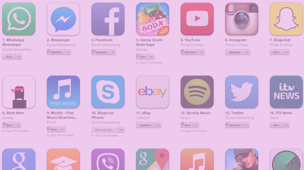
- Top apps in the app store only use one word (i.e. Youtube, Twitter, Snapchat, etc).
- If you’re using keywords in your title, consider placing them in the beginning.
- Boost your CTR by focusing on the first 25 characters (only the first 25 will show up for most users in search).
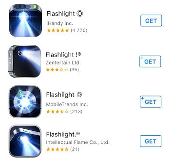
- Be unique! It’s hard to stand out from the crowd if you have the same name as about 10 or more other apps. (Flashlight app example below.)

Keeping your name intriguing, simple and parallel to what your app is all about will attract users from the get-go.
Write some real copy!
Although your app’s name plays a higher role in search results, your app’s description helps your users better understand your app’s purpose, converts them into downloads and is indexed by Apple for keyword search relevance. Here are some best practices when crafting your description.
- Apple allows you a maximum of 4,000 characters, which equates to about 600 words, so be wise with what you put out in front of your audience.
- Keep the messaging clear and concise. Use the space to sell and market your app.
- Only the first 3 lines are displayed before ‘read more’. Focus on the best features within these first lines.
Remember, you shouldn’t go on a keyword stuffing frenzy—Apple will reject your app if you do this—but instead supplement your keywords and have copied that’s compelling enough to get users to install.
Make Your Icon Instantly Recognizable
An app’s icon plays a significant role during the initial CTR and CVR as well as after the app has been installed on the user’s smartphone. Why after? Because the average smartphone user has 42 apps installed on their phone, but only uses 10 of them on a daily basis, making it really important for your app to stand out. Here are some points to keep in mind when designing an icon for conversions:
- Stay consistent with the purpose of your app, along with other elements like the screenshots and app name.
- Design an icon that is in a vector format so it will show up correctly no matter what size screen your users have.
- Stay away from using words. Since the icon image is already small, users seeing it on iPhone 4, for instance, will have a hard time reading the text.
- Keep it unique! See what your competitors are doing, and don’t create one that looks like theirs. How else will users see your app in a pool of others if they all just look the same?
Here are some examples of ones that do a terrific job of standing out:
Teenage Mutant Ninja Turtles: Legends

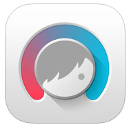
Facetune

When it comes to clicks and then conversions, your icon really matters. It needs to be eye-catching enough to get a user to even consider learning more about your app, and relevant to your app’s core values for more clicks.
Screenshots: App Preview
Think of your screenshots and app preview (video) as an extension to your ad on the web. When a user sees an ad online, what makes them want to click and ultimately convert? The graphic elements, for the most part, is what will grab their attention. What comes after is convincing them why they should install your app. As such, you have the most freedom to express your apps benefits through screenshots and a video. However doing so requires some skill. Here’s what you should keep in mind when creating these two graphical elements.
- Highlight 3 to 5 of the best features of your app.
- Don’t get too text heavy. Consider using 75 or less words for the whole video.
- Show more gameplay for game apps.
- Add music to make it more engaging.
- Avoid screenshots with too much going on. Each one should be simple, eye-catching and informative.
- Don’t show login or registration screens.
- Keep in mind different screen dimensions. All screenshots and videos must be sized to fit all phones.
- Use either landscape or portrait versions, just not both!
If you’re looking for some inspiration of a great video that’s designed for conversions (and will make you laugh a little too), check out Keezy.
Constant Iteration with A/B Testing
Once you’ve established your app name, description, screenshots and app preview for your targeted audience, you’ll then want to test variations to make sure you’re optimized for clicks and conversions. There are tools like TestNest that have the capability to A/B test variations of your elements for your app store listing page. Remember, producing the best possible assets for your app will get you the downloads you’re looking for, which in turn will rank your app higher in search results.
Kristina Altman is currently Head of Content at TestNest, an A/B app store page testing platform, and has been marketing and working with apps for almost 5 years. She is also a graphic designer and loves expressing her creativity in all of her work.
Thanks for
reading!
More articles you might be interested in:
How to Optimize App User Flows Without Re-deploying to the App/Play Store
You might have thought that real-time changes to flow and features were not possible. After all, code changes are almost always required to make substantial changes to your onboarding tutorial or turning different features on/off. You can actually continuously optimize...
Read MoreHow Clever Lotto Increased Clicks by 35% Without Any App Code Changes
There is a misconception in the mobile space. While most mobile product managers want to optimize their app through A/B testing, many seem to believe that A/B testing is a daunting enterprise that would require a lot of developer resources....
Read MoreHide Bugs Without Waiting for the App Store with Apptimize Hotfixes
Ever deploy an iOS app only to find a bug that crashes your app in a completely unexpected scenario? Or your app is working perfectly fine, but someone somewhere updates an API and suddenly an entire section of your app...
Read More