How to Use Email to Drive Mobile Engagement
How to Use Email to Drive Mobile Engagement
When users aren’t engaging with your app, it’s tempting to send push notifications and SMS messages to get their attention ASAP. But a user’s phone screen is their sacred space. Spamming them with intrusive demands and feature updates is a great way to get your app uninstalled altogether. Email, on the other hand, is both, a less intrusive and more powerful way to get your users’ attention.
More than half of all emails are opened up on mobile, which hints at two things:
- CTAs guiding users into your app are now more effective.
- Email has become a cross-device platform.
The first point means that you can shamelessly create a direct line between email and mobile, and nudge about half of your email recipients back into your mobile app. The second point, however, is the game changer. While SMS and push notifications require a user to already have their phone in hand, email reaches a much wider audience. Whether you’re on your home desktop, your iPhone, your smart TV, your tablet, you can check email.
Here’s how to take advantage of that direct line to your user, and increase mobile engagement through email.
A Word on Format
Despite the high open rates on mobile, most software companies don’t give much thought to how their emails look on a mobile device.
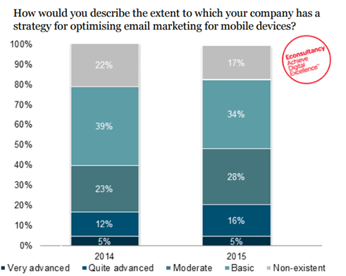
Neglecting to make your emails mobile-friendly limits the amount of recipients opening your app to less than 50%, but also deprives you of the opportunity to launch users into your app from the email. You’re throwing that effective CTA out the window.
By providing a seamless cross-device experience through email, you’ll magnify your brand’s reach and create a positive impression of your email campaigns. Here are a few essential things to keep in mind for your mobile-friendly email:
- Responsive design. Make sure your images work and that the email adjusts according to the size of the window.
- Vital-first information. Scrolling down with one hand stinks, so make sure you have a killer hook to get them to keep reading—and that they can read the first paragraph and still catch your drift.
- Include CTAs at the top and bottom. You don’t want your email recipient to read your email and exit the screen. Make entry into your app as frictionless as possible by providing multiple, easily-accessible CTAs.
Few companies think about this small but important detail, so pay close attention to how and where your emails are received. Otherwise, all that time and attention you put into the design and copy will go to waste.
Give Onboarding A Boost
86% of users don’t return after downloading an app, and an average of only 2.7% stick around after day 30. Those stats mean that you need all the help you can get to guide users back into the app.
Use email to extend onboarding outside your app, as a sort of preview. You can reinforce the value for users interested, and remind disengaged users why they downloaded your app in the first place. The trick is to give users just enough information to spark their curiosity, so that they’re eager to get back into the app. Here’s a few ways to do just that.
A Reminder of value
Users might download your app for a ton of reasons. Maybe they heard about it from a friend, read about it in an article, or just liked how the icon looked in the app store. Your onboarding email could be the first chance you get to succinctly state your value prop.
Use the first email to remind them why they downloaded your app in the first place. Take a look at how Lyft accomplishes this.
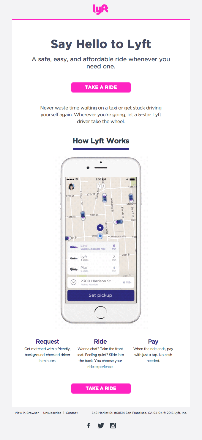
Lyft starts with its value prop—get a “safe, easy, and affordable ride whenever you need one.” Then, they offer a quick run through of how little time and effort that would take, and close the deal a highly specific CTA. They’re bridging the external and in-app onboarding into one seamless experience.
the tip of the iceberg
Users have gone through enough how-to manuals and overly complicated UI experiences to be on guard against any newly downloaded app. That’s why many app developers take a truly minimalist approach by offering just one or two simple suggestions to get the user started.
By not giving too much away, a simple tip of the iceberg email serves to pique the user’s curiosity and compel them to want to return to the app to learn more. Headspace takes this approach with their mascot Andy:
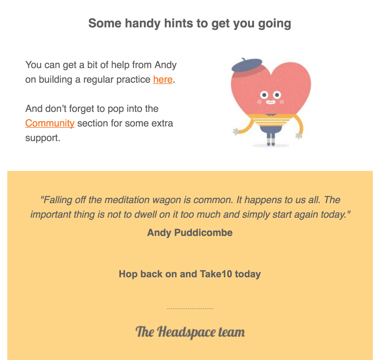
Headspace is a mindfulness app. They’ve realized that what makes mindfulness successful as a practice is the same thing that makes a user engaged in a product—forming a habit. Just as Nir Eyal recommends in his famous hook model, they use the users’ internal motivation to become mindful and make it possible with this external trigger.
Memory trigger through Design
Users can start to love your app for a range of reasons—from functionality to a broad range of integrations to UI. But if they’ve been inactive for some time, they’ve likely forgotten what those reasons were.
One of the best ways to stimulate memory is through visual cues. Use design elements in your emails that are similar to your product’s UI . So if your user already had an awesome first-time experience with your app, you can trigger their memory via email by reminding them what it’s like in-app.
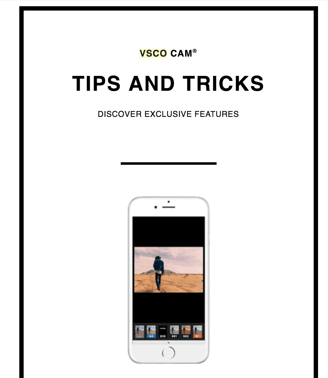
New photo-sharing app VSCO has quickly gained a reputation among teens as being the chic Instagram. Its design and UI is almost exclusively what separates it from bigger competitors, and they won’t let you forget it with any of their emails.
Teach Users To Scuba Dive
When users first take your app for a test drive, they get to know it on a surface level. They know what it looks like, the gist of how it works, and have some basic assumptions around how to use it. All of your engagement strategies should work towards getting them to go deeper.
Unfortunately, after onboarding there’s little opportunity in-app to teach users without intruding on their experience. Users don’t want to go through walkthrough after walkthrough just to use a mobile app. That’s why email serves as the perfect medium for teaching users how to go deeper. You can offer suggestions on how to make the most of the app, without meddling with their day-to-day workflow.
Progress bars and insights
Send out behavior digests to give users insight into how well they’re using your app. By giving them updates on their own accomplishments, you’ll be tapping into what’s called the Zeigarnik effect. This psychological principle states that people have a tendency to remember uncompleted tasks.
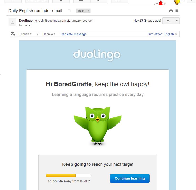
Duolingo sends out emails containing status bars. They remind the users how far they are from reaching their language benchmark and encourage them to check in daily to keep up progress.
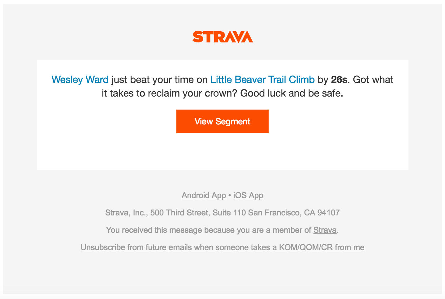
Even if your app isn’t educational the way Duolingo is, it’s still useful to give users insights into their own behavior. You’re showing them the value that they’ve gotten out of your app thus far, and what they need to do to continue getting that value. You can even gamify the experience, the way exercise app Strava has.
Behavior-based recommendations
Using email to offer behavior-based recommendations is the best way of saying “keep doing what you’re doing.” You’re making it easier for your users to continue interacting with your app by doing half the work for them. Through careful, pointed suggestions you can strengthen existing tendencies to turn them into habits.
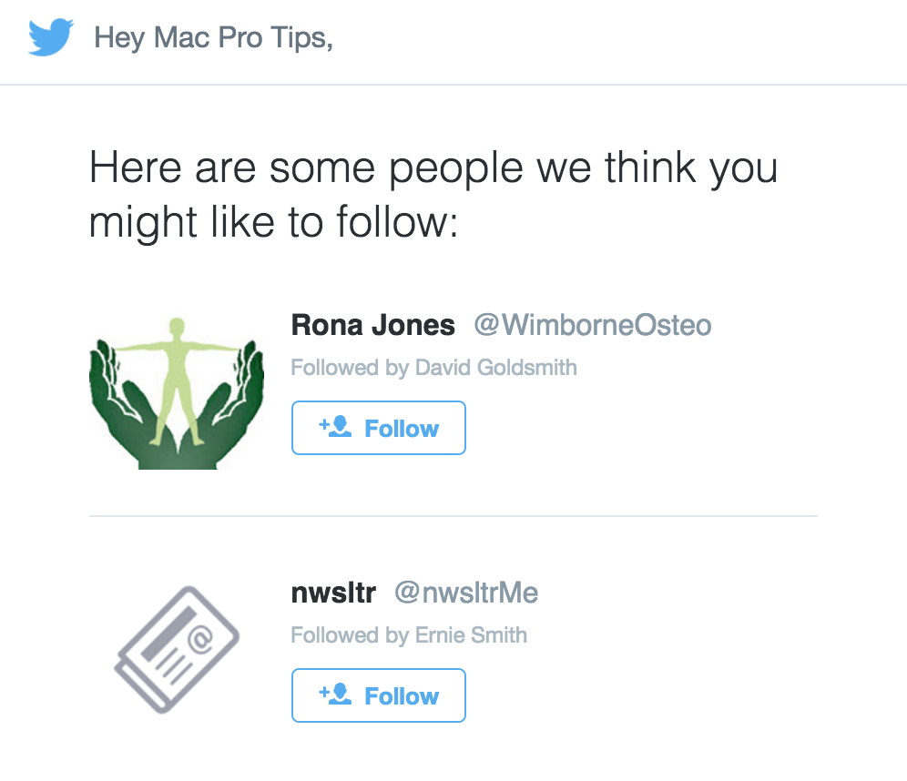
Twitter sends suggested “friends,” but you can suggest anything from purchases, to features, to workflow patterns.
It’s important to make recommendations based on existing behaviors—not predicted behaviors. If you don’t have the dev resources to build out an analytics platform just for targeted recommendations, just use a tool like Amplitude. You can pinpoint low-engagement levels and send recommendations to users who would benefit from them the most.
Create Hype Around New Features
Once users get accustomed to using your app, they go through the same motions day after day. While it’s good that they’re forming habits, it can also lead to what Appcues founder Jackson Noel has dubbed “feature blindness.” Like “banner blindness,” this phenomenon occurs when users get so used to the way your app works that they become blind to all the other features they don’t use on a regular basis.
As a platform totally separate from your users’ app experience, an email can break through feature blindness and draw attention to a new feature outside the user’s regular flow. Here’s how.
Provide the rundown
When you’ve spent tons of time building a new feature, it’s natural to want to show it off. As a result, many emails overwhelm users with a hundred and one ways to use the feature. But if the first thing they see doesn’t seem immediately relevant to their use case, your users won’t even finish reading your email.
Instead, you should illustrate the new feature’s potential through a short and concise email. Similar to onboarding, you don’t want to give too much away—you just want to pique their curiosity. The rest can be learned in-app. Here’s the message Evernote sent out to announce their iMessage integration.
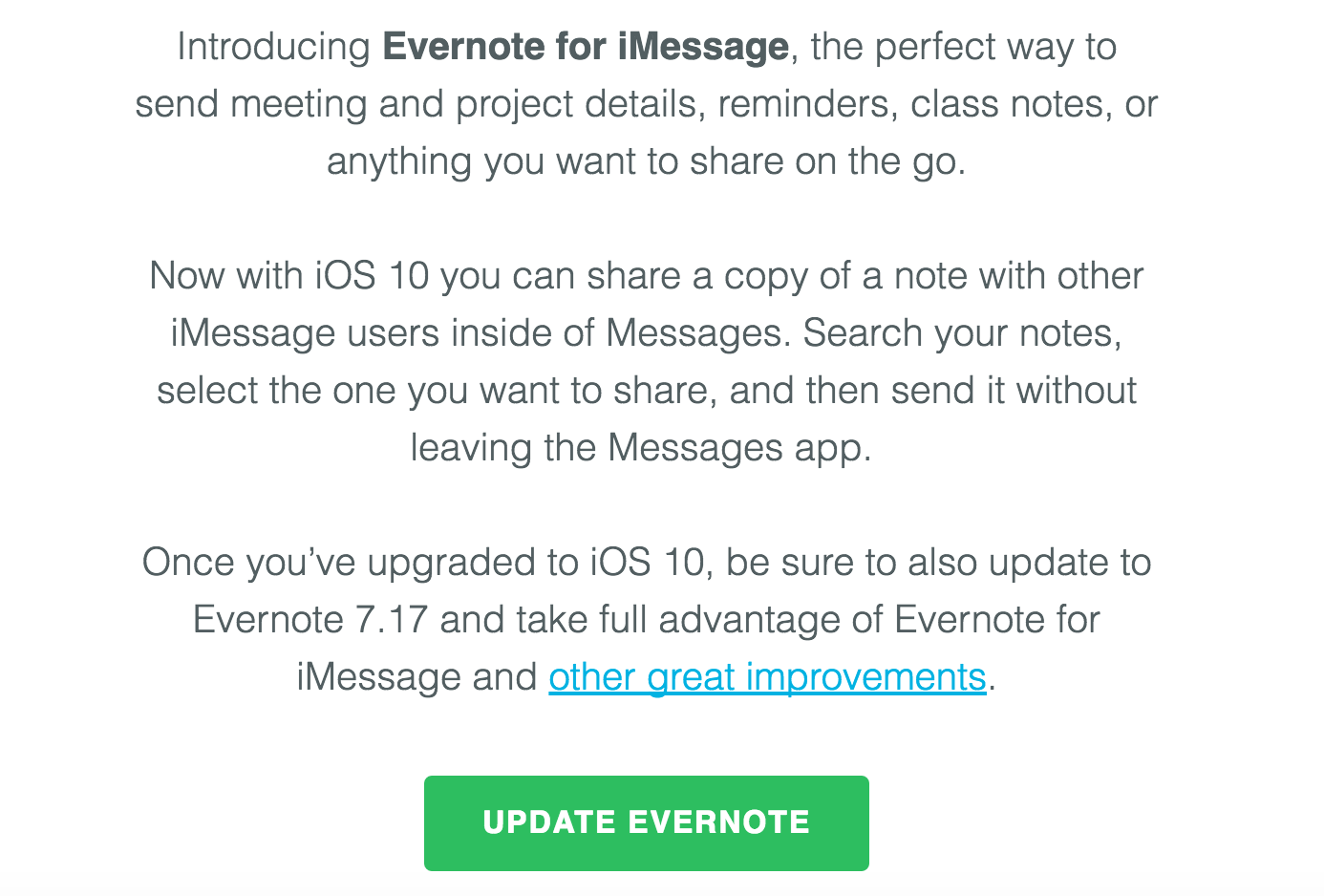
Evernote didn’t mention all their new updates—they just provided a link for the curious bunch that wanted to learn more. And their copy illustrates the big-picture use case for the product update without diving into too much detail.
A look into in-app Design
A picture is worth a thousand words—especially when it comes to a mobile app, where UI can make or break an app experience. An illustration of what the feature looks like in the product will remind users of the product experience, and will let them know where to look and how to behave when trying to access your new feature.
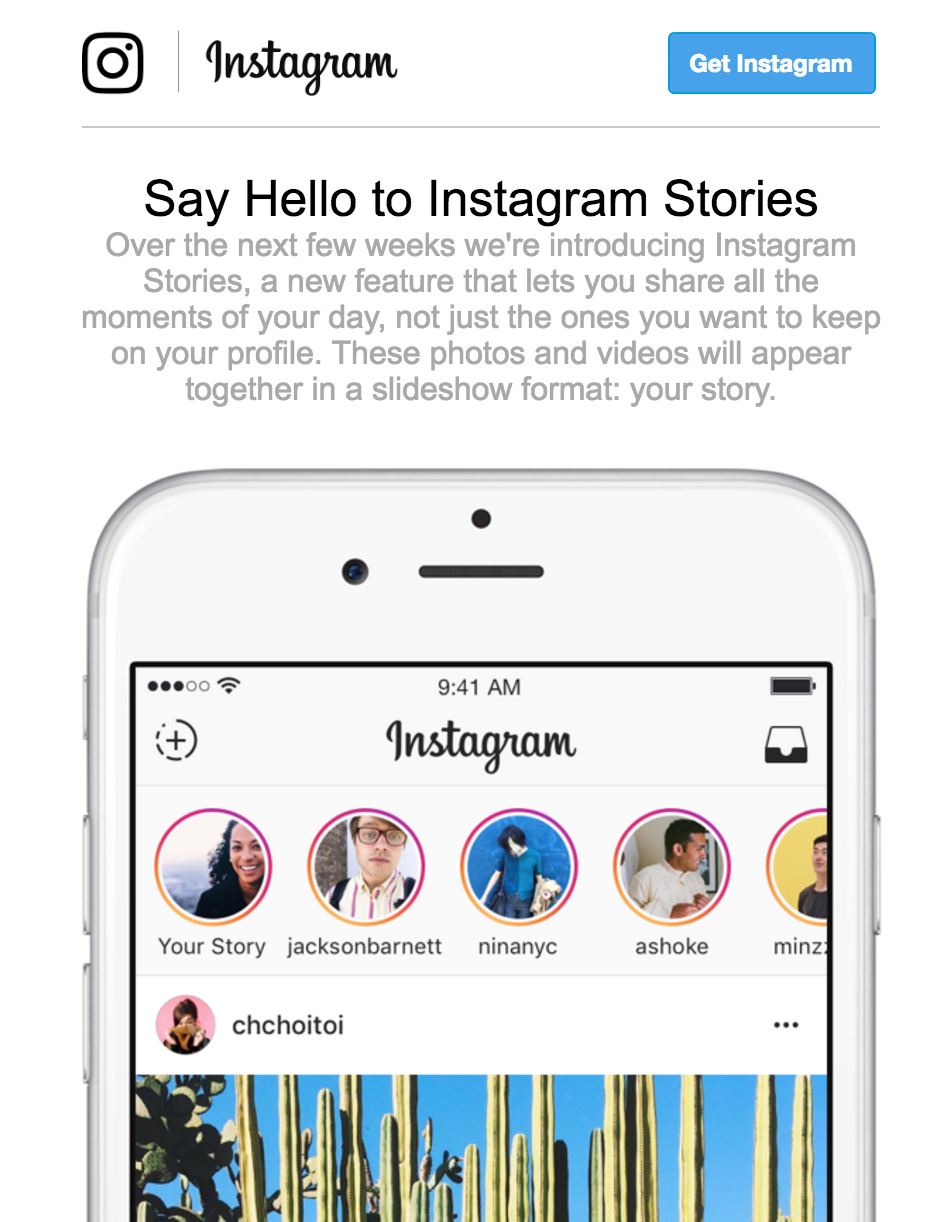
When Instagram released their Stories feature, it bore a striking resemblance to Snapchat’s core functionality. The visual put the new feature in context and helped highlight how the new feature would be an addition to—not a replacement— to the core, photo-sharing, function.
User-centric Upsells
You can use feature updates as an opportunity to upsell. But be careful— upsells straddle the very thin line between self-promotional and helpful. An email with a mobile upsell is only successful under two circumstances:
- User-centric. The copy of the email has to be framed around how the users’ needs are met. This is the difference between, “we made x feature that does y,” and “you can now easily do x and y.” The difference seems slight, but one has a helpful connotation and the other is boastful.
- Relevant. Don’t send upsells to your entire email list, ever. It’s a surefire way to earn yourself a spot in the spam folder, or get users to unsubscribe. Upselling emails should only target users who would be the likeliest to adopt. This can be based on how long they’ve been a customer, how they already use your app, or based on their answers in a survey.
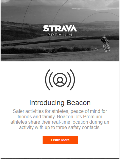
When workout app Strava introduced Beacon, they targeted users who had already been on the free plan for several weeks. The copy explains how the safety feature benefits users and improves their app experience.
Thanks for
reading!
More articles you might be interested in:
Mastering Mobile App Growth Through Engagement and Retention Strategies
Encapsulating a new wave of innovative strategies, Growth Hacking was undoubtedly one of the leading buzzwords of 2017. By merging creative and analytical methods, product leaders and marketers have used Growth Hacking to reference methods that aid the virality of...
Read More3 Tactics Retail Giants Use to Encourage Mobile App Engagement
A simple mobile-app-only sales campaign can easily boost app downloads for a retailer. The challenge for retailers, however, comes in convincing users to keep using their mobile apps after that initial sale has been claimed. Mobile retail apps need to...
Read MoreApp Engagement: Engagement Metrics and Some Industry Stats
When talking about app optimization, we often hear mobile experts talk about “engagement.” But what exactly is engagement? How do most app managers define engagement and what are some ways to improve engagement? In this post, I’ll go through some...
Read More