3 Mobile UX Design Principles for Travel Apps

If the internet has put the world at our fingertips, mobile apps—especially mobile travel apps—have put it beneath our thumbs.
Only problem is that the entire world can sometimes prove too much for the limited reach and mobility of thumbs, making mobile apps overwhelming and frustrating rather than accommodating and delightful.
The reality is that 99% of users don’t need the whole world.They need a cheap flight home for Thanksgiving, or a February escape to Cancun from a Minnesota winter.
The biggest challenge facing travel apps, then, is communicating vital information within the sprawling context of world travel, while maintaining an intuitive and easy-to-navigate interface. The challenge isn’t insurmountable, but it does require some strategic thinking and good use of user-data insights.
Let’s take a look at some of the amazing mobile experiences designed by top travel apps. We’ll discuss why they work and the three crucial UX mobile design rules you can apply to your app for similar results.
1. Design for Small Screens and Big Thumbs
Web apps are great. But if you’ve ever tried to use desktop-first sites on your mobile phone, you know that they can also suck.
Having to zoom in and out of specific sections just so you can read the text or click on a menu option (rather than five!), and endlessly following winding drop-down menus that seem to have a mind of their own is enough to make you send your phone flying across the room.
The first rule of great mobile UX design takes into account both the size of a phone’s screen (considerably smaller than your desktop’s) and the size of thumbs (considerably larger than your mouse point). Airbnb’s app design epitomizes this rule.
Instead of following tried-and-true desktop models, Airbnb’s mobile app completely reimagines the booking process for accommodation.
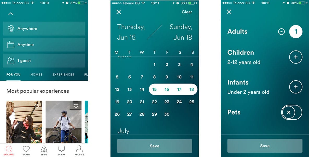
- Selecting desired travel dates is as simply as tapping or sliding your thumb across the screen.
- Forget about fumbling with a tiny keyboard to input the number and categories of travelers. Just click the appropriately-sized buttons to increase or decrease your travel party and you’re good to go.
- The map view lets you zoom in and out of the areas that interest you, quickly redoing the search in each focal area and presenting your options as price tags for easy comparison.
From picking destination, dates, and number of people traveling, to perusing the available listings on a map, Airbnb’s app is all about making users’ lives easier.
2. Personalize for More Than User First Name
“Dear First Name.” Ever got one of those emails from a service you subscribe to by accident? It used to be that personalizing on the web for first name was a big deal; now it’s the expected minimum standard.
Awesome mobile app personalization goes well passed first names. It takes into account the entire context of your users’ journey and the tasks they’re trying to achieve beyond the screen.
With a philosophy of making flying fun again, Virgin America’s mobile app capitalizes on the importance of larger real-life context for creating an amazing user experience that keeps customers hooked.
Virgin starts, of course, with a great in-app design that features a great use of whitespace, good typography, and clear CTA design that makes it easy to book and manage flights.
But where the app really hit the nail on the head is by using their user insights to personalize the post-purchase process.
One thing all travel apps know is precisely when, where, and how their users will be traveling next. Only smart apps like Virgin America, however, seem to be using those data points to become “context aware.”
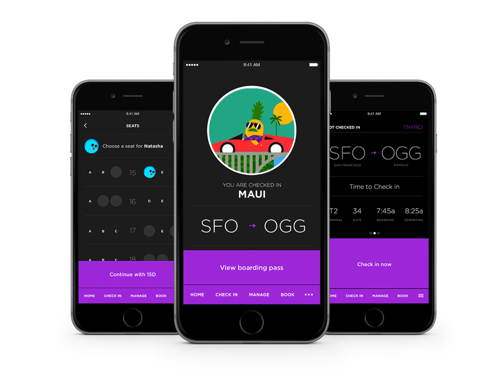
24 hours before your next travel trip, the app shifts from helping you book flights to becoming your helpful and knowledgable travel companion. It allows you to check in to your flight, view your boarding pass, and see any critical flight alerts that may change your plans.
It’s no surprise that within the first month of its release, Virgin America’s mobile app was downloaded over 200,000 times and got featured as a top app in both the App Store and Google Play.
3. Put Function Before Beauty
If putting function before beauty sounds like strange advice in the context of design principles, we may need to reconsider what design really means.
As Steve Jobs, one of the pioneers of mobile app design (if not its principal pioneer), has put it:
“Design is not just what it looks like; design is how it works.”
Having an app that looks pretty is all well and good, but let’s face it: no one’s going to come back to a dysfunctional app just because it looks good. And Booking.com seems to know this truth and capitalize on it.
Taking pride in the data-driven approach of their operations, the Booking.com team obsesses over building intimate relationships with their customers. They translate the knowledge they glean from their data into a superior user experience that’s vetted by layers of testing, tweaking, and optimizing.
The resulting app may be nowhere near winning any awards in aesthetcis, but it does win major points in user usage and retention.
The app focuses on allowing users to get what they came for — a great deal on a hotel booking — in as few clicks as possible. To achieve that, every screen maximizes space use to provide the critical information users need to make a decision.
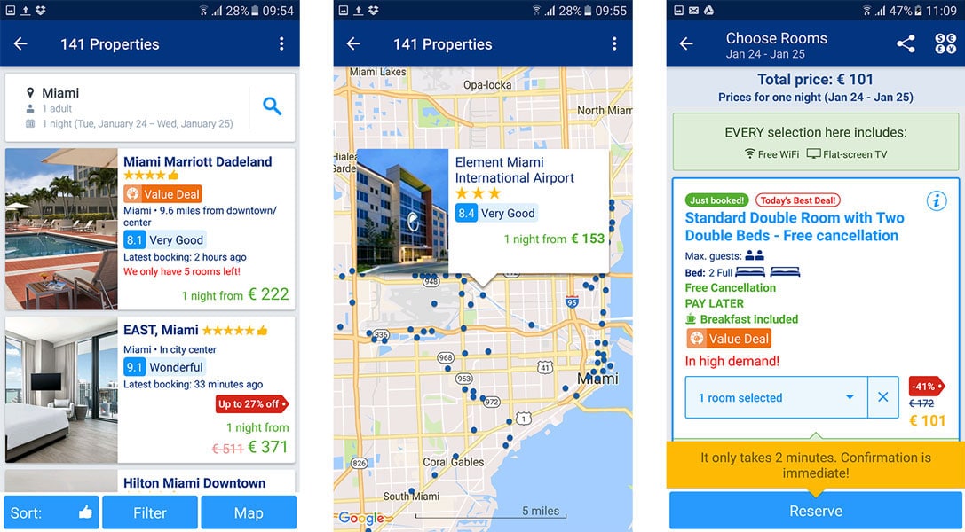
- Instead of relying solely on a numeric score for customer ratings, which might appear rigid and unclear, the app contextualized hotel scores through terms such as “Very Good” and “Wonderful” which associate a feeling with each place.
- Labels such as “Value Deal” and discount tags allow users to quickly make a comparison and reassure them that we’re getting the best deal
- “Only 5 rooms left” and other similar elements create urgency and push users to complete their purchaseBanking on functionality, the UX design on the Booking.com app helps users do the job they came for in the easiest and quickest way possible, and that’s what counts.
4. Design for Experience Not Dazzle
When designing your mobile app, fight the urge to drop in bits and features just because they look cool. The most successful apps aren’t the fanciest ones—they’re the ones that structure user experience around a meaningful task and within the relevant context.
So before you hit the design board, internalize these three crucial mobile UX design rules:
- Design for small screens and big thumbs — your desktop and mobile apps may achieve the same results but they’re not likely to get then in the same way.
- Personalize beyond first names — Leverage geolocation and user data to deliver a context-aware user experience
- Put function before beauty — remember that while good looks are great, but good design hinges on function more than appearance.
Above all, remember to A/B test your app and use data to inform your design decisions. There are no catch-all rules for every part of mobile app design. And while you can learn a lot by looking at the competition, ultimately you have to test for yourself and see what sticks.
After all, the entire world may be at your disposal, but the real question is—what will you choose to give your users?
Apptimize is the best-in-class mobile growth platform for Enterprise and SMBs, powering 1.2 billion app downloads across 75 countries.
Thanks for
reading!
More articles you might be interested in:
How to Create Habit-Forming Mobile Apps
How do you ensure that your app is captivating and retaining users? Habits. In comes the ‘Hooked Model.’ The ‘Hooked Model,’ developed by Nir Eyal, is a four-step process built on basic principles of behavioral psychology that can be used...
Read MoreHow the Best Entertainment Apps Use UX to Hook Users
Entertainment apps make big bucks. Spotify and Apple Music generate over $7B in revenue. Netflix is close to breaking the $9B mark. And no one knows for certain how much YouTube makes, but estimates put it at higher than all of...
Read MoreThe Secret to Enhancing Apps
Apptimize CEO, Nancy Hua, was featured on Fox Business News’s Risk & Reward with Deirdre Bolton for bringing innovation to a slow mobile development process. “For most companies, the biggest barrier to their apps being hugely successful is the painful...
Read More