KAYAK’s Recipe for Great Mobile A/B Testing, Part II
Earlier in the week, we posted a podcast with Vinayak Ranade, Director of Engineering for Mobile at KAYAK. The podcast was only five and half minutes, but our actual conversation was over an hour long. Here are some tidbits from the rest of the conversation distilled into a few more questions.

Nancy Hua: KAYAK started as a website and now you’re getting a lot of activity on your mobile apps. How does KAYAK’s mobile activity compare to the web?
Vinayak Ranade: The amount spent per user is lower on mobile but the growth is much higher. There’s a ton more growth on mobile. It’s an inevitable side effect of the tech transition.
NH: How do you A/B test on the web versus on your app?
VR: Web A/B testing is basically a solved problem and KAYAK’s internal web A/B testing platform is amazingly good. We can come up with big redesigns and A/B test each component before launching the full redesign because web shipping time is zero. In contrast, mobile is obviously a different beast. The bar for internal mobile A/B testing tools is extremely low because mobile is so difficult. Release cycles are much slower on mobile. Approvals are a big gating factor. And who wants to annoy users by making them update all the time?
NH: What metrics do you track?
VR: Bounce rate, time spent, how much time on each screen. Also industry specific metrics like sales, ads, searches, etc. A higher number of clicks per search and a lower bounce rate are strong signals the user finds it easier and less annoying to book, which is a success.
NH: What are some A/B testing results you’ve gotten?
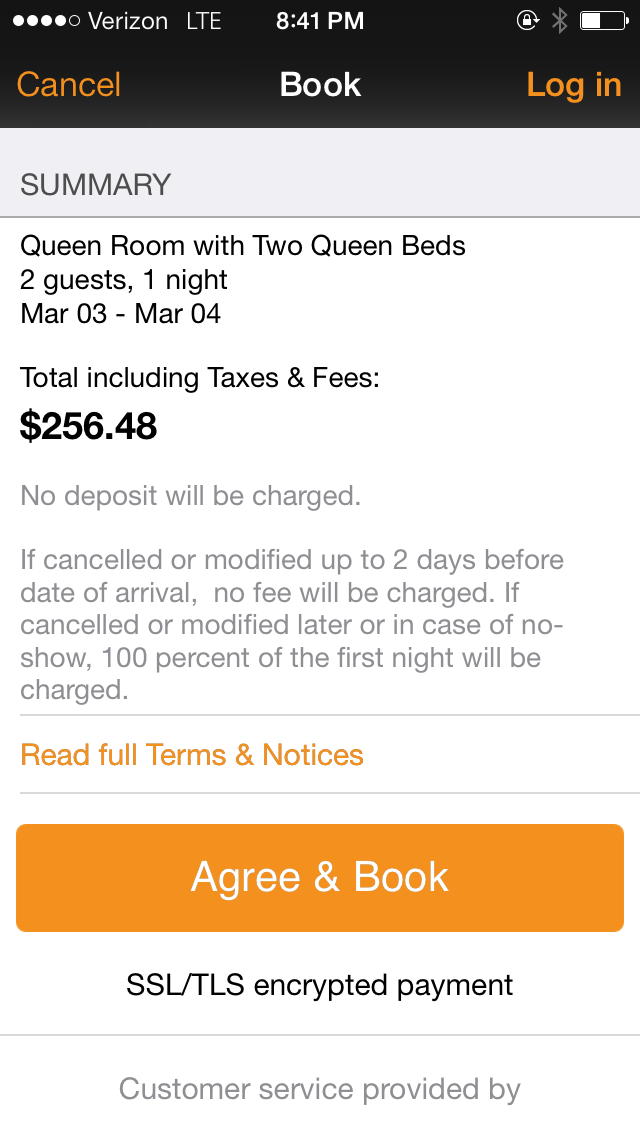
VR: We A/B test everything. For example, messaging is known to have a lot of impact on user behavior. But A/B testing is how KAYAK decided to have orange buttons everywhere. For some reason, orange turned out to be the most profitable color.


NH: Do you do targeting?
VR: We do obvious stuff like language and currency but we don’t want inconsistent behavior across demographics because it’s our company paradigm that we want a consistent experience.
NH: You said it’s easier to test content than UI. What’s the cost of testing layouts and visual things?
VR: Testing UI requires a developer to implement the new UI so it’s annoying. We looked at some solutions but you have to bake in a lot of stuff and put in tags so they’re more trouble than they’re worth. That’s why Apptimize’s ability to change visual elements realtime with zero lines of code is so appealing.
Thanks for
reading!
More articles you might be interested in:
Get Started with Mobile A/B Testing using ONE Easy Test
I talk to a lot of app developers and product managers on a regular basis about A/B testing their mobile app. The feedback I hear the most is: “I know I need to start A/B testing, but we just haven’t...
Read MoreHow to Evaluate a Mobile A/B Testing Solution
How do you know which mobile A/B testing solution is right for you? Ask for a demo. Signing up for a trial is a great start. Seeing a live demo is even better. With a live demo, you can watch...
Read MoreKAYAK’S Most Interesting A/B Test
This is the inaugural Apptimize podcast! Our CEO, Nancy Hua, speaks with Vinayak Ranade, Director of Engineering for Mobile at KAYAK about how to identify what to test. Listen to the podcast and/or read the transcript below.
Read More