What The Need for Speed Franchise Can Teach Us About Onboarding

When The Fast and the Furious released in 2001, it sparked huge amounts of interest in street racing. Suddenly, young men everywhere pined to live out their newfound desires to soup-up entry-level/midrange cars and race them in the streets.
In response, EA released one of their most successful games of all time: Need for Speed: Underground. The game promised an immersive experience: starting out as a fledgling driver, modding your own car, and building a reputation through races.

Games such as these can be highly addictive, incredibly sticky, and provide loads of values to their users. So what onboarding lessons can we take away from one of the best selling games of all time?
Set Up an Early WOW
Nobody wants to start their first race with a boring stock dodge neon, right?

Putt. Putt. Putt.
Most racing games at the time followed the same formula: start out with a low-end car, then work your way up to the track-ready McClarens, Nissans, F1, or other exclusive vehicles. However, that also meant that that it would take quite some time before new users would be able to live out their true street racing fantasies.
Underground took a radically different approach to onboarding, and focused on wowing their users in the first few minutes.

At the beginning of the game, they immediately drop users into the driver’s seat of a fully souped-up Integra at the starting line of a high-level street race. The car and the high-speed pace whett users’ appetites and incite excitement for what’s to come later in the game. After the short appetizer, players learn it was all a dream as they snap you back to reality and make you claw your way up to the nice cars.
What Underground focused on was thrilling users in the first few minutes of gameplay (the wow moment), and then channeling that energy into the less exciting elements: low-speed races in entry-level cars, and minor customization options.
In the same way, dev teams should do the same with their apps. Thrill the users with an early wow moment, then channel that energy into less exciting tasks such as registrations, giving app permissions, or learning new patterns. If it’s done right, it’ll help you bend the curve and avoid the dreaded 77% drop off within the first 3 days.
Don’t Sell Your Product, Sell a Better Version of Your Users
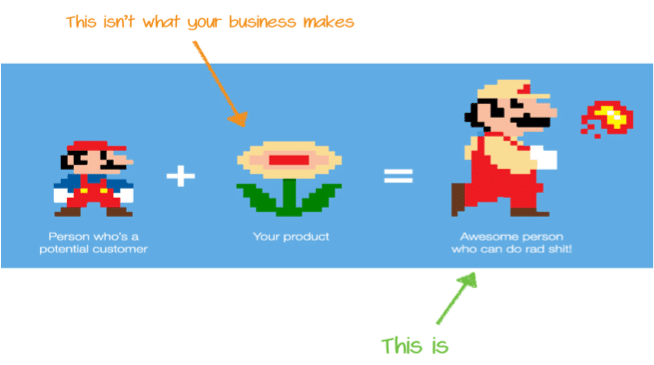
Image via UserOnboard.com
It’s easy to fall into the trap of only promoting your product and it’s cool features and functionalities. Rather than just selling their racing simulator product, EA sold users on the street racing lifestyle: getting to customize a car from scratch, earning the respect of their peers, and heart-pounding night races—without the risks or costs.
Set Up an Early Win
The last principle is that the game set users up for an early win instead of making them work their way up to victories. In the first race, the car users are given is superior to the competition, so driving skills are less of a worry.

A few safeguards also help protect users from early failures. They’re given an extra NOS powered speed boost so they can quickly recover from crashes, as well as retries if they lose the race.
Apps Applying These Lessons Today
Robinhood
Like Need for Speed Underground, Robinhood’s onboarding is about getting users excited about their product. Before requiring any registration info, bank accounts, or disclosures, they allow users to try a demo of their app and actually simulate the purchase process that they’ll go through.
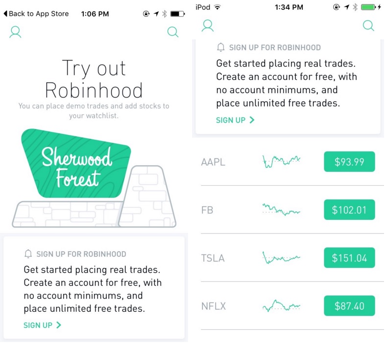
Once they enter the demo, users see a pre-populated list of popular stocks like Netflix, Facebook, Twitter, and ~5 others. Selecting one takes the user to a summary page where they can explore the different types of data available or choose to make a simulated purchase.
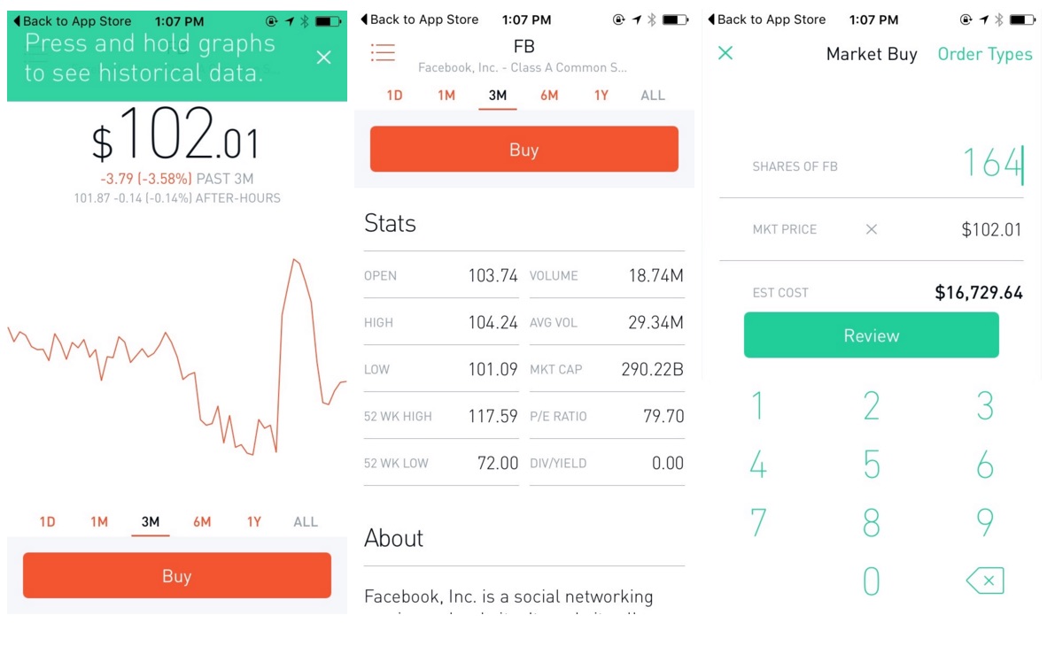
Robinhood’s allure and value proposition lies in free trades and its super slick UI which is clearly highlighted in the demo. The purchase flow makes for a
pleasing experience while still allowing multiple trade options.
Robinhood’s demo does an amazing job helping first time users familiarize themselves with the new UI from the get go and conveying one of their strongest value propositions: their UX. Once users have selected their purchase options, they’re taken to the final checkout page where the pattern of review and “swipe up to submit” is introduced.
With this simulated purchase, users are able to experience the excitement and all the great usability built into the product. Right after making the simulated purchase, Robinhood directs users to create an account with them, jumpstarting them on their process to becoming a Robinhood power user.
With Robinhood, the team was able to take market data and utilize it in their onboarding process. However, this doesn’t work for every type of app. What if there is no market data to pull and utilize? Let’s take a different scenario, one where the app harnesses users’ profiles and personal data.
Inbox
With the incredible popularity of Gmail, introducing Inbox meant that the team at Google had to determine a way to introduce a new way to email. They had an uphill battle, trying to break the deeply ingrained habits of daily email checking.
With an already Herculean task of habit changing in front of them, the team made sure to keep as many other things consistent as possible to focus on the habit change. To do so, they decided to use their users’ existing emails as a part of the onboarding process.
When you first open Inbox, you’re prompted to a quick tutorial of the new functions, then quickly thrown into the thick of things: managing your own email using these new methods. Having seen the patterns just seconds before, users can experiment changing an email type to “Done” (rather than archiving it) or reminding themselves to address it at a later time.
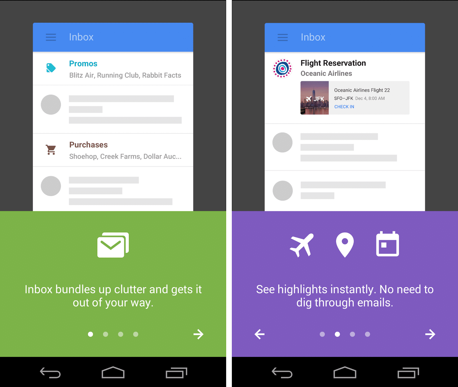
This interaction is an excellent teaching method similar to a lecture + homework approach. After getting a primer on the fundamentals, users are left to try out the product on a real world situation: their own inbox.
Since this manipulation directly affects a user’s inbox (and can screw them over if something goes wrong), the app implements a key feature that previously existed only in Google Labs: the undo button.
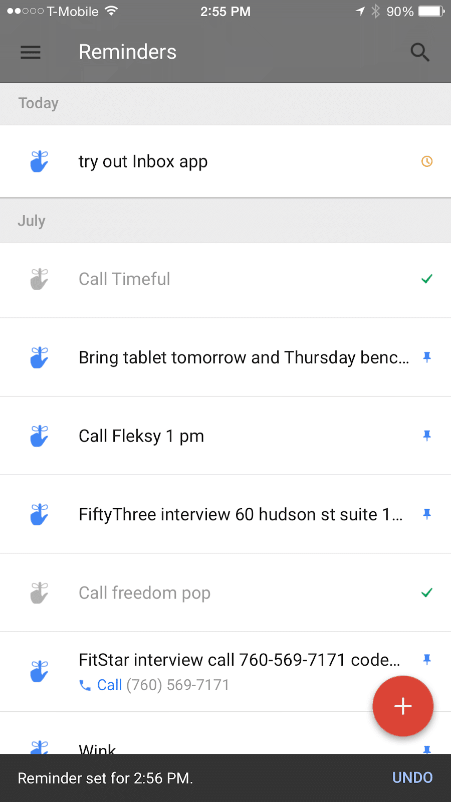
With the undo button, Inbox allows users to quickly fix their mistakes and retry. This quick succession of trial + error allows for free form exploring and allowing users to really see the value it adds in their lives.
If you’re unable to use market data or user data in your onboarding, there’s still another way: using sample data like Xero.
Xero
Xero is accounting and invoice software done on mobile. It’s a complex product in an oftentimes confusing field, so getting users to buy into their product’s usability is vital. The problem is, migrating all the customer data can be a huge undertaking, and not one that customers are likely to do willingly. As a result, showing off the product can be a bit of a challenge.
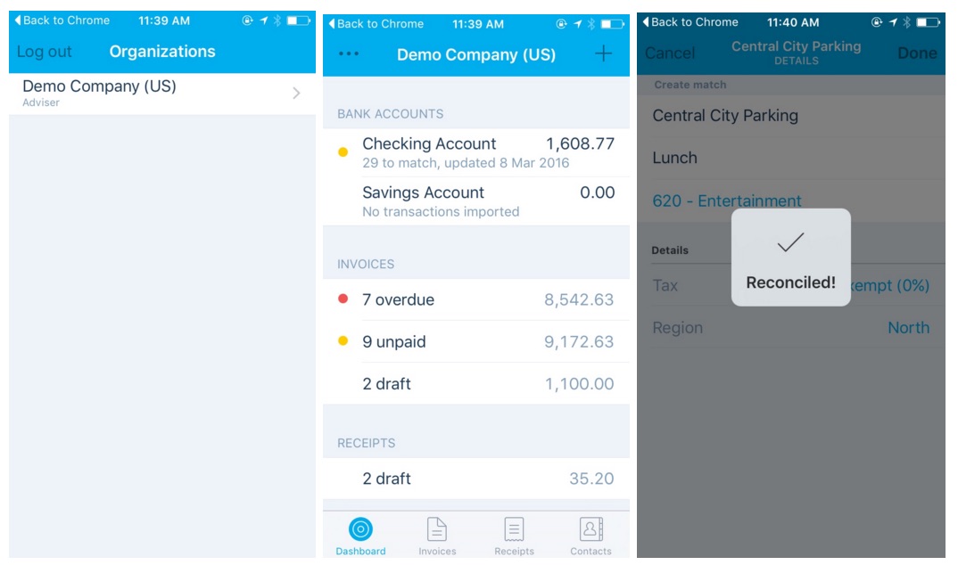
Instead of using marketing and sales jargon to get buy in, Xero utilizes sample data to get users to their Wow! Moments. They provide all sorts of sample transactions and categories for users to file their expenses into. This allows them to get a feel for how convenient and easy to use the system is, without the huge headaches of doing so.
Conclusion
With each of these methods of onboarding, the goal is simple: get users engaged and show them what the product is going to enable them to do. Like the onboarding in the game, demonstrating what power users are capable of gets them excited to start with the initial (and often boring) steps of getting set up and acclimated.
Once you’ve got your users to go Wow!, focus on channeling that energy to the next steps, then pushing them toward the Aha! Moments, which focuses on retaining those users over time.
Thanks for
reading!
More articles you might be interested in:
Leverage User Onboarding to Create Personalized In-App Experiences
An endless content repository is a double-edged sword. If users can’t find what they are looking for or discover content they are interested in, they are almost guaranteed to abandon your app. Many apps aim to improve user retention by helping...
Read MoreUser Onboarding at Different Stages of Growth
Sean Ellis defines startup growth in 3 stages. There’s Product/Market Fit Stage, in which you’re trying to match pain points/value props with a specific persona. Then there’s Organic Growth Stage, where you’re growing by word of mouth. And then there’s...
Read MorePersonalizing Mobile User Onboarding
Feel like going to the Giants game at the last minute? Gametime is an app that let’s do just that and buy last minute tickets with just two taps on your phone. It avoids the hassle of printing or picking...
Read More