The Key to User Acquisition: Onboarding
User acquisition and growth are the number one concerns for most mobile app managers these days. At Apptimize, we’ve found that monetization often takes a second seat to user growth. The question that many product managers ask is, “how do I increase conversions on my signup flow to get more users?” Marketing and advertising can get the users to download the app, but once the app is on a user’s phone, the first minute of a user’s experience can often determine if that user bounces and never comes back or if that user becomes a valued customer.
The first step to user retention is improving that first experience–AKA onboarding. Here are the most common questions product managers have been able to solve using A/B testing.
The Basic Setup
Before dive into the questions solved by A/B testing, let’s first set the scene. Below is a(n extremely rough and childish) drawing (by me) of what a typical onboarding flow looks like. At the start, you have a splash screen that immediately appears when a user opens the app for the first time (to give users something to look at while the rest of the app loads in the background). Then there’s usually a series of (mostly typically 4) screens that constitute the tutorial. The tutorial sometimes shows the app’s value proposition to prove to the user that they should log in/continue or it’s sometimes instructional (e.g. how to use certain features). Then at some point, the user enters the meat and guts of the app.

This is a bare bones of a typical onboarding flow. The question is when to ask users to do what.
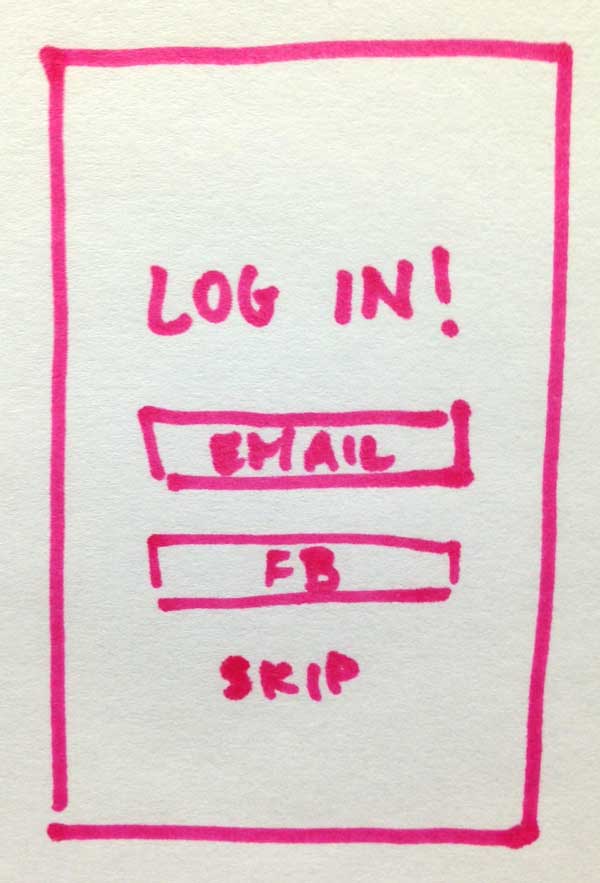
1. When should users be asked to log in?

The most typical answer is after the tutorial. However, some apps that rely on the user registration data to make the app function are tempted to place the registration page right after the splash page. This can sometimes work if the purpose and value of the app is clear to most users before they download the app (for example, Facebook’s login page is the their first page), but it’s more often than not, better to have the log in screen after some value of the app has been conveyed to users.
2. Should I allow users to skip registration?
… and if I do let them skip, when should I prompt them for registration again?
This question has no universal answer for every app. You absolutely have to A/B test different solutions and find out for your app. Here‘s an example of a surprising case.
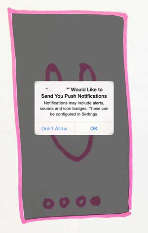
3. When should I ask for permissions?
Many apps ask the user for permission for push, location, gallery access, contact list access, etc. In some cases, it’s impossible to provide a great app experience without those permissions, so asking at the right time is really key.

Again, there’s no standard right time to ask for these permissions, but there are a few common A/B testing ideas that have yielded great results. The first obvious one is testing when to ask for permissions. Is it before or after login? Is it before or after the tutorial? For access to GPS, contacts, and gallery, it could be just as a user is about to take a related action (e.g. as they perform a location based search, as they are about to save a photo, as they are about to import contacts).
Experimenting with the messaging that requests permission has also worked very well for many apps. And even more interestingly, some apps ask the user again if the user says no. When a user refuses to give the app permission, some apps have tested showing them another alert to further emphasize the value of allowing the app to do x and then given the user instructions on how to change that setting at a later time.
4. When should I teach users something new?
Most apps require that the user learn how to use the app. There are some apps that are just so simple or so well designed that users pick up the knowledge as they tap around, but many apps need to explicitly point out certain features during onboarding.
Not only is important to A/B test when these educational prompts happen, but also test the order in which new features are shown to the user, the wording, and the method (e.g. tutorial, overlay, animation, etc.).
Conclusion
For many apps, there is no clear on answer what the best onboarding experience is. Every app needs to A/B test and iterate. Iterate, iterate, iterate.
Thanks for
reading!
More articles you might be interested in:
Leverage User Onboarding to Create Personalized In-App Experiences
An endless content repository is a double-edged sword. If users can’t find what they are looking for or discover content they are interested in, they are almost guaranteed to abandon your app. Many apps aim to improve user retention by helping...
Read MoreUser Onboarding at Different Stages of Growth
Sean Ellis defines startup growth in 3 stages. There’s Product/Market Fit Stage, in which you’re trying to match pain points/value props with a specific persona. Then there’s Organic Growth Stage, where you’re growing by word of mouth. And then there’s...
Read MorePersonalizing Mobile User Onboarding
Feel like going to the Giants game at the last minute? Gametime is an app that let’s do just that and buy last minute tickets with just two taps on your phone. It avoids the hassle of printing or picking...
Read More