Decision Fatigue Is Tanking Engagement
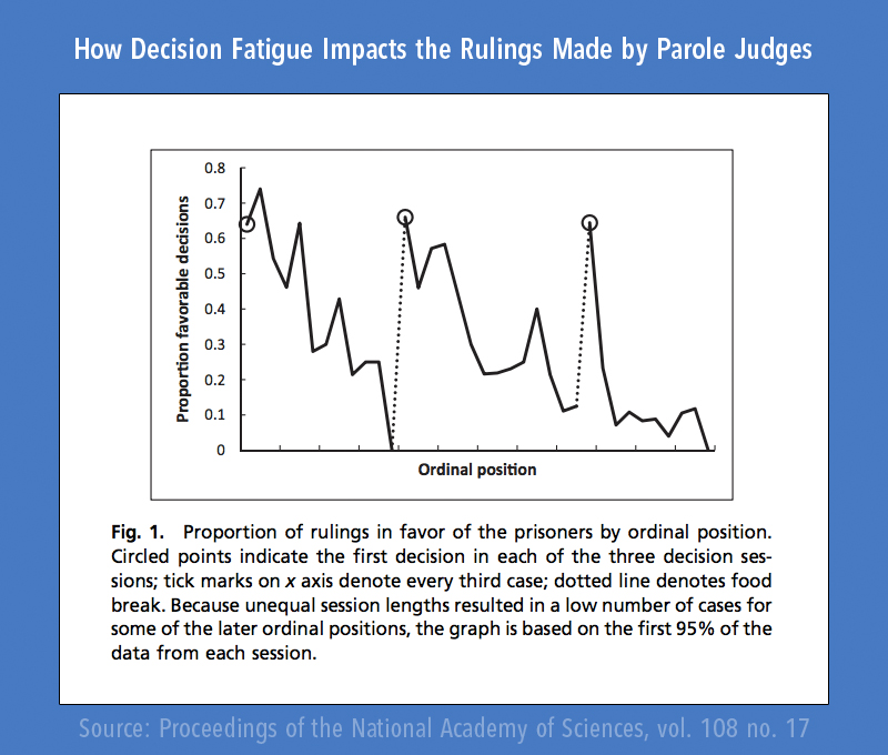
If you’re asking for parole in court, you’d best try and make an appointment early in the day. A study by the National Academy of Sciences has shown that judges granted parole 65% of the time for cases at the beginning of the day, yet near 0% by the end of it, indicating a strong correlation between the time of the day and the decisions made. So why is this? What factors into why these judges ruled so much more harshly in the later hours of the day?
You may think it’s due to sleepiness, hunger, or fatigue, but you’d be only partially right. Actually, it’s the reason Mark Zuckerberg wears the same T-shirt and jeans combo everyday, why so many people cheat on their diets, or why President Obama has his day perfectly planned out by his staff.

It’s a phenomenon known as decision fatigue that causes us to make poorer decisions when we’re mentally exhausted. It’s something that affects us all, and especially your users.
Here’s why, and how you can utilize it to optimize your app…
What is Decision Fatigue?

Decision fatigue is the tendency of individuals to make poorer decisions than they normally would after being subjected to repeated decision making. It’s one of the major reasons individuals make irrational trade-offs.. In essence, decision fatigue means that the more decisions you have to make in a day, the poorer the quality of your decision making process becomes, leading to worse and worse choices as your willpower erodes.
As it turns out, your willpower is like a muscle. And similar to the muscles in your body, willpower can get fatigued when you use it over and over again. Every time you make a decision, it’s like doing another rep in the gym. And similar to how your muscles get tired at the end of a workout, the strength of your willpower fades as you make more decisions. – James Clear
If we think of the brain like a muscle, this makes a lot of sense. A common example is that of an individual struggling to follow a diet. As a person goes on through a day, they’re constantly tempted to cheat by snacks, billboards, tv commercials, menus, and so on. Each time they encounter a choice as to whether to eat healthy or unhealthy, their willpower erodes, making resisting choosing the unhealthy option more and more difficult. After resisting for a whole day (or week), it becomes much more likely that the individual will make a more poorly reasoned choice or give up entirely.
What are the effects?
When a brain experiences decision fatigue, it responds by looking for shortcuts. This manifests itself in 2 ways:
1. The brain looks to act impulsively instead of spending additional energy to first consider the consequences of an action.
In this response, the typical decision making process is cut short. Since the brain is under stress from working through the weighing process of a decision, it decides to skip a critical step and act impulsively, favoring action over consideration. This reptile brain reaction typically manifests itself in poor decisions driven by primitive desires.
Note: This reaction is triggered only when there is a strong driver behind it, such as hunger or fear. Cheating on a diet manifests itself in action, yet something not as urgent or abstracted such as investing in a retirement fund results in the second response: inaction.
2. The brain avoids additional fatigue by not taking action
The other manner in which the brain prevents additional strain is to choose inaction. Instead of weighing the costs and benefits of an action, it decides not to make a decision at all. This is often the case with investing in retirement. Even though most people know it’s vital, many procrastinate on actually opening up their 401(k) or Roth because it simply isn’t urgent or immediately gratifying.
How this manifests in mobile apps
Now that we understand decision fatigue, its effects, and its remedies, let’s take a look at how we can apply this to the mobile space. There are a few main ways that we can apply the concept of decision fatigue, some for good, and some lie…a little in the grey area. Let’s start first with how to avoid fatiguing users.
Give Users Fewer Choices
While this may seem a little counter intuitive, giving users fewer choices can actually help improve engagement and retention rates. A common mistake is to overload users with too many options (i.e. decisions) at once or allow them to navigate completely freely, which both cause an additional mental load with deciding what to do next. As a result, users are more likely to default to inaction, which means leaving the app, likely to never return.
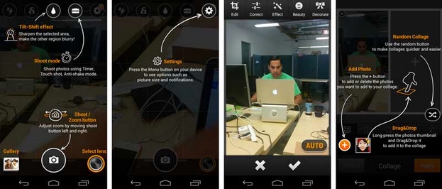
Here’s an example. The camera/editing application above walks through a tutorial, but overwhelms the user with a plethora of different functions. While it does a good job of showcasing the versatility of the app, it more often will fatigue your users than help them get started.
This app should focus on its core features first, walking through the application process by prompting users to first take a picture, then trying a single feature first. Vevo does an excellent job of this in their app. Granted, they have a more simple system, but they used the same tutorial method much more effectively.
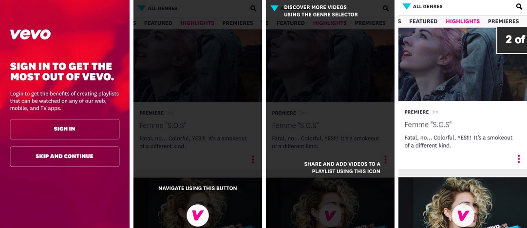
The first few pages of Vevo’s app are guiding you only to the absolutely most essential functions you need to start. Even though they have more options, they drive your attention toward the important next steps, and allow interested users to discover the extra features on their own.
Make it incredibly easy for users to get what they want.
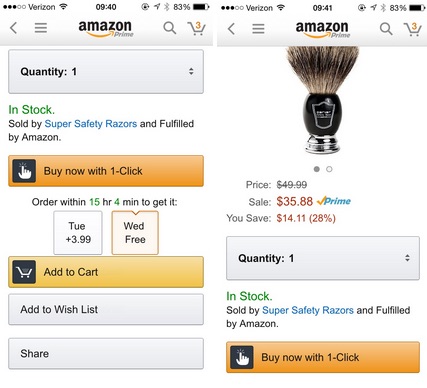
Amazon and Netflix are at the top of the tech food chain for good reason. They cater to users desires by allowing them to get what they want incredibly fast. Amazon allows users to search for an item, look at the specs, and buy them with 1-click purchasing.
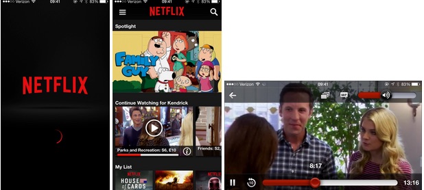
Similarly, Netflix allows users to start watching a movie in only 2 clicks. All a user has to do is click once to open the app, and once more to start a movie or show. Since user preferences are saved and promoted at the top of the app, oftentimes there’s no need for scrolling.
Make it easy for them to get what they want without making decisions, by using any context and data available.
Ideas to Test:
Use any context and data available to predict what users want, then make it easy to get there. An example for e-commerce is to make users wishlists immediately accessible and viewable. Users who are tired don’t want to go searching and navigating for certain features, clicking male or female clothing, medium or extra large, blue or black, or be bombarded by a ton of micro decisions when browsing an item.
Prompt Users when they’re refreshed
Granted your app provides great value to a user, you probably want to interact with them at a time when they’re most relaxed and likely to make better decisions. You can do a few things here. One is to strategically plan and test out times of day when the users are most fresh. Prompting them early in the morning or after lunch could be huge for your app, helping ensure that they see the value proposition of your app and are willing to dig deeper.

Another method is to try techniques for refreshing your user during usage. Something as simple as inserting a cute cat video, or priming the users by directing them through a relaxation exercise could have great effect, putting them in a better state of mind and relieving decision fatigue before key conversions.
The Grey: Capitalizing on User Fatigue

Like anything else, decision fatigue can and has been used for devious applications as well. Some examples of this are how salesmen tack on extra charges by peppering the user with decisions about add-ons, or how lawyers/lawmakers can get away with inserting discrete text when tacked on to wordy documents.
“Decision fatigue helps explain why ordinarily sensible people…can’t resist the dealer’s offer to rustproof their new car.”
It has been observed that when faced with a large amount of choices, users tend to go for the default options as they become fatigued. Car salesmen are acutely aware of this, and may prompt customers for trivial, low-cost items first to increase fatigue, then have users make larger, high-roi items when they’re tired.
Wrap Up
Decision fatigue plays an important role in our lives, and it’s important not only to note its effect on our own decisions, but how we affect others’ decisions as well. Knowing what you know now, go out and make sure that your app is optimized to help your user make smart choices and see the value in what you do. Using what you’ve learned here, create a hypothesis and test out new changes to see how users react. You may be surprised at how effective it can be.
Maybe you should check out our A/B testing platform. Like, right meow.
Thanks for
reading!
More articles you might be interested in:
Automatically Track Retention and Engagement with Apptimize
The success and failure of an A/B test doesn’t just rest on whether or not variant A caused more customers to click on a button. That’s only the simplest case. Sometimes you want to see if customers spent more time...
Read More4 Things to A/B Test to Increase App Engagement
In a previous post, I wrote about the importance of app engagement and the top engagement metrics that you should be tracking in your app. Now that we’ve discussed what to track, let’s talk about how to increase those numbers....
Read MoreApp Engagement: Engagement Metrics and Some Industry Stats
When talking about app optimization, we often hear mobile experts talk about “engagement.” But what exactly is engagement? How do most app managers define engagement and what are some ways to improve engagement? In this post, I’ll go through some...
Read More