Mobile Logins Suck. 5 Ways to Suck a Lot Less
Password logins. They’re the bane of mobile users around the world, yet we’re still forced to use them for almost every app on our phones. The process we’ve ported over from web seems archaic and much more tedious than it ever was with a full-sized keyboard, making you wonder if there’s a better way. According to Foolproof UX, 56% of users said they have not signed up for an app or mobile service because the registration process was too time-consuming.
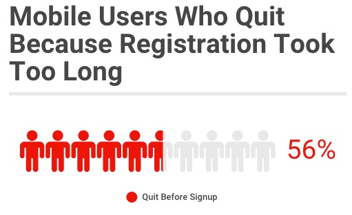
Why? Because passwords are particularly hard to use on mobile. The hassle of trying to maneuver large, stubby fingers to press on touchscreen keyboards clearly made for leprechauns is atrocious. Without the tactile feedback of a keyboard, I find myself silently cursing the minute keyboard at least once or twice a day.

Mobile logins oftentimes act as a drop off point for your users. Want to use the app or X feature? Just login! Uh. No thanks. They’re just another reason for users to leave and never come back. While a case can (and should) be made to remove or delay logins on your app, this isn’t always possible. So how can we make the process less of a burden, while still making sure user data is still secure? We’ll show you 5 different options for making logins less painful, ranging from small simple changes to wildly unique and novel verification methods.
1. Allow users to see their passwords while typing
“Masking passwords doesn’t even increase security, but it does cost you business due to login failures.” -Nielsen Norman Group
It might seem like a bit overkill, but showing passwords in plain sight isn’t always such a bad idea. Luke Wroblewski of Polar has pointed out that on mobile, hiding the password with ••••’s doesn’t actually do a whole lot in terms of security. On a desktop with a large monitor and a wide range of viewing angles and the tactile feedback of a keyboard, hiding passwords is logical. On mobile, it’s just an inconvenience.

But won’t users freak out if we display their passwords in plain sight?
What’s key here is the implementation. According to research by www.passwordmasking.com, when apps simply displayed the passwords in plain sight for users to see, 60% said it made them suspicious of the site, while 45% identified that not hiding the characters increased usability. Displaying passwords without explaining made users question how seriously an app took security. The result would then likely be an increase in dropoffs, especially for apps that users don’t yet trust.
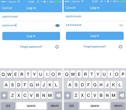
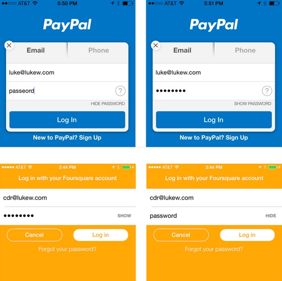
Instead, the team also tested how users reacted when they had the option to hide or show their password. In that scenario, 100% of the users saw it as a feature that helped improve the user experience. Enabling such a feature helps users quickly fix typos, as well as verify if they’ve typed in everything correctly. This small change and challenge to conventional UI makes for a huge improvement in the login experience, and many large companies such as Paypal, Twitter, and LinkedIn are already using it.
2. Use Mobile Deep-Linking to Verify Identities
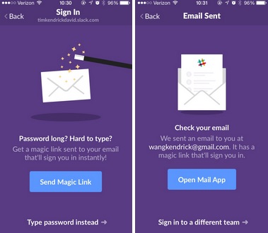
I was *deeply* impressed by this ingenuity. Upon downloading Slack for my phone, I immediately noticed that there was an option to log in without using a password. Hmmm. Curiosity, combined with some awesome copy sent me on a quest to utilize the alternative method, rather than simply type in my password. I eagerly clicked on “Send Magic Link” and was prompted to open my email app.
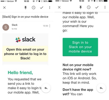
Soon after, I received a message in my inbox with a button to sign me in. Clicking on it took me into a mobile browser (seems a bit repetitive), where I tapped another sign in button to complete the process. That link opened up the Slack app, logged me in, and took me straight to the Slack home screen. Very impressive.
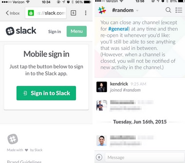
Clicking on the button through the mobile browser immediately pulls up the Slack home screen on your mobile device, providing a near-seamless experience. While it did take me 3 different clicks on various apps to get signed in, it was much more pleasant, novel, and easier than the 10+ clicks needed to type the password without any errors. Slack’s method is an ingenious way to not only make the process simple and straightforward, but a delightful one as well.
3. Integrate Password Managers for Mobile Logins
As security becomes an ever increasing concern, password managers have risen in popularity along with it. Tools like 1Password and Lastpass have a simple proposition: get the advantages of strong, unique passwords for all of your accounts, while only having to remember a single master.

Integrating a password manager into your login process makes it easy for users to login, by not requiring them to memorize which password they used for your app. Instead, they simply enter their master into the integrated password manager and voila!
Many well-known apps such as Soundcloud, Etsy, Uber, and Ebay have been integrating 1Password into their mobile login process. Now, their users can create accounts or login using the manager, making it incredibly convenient.
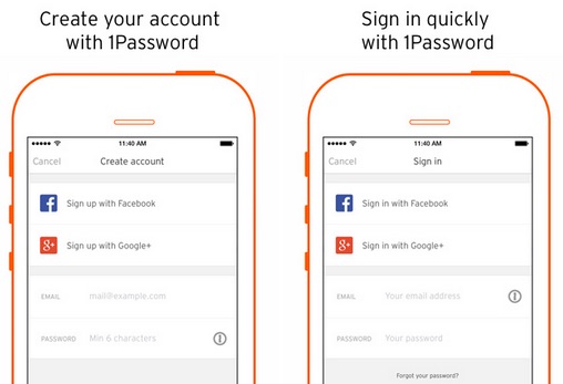
Of course, this only works for users who are already using 1Password, but there seems to be a fairly large user pool, enough that quite a few apps are adopting the process. If it saves your users headache and increases conversions, it may be worth a look into.
4. Use Apple TouchID / Android M
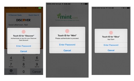
Apple TouchID and the recently announced Android M fingerprint support are sure to be popular ways to make the login process less painful, simply because they’re going to be standard for all future phones. They work similarly to password managers, but with a few key differences. Apple TouchID utilizes your Apple ID, having that act as a login and typing credit card information as well. This has already proved to be a huge benefit to apps like HotelTonight, which found that integrating Apple’s system increased conversions by 26%. Android M’s Pay and Fingerprint systems will likely function in the same manner, with similar benefits.
5. Integrate Social Logins
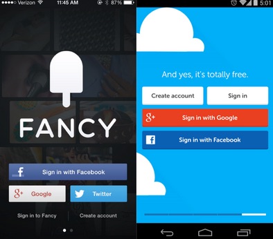
Most users are already logged into Facebook, Twitter, and/or Google, so why not take advantage of that? Social logins can allow users to login with just one or a few clicks, since they’ve already verified their ideas through other apps. Of course, users have to already be using these apps, but they almost certainly are.
Social Logins can be done either through the Facebook / Twitter / Google+ documentation, or through a 3rd party login/identity manager such as Gigya or Janrain.
Conclusion
Entering passwords on mobile doesn’t have to be the painful and tedious process that we’ve accepted. Even simple and small changes such as allowing users to see their password as they type can have a huge impact on the user experience.
With such a plethora of choices for improvement, there’s little reason you should stick with the same old flow that you’ve got. Or maybe you could even implement more than one. Using Apptimize to test out these login changes will tell you exactly how they affect your app, allowing you to move faster and make better data-driven decisions.
Thanks for
reading!
More articles you might be interested in:
What Banks Can Learn About Mobile From Fintech
The recent investment surge in fintech firms — $17.4B globally in 2016 — is a strong indicator that banks need to start looking at these upstarts not just as competitors, but also as a source of inspiration. The desire to...
Read MoreWhat You Need to Know About Facebook’s New Mobile Logins
Last week at F8, Facebook announced their changes to social logins. Over the next few months, they’ll be testing the new logins with select apps, and opening release to all devs later this year. Below are the key takeaways you...
Read More4 Ways Mobile Can Create a Great Holiday Retail Strategy
Are you ready for Halloween? Thanksgiving? Christmas? New Years? Post New Years? As any seasoned product and marketing manager knows, running campaigns that align to consumer trends and seasonality is the way to be relevant at a time of year...
Read More