6 UX Mistakes to Avoid When Designing a Native Mobile App
It’s hard enough to get to people to download your app. Why spend all that time, money, and resources generating a download only to have the user close and delete the app? Avoiding these 6 pitfalls when designing your native iOS or Android app will help you make an app that users love and keep engaging with.
- Migrating from web to mobile without redesigning for the mobile experience
Mobile is not the same as web. Even mobile web is very different from native mobile. Designing for a native mobile app requires different considerations because the user has different expectations and is in a different state of mind. Yet still too often, mobile apps are confusing or unusable because their creators are trying to port the web experience directly over to mobile without fully considering how different the platform is.
There are 3 main reasons why designing for native mobile is so different from web:
a. Smaller real estate – A smaller screen means that you can squeeze the same content from your web homepage to your app homepage. Your font needs to be legible and the buttons need to be big enough that a finger can click on it.
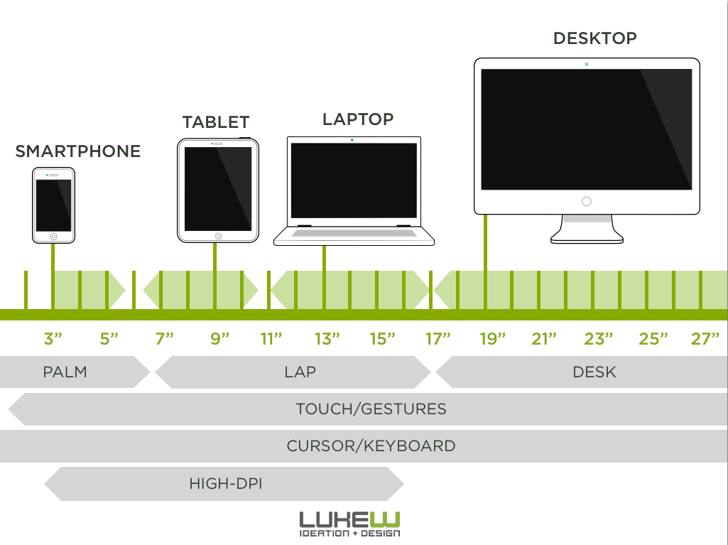
b. Different user intention – Mobile users may go to your app with a different task in mind or in a different environment than when they go to your website. Users on mobile devices are often on the go or multitasking. Desktop or mobile web visitors often come through external links, but users open apps with a purpose. And because of the distractions that can come with doing concurrently doing something else and/or being out and about, mobile app users typically want to accomplish their task efficiently or are easily distracted from the task you want them to perform. While your mobile app user is often the same person that comes to your website, they are in a different mindset when they come to your app. Design for the mobile version of your user.
c. UX Confusion – Let’s start this one off with an example. I’m looking at the Macy’s website and shopping for women’s dresses. I’m on a page with a list of items:

On the website, it’s pretty intuitive for me to click on the name of the dress since the link becomes underlined when I hover over it. The white space around the link is not clickable. Completely normal behavior for a website. This does not confuse me.
Here is the same women’s dress section of their app:
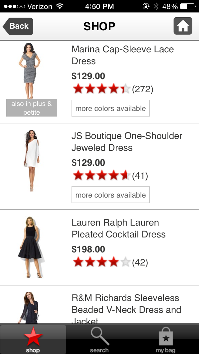
I have to click on the name of the item. The white space around the item is also not clickable. This is not intuitive behavior for an app. I’ve been trained through using many apps in the past that clickable regions are usually bigger since my finger is bigger than a mouse. It’s confusing to click on what I think is the button on the app and have nothing happen. I had to click a few times before I realized that I had to click on the item name.
The lesson of the story is that users have slightly different behavioral patterns on mobile. Behavior that is intuitive on web is not always so on mobile.
- Migrating from iOS to Android or vice versa without redesigning for the new OS
The biggest difference is that iOS only has one home button while Android has a persistent return, home, and recents buttons. When porting from Android to iOS, remember that you need to add a back button because user can’t do that on their on. Alternatively, when porting from iOS to Android, remember that your old back buttons are now taking up precious space for no reason.
Here is an example of how Amazon leveraged the Android and iOS differences.
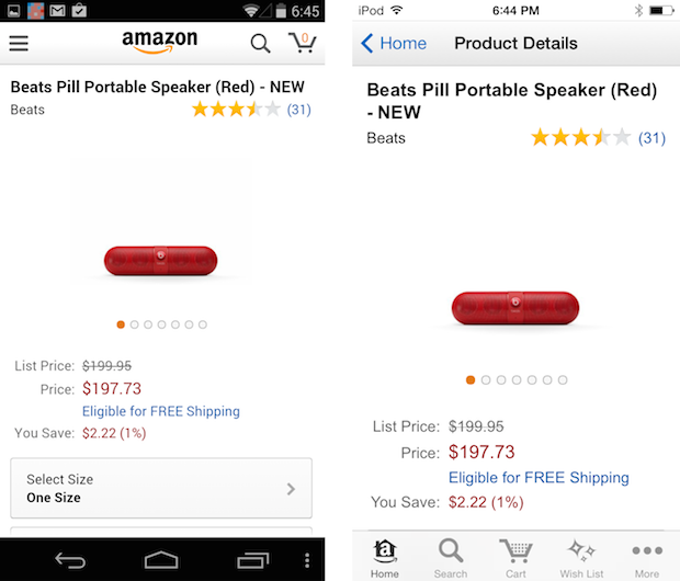
There is no need for a back button on Android so they have used that space for a menu button instead. And with the smaller screen real estate of the iOS device, the top priority menu items are moved to the bottom.
This is just one stark way in which Android and iOS users have become accustomed to using their apps in different ways. Notifications are rendered differently in across the two platforms as well (notifications in the status bar versus alert count numbers on iOS icons).
- Responsiveness
Mobile users expect nearly immediate responses to an action they take. They are often on the go or multitasking. Any moments of unnecessary lag or confusion (did I click it?) create opportunities for the user to disengage with the app and focus on the other thing they’re doing. The user might think to themselves, “I’ll figure this out later,” but they more often never come back and then uninstall the app after realizing it’s been there for weeks without any use.
Thus if a user clicks on a button, the next step should come up immediately. According to a report by Compuware:
79% would retry a mobile app only once or twice if it failed to work the first time.
If dissatisfied with the performance of a mobile app, 48% of users would be less likely to use the app again.
78% expect mobile apps to load as fast as — or faster than — a mobile website.Expectations for performance are high. The app needs to run well the first time or there are other apps to engage with and other things to do.
- Quantity of Content
Too little or too much content will cause users to have trouble finding what they’re looking for and drop off. There is no single answer to the question of “How much content should I have on each page of my app?” You really have to A/B test it with your users to find the right balance.
- User Confusion
A confusing interface causes users to become frustrated and drop off. They might tell themselves that they’ll come back and figure it out later, but they’ll often just delete the app month later when they realize that they haven’t opened it in a while. There are a few common ways to make apps easier to use:
a. Use popular icons that everyone recognizes and place buttons where users expect them to be. If an action is complex or hard to explain with a commonly seen icon, use a text button.
b. Make tap regions big enough that users can click on buttons and links easily.
c. Give users confirmation that they did certain tasks. For example, turning the button a different color after it’s been clicked.
d. Increasing responsiveness can also reduce confusion. I can’t count the number times I’ve clicked on a button and wondered, “did I do it right?” for a few seconds while the new page loaded. Sometimes, I think the app froze and I close/delete it.
e. User tutorials can also help to teach users how to engage with your app. However, they are tricky. If they are too long, users get impatient to use the actual app and close the app. If they are too short, the user doesn’t learn what he/she needs to in order to have a good experience later. This is where A/B testing comes in really handy. The right balance of how long and what material to cover in a tutorial varies greatly from app to app. It’s wise to create a few versions of the tutorial and test them.
- Using iOS and Android Human Interaction Guidelines
If you don’t already have theses, here they are:
Apple and Google have been training their users to interact with apps in a certain way by encouraging app creators to follow these guidelines. The typical mobile user doesn’t have to wonder what colored text means or what the left pointing arrow refers to. They know that colored text represents a link and that left is always backwards. Sticking to app design standards greatly reduces user confusion with your app.
Thanks for
reading!
More articles you might be interested in:
Reducing Call Center Costs with a Mobile App?
Executives face an ongoing challenge of creating amazing customer experiences while also keeping costs at bay. This tug of war between satisfying customers and reducing costs takes center stage in stores, branches, and call centers. In particular, organizations have typically...
Read More7 Things to A/B Test in Your Mobile App
We hear from customers that planning out your second, third, and fourth A/B tests is one of the hardest things to. Many app managers have a first test in mind when they start experimenting and planning out a series of...
Read MoreContradictions in Mobile App Design Research
There is a lot of literature about how to build great apps–what works, what doesn’t. But something I found while researching email marketing subject lines is that a lot of research is contradictory. Mailchimp’s data told me that subject lines...
Read More