4 Things to A/B Test to Increase App Engagement
In a previous post, I wrote about the importance of app engagement and the top engagement metrics that you should be tracking in your app. Now that we’ve discussed what to track, let’s talk about how to increase those numbers.
Most of the articles on this topic talk repeatedly about how the app must give value to the customer. Yes, the number one thing that gets customers using your app is to provide something useful. But let’s assume you’ve done that. You’ve found a product market fit, and you have at least some customers that are finding utility in your app. The question now is how to keep those customers coming back to your app and how to get new users to also love your app immediately.
Here are 4 things in your app that you can A/B test to increase engagement.
- First Run Experience
It’s crucial to capture the user’s interest when they first launch the app or else there’s a good chance that they will never open it again (and eventually delete it). The app needs to provide value to the user as quickly as possible to hook the user.
Think about testing:
Intro Tutorial. Compare having no tutorial at all to showing a short tutorial that teaches the basics to a longer tutorial that shows more of the power of the app. For some apps, users want to just start using the app. For others, the users want to be shown instruction on how to use the app. While a tutorial is not a substitute for good usability design, it can help (or hurt) a new user engage quickly.
Sign in process. Many apps force the new user to register before using the app. This is a huge no-no according to Apple’s Human Interface Guidelines. However, the trade-off of having more users bounce immediately could be that the ones who do register are shown a more customized experience or social connectivity is critical to using the app. Each app is different, but consider testing moving the sign in page to a later time, showing a combination of sign-in options, and allowing customers to skip sign in.
Crashes and Latency. Actually, this one is much less about A/B testing and just plain regular engineering testing. Make sure your app launches quickly for all the hardware/software/carrier combinations.
- Usability
How many times have you stopped using an app simply because you just got confused about how to do what you wanted or why it was doing certain things that just didn’t make sense? A combination of A/B and user testing can dramatically help make your app easier to use.
Thing about testing:
Flows. Determine what the most common use cases are. What are users trying to do in your app? Then plan a few different paths for the users to get from opening the app to the final desired action. A/B test these different flows.
Layout and design. Test the placement, size, and responses of buttons and menus to find the layout and design that makes the most sense to your users. Particularly, the visual size and click area of buttons are often overlooked elements.
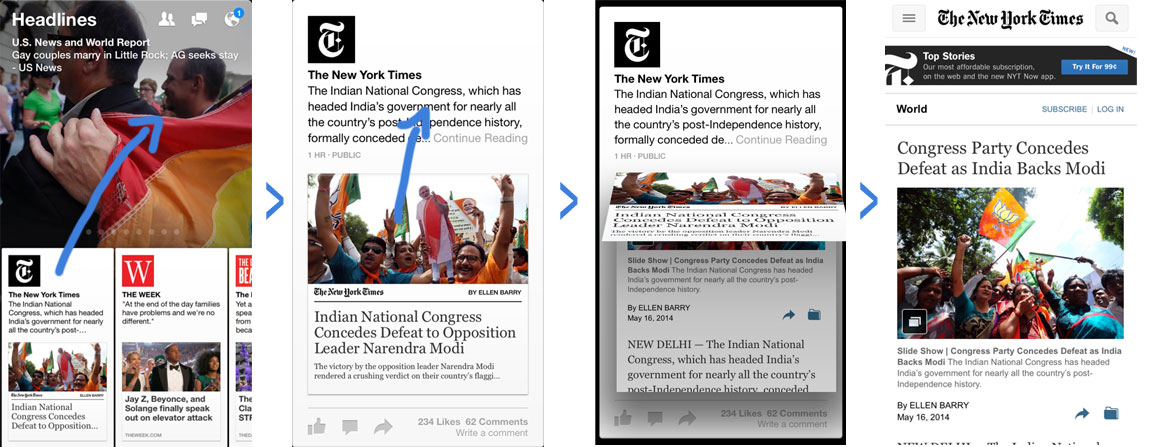
Gestures and actions. In addition to clicks, how do users navigate through your app? If you utilize gestures, there are many ways that gestures can be implemented that are worthwhile testing. I’ll illustrate with an example.
Facebook’s Paper app is a great example of strategic use of swiping to navigate. The app allows you to navigate through articles as if you are were opening and closing a newspaper. Swiping up opens a card and swiping down closes it.

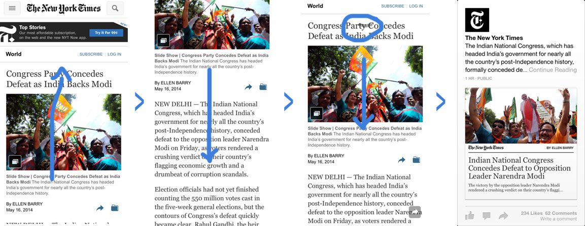
This is great. Except that the first time I downloaded the app, every down swipe closed the article I was reading. This meant that every time I wanted to back up and reread the top of an article, I would inadvertently close the page. Very frustrating. Through their rigorous testing strategies, they have found that many users found this behavior confusing. Now, when you swipe down, the article scrolls and an arrow pops up giving you the option to swipe to close instead of closing for you.

I also think this app did a great job with sloppy gestures because you can be very inaccurate with your swipes and the app still does what it should. My up and down swipes naturally form an arch since I’m holding my phone and navigating with my right hand only. The app’s algorithms are well designed so that I don’t have to repeated swipe to get the angle just right.
- Customization and Suggestion Algorithms
This might not be applicable to all apps, but there is a lot of room in ecommerce, retail, social media and utility apps in particular to test user customization. Any place in your app where a feed or list of items is suggested to the user, consider A/B testing different algorithms for that suggestion. New items in an ecommerce app could be suggested to the user based on previous purchases, views, gender, age, location, etc. Suggested content in a social sharing app could be sorted based on previous user behavior or overall popularity of the content.
The co-founder of SocialCam, a social video app, named feed suggestion algorithms as one of the most important things he’s tested in his app. After testing many algorithms, he found that showing users the most popular videos with an indication of how many views that item received maximized the number of videos viewed per user.
- Alerts and Notifications
Alerts, notifications, and badges are a great way to both re-engage users in between opens of your app and to create awareness around new or not-yet-used features to create deeper engagement.
Think about testing:
Messages and copy. How a prompt is worded is really important for spurring action.
Timing. Test when alerts and notifications appear. This can mean sending notifcations to a users after 12, 24, 36, etc. hours of inactivity or it can also mean showing a users an alert after they’ve taken a certain action or something has happened within the app.
Conclusion
The most important thing about testing to increase user engagement is to make sure you track the right metrics to ensure that your app is actually improving. In addition to my earlier post on which metrics to track, also read John Egan’s (Pinterest Growth Engineer and mobile growth expert) about how to track the right conversion funnels to identify where your app is actually losing users.
Thanks for
reading!
More articles you might be interested in:
How to Increase App Upgrade Revenue with A/B Testing
ChordShaker, an iOS app that makes learning guitar chords easy and fun, increased their revenue from upgrades by 20.1% with an A/B test of a simple copy change. With Apptimize, this change took only a few minutes to set up...
Read More7 Things to A/B Test in Your Mobile App
We hear from customers that planning out your second, third, and fourth A/B tests is one of the hardest things to. Many app managers have a first test in mind when they start experimenting and planning out a series of...
Read MoreInfographic: 7 Things to A/B Test in a Travel App
Our third infographic in the “7 Things to A/B Test” series! Click on the image below to see the full infographic.
Read More