3 Ways to Earn More Upgrade Revenue from Your App
Rather than monetizing off of ads or asking users to pay for an app sight unseen, many apps provide a premium version that requires an upgrade fee. This is a proven way to monetize your app. But once you’ve dedicated yourself to this method, it’s really important to constantly test to increase the amount of revenue you earn through upgrades.
Here are 3 main ways to prompt users to upgrade and ideas on how to encourage more users to upgrade:
1. Ad Removal
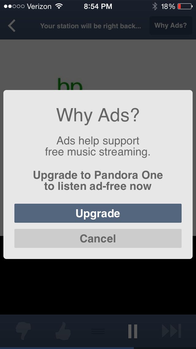
Freemium services such as Pandora, Stitcher, and many games offer ad-free versions of their free service/product. Each app uses a different mechanism for letting users know that upgrading to an ad-free version is an option. Here’s how Pandora does it:

Ads are inserted into the stream of music. During an ad, if you turn on your phone screen, you’ll the graphic for the ad as a well as a button in the top right-hand corner that reads, “Why Ads?” Clicking on the button opens the pop-up that see above. This alerts users to the option of upgrading as they are thinking about ways to get rid of those ads.
Alerting users at the right time with the right message regarding ads is a challenge that will have a different solution for every app. Some ideas:
- Test the messaging copy. Should you take an education approach like Pandora did or a harder sell?
- Test the timing of the message. Should the pop-up only open after the user clicks a button regarding ads or should the upgrade prompt just pop up? If so, when and how often?
- Or perhaps you get the most conversion if the prompt is ad itself.
2. Upgrade for Features
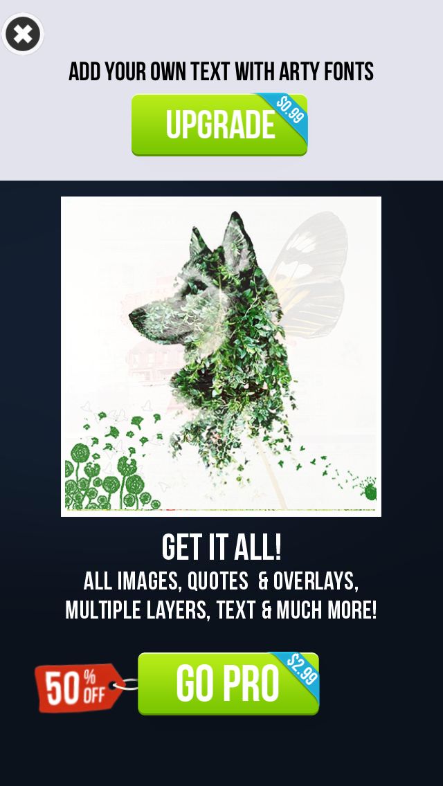
Many apps will have certain features that are premium only. Instant Blend is an iOS app that blends your pictures instantly. Users take two pictures and combine them into cool graphic designs (or hilarious monstrosities, in my case). There are some photo filters, text fonts, and other features that do not come with the free app. When I try to select one of those features, I see this pop-up:

Unlike some apps, Instant Blend does not tell me which features are premium before I click on them. This is something every app should test. Is engagement hurt (i.e. are users annoyed) when you don’t tell them which features are premium before they click on the feature? Or does it increase conversions because more users will click on those features while they are exploring?
It’s also important to test which features are free and how many features are free. Users need to get enough of a taste of the functionality of the app, but high value features should be reserved to drive revenue.
3. Unspoken Trial
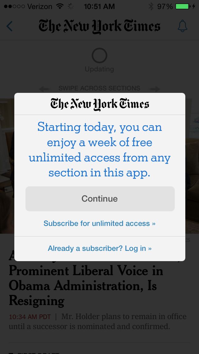
Many free apps are actually a limited trial of the app. For example, the New York Times app lets users know upon the first open that you can only use their app for a week:

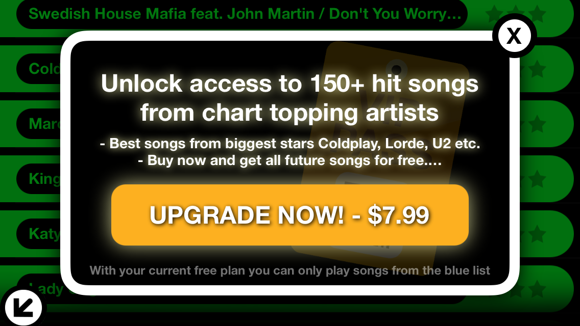
Alternatively, some apps let users experience the app before prompting them to upgrade. ChordShaker is app that teaches users guitar chords through popular songs. The first few introductory songs are free, but the user quickly gets to the more advanced songs at which point ChordShaker prompts you to upgrade in order move on.

ChordShaker A/B tested the messaging on this pop-up and increased total upgrades by 20.1% with Apptimize:

Read the full case study here.
TL;DR
Regardless of what is provided to your users in the premium version of your app, there is always room to optimize through experimenting with:
- Message copy
- Message behavior (do users click a button or does the message just pop-up sometimes?)
- Timing (when and how often do you ask users to upgrade?)
- User triggers (do certain actions by the user prompt upgrade messaging?)
Thanks for
reading!
More articles you might be interested in:
How to Increase App Upgrade Revenue with A/B Testing
ChordShaker, an iOS app that makes learning guitar chords easy and fun, increased their revenue from upgrades by 20.1% with an A/B test of a simple copy change. With Apptimize, this change took only a few minutes to set up...
Read MoreWebinar: Easy Optimizations Every App Should Make
In our inaugural webinar, AbdulAziz and I walk through the ABC’s of A/B testing: A is for Arrangement B is for Buttons C is for Copy Check out the webinar to see how to leverage these ABC’s in your app....
Read More5 Easy Ways to Improve Your App with A/B Testing
Here are 5 ideas for relatively easy to implement tests to visual aspects of your app. You most likely won’t need to rework user flows or do a lot of complex coding. These are layout and design changes that can...
Read More