Conversion Funnels: What’s Really Going On In Your A/B Test
The simplest case of A/B testing is creating two versions of something and seeing which version is better based on one simple metric. Most tests, though, are not so simple. For most tests, the definition of “better” can be somewhat complex. Is a red button better because it got more clicks or because it created more items sold? One of the biggest mistakes we’ve seen in A/B testing so far is that many testers are not looking at the entire conversion funnel when they create a test. This can result in misleading results.
Here are two simple examples of A/B tests that could have resulted in bad decisions being made had the full conversion funnel not been investigated.
1. Tracking the last step in the funnel
A common A/B test is one to improve the registration page of an app. When should registration be prompted? What types of registration options should be offered? Should registration be mandatory? It’s tempting to create the A/B test and then only measure the impact of the test on registration rates. In actuality, it’s crucial to also watch how a change at the start the funnel affects the very end of the funnel.
Below is an example where an app decided to test if a skip button should be included on the registration page.

In the first run of the test, they discovered that the registration rate increased when the skip button was removed. At first they were happy about this, until they realized of course registration rates will increase if you don’t let people skip it. Bounce rates also increased. Whenever you reduce the option set for users from 3 to 2, the remaining options will get more clicks. This doesn’t tell you if the new version is a success or not.
This app ended up re-running the test but this time tracking further down the funnel to look at their purchase funnel. This includes items viewed, items added to cart, and items purchased. They found that while removing the skip button increased bounce rates, the increase in registration rates provided enough more engaged users, that items purchased increased significantly. So the test in the end was a success.
2. Conversion Rates
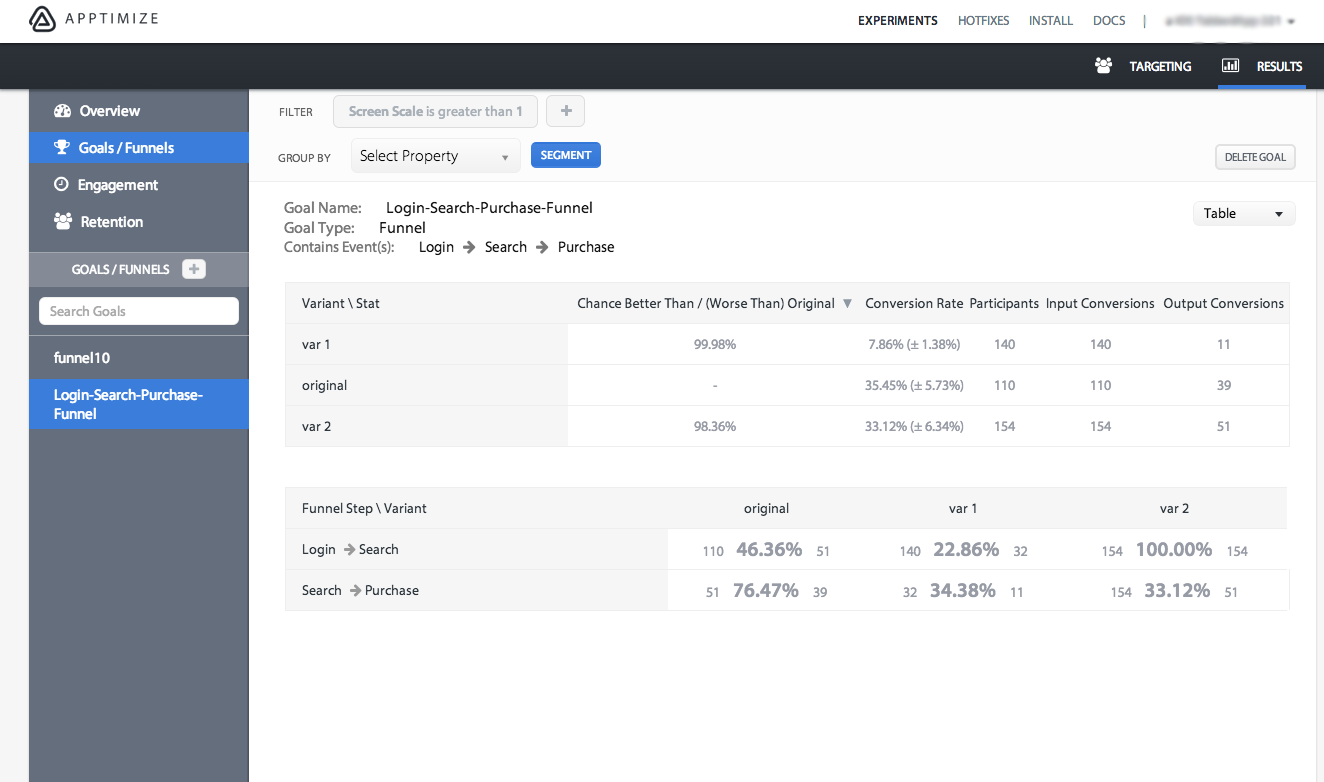
In a another test, an app created a change to the messaging copy on their login screen and wanted to see the impact of the messaging change on the subsequent action. Through various analytics techniques and discussions with customers, they hypothesized that the reason purchases were low was because users were not aware that they could search for an item they wanted. The team felt that purchases could be dramatically helped if they got more users to search for an item after logging in.
The goal is to increase the final number of purchases, the team specifically wanted to see if the copy change would affect the conversion rate of login to search.
The team created two variants to test in addition to the original app, each with a slightly different message after the user finished logging in. The results showed that variant 2 created the most purchases.
However, the deeper story can be seen using Apptimize funnels.

It turned out that both new variants dramatically decreased the percentage of searches that resulted in purchases, but variant 2 so dramatically increased the conversion rate of logged in users who performed a search that the total number of purchases was still higher for variant 2. This showed the team that now they can try other ideas to increase the conversion rate from search to purchase.
Read more about how to set up your funnels here.
Thanks for
reading!
More articles you might be interested in:
Apptimize Webinars to Help You Plan Your Next A/B Test
Whether you’re just getting started with mobile A/B testing or you’ve been testing since before it was cool, knowing what to test next is sometimes a challenge. That’s why we’ve set up two webinars to give you some ideas based...
Read MoreGet Started with Mobile A/B Testing using ONE Easy Test
I talk to a lot of app developers and product managers on a regular basis about A/B testing their mobile app. The feedback I hear the most is: “I know I need to start A/B testing, but we just haven’t...
Read MoreThe Key to Mobile Growth Hacking: Conversion Funnels
When it comes to growth metrics, one of the most important things is finding metrics that are insightful enough that you can figure out exactly what you need to do to grow your user-base. Conversion funnels exemplify actionable metrics by...
Read More