Do We Really Need App Logins?
86% of users are bothered by having to create new accounts on websites (Web Hosting Buzz). Is your onboarding process causing unnecessary bounces?
Sign ins were first used in the mid 1960s at MITs time-sharing computer named CTSS to segregate private sets of files for the multiple users. Since then, computing has changed quite a bit, but sign ins are prevalent in almost every application.
Just a few years ago, it seemed almost standard that apps would prompt you to login or register within the first 30 seconds. I can’t tell you how many times I’ve uninstalled an app failing to promise or deliver enough value before asking me to hand over my personal information. As the app ecosystem becomes more saturated and more competitive, optimizing logins to best suit your needs is incredibly vital to pull more traffic through your funnel.
Unfortunately, for all their benefits, logins can be taxing on your users, causing them frustration with increased steps and friction to getting what they want, as well as giving decision fatigue. If your app doesn’t need to ask for immediate logins, it may benefit from allowing users to skip the process in some manner. Let’s take a look at the three different methods that apps are using to meet their goals.
Immediate Logins
Facebook, Instagram, Mint
It isn’t uncommon for users to be required to enter personal data within seconds of opening a new app. This practice is especially common among top apps in the Apple and Android marketplaces. Apps that do so usually have a specific need or reason to do so, ranging from driving core functions to increased security, or allowing for social features.
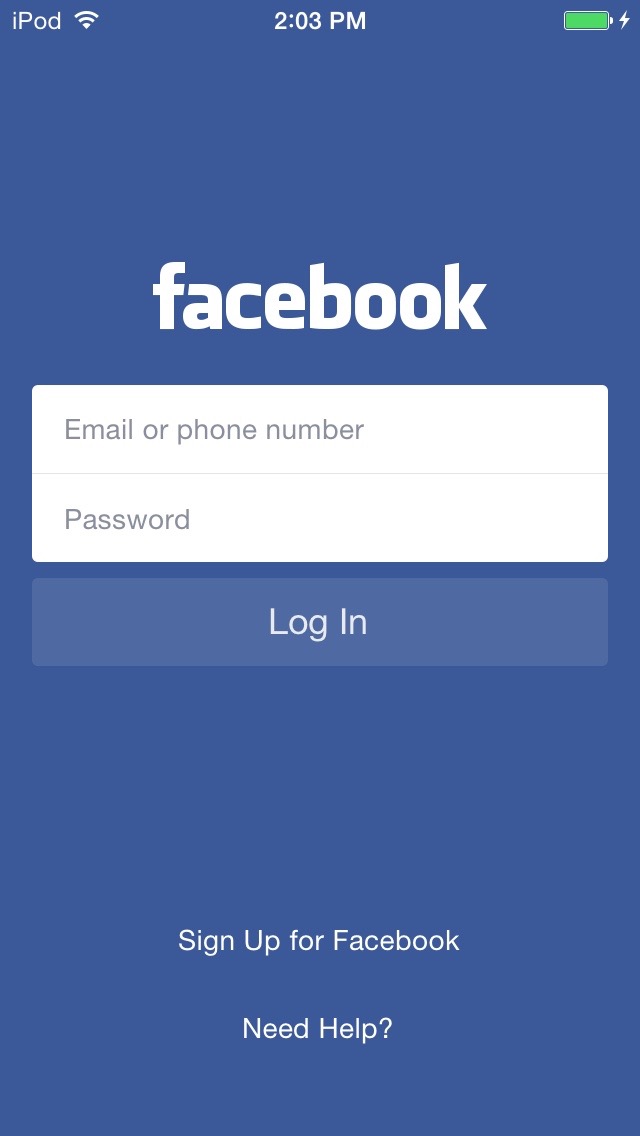
Facebook is one such example of an app that requires immediate logins. The first thing the app prompts you to do upon open is create an account or sign in. Since it is a social network that connects a user with their real-life networks, using personal data is vital to connect users to their friends and family. Without it, there is a significant decrease in functionality and value. In their case, asking upfront is crucial.
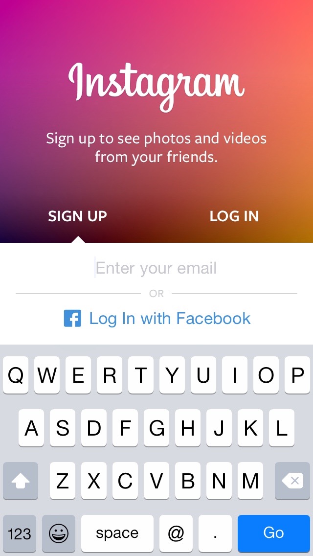
Instagram uses logins for a slightly different reason. Instead of only focusing on social connections, Instagram also provides value by focusing on allowing users to follow individuals who generate interesting content. The app makes (or plans to make) money through advertising. By linking their personal data with their parent company, Facebook, they’re able to stitch together more information about a user to serve more effective and highly targeted advertisements.
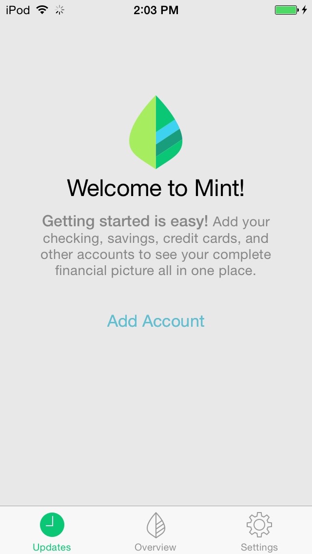
Mint uses logins for security reasons. Since personal finance information is sensitive, having immediate logins makes sense, especially since Mint soon after asks you to link your bank account information. Forcing users to log in makes sense as it helps ensure users that their data will be well protected.
One thing you might notice is that most of the apps that ask for this data have a specific need to do so. Facebook would function poorly without it, Instagram needs information to advertise effectively, and Mint needs to provide a sense of security for its users. Most of the apps that ask for immediate logins are also well known already, so users have a rough idea of what value they’ll get by signing up.
Temporarily Skip Login:
DuoLingo, Chipotle
If you’ve read Apple’s User Experience Guidelines, you know that they recommend letting users temporarily skip logins. Delaying the process allows users to try out new apps and determine what value they’ll receive, before having to give away personal information. Many apps have tested this for themselves and discovered that allowing users to skip the login process was highly beneficial.
This method has become popular because skipping decreases extra friction and decision fatigue for users. When allowed to skip, users don’t have to tediously input their information before getting to use the app they downloaded. They also won’t have to fret as much about if they should log in, or which login they should use. Users can simply press skip and be on their way.
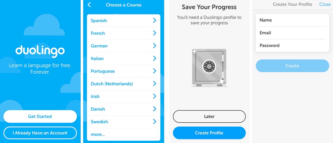
Duolingo has a great model for taking advantage of this process. To get started, all users have to do is select what language they want to learn. One that is selected, they set a goal, then start practicing. Once users complete the lesson, they are prompted to create a profile in order to save their progress. This flow encourages users to get started immediately, but also requires them to sign-up in order to continue to use it, else lose their data.
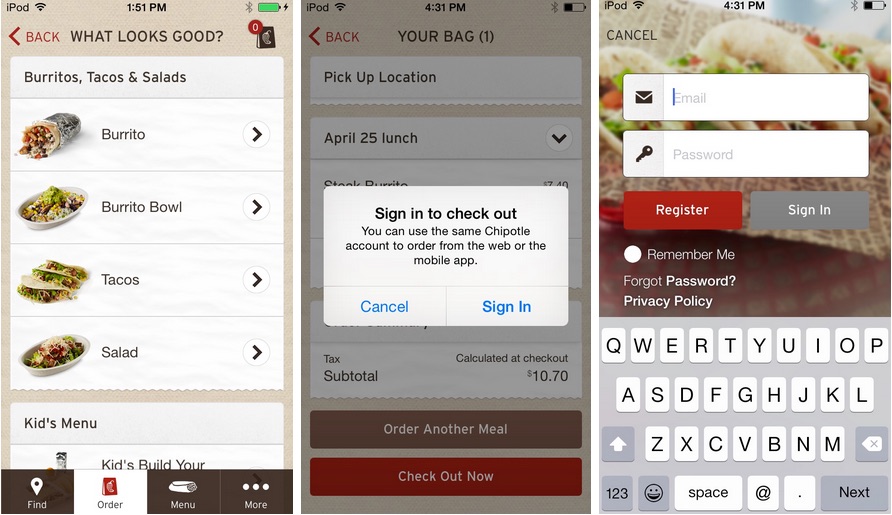
Chipotle allows users to customize and order their food before creating an account. After finding a location and specifying food and drink orders, they prompt users to create an account before purchase. This takes advantage of users being hungry and seeing pictures and creating their lunch before prompting them to do a task they likely aren’t excited about: creating an account.
These apps place the registration at the last possible moment so that users are already invested and can see the value in the app, before ever asking them to give up valuable information. This technique is beneficial for many apps that don’t have the popularity of large apps like Instagram and Facebook.
Apps that work without logins:
Dollarbird, HotelTonight, Target, IMDb
Delaying logins allows users to see what value they could get out of the app. Before providing that actual value such as booking a rental, ordering a burrito, or saving your progress, these apps prompt your for personal information. While this is a clever way to entice users, it’s also possible to get even more value by doing away with mandatory sign-ins.
Say for instance, I wanted to buy a Chipotle burrito. At that crucial last step, I’m prompted for my email and a password. Hold on…I’m just trying to buy a burrito. They don’t ask me for this stuff when I’m in the actual store. Why would I want to give it now? While more effective than asking for information up front, any registration still causes users to get turned off and leave.
If decreasing the friction by postponing signups improves KPIs, making registration optional can increase them further. Since registration is quite often a source of user annoyance, cutting the funnel down even further can be quite beneficial. Dollarbird, HotelTonight, and Target all do this very effectively.
These apps make registration optional by providing the core value without a need for giving up registration information, but providing additional incentives for signing up. Let’s take a look at how they do it.
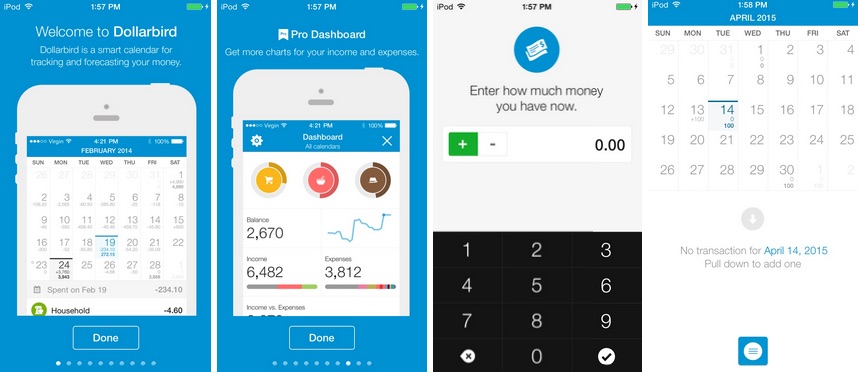
Dollarbird is a personal finance app that helps users track their daily spending over time. After installation, users view an onboarding tutorial and jump right in to start using it. If users wish to use premium features, they can do so by signing up for an account. I’ve been using it for over 2 years now, and haven’t ever had to input my email or create an account. The app is great because I get awesome functionality from it, and haven’t needed to give up anything in return.
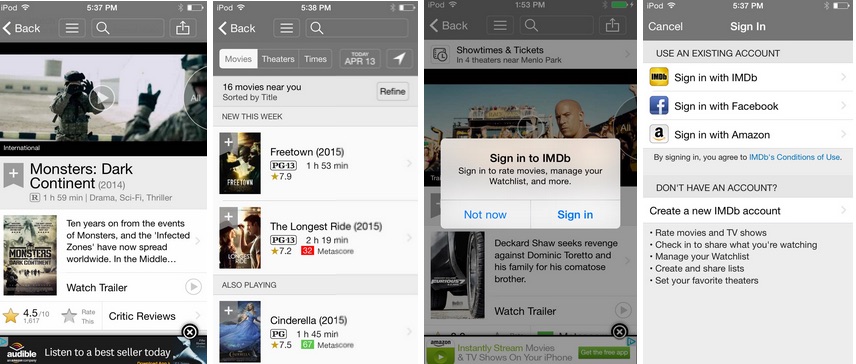
IMDb is also a great example of an app that provides its core value, but has users sign up to get additional features. Users can get the core value out of the app without signing up. They can look at movie info, watch trailers, and see movie times in their area all without trading any information. If users want to take advantage of the social features such as bookmarking a movie or writing a review, they would need to create an account. Otherwise, they can use it to their hearts delight without ever having to log in.
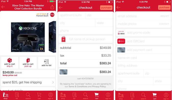
Target and HotelTonight also don’t force users to log in. Instead, they focus on allowing the users get value by quickly being able to purchase their goods without fussing with registration. Users simply enter the appropriate payment information and they’re done. If they would like to make repeated purchases, having an account makes the process even faster. To read more about HotelTonight click here.
Cutting down the funnel by making logins optional can be incredibly beneficial by providing tons of value upfront, and showing the users that your goal is to serve them. Doing so creates trust and a mutually beneficial relationship.
Conclusion
It’s important to note that some apps’ goals may conflict with the last model. Apps like Facebook or Tinder would have a hard time demonstrating value in this method. However, if it does work, devs should definitely test to see if it improves their KPIs. With the app space as competitive as it is these days, developers need to think about how to differentiate themselves and gain an edge over the competition.
To see how HotelTonight tested logins to increase bookings by 15%, read more here.
Thanks for
reading!
More articles you might be interested in:
Leverage User Onboarding to Create Personalized In-App Experiences
An endless content repository is a double-edged sword. If users can’t find what they are looking for or discover content they are interested in, they are almost guaranteed to abandon your app. Many apps aim to improve user retention by helping...
Read MoreHow to Optimize App User Flows Without Re-deploying to the App/Play Store
You might have thought that real-time changes to flow and features were not possible. After all, code changes are almost always required to make substantial changes to your onboarding tutorial or turning different features on/off. You can actually continuously optimize...
Read MoreHow Will Amazon Fire Affect Your App’s Users?
Amazon’s unveiling of their new phone has set the tech news world aflame today (yes, bad pun intended). While this is exciting news, app owners must wonder how this phone is going to affect users’ experience in every other retail...
Read More