Best Practices for Refining Mobile Onboarding Flows

By now, you know that onboarding is the most important element of mobile growth.
You know that it improves the ROI of any acquisition spend…and that it’s the most significant difference between the top 5000 apps and your average
mobile app.
But what are the key components of onboarding? If we don’t know that, we’re simply copying techniques seen in other apps or blogs.
What we want to do instead is understand the key components of the process, and use that to build our own unique onboarding flows that blow away users.
In this post, we’re going to lay the groundwork for building an amazing onboarding flow that engages users and sets them up for success. Let’s get started.
Focus on the 3 Key Elements of Onboarding
Stanford Psychologist BJ Fogg explains in his Behavioral Model that there are 3 elements that must be present for an action to occur: Motivation, Ability,
and a Trigger. Similarly, activating new users requires all three of these elements to be present in onboarding.
#1 – Convey the Value of your App

Users must have sufficient motivation to invest time into your app if they are to continue using it. This means that you have to convince users that you’re
going to actually add value in their lives. While the set-up happens pre-download with app descriptions, screenshots, and a clear message, onboarding is
where you have to deliver on those expectations.
This can be done in a number of ways including:
- Driving users to the Aha! moment
- Demonstrating functionality
- Walking users through use cases
- Leveraging social trust
- Shortening the time from install to value
- Clarifying your copy

In the above example, Inbox demonstrates new value adds to the users: being able to swipe right or left to clean out their inbox quickly and enjoy the
peace of mind that comes from inbox zero.
#2 – Increase Users’ In-App Abilities
Great onboarding also needs to increase the ability of users to complete their desired tasks. On mobile devices, there are many additional constraints
unique to the platform including limited connectivity, small screen real estate, and clunky controls. For onboarding to effectively activate users, it has
to overcome these limitations to provide a smooth experience that allows users to reach their goals.
From their first open to the first chance they’re given to explore, user onboarding should be a smooth, guided process to help users find exactly what
they’re looking for. Developers can help improve this experience by:
- Simplifying information architecture
- Creating easy to understand UIs
- Eliminating unnecessary friction
- Guiding users to the next important action(s)

Due to the fact that mobile users are more easily disengaged than web users, your user experience has to be much more refined than an equivalent for web.
#3 – Set Up Triggers for Future Engagement

The last goal of onboarding should be to set up triggers to re-engage users once they’ve left your app. Let’s face it. Mobile users are much more prone to
dropping off because devices are often used in non-work settings, whereas laptops and other devices are more commonly used in coffee shops, homes, and offices.

Even if they intend to return later, users often forget and never come back, deleting the app after weeks without use. Once users drop off, you need to
have a strategy for bringing them back into your app. That’s why creating triggers to re-engage them are critical.
Triggers for re-engagement don’t always have to be external triggers such as push notifications or emails. They can also be internal triggers such as
product hooks, habits, or anticipation of a reward, which have been shown to be far more effective.
You should have 3 goals for onboarding: to demonstrate value, to increase user ability, and to set up triggers.
Treat Mobile vs Web Like It Is: A Difference of Degree
Lots of pundits go on about the huge differences between mobile and web, or the advantages of mobile first or mobile web etc. etc.. The difference between
web and mobile products is much more simple than that: it’s one of degree. Mobile apps simply have more constraints than their web counterparts.
Think of the various limitations on mobile:
- Small screen sizes
- Clunky controls
- Limited or slow web connectivity
- Often used in environments full of distractions
- No contextual data passed through an app install
- Device switching
Like any obstacle, these constraints either make your app better or reveal its deficiencies. Because of these
constraints, users are far less tolerant towards a poor user experience on mobile than they are on web. This means teams have to polish their products even
more intensely, experimenting with different strategies to hone in on an optimal user experience.
Ideally the web experience can be held to the same high regard, but it seems like there’s a little more room for error.
-Samuel Hulick, User Onboarding
Make Sure You’re Testing “Best Practices”
“You can’t just go in and say ‘hey, this worked somewhere else. It must work here.’ Every situation, every product, every user base,every app is different and what works for us does not always necessarily work for you.”
– Sergei Sorokin, Yahoo Growth
The techniques and framework we go through in this blog are not “one size fits all” and don’t apply to every app, business, or industry. Depending on your
team’s goals and KPIs, each technique may have varying effects upon user behavior.
That’s why we stress the importance of testing on your app’s users. It allows you to evaluate how a particular change will impact user behavior, and
whether that alights with the overarching goals.
What you’ll find through testing is that best practices aren’t really best practices at all. What works for other apps may prove detrimental to the user
behaviors you desire. Instead, take the best practices you’ve learned from other apps and test on your own app.
Each test gives you deeper customer insights through the analytics. Even though some tests and incremental gains may feel like failures, they’re actually
giving you valuable feedback as to what doesn’t work with your customers and why.
“I’m highly mistrustful of ‘experts’ who don’t practice iterative, empirical design. Also, a lot of so-called ‘best practices’ could simply be a bad fit for any given business’ market/product, so I find it’s always best to take a ‘hypothesize, try, and find out’ approach.”
– Samuel Hulick, User Onboarding
Craft an Iterative Improvement Strategy That Compounds Gains
Take an iterative approach, rather than trying to overhaul your entire app in one go. Making all the changes at once, while tempting, actually fails to
leverage all the learnings from successive small experiments.
Yes, taking an iterative approach at times may feel painfully slow, but it’s actually one of the most effective ways to grow quickly, as we’ve seen with the team at Yahoo! Growth.
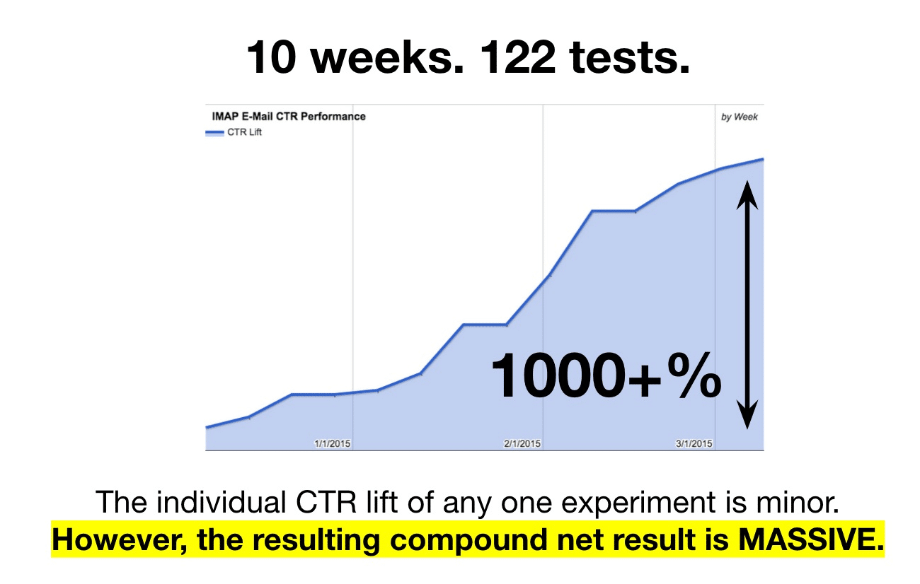
Small iterative improvements may make minor differences alone, but their compounding effect is massive. In
addition testing onboarding at the top of the funnel gives you the highest volume segment and most impactful effects that will affect all new users coming
into your app.
Best Practices for Onboarding
When it comes to onboarding, you want to make sure you have the 3 basic elements in place that convey value, increase user ability, and set up triggers for
future engagement. These will ensure that you’re achieving the right goals for the first time user experience. Treat mobile like it is: a web experience
with further constraints.
You need to refine the user experience and make it easier to use and more value packed than its web equivalent. Lastly, make sure you create a strong,
iterative testing strategy to ensure you’re making compound gains and maximizing your effectiveness.
Thanks for
reading!
More articles you might be interested in:
The 4 Best Mobile User Onboarding Flows We’ve Seen So Far
We look at a lot of apps on a daily basis here at Apptimize. Some are good, some are bad, and the average is not too pretty. Still, we come across quite a few gems; teams that have put an...
Read More7 Reasons Why Mobile Onboarding Is Your App’s 80/20
The Pareto Principle. It says that 80% of the effects come from 20% of the causes. Simple right? If you’re playing tennis, that 20% is probably footwork to make sure you’re in the perfect position to make a shot. When...
Read MorePersonalizing Mobile User Onboarding
Feel like going to the Giants game at the last minute? Gametime is an app that let’s do just that and buy last minute tickets with just two taps on your phone. It avoids the hassle of printing or picking...
Read More