Why Fixing Week One Retention Will Save Your Mobile App

The average app hemorrhages 77% of daily active users within three days after they download it. By 30 days, this figure skyrockets to 90%.
While this paints a bleak picture for mobile product managers, there’s more to the story.
The top 5,000 apps in Google’s Play store have vastly different retention numbers—but past Day One they decline at a similar rate. The main difference between the top 10 apps and the top 5,000 all occur within the first couple of days users experience the app.
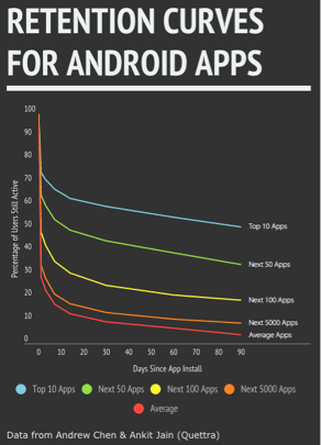
The top 10 apps have a 90-day retention of 50.87%, while the top 5,000 apps have a 90-day retention of 8.99%. But if you can increase Week One retention by 20%, you shift the entire curve up 20%.
Better Week One retention leads to:
- Higher engagement
- Higher retention
- Better user experience.
Getting your Week One retention up is the difference between long-term retention and getting your app tossed into the discard pile. To do so, requires that you drive you users toward their Aha! Moments.
1. Find Your Aha Moment
Your app’s aha moment is the moment that users realize the app’s core value and exclaim, “Aha!” But while you may think you know exactly what your aha moment is, it’s often only obvious in retrospect.
Facebook’s famous “7 friends in 10 days” metric, for example, was only something that they discovered 45 million users in. Making 7 friends after 10 days separated users who engaged with Facebook and stuck around from users who churned.
In order to drive Week One retention, you need to work backwards from the data you have and identify what your app’s aha moment is.
Create a baseline for user retention
Use data to determine which actions led to increased retention
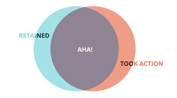
The aha moment is the intersection between users who stick around for a longer term, and users who take specific actions in-app. This allows you to isolate what’s working and reverse engineer it.
DIGGING INTO USER BEHAVIOR
Imagine that you have a music-streaming mobile app. You know that users love playing music on the app and they enjoy the social aspect of the app. Either of these actions might lead to your aha moment and long-term retention:
- Playing more than 3 songs
- Joining at least one community
To start, plot out these actions on the retention curve with an event-tracking platform like Amplitude:
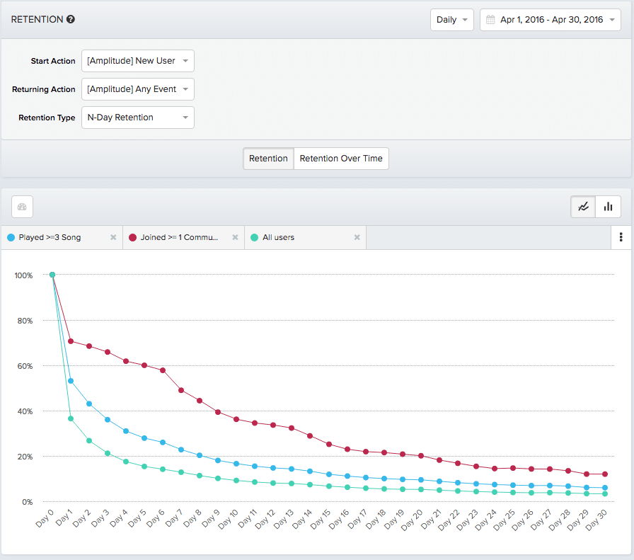
In the above graph you see that while users who play more than three songs have a higher-than-average Week One retention rate. But by Day 30 there’s barely any difference between this cohort and the average.
Taking a look at the cohort of users that joined at least one community, you see a more promising retention curve. By Day 23, it appears to flatten out at a higher retention rate. Joining a community is a starting point for digging deeper and establishing a causal connection between the action and long-term retention.
2. Drive Aha Moments during User Onboarding
Once you’ve identified your aha moment, you’ll want to direct users toward it. While this is true for any app, it’s especially the case on mobile. Your users aren’t sitting behind a desktop screen—they’re walking on the street, or waiting for the subway. The chances of them dropping off very quickly is incredibly high.
If you don’t quickly convey value to your users, they’ll get distracted and disappear forever.
That’s why getting users to the Aha! moment is foundational to your user onboarding process. User onboarding is the first thing users see when they enter your app, and it orients their entire experience. If you can take users to your aha moment immediately during user onboarding, you maximize the chance that they’ll actually come back.
Ultimately, your aha moment is unique to your product. That’s why you need to iterate and refine your onboarding flow, instead of copying what somewhat else does.
The most successful apps find an onboarding flow that’s unique to them:
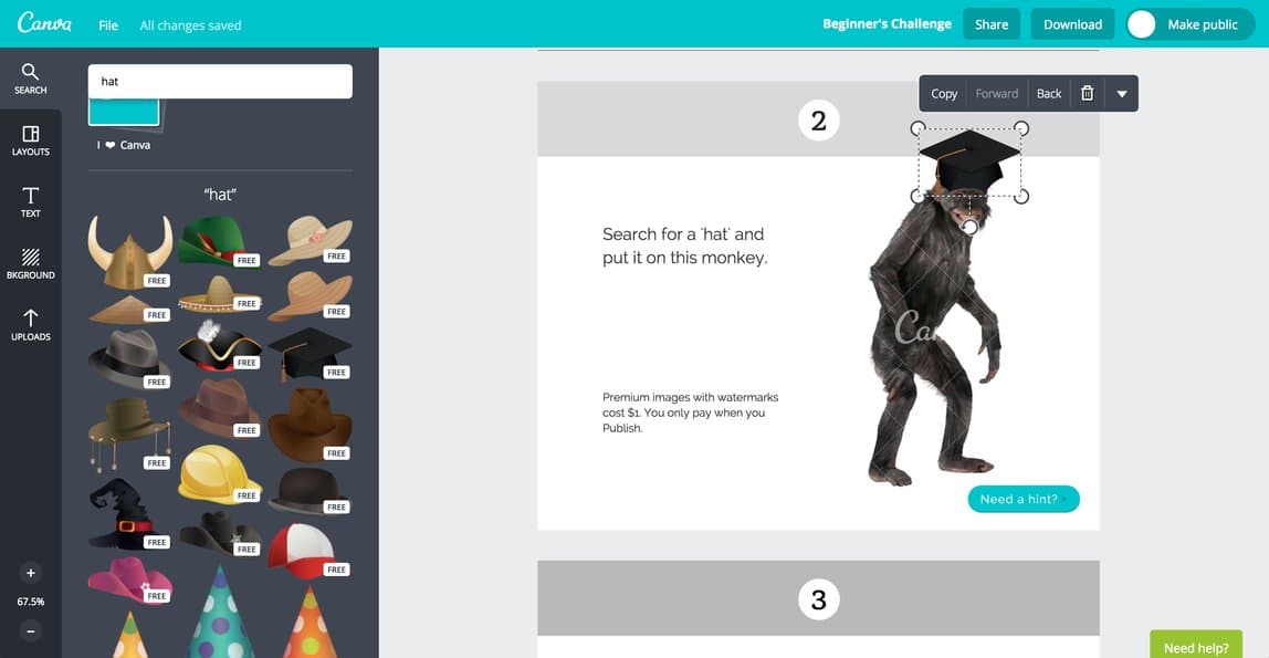
- “Show don’t tell.” The Ikea Effect is a psychological principle that states that we value things more when we put effort into making them. Canva, the design app, puts this into practice by getting users to create a design during user onboarding.
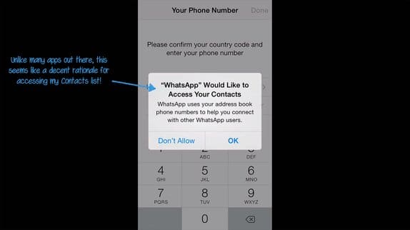
- Don’t ask users for more than absolutely necessary. 60% of users now opt out of push notifications. Asking users to enable push notifications, microphone access, and geolocation data all at once comes off as creepy. Get users to enable permissions only when your app needs it to deliver on value.
(source: Samuel Hulick)
- Test the steps in your onboarding flow. Try split-testing account creation, tutorials vs. tooltips, and the copy of your onboarding flow—you’ll typically be surprised by the results. A survey found that 46% of Netflix users, for example,wanted to be able to browse movie options in-app before signing up for the service. But by A/B testing their sign-up flow, Netflix discovered the complete opposite to be true.

Show users the core value of your app and take them to your aha moment first. The bells and whistles, like creating an account or enabling permissions can come later.
HOPPER: TAKE THEM TO THE STICKY

Hopper, the mobile travel app, does something extremely unconventional. They don’t bother asking users to create an account and sign-up during onboarding.
Hopper’s aha moment occurs when users set a price alert for a flight. Rather than create more friction, they focus on taking users to that point as swiftly as possible.
Open the app for the first time and a simple welcome screen explains, “Hopper watches billions of flight prices a day to predict the right time to book your flight, saving up to 40%.” The next screen shows that by allowing push notifications, users can find out instantly when prices rise or fall.
60% of iOS users opt-out of push notifications. If Hopper asked for push notifications and users to create an account, a lot of Week One users would probably drop off after the second screen. Instead, Hopper focuses on getting users to track that first flight. It’s a simple hook that keeps users coming back.
Another important thing to note is that Hopper actually designed their push notifications to encourage users not to open the app. Instead, push notifications are designed to be an extension of the product, not a gimmicky way to boost engagement numbers.
3. Reinforce Aha Moments Through Week One
Once you’ve gotten users to the aha moment, you need to reinforce it without seeming pushy or aggressive. After onboarding, you need to continue to guide users through Week One retention.
User behavior expert Nir Eyal outlines two types of triggers that reinforce habits and build them over time:
- External Triggers: Push notifications, lifecycle emails, and even a billboard advertisement all count as external triggers. They remind users to take action externally.
- Internal Triggers: Internal triggers come from a specific user’s motivation. They occur automatically, and are tied to emotions, habits, and behaviors.
External triggers are what remind users to take actions within your app. Internal triggers remind users why they want to take those actions. You can’t have just one or the other—you need to align both to actually get your users coming back through Day 90 and beyond.
BUSUU: PUSH NOTIFICATIONS THAT DON’T SUCK
Like Hopper, Busuu’s push notifications aren’t gimmicky. They’re an extension of the product.
“…most re-engagement push campaigns suck. And that’s an understatement, really. Most of them are just here to remind you to use the app and provide you with no other value. They are nagging, desperate calls for attention (“It’s time to do x”, “Come back?”).”
– Antoine Sahko, PM at Busuu
Instead, Sahko takes a different approach. As a language learning app, Busuu’s value is helping users learn vocabulary and sentence structure. Their push notifications are the perfect extension of that:
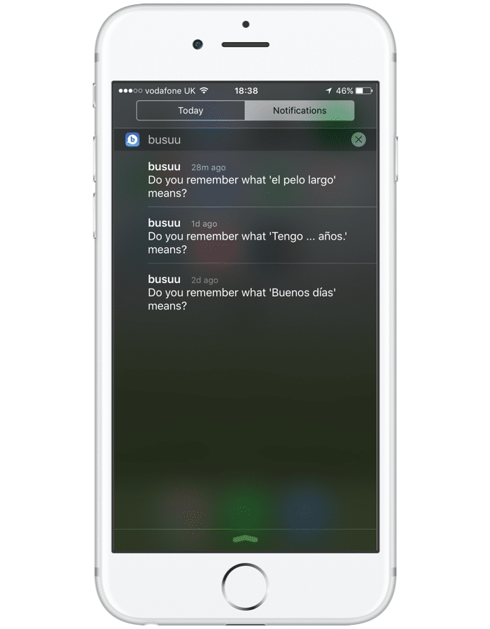
By providing flashcard-like functionality directly from their notification screen, they provide value as well as increased motivation by jumpstarting a user’s studying immediately.
And their metrics demonstrate just how much more effective they are:
- Push open rates increased by 300%
- For the same volume of push sent, revenue has increased 10x on Android and 400% on iOS
The genius of push notifications is that they bring your internal motivation into the conversation. If you’ve signed up for Busuu, you’re probably trying to learn a language.
The reminder push notifications are external triggers that remind you to use the app, but they rely on your internal desire to actually do so. Rather than futilely nagging you to keep using the app, Busuu reminds you why you downloaded it in the first place.
Test, Don’t Guess
You’ll never build the perfect onboarding flow or in-app messaging sequence the first time you try and the best practices and “how-to” guides you find online are often wrong. We assume that other people test and iterate, but most of the time they don’t. Designing your app accordingly will only make it average.
The top 10% of apps in the App Store release updates 3x more frequently than the rest. They constantly push, test, and iterate to look for small wins that will create big ones over time.
For increasing your mobile app’s retention, this all breaks down to boosting Week One retention.This is a process of creating a hypothesis for your aha moment, adjusting the Week One experience of your product to drive users to it, and measuring whether it actually worked.
Thanks for
reading!
More articles you might be interested in:
Why the Growth of Mobile Apps Makes In-App Experience Even More Important
The astonishing growth in smartphone adoption in the past few years has been matched only by the equally impressive growth of mobile apps. As of January 2017, the iOS App Store contained more than 2.2 million apps for Apple mobile...
Read MoreMastering Mobile App Growth Through Engagement and Retention Strategies
Encapsulating a new wave of innovative strategies, Growth Hacking was undoubtedly one of the leading buzzwords of 2017. By merging creative and analytical methods, product leaders and marketers have used Growth Hacking to reference methods that aid the virality of...
Read MoreWhy Mobile Growth Is Actually About App Retention: How Optimizing In-App Experience Leads To 2x Faster Growth
Trying to grow your active user base is a lot like trying to fill up a leaky bucket. The bigger the hole, the faster you have to add more water and the more time and resources you have to spend...
Read More