How to Trigger Aha! Moments Across the Customer Journey

Conventional wisdom says that once you drive users to the core action of your app—the aha! moment, when they discover the value of the app for the first time—you’re golden. Show them the value, and they’ll come back for more.
The problem is that there is a chasm between a user getting to an aha! moment once, and true engagement. To build an app that people love and return to, you need to continuously trigger aha! moments over the entire customer journey.
The Mobile Hierarchy of Engagement
(Source: Greylock)
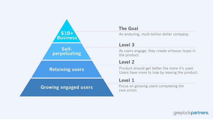
According to Sarah Tavel, a partner at Greylock, the hierarchy of engagement for the most successful consumer apps follows three levels:
- Growth: Users complete your app’s core action, and realize the value of your app. On Pinterest this would occur when you pin an image for the first time.
- Retention: The product gets better the more it’s used over time. The more friends you add on Facebook, the more people like the photos and news articles you share.
- Self-Perpetuation: Users engage and create virtuous loops in product, leading to even more usage. Retweeting a tweet on Twitter, for example, means that the tweet is shared with your followers, who can share it with their followers.
Once users have completed your core action, your focus should be entirely on Level 2 of the pyramid—retention. As you reach a critical mass of users completing your core action, you have to get them to stick around to survive.
Retention on mobile is hard. Your users have limited real-estate on their home screens, and you need to wage war for every half-inch. For consumer apps, the most important factor for retention is that the mobile app gets better the more it’s used. For Tavel, this means that an app has:
- accrued benefits:the more you use a product, the better it gets
- mounting losses: the more you use a product, the more you lose if you leave it
Let’s look at the accruing benefits and mounting losses for some of the most successful mobile apps out there, and how you can build them into your own engagement loops for your mobile app.
1. Build retention hooks into your core action
The core action of Snapchat is the ability to send a photo, drawing, or video to friends. But what separates Snapchat from the mass of other messaging apps out there is its self-destruct feature for each message you send. As UX guru Nir Eyal writes, “the self- destruct feature encourages timely responses, leading to a back-and-forth relay that keeps people hooked.”
The moment after you take a picture on Snapchat, the next screen that appears is an address book populated by recent contacts:
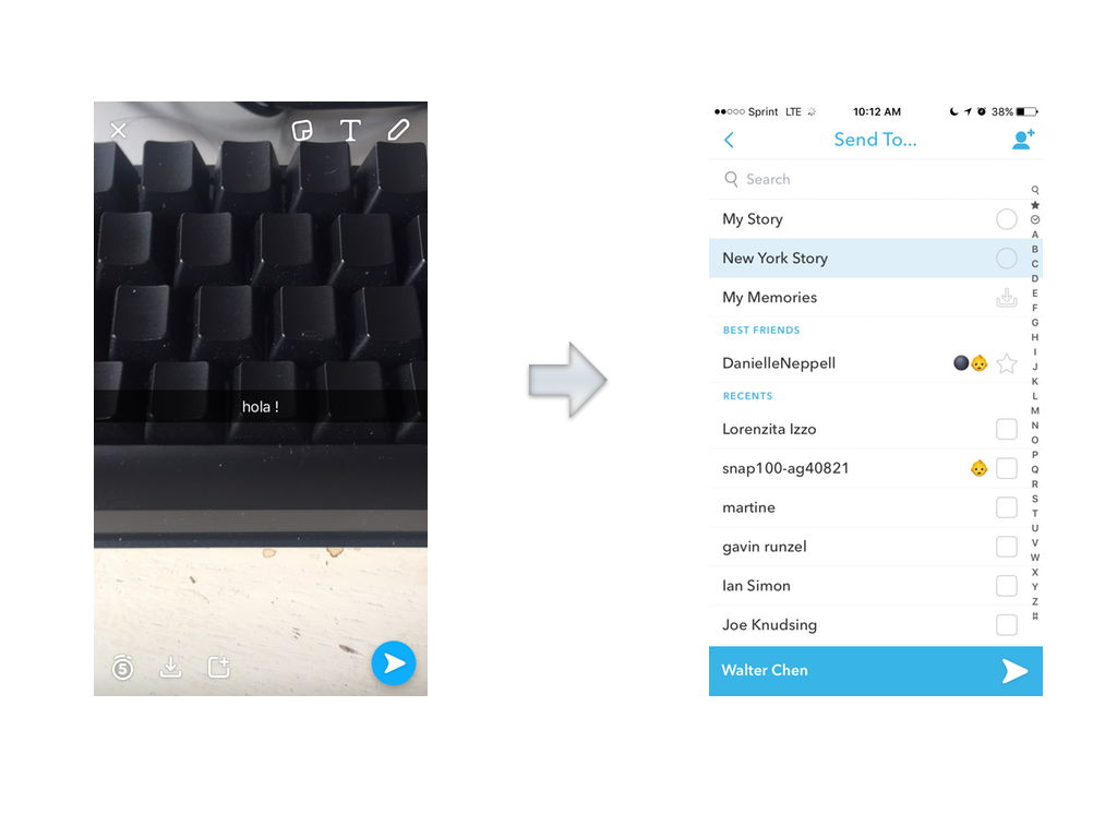
The more messages you send, the more you appear in your friends’ recent contacts, and the more messages they send back.
- accrued benefits: The more messages you send with Snapchat, the more messages you receive.
- mounting losses: Delete Snapchat, and you suddenly lose access to a world of photos, drawings, and videos that your friends send to you on a daily basis. If you download the app again three months later, you’ve missed out on a lot.
With the launch of additional features like Stories and Discover, Snapchat builds on top of its core engagement hook. Stories only last for 24 hours, so users have to return to the app or the moment passes.
2. Personalize your mobile app
What makes Netflix special is its huge catalogue of content that allows users to watch what they want, when they want it.
But as one Netflix engineer pointed out, “humans are surprisingly bad at choosing between many options, quickly getting overwhelmed….” It’s a common affliction for users saturated by apps, known as decision fatigue.

(source: Netflix Engineering Blog)
Netflix engineers discovered that the crucial aha! moment occurs when they give users something they want to watch within 60-90 seconds.
To get users more personalized content faster, they created a system of “rows” of similar content, and placed them on the landing page according to how relevant they are to the user’s interests based on an algorithm of what that user has already watched and rated.
- accrued benefit: The more you use Netflix, the more personalized your recommendations are. You spend less time choosing what to watch, and more time actually watching it.
- mounting losses: Delete Netflix, and you lose access to a highly-customized list of movies you know you’ll love.
For Netflix, these rows of personalized content are key to driving user engagement within the app—particularly on a tablet or a phone, where users are generally too impatient to read through summaries or endlessly scroll.
3. Create stored value
Every time you log in to LinkedIn, you’re constantly reminded to improve your online resume by adding the specific skills, jobs, and recommendations that you’ve picked up over the course of your professional career.
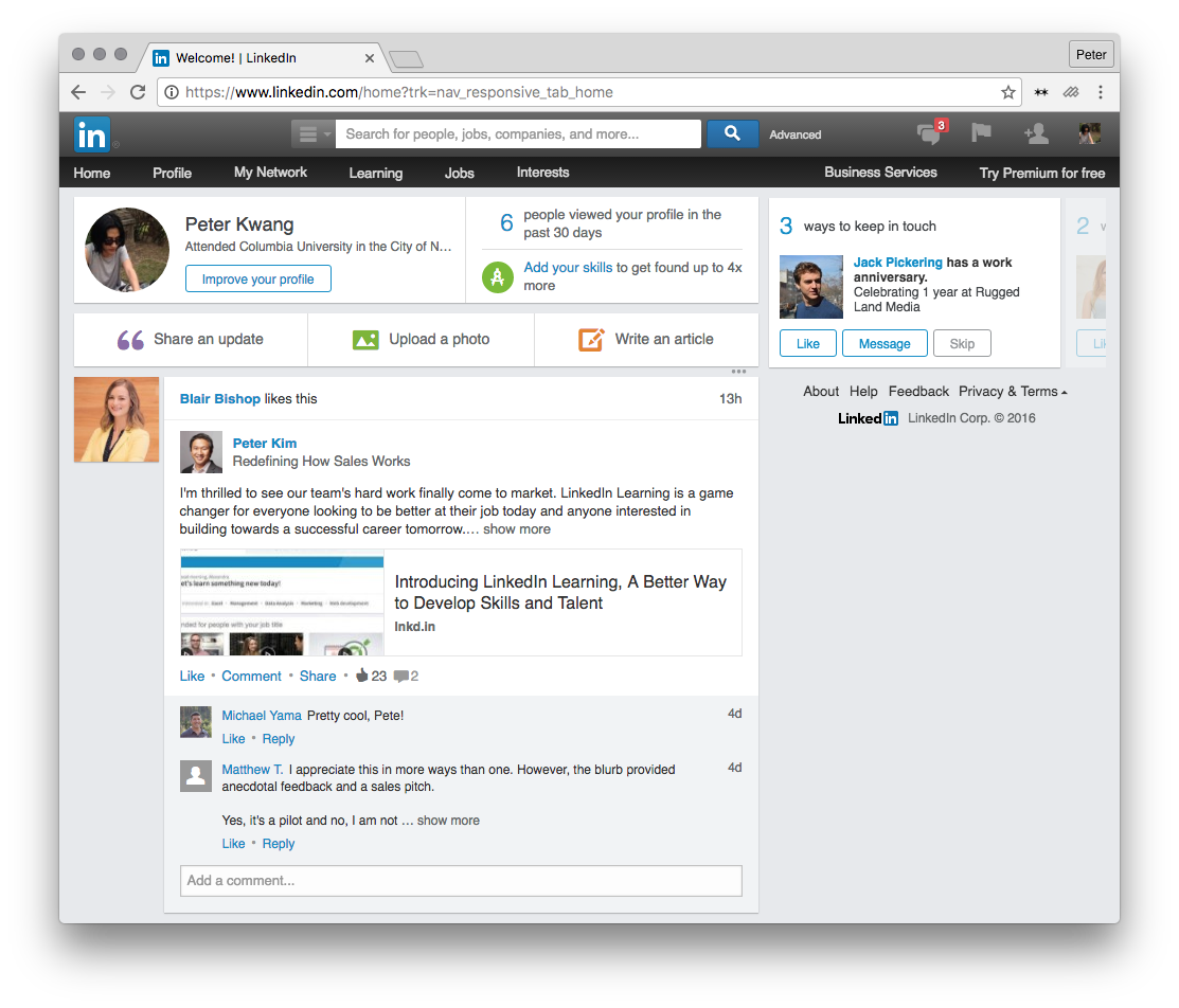
As former product manager at LinkedIn Josh Elman said, “If we could get users to enter just a little more information, they were more likely to return.”
Doing something like filling out your skills on LinkedIn, means that other people can endorse those skills. Their connections then see that activity, which increases the discoverability of your profile.
- accrued benefits: The more you use LinkedIn to fill out your profile, the more people actually see your profile, and the more connections you make.
- mounting losses: Delete your LinkedIn account, and you lose access to all the connections you’ve made and endorsements received over the social network—along with all the time you’ve put into crafting your online resume.
The more you add to your LinkedIn profile, the more endorsements from professional contacts you can collect, and the more value you gain out of using LinkedIn when looking for a new job, or networking in the day-to-day.
4. Make life easier for your users
At 700 million monthly active users, WeChat is China’s premier mobile app. It’s achieved this by following the biggest law of mobile apps: make things easier for your users.
300M of those users have their bank accounts tied to WeChat to use the app’s mobile payments system. As a16z partner Connie Chan writes, WeChat’s Wallet “is not a traditional wallet but a menu of carefully curated, pre-selected service providers that users can transact with.”

Booking a doctor’s appointment on WeChat. (source: a16z)
Chinese users use WeChat to do everything from calling a taxi, buying fruit on the street, pay their credit card bills, and schedule doctor’s appointments—all through the conveniently central portal of WeChat.
- accrued benefits: The more you use WeChat, the less you need a wallet and the less you need other apps.
- mounting losses: Deleting WeChat means your life is less convenient.
With the launch of chatbots on Facebook Messenger, we’re starting to see a similar move towards creating utilities in the West. But what separates the WeChat from Messenger for the moment is that WeChat has a critical mass of users plugged into the utilities on its platform, creating a virtuous loop for other users.
Retention Trumps Growth
Dazzling firstime users is critical to getting them into your app, and actually using it. But that’s just the first step to engagement. Retaining these hard-won users is what ultimately makes or breaks your app. The best way to make sure users stick around is to give them a better experience each time they come back.
Thanks for
reading!
More articles you might be interested in:
Apptimize Cross-Platform: Mobile-First Experimentation, Enabled Across Digital Channels
As a product manager, you understand the importance of making data-driven decisions. You know first-hand that a seamless and personalized experience for your users can positively impact your KPIs. In fact, an inconsistent user experience can be detrimental: Today, we’re...
Read MoreThis Is How You Find Your App’s Aha! Moment
These are the key growth actions that Slack, Facebook, and Dropbox relentlessly pursued. The Aha! moments. For Chamath, the former growth lead at Facebook, getting users to reach 7 friends in 10 days was the “single sole focus.” Their Aha!...
Read MoreVevo Iterates Faster with Apptimize
Vevo has been one of our most amazing customers for a long time. They are constantly trying new things, experimenting, and bringing a better user experience to their iOS and Android app users. Apptimize is proud to help them do...
Read More