The 3 UX Features Top Mobile Retail Apps Use to Drive Growth

The 2016 holiday season saw an incredible 44% year over year increase in mobile purchases with US consumers spending over $17B while shopping from their smartphones.
The mobile share of e-commerce is experiencing rapid growth, and a fifth of all online sales in the US are completed through handheld devices. Retailers who don’t take advantage of this major shift now could be looking at rough years ahead.
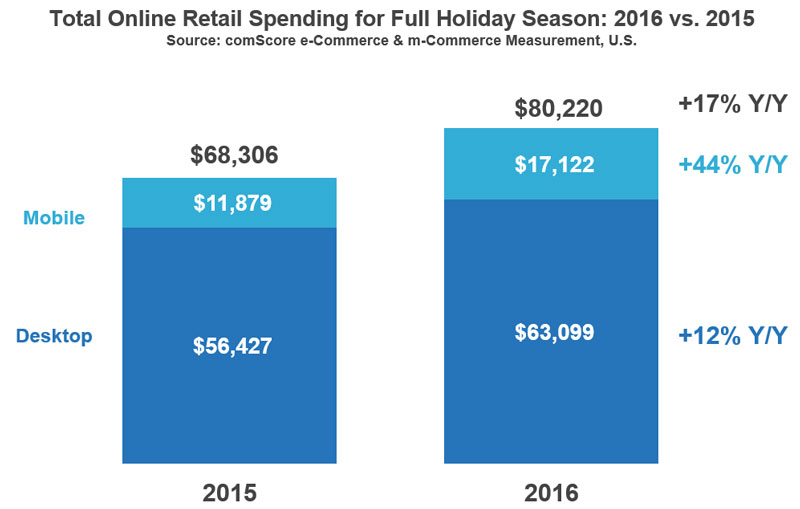
As online retail rapidly moves into the direction of mobile, apps offer the best opportunity for brands to connect with buyers. Engaging shoppers on mobile devices through a well-designed shopping experience can transform casual browsers into loyal customers.
In this blog post, we’ll look at three of the most successful retail apps and discuss the specific UX features that help drive their success.
AliExpress: From Snapping to Shopping
Alibaba, the e-commerce giant to which the AliExpress app belongs, holds a staggering 80% of the Chinese e-commerce market.
Mobile has played a crucial role in the company’s overall e-commerce strategy and has greatly contributed considerably to its leading position. The company views mobile as their most powerful weapon in taking on established international giants such as Amazon in their struggle for expansion.
The AliExpress mobile app makes it easy for consumers to search and shop for products without the hassle of having to describe them. With one snap of the camera, the app turns real-world products into potential mobile purchases with many low-cost alternatives.
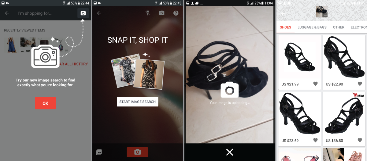
Since the majority of Ali Express’s audience consists of price-conscious shoppers who are more interested in getting great styles at minimal cost than buying a brand name, this feature empowers them to find what they like in a frictionless way.
Peeling away layers of complexity is a powerful way to engage mobile users who value efficiency above all. Simplifying product search through images lets users explore the app’s many product listings as well as discover more items they might be interested in buying.
How to Use This In Your App
Ali Express isn’t the only app that offers visual search—Pinterest, for example, lets users search for objects they spot in Pins. Parsing the content of images and allowing users to search through them is now available to virtually all developers through APIs like Google’s Cloud Vision API.
Apptimize Feature Flags allow you to test such tools with a small segment of your userbase, iterate based on the feedback (improve UX, fix bugs, etc.) before rolling the feature out to all users.
H&M: Banking on Context
Swedish fast-fashion clothing retailer H&M is one of the biggest brands in the world. Ever since the brand launched its mobile in 2010, it has introduced online shopping to users in over 30 countries.
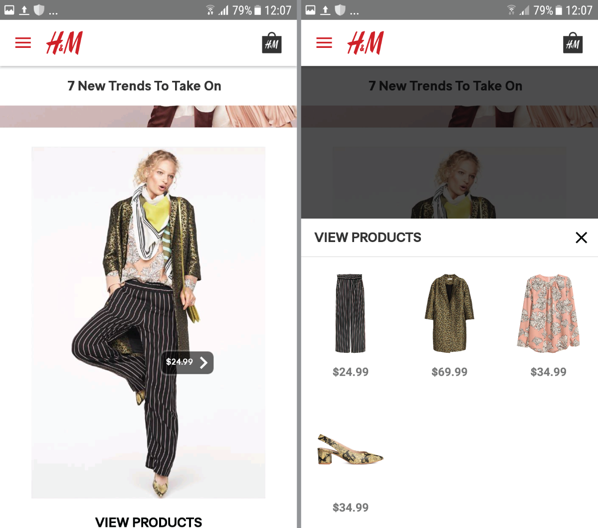
Understanding the importance of context when shopping for clothes, especially in an online environment where shoppers don’t have the opportunity to try on the items, H&M chose to showcase outfits, rather than individual articles of clothing, in its app. Shopping by a “look” rather than a list of products makes it easy for their audience to find various pieces that complement each other and make up a certain style.
A simple click on an outfit that takes your fancy while browsing through the app allows you to select and purchase any or all of the items used in that specific outfit.
Even when viewing individual items, you aren’t left to guess possible matches on your own. The first menu icon at the bottom of the image brings up a whole array of complementary items to buy, including the ones worn by the model to showcase the original article of clothing, as seen in the images below.
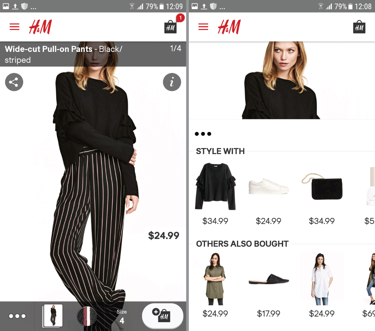
Visual context can greatly enhance your app’s in-apps purchases as it helps users understand how a product you’re selling fits into their lifestyle. H&M’s outfit presentations nicely demonstrate how you can use context to improve your users’ shopping experience, even without having received previous purchases from those users or having their shopping preferences on file yet.
How to Use This In Your App
Showing products in context is a great way to boost sales and learn more about your audience. If you’re running a retail app of any kind, you can A/B test different pairing options for your products on a limited user sample and use your findings to optimize your relevant product suggestions.
Wayfair: Augmenting Shopping Reality
Despite being an online-only store, home furniture and decor seller Wayfair is one of the largest retailers in the U.S. With over a third of its orders coming from handheld devices, Wayfair certainly knows how to capitalize on mobile commerce.
The tremendous growth of its mobile channel has encouraged the company to adopt a mobile-first mentality to their shopping experience. According to Bob Sherman, Senior Director Customer Acquisition, this approach has contributed to a much more seamless shopping experience for Wayfair’s customers.
In fact, the app’s “View in Room” feature makes the shopping experience so seamless that it literally brings it inside the user’s home. A common pain point of e-shoppers is not knowing how an item will look in their space. Wayfair solves that problem by using augmented reality to allow users to plot 2D models of their products in their immediate surroundings using their phone’s camera.
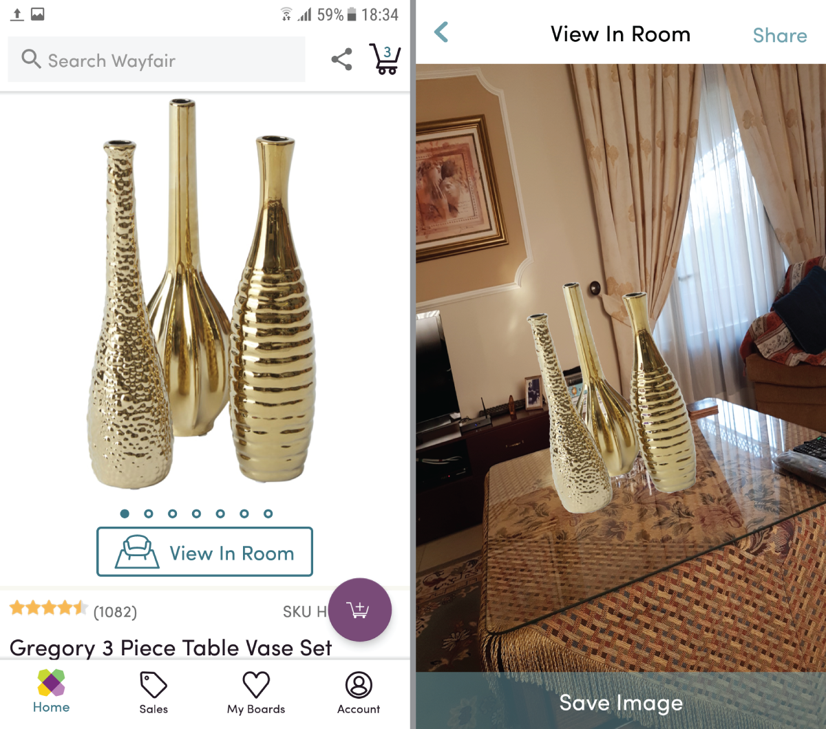
Letting customers view how the product would fit their environment is a shortcut to creating an emotional connection that can drive the sale. Whether your app compliments the brick-and-mortar shopping experience or serves as the primary point of purchase, a “View in Room” feature can help you bring your items right to your users’ home, too.
How to Use This In Your App
The “View in Room” feature requires advanced techniques, including a 3D scanner device, to provide fully-fledged models of items available in the app. However, simpler implementations are available through a variety of augmented reality SDKs.
As with H&M’s featured styles above, this technique is all about showcasing products in context. A quick way to test whether this tactic would work for your app is to A/B test images of your products against a plain background vs. those placed in context. Track results to see which ones sell better and to gauge whether the numbers justify investing in an immersive augmented-reality feature for your app.
User Experience Affects Your Bottomline
With mobile commerce growing at a much faster pace than desktop shopping, the importance of creating compelling user experiences will only keep rising.
In the three examples discussed above, we clearly see the big players of mobile shopping investing heavily in improved user experiences. It’s becoming clear that as online commerce leans more heavily towards mobile devices, app UX will become one of the key battlegrounds for dominance in the e-commerce space.
Some of the most promising avenues to explore with your app are seamless product searches, contextual displays, and app-to-reality integrations. Improving user experience in these areas can really improve the engagement of your users with your app, lead to easier and more frequent conversions, and ultimately boost your bottom line.
Apptimize is the best-in-class mobile growth platform for Enterprise and SMBs, powering 1.2 billion app downloads across 75 countries.
Thanks for
reading!
More articles you might be interested in:
Why the Growth of Mobile Apps Makes In-App Experience Even More Important
The astonishing growth in smartphone adoption in the past few years has been matched only by the equally impressive growth of mobile apps. As of January 2017, the iOS App Store contained more than 2.2 million apps for Apple mobile...
Read More3 Simple Features Mobile Retail Apps Use to Increase Retention
Retail sellers have an easy way to incentivize customers to download their mobile apps: offering them unique products, one-time discounts, and special offers not otherwise available to other customers. The real challenge, however, begins with building retention in mobile retail...
Read More3 Mobile UX Design Principles for Travel Apps
If the internet has put the world at our fingertips, mobile apps—especially mobile travel apps—have put it beneath our thumbs. Only problem is that the entire world can sometimes prove too much for the limited reach and mobility of thumbs,...
Read More