How the Largest Apps by Revenue Ace User Onboarding

Onboarding users to your mobile app isn’t just about teaching them how to use your features or what they can accomplish through your app. While some apps generate millions in revenue, most apps in the app store never reach a critical mass of users to make it pass the sink line.
User onboarding offers mobile apps the unique opportunity to prove their value to new users, so they’ll stick around and tell all their friends about it too.
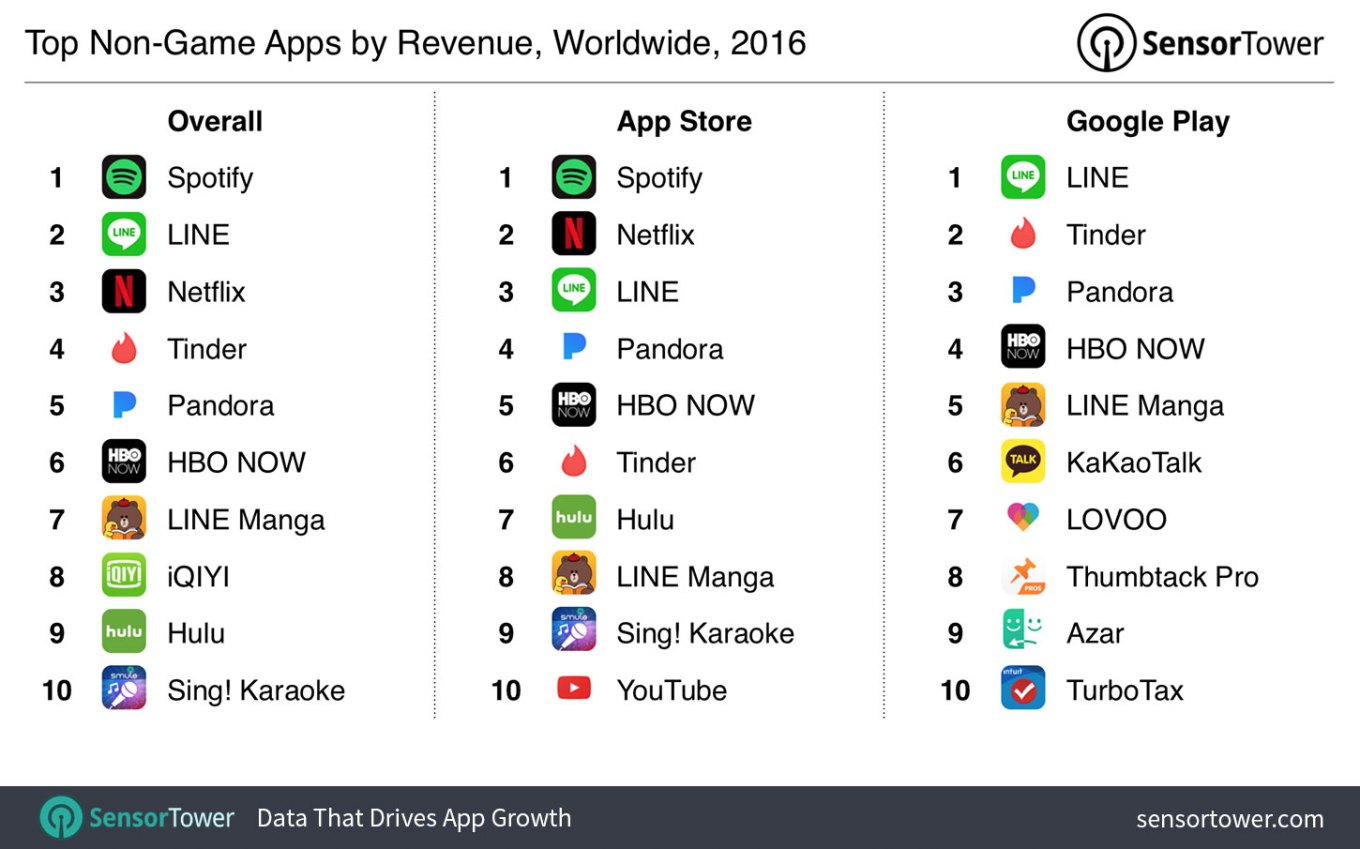
Image source: TechCrunch
In this post, we break down the onboarding flows of four of the top ten non-game apps by revenue for the year of 2016. Diving deep into their mobile onboarding tactics, we discuss tips that you can apply to improve the onboarding process of your mobile app.
1. Spotify: Hook Users With a Free Premium Trial
Pulling in around $7 billion a year, music-streaming service Spotify ranks as the top non-gaming app by revenue.
Spotify’s mobile app is noteworthy for its minimal user onboarding flow that’s engineered to get new users playing their favorite music as quickly as possible. When new users land on the sign-up screen, they can scroll through four screens with welcome messaging, and value propositions that explain the benefits of joining Spotify:
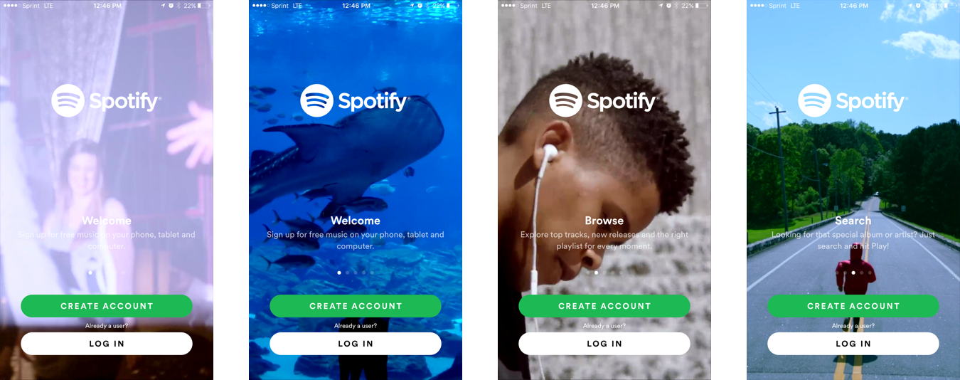
Two large calls-to-action—“Create Account,” and “Log In”—are present on each screen. At any point, new users can cut to the chase and begin using the app with a free account.
Inside the app, a variety of popular playlists and songs greet new users with the “play” button at the ready. On the free plan, new users can play music from artists and playlists on shuffle, and they can skip a certain number of tracks per hour. Now, here is where the genius of Spotify’s user onboarding kicks in: once users go above their skip limit, an in-app modal prompts them to start a free premium trial for “unlimited skips.”
In other words, once Spotify demonstrates the value of the full app to new users, it quickly pivots to an up-sell for a Premium membership—starting them off on a 7-day free trial.
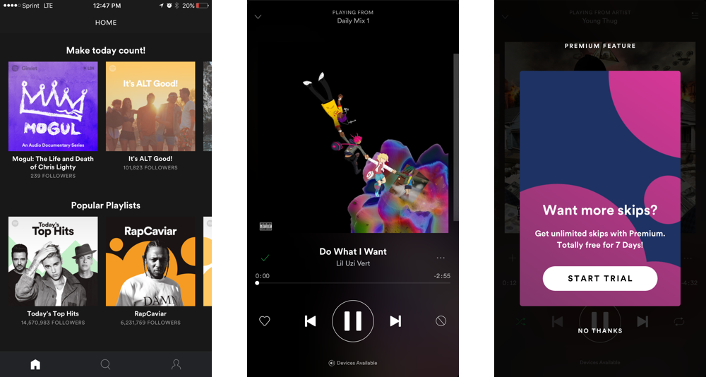
Had Spotify asked new users to sign up for a 7-day trial during the initial onboarding process, they might have been less likely to do so. However, by getting new users to play some of their favorite songs as part of their onboarding, Spotify quickly demonstrates its value. Spotify asks for the free trial signup only when new users experience the app and want more.
2. Tinder: Build Positive Habits Through Onboarding
Tinder, the highly-addicting dating application, was built around a very specific UX feature: the swipe. Users simply swipe right to “like” a potential partner and swipe left to “dislike” a proposed match. The app designed an onboarding sequence that gets new users acclimated with its core UX action, so they can quickly start making matches.
Tinder’s onboarding begins with a standard four-screen tutorial that highlights positive in-app behavior that will lead to the most benefits: swiping right to like and chatting with new matches. New users can skip the tutorial at any time by logging in via Facebook:
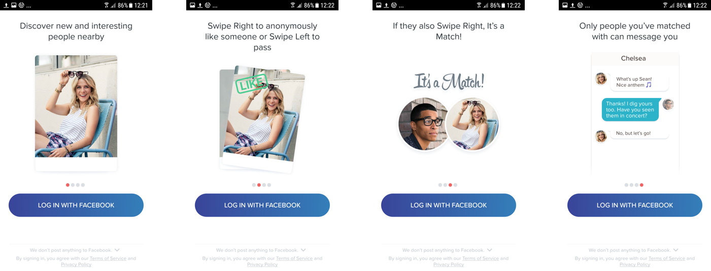
Once new users create an account, which takes a single tap to do, Tinder asks them to enable geolocation and notification permissions before they can start swiping:
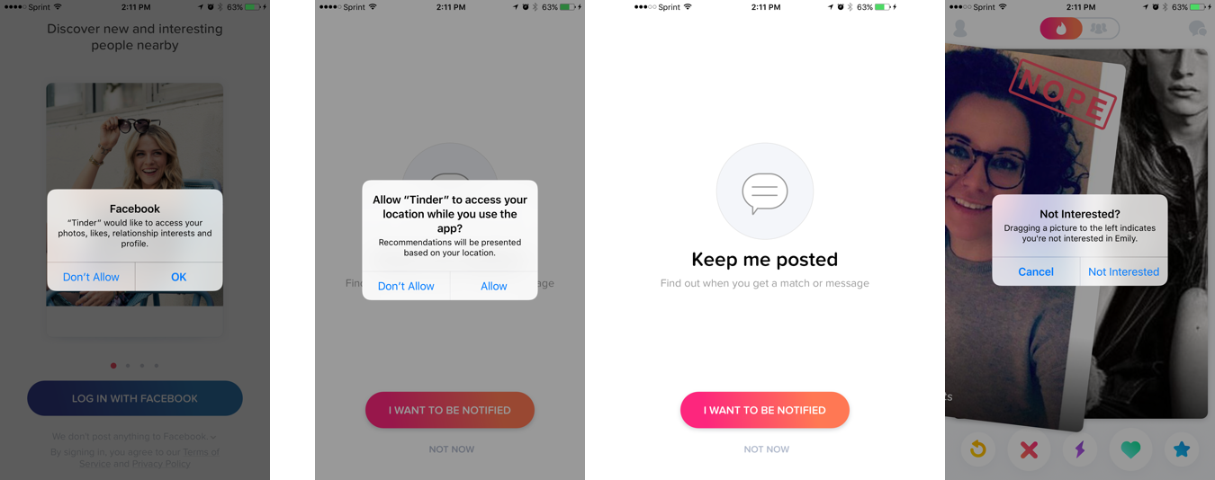
With a total of three taps, new users are ready to start swiping through a deck of potential matches. Tinder keeps onboarding simple: the first time a new user drags a card in either direction, or taps one of the buttons at the lower menu, a dialog box appears explaining what the action does. Tinder then gets out of the way and lets users start dating.
As Appcues CEO Jackson Noel writes, “[Tinder] is entirely built around the pursuit of variable rewards. Behind every swipe is another potential match.
The more users swipe, the more matches they make on Tinder, and the more encouraged they are to keep swiping. Tinder’s user onboarding builds positive habits early, driving increased in-app engagement and odds of retention once the user is onboarded.
3. Pandora: Drive Users to One Core Action
Pandora is a music streaming and internet radio service that logs nearly $1.4 billion in revenue per year. While Pandora offers a premium paid service, the majority of its revenue comes from advertising, much like traditional radio stations.
When using Pandora, users can listen to music based on stations, which can be defined by music genre, specific artists, or even tracks. Pandora’s user onboarding is designed to drive new users to the mobile app’s one core action: creating a station.
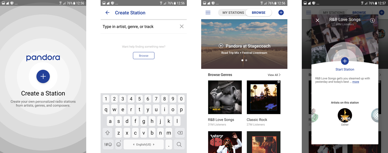
When new users first log in, they can create a station based on their favorite artist, genre, or track, or they can browse popular stations. The latter option minimizes the amount of cognitive effort required of new users and allows them to explore what other people are listening to on Pandora.
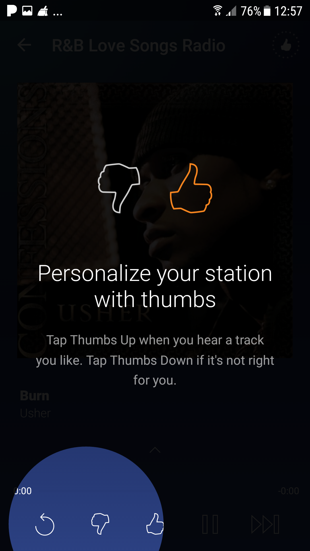
Once new users complete this core action and create a station, the app explains to them how to use other features and personalize their experience through a series of tooltips and in-app modals.
Prove the Value of Your Mobile App, Fast.
The top mobile apps by revenue onboard users in a variety of different ways, from mandatory onboarding tutorials to in-app tooltips and icons. The common theme running through them all, however, is that they drive users to their core value proposition fast.
Good onboarding means giving users a taste of the overall value of your mobile app as quickly as possible. The job of your mobile onboarding process is to set the stage for the delivery of that value that will have users coming back time and time again.
Apptimize is the best-in-class mobile growth platform for Enterprise and SMBs, powering 1.2 billion app downloads across 75 countries.
Thanks for
reading!
More articles you might be interested in:
Leverage User Onboarding to Create Personalized In-App Experiences
An endless content repository is a double-edged sword. If users can’t find what they are looking for or discover content they are interested in, they are almost guaranteed to abandon your app. Many apps aim to improve user retention by helping...
Read MoreUser Onboarding at Different Stages of Growth
Sean Ellis defines startup growth in 3 stages. There’s Product/Market Fit Stage, in which you’re trying to match pain points/value props with a specific persona. Then there’s Organic Growth Stage, where you’re growing by word of mouth. And then there’s...
Read MorePersonalizing Mobile User Onboarding
Feel like going to the Giants game at the last minute? Gametime is an app that let’s do just that and buy last minute tickets with just two taps on your phone. It avoids the hassle of printing or picking...
Read More