This is How Top-Grossing Apps Design Their UX for High Engagement

In 2016 alone, the Apple App Store and Google Play generated a combined net revenue of $8.7 billion.
The astounding amount included revenue from in-app sales of anything from animated bear-and-rabbit stickers to countless replays of all four seasons of Silicon Valley.
The secret behind the most profitable apps available in the app stores today lies in the ease of use they provide to users. When you make it easy for users to find what they’re looking for, you make it easy for them to buy.
In this blog post, we’ll look at how some of the top-grossing apps create a compelling user experience that gets customers to pull out their wallets and open them wide.
Spotify: Simplify Content Access & Discovery
Selling access to a library of content for a flat monthly fee has become a popular business model with music and video streaming apps. In order to succeed with this model, however, content providers must offer enough interesting options to keep users subscribed in the long run.
Apps built on this model pour millions of dollars into improving their recommendation engines because they understand the importance of discovery. Figure out how to help users find the content they love week after week, and you have a billion dollar business on your hands.
In the latest iteration of its mobile app, Spotify simplified the user experience by removing the hamburger menu. The app now offers a tab bar at the bottom of the screen that provides one-tap access to search options and the user’s personal library.
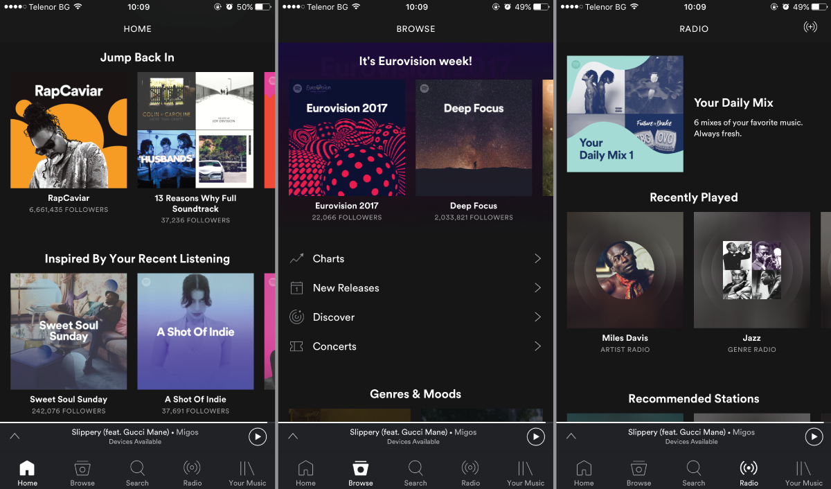
The Spotify team’s research revealed that the new tab bar, which features only five options, leads users to discover more content, including user-generated and brand-generated playlists. Internal testing also showed that users click 30% more on the items on the tab bar compared to when these were “hidden” inside a hamburger menu.
Spotify has laid claim to one of the top spots in the music subscription category by making it as easy as possible for users to discover new music, and access their favorite songs in the app.
HBO NOW: Reduce the Number of Steps to Your Core Action
The average mobile user has over 80 apps installed on their smartphone, but only uses ten on a daily basis. For your app to make it among those top ten apps used on a daily basis, it must provide a highly engaging user experience that keeps users glued to their screens.
HBO has managed to claim a spot among the all-time top apps by designing a flawless user experience. During a redesign of the HBO GO app, the team working on the project found that users favor having to make fewer steps to watch the latest episode of a show. The discovery prompted the team to cut the number of taps required to get to a show. And the team has applied this learning to both their HBO GO and HBO NOW apps.
When using HBO NOW, it only takes two steps to start watching the latest episode of your favorite series:
- Tap on the image of your favorite show to get to its dedicated screen
- Tap on the image with the “Play” sign to start watching the latest episode
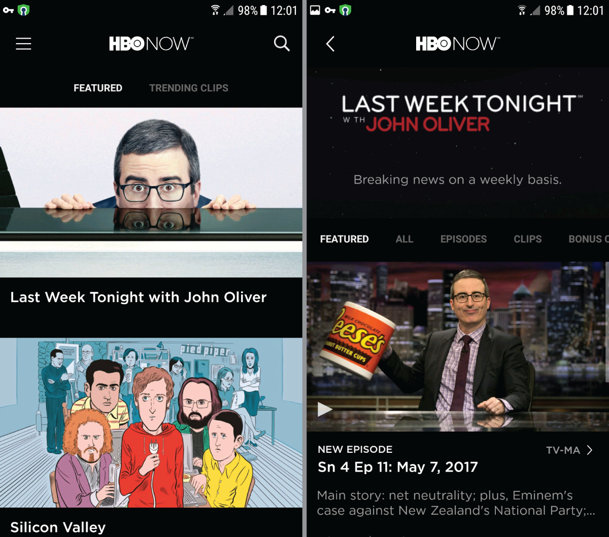
Once the episode starts playing and users get drawn in by their favorite characters, they’re unlikely to leave the app any time within the next hour.
Line: Leverage User Behavior to Increase App Engagement
A large user base doesn’t always translate to high profits, especially for freemium apps. Facebook, for example, is still struggling to generate significant revenue from its messaging services despite the tremendous popularity of both its messaging apps, Messenger and WhatsApp.
The Japanese app Line, however, has taken a different route to monetization by diversifying its in-app revenue streams. Even with fewer monthly active users than either of Facebook’s apps, Line reported a revenue of $656 million that leaves its Western competitor in the dust.
About a quarter of Line’s profits come from selling sticker packs that people use to enhance their text chats. In fact, Line has developed its own characters that have become a cultural phenomenon in the countries where the app dominates.
By leveraging a particular cultural aspect—in this case, the popularity of cuteness or kawaii in Japan—Line has managed to enhance its user experience and create an app experience that keeps users coming back.
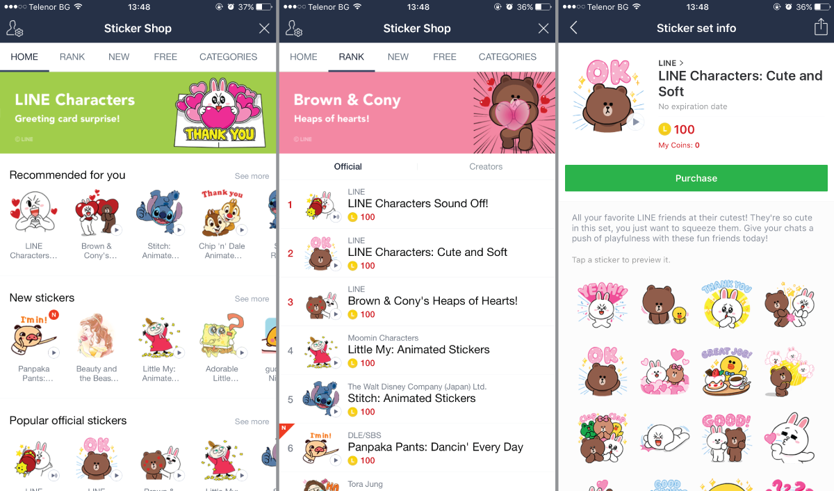
On top of being just cute, Line’s stickers play an important UX-enhancing role—they allow Line’s users to express emotions that might otherwise be harder to communicate through a text message.
Good UX is Invisible
So what ties together these distinct UX approaches that we’ve reviewed above? Invisibility.
All three apps focus on satisfying the user’s core need in the simplest way possible—an easy way to find music, a quick way to watch a movie, and a better way to express emotions in text chats. Top-grossing apps are always looking for ways to simplify their user interface and get out of the way of their users.
In this sense, the most engaging apps are the ones that manage to make their interface invisible so they can enhance their in-app user experience.
Apptimize is the best-in-class mobile growth platform for Enterprise and SMBs, powering 1.2 billion app downloads across 75 countries.
Thanks for
reading!
More articles you might be interested in:
How the Best Entertainment Apps Use UX to Hook Users
Entertainment apps make big bucks. Spotify and Apple Music generate over $7B in revenue. Netflix is close to breaking the $9B mark. And no one knows for certain how much YouTube makes, but estimates put it at higher than all of...
Read More3 Mobile UX Design Principles for Travel Apps
If the internet has put the world at our fingertips, mobile apps—especially mobile travel apps—have put it beneath our thumbs. Only problem is that the entire world can sometimes prove too much for the limited reach and mobility of thumbs,...
Read MoreThe Secret to Enhancing Apps
Apptimize CEO, Nancy Hua, was featured on Fox Business News’s Risk & Reward with Deirdre Bolton for bringing innovation to a slow mobile development process. “For most companies, the biggest barrier to their apps being hugely successful is the painful...
Read More