How to Measure User Retention and Track Improvement

“How do I track and measure user retention?”
If you’re managing a fairly successful mobile app, you’ll inevitably run into user retention issues. User acquisition tactics can get you quick traction, but building sustainable, long-term growth all comes down to user retention.

But if you’re like most teams, how you measure and report retention isn’t always obvious. And you can’t improve what you can’t measure.
Using industry standard metrics such as MAU, WAU, or DAU counts, doesn’t differentiate between acquisition and retention. Using formulas such as these:
Retention Rate = (Users at End- Users Acquired)/ Users at Start)) X 100
are pretty useless in identifying what’s working and why.
What you need are acquisition cohorts, which track specific groups of users over their lifecycle and help you pinpoint precisely when users are dropping off and how specific changes affected your retention over time.
Table of Contents:
- Cohort Analysis
- Visualizing the Retention Curve
- The Stages of Retention
- Early Stage Retention
- Mid-Term Retention
- Long-Term Retention
- Pulling it All Together
Cohort Analysis – The One Tool You Need to Measure User Retention
We’ve talked a great deal about cohorts in the past, but why are they (acquisition cohorts in particular) a good measure for user retention?
Cohort analyses are advantageous for a few key reasons:
- They separate user acquisition efforts from retention efforts
- You can compare past cohorts to newer ones to see effects over time
- You can use behavioral cohorts to identify key actions that affect retention
So let’s break down what they actually are, and what they measure.
What are Cohorts?
A cohort is simply a group of individuals that shares a common characteristic.
For example a group of students that graduated in 2012 can be considered a cohort. Their common characteristic is that they graduated in 2012. Students who graduate in 2013 would be a separate cohort.
Acquisition Cohorts
Using MAUs as a measure for app growth is critical for any team, but for measuring retention, it’s a poor indicator.
Acquisition cohorts are a great way to measure retention because they look specifically at how a specific group of users acquired on the same day drops off over time. This separates your acquisition and marketing efforts from how well your product is retaining users.
In addition, they also show you in detail when people are dropping off in your app so that you can dig deep into the behavior and figure out the best times to re-engage users or introduce additional functionality.
If you use behavioral cohorting, you can compare how users who have taken specific actions in your app retain vs those that haven’t, which allows you to help determine which behaviors lead to retention.
Acquisition cohorts generally look like this:
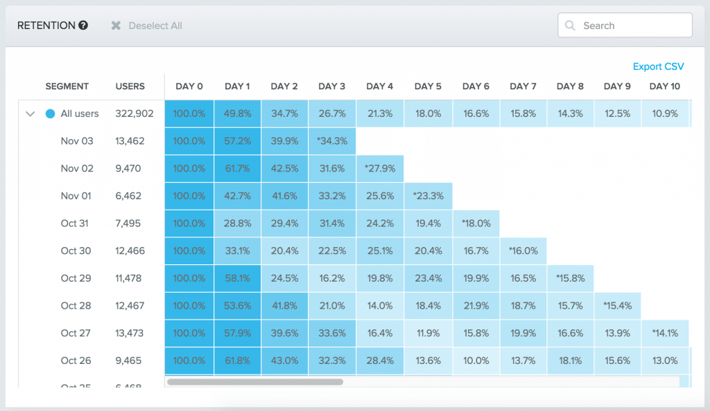 Image via Amplitude
As you can see, the rows represent different acquisition dates, such as Oct 26th. From there, we can see the retention rates for each subsequent day (Day 1, Day 2, etc.). Each day is calculated by the number or percentage of users who were active on the app on that day.
So if out of 9,465 users signed up on October 26th and the 13.6% of them were active on day 5, roughly ~1287 of users who installed on October 26th were active on that day.
Quite a few analytics tools also allow you to segment by weeks or months. I’d generally recommend using days for two reasons:
- There are clear benchmarks available online already to measure yourself against
- They allow you to target specific days to engage users
Visualizing the Retention Curve
While the data itself might be easy to read, interpreting it is better done visually with a line graph.
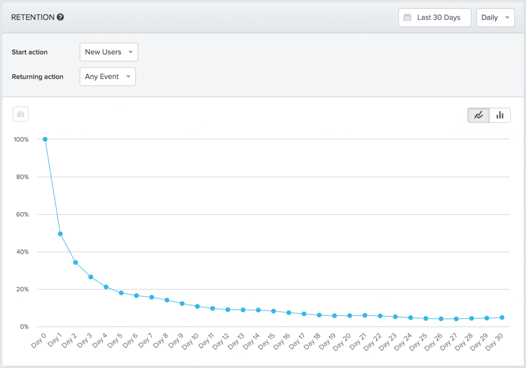 Image via Amplitude
In this graph, the data from an acquisition cohort table is plotted along a simple line graph. This allows you to see the dramatic drop off as time goes on.
With this visual you can identify the key days in user retention such as the steep drop off and flattening of the curve.
We can also use it to make a direct comparison against key benchmarks such as:
- Average retention rates for Android apps – with the data compiles by Ankit Jain and Andrew Chen, you can benchmark your app v.s. apps based on their ranking.
- Behavioral Cohorts for your app – Behavioral cohorts are acquisition cohorts that filter based on specific actions taken by users. So if you want to look at only users who have let’s say, created an account, you can check to see if those users have better retention rates than those who didn’t.
Now that we’ve got a good idea of what retention curves look like, we’re going to dig deeper into the 3 stages of retention, and what to look for in each.
Interpreting the Stages of Retention
In his talk, Growth is Good, Retention is 4+Ever, former VP of Growth Brian Balfour breaks down retention into 3 distinct stages:
- Early Stage (Week 1) Retention
- Mid-Term Retention
- Long-Term Retention
They look roughly like this:
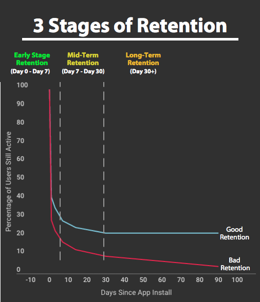
Each stage of retention has a slightly different focus.
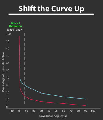
Early Stage (Week 1) Retention
This first stage of retention is always going to have the steepest user drop off.
“Most of your churn is going to happen in the first 7 days; it’s the nature of the beast. People get curious, come try your product out, then shrug their shoulders and then leave without saying goodbye.”
– Ben Ratner, Product @ LeadIn by Hubspot
During this period, you’ll want to try and get users to the value as quickly as possible. Users on mobile tend to have higher intent when it comes to downloading an app, so getting them to the value they’re seeking quickly is darn critical.
The Goal:
- Demonstrate the value of the product quickly so that users are incentivized to engage (and re-engage) with your app. To do this, you need to deliver on their expectations by getting them to the core value.
Early-Stage Retention Metrics to Track
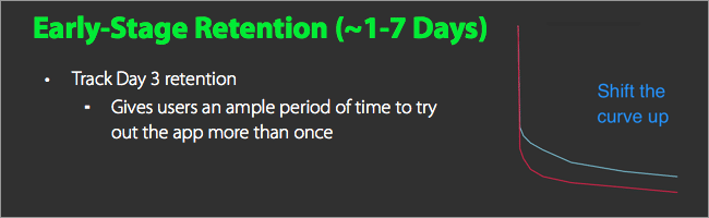
A general rule is to look at Day 1, Day 3, and Day 7 retention in your acquisition cohorts. Over time, you want to compare these percentages with older cohorts to see if you’re improving early stage retention.
Visually, this has the effect of shifting the curve up, by activating users during their first time user experience (FTUE).
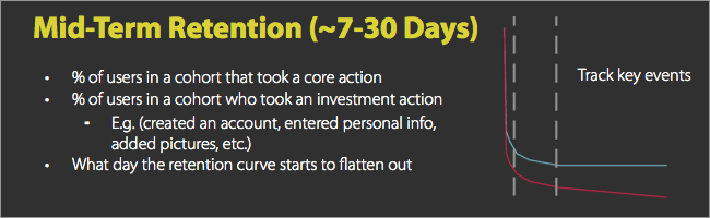
Mid-term Retention
Mid term retention is where the steep drop off begins to slow down. Usually this falls somewhere between 7 – 30 days after an install.
The Goal:
- Begin building a habit around your app’s core actions using methods such as the Hooked Model.
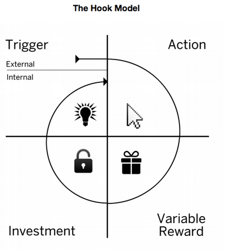
The Hooked model is great because it also encompasses a core secondary goal of this period, which is to drive user investment in order to improve their experience.
Mid-term Retention Metrics to Track
Generally, mid-term retention aren’t as great of indicators of retention as early-stage or long-term metrics. Instead, you can use these as sub-goals to indicate whether you’re driving the right kinds of behaviors or not.
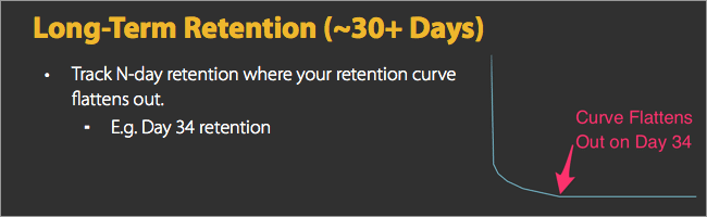
Long-term Retention
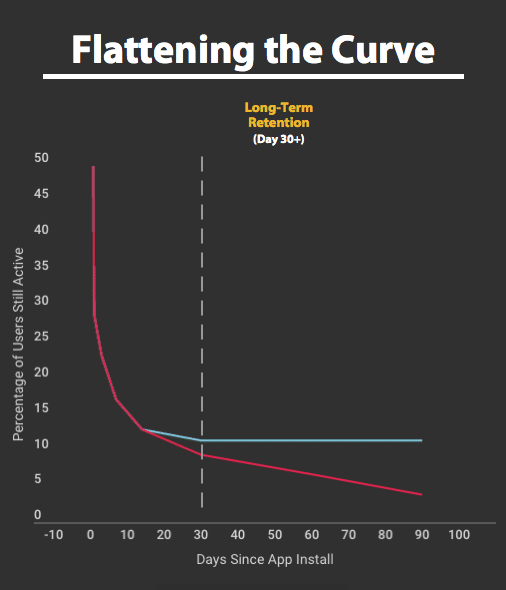
This is the period where your retention curve (hopefully) starts to flatten out. If your retention is trending towards zero, you’ve got a serious problem.
Balfour explains that apps whose retention trends towards zero have a product-market fit problem. That is, the app simply isn’t valuable enough to users and some significant changes need to be made.
The Goal:
- Flatten out the curve by continuing to provide strong, repeated product value
The main goal of long-term retention is to ensure that users who have reached this point retain. You want to provide a consistently excellent experience that ensures they’re going to stick around.
Metrics to Track:
Look for the section of the curve that flattens out, and use that as your benchmark. In the (hypothetical) example below by Ben Ratner, the PM for LeadIn by Hubspot, he’s identified that the curve flattens out at 17 days.
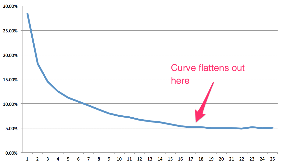
In this example graph he created, Ratner explains that it’s best to look for where the retention flattens out. That is, “new user churn essentially stops after 17 days.” The users who stick around are ones that are invested.
Using this information, the team can use the 5% retention as a benchmark, and try to steadily increase the percentage of users who retain by day 17.
For the actual LeadIn product, Ratner and his team discovered that their retention flattens out after ~5 weeks. “The name of the game for us, retention-wise, is to keep our new users engaged and experiencing so that they get to that point,” says Ratner.
Pulling It All Together
Tracking user retention ensures that you’re not conflating your acquisition efforts with actual user retention. Doing so is quite simple if you use cohort analyses. You’ll want to track 2 key metrics:
- Early-stage retention: Day 3 retention (or equivalent)
- Long-term retention: Day 17 retention (or wherever your retention curve flattens out)
Using these key metrics, you can create a simple dashboard that tracks these 2 metrics for each cohort over time, like the one we’ve created below:
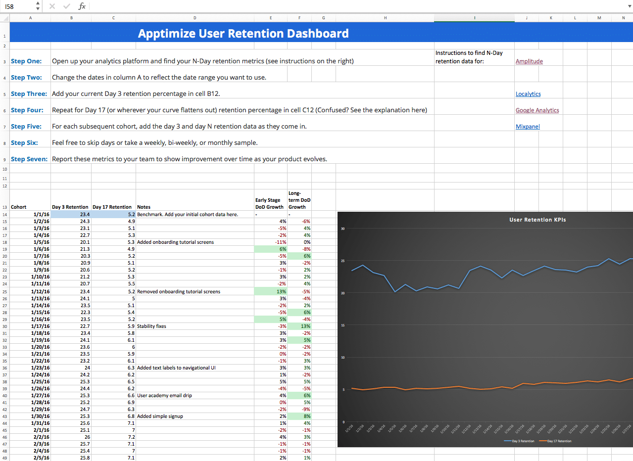
We’ve created a handy worksheet that you can plug your N-Day retention data into to track progress and help correlate product changes to increases in user retention. You can download a copy for free below.
Tracking retention rates over time is one of the most vital things your team needs to align on in order to build long-term growth. With it, you’ll be able to create that incredible hockey stick growth that’s so coveted in the industry.
Thanks for
reading!
More articles you might be interested in:
3 Ways the Top Health & Fitness Apps Have Great User Retention
Product leaders are increasingly realizing that simply acquiring users isn’t enough for their mobile apps. In order to form lasting connections, you need to focus on user retention: demonstrating the value of your product as a means to earn loyal users...
Read MoreA Primer on Mobile User Retention
Solid mobile user acquisition channels? Check. Onboarding? Could use some tweaking. User retention? …..needs work. If you’ve got decent traction for your app already, retaining mobile users likely is your top objective. Yet retention is often this nebulous term everyone...
Read MoreAutomatically Track Retention and Engagement with Apptimize
The success and failure of an A/B test doesn’t just rest on whether or not variant A caused more customers to click on a button. That’s only the simplest case. Sometimes you want to see if customers spent more time...
Read More