8 Humbling Lessons from Seasoned A/B Testers
A coveted benefit of A/B testing is it’s ability to reveal new insights and unconscious biases. With clear data-backed results, it allows testers to to prove/disprove their hypotheses, and reveal hidden assumptions. We’ve compiled advice from seasoned testers about how the data obtained from testing can result in unexpected surprises.
1. “Just because something increases your signups doesn’t make it good.” – Tim Robinson of Zentester.
Be sure you’re not trading short term gains for long term growth.
It’s undoubtedly exciting to see any of your key metrics increase as a result of an A/B test. While an increase in signups can be a great thing, you’ll want to be sure it’s not negatively affecting the key conversions that drive your business. These metrics can be sales, no. of likes per user, or even just the number of eyeballs on a page. What’s important is that you track down the entire funnel, to be sure that any gains are not negatively impacting more important metrics.
2. In-depth onboarding tutorials can actually hurt your conversions.
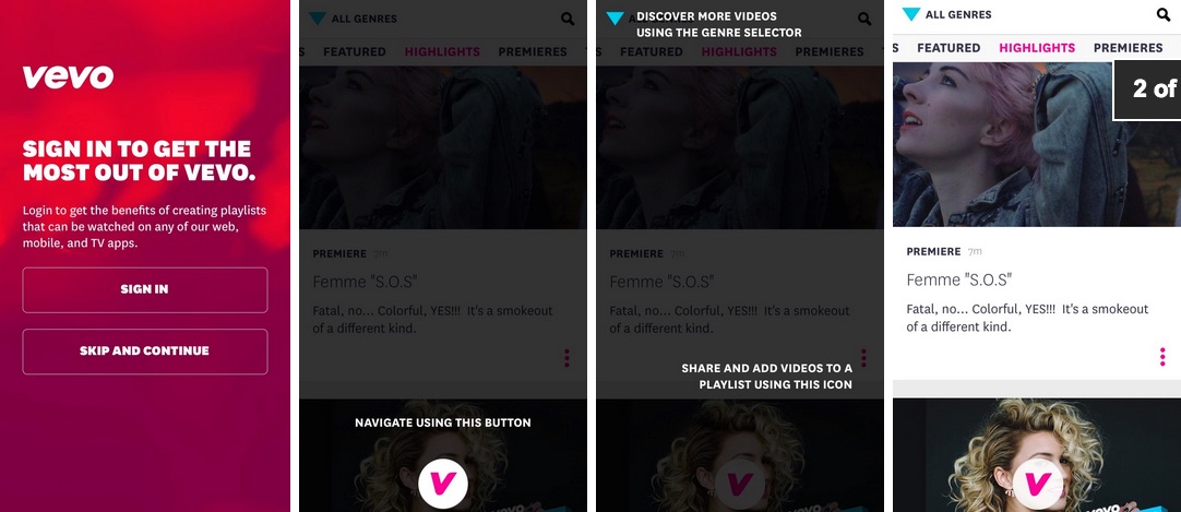
Vevo found that their tutorials actually diminished conversions, instead of increasing them as expected.

An almost universally accepted practice for mobile apps is using tutorials to onboard users. This usually consists of a multi-page introduction to the app, and some specific instructions about how to navigate or do certain actions. It makes sense, because if teams don’t nail the onboarding process, all that time spent developing and improving the app will be for naught.
Surprisingly enough, Vevo discovered that their multi-page introduction tutorial was suppressing sign-up conversions. While excellent in theory, the number clearly showed that removing the feature increased conversions by 10%, while not having a notable effect on engagement metrics such as videos watched.
3. Short and concise copy isn’t always best for optimizing conversions.
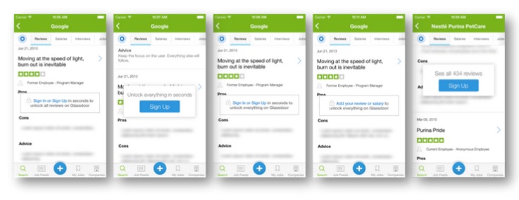
Even with our short attention spans, companies such as Glassdoor are learning that longer copy with a strong value-proposition are often much more effective than those with brevity.

Glassdoor’s different variants
It’s natural to assume that short concise sales pages are optimal for conversions. After all, it’s difficult to hold audience attention, and long copy puts the majority of audiences to sleep. However, shortening the sales pitch at critical conversions may do more harm than good. Glassdoor A/B tested different CTAs on their app, and found that longer copy that emphasized the added value outperformed short, concise ones.
“I once advised a friend to take his long-copy page and cut it down to be shorter. Conversions dropped by 50% overnight.” -Ramit Sethi of I Will Teach You To Be Rich.
Ramit, a NYT Best-Seller and popular blogger also came to the same conclusions through designing and selling his many various products.
“I learned that if people are motivated and interested in your services, you almost cannot give them too much information. This flies in the face of the Silicon Valley belief that ‘If you build it, they will come,’ but it works. And every direct marketer has known this for decades. For example, one of my sales pages is over 25 pages long. It converts very well. In another test, we emailed people twice/day during the final launch period, and open rates stay constantly high.” Next time, think twice before trying to shorten your copy to only the most basic of details. Maybe you’ll find long form converts better than you’d expect.
4. Hey. You should take some risks with testing.
“Hey,” was the most effective email subject line for the Obama campaign, and that particular email brought in millions of dollars, despite its casual tone.

When Obama’s team was campaigning, they tested emails extensively in order to ensure that they were getting the maximum returns on donations to fund the cause. One of the key differentiators of the email campaign is that the team wasn’t afraid to take risks using casual and often surprising copy. They tested out multiple email titles such as “I’m saving you a seat,” “dinner?” and even tried dropping mild curse words.
These messages were actually incredibly effective, and brought in millions of dollars. The team found that the relatability of the emails resonated with contributors, and were a large improvement over stuffy, formal language. They weren’t afraid to test out experimental copy on a small group, and apply the winners on a wide scale.
5. Tests help you hone in on what customers actually want, and why.
Google had conducted user testing that said users wanted more search results, so they ran a test to increase from 10 to 20, 25, and 30 results. Searches plummeted, and perceived behavior from user testing differed from the actual behavior. Testing helped them find out why.
User surveys are often great tools to implement, but they can also give you somewhat misleading information, as Google famously discovered. When the company conducted user surveys and testing, users near unanimously agreed that an increase of search results from the default 10 to 20, 25 or 30 results would delight them. However, when they tested these hypotheses, they found that increases caused the amount of searches to plummet. It seemed that their user-survey based hypothesis were completely wrong.
An increase from 10 results to 20 decreased conversions by 20%, and an increase to 30 had a 25% drop. Through analyzing the results, the Google team was able to determine the cause: increased search time. The additional time it took to cull results (~0.5 seconds) was too slow. Testing helped them avoid what could have been a devastating update, as well as pinpoint that users would rather have quick, accurate searches than more results.
6. Even if you have the slimmest funnel, you can always cut it down.
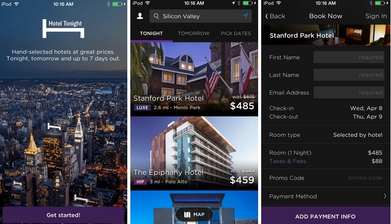
HotelTonight was a company that already had an extremely slim sales funnel. After 3 clicks and a swipe, users were booked and ready to go. When they pushed and made even further cuts, bookings increased by 26%.

A critical cornerstone of increasing conversions is to make it as easy as possible for users to complete the conversion process. In any funnel, its important to decrease as much friction as possible, grinding down pain points until the process is silky smooth. Most companies think they already have slim funnels that are the easiest possible way for customers to sign up. HotelTonight did too, until they decided to test out another idea with new technology. Doing so increased bookings dramatically. Click here to read more about HotelTonight’s test.
7. Testing reveals unexpected assumptions
Paktor found that a change they assumed would work wonders actually decreased engagement by 6%.

Paktor, a Asia-targeted dating app, thought that users would respond positively to an icon change from a thumbs up and thumbs down combo to a heart and x combo. However, they were shocked by the results of their tests. Instead of increasing clicks, they decreased user engagement. After review, the Paktor team believe that the icons they chose represented a level of commitment that users didn’t feel ready for at that stage, especially given the cultural context. Testing helped reveal their unknown biases and avoid implementing an unexpected faux pas.
8. Don’t underestimate novelty, but don’t depend on it.
Novelty can be used to spark user curiosity and drive short term increases, but the effects quickly wear off.
A/B testing can sometimes create temporarily lift simply due to the novelty of a change. When Instagram changed to a new UI, including a new like button, I definitely “liked” a few more photos than usual just to see the different animations. The novelty got me excited, but after a few weeks that change won’t likely increase my engagement.
Luckily, this bias is easy to combat: don’t just stop A/B tests when they reach statistical significance and wait at least a week or two before declaring a winner. If Instagram ran a test on the new UI change, they’d be sure to quickly reach statistical significance. If i represent the average user, there’s clearly a correlation between the new change and the increase of likes. However, once the novelty wears off, will there still be a correlation between long term increases in likes and the UI changes? Running the test over a longer period of time will tell you the answer, and minimize false positives.
Thanks for
reading!
More articles you might be interested in:
When to Use Multivariate Testing vs. AB Testing
Deciding between sequential and multivariate testing without knowing their advantages and limitations can pose significant challenges. If you’re looking to optimize your app’s conversion rate, sequential A/B tests, or experiments with two variants, usually do the trick. But in some...
Read MoreStorytelling with data: Lessons learned from Bump
Bump used A/B testing before it was cool. Google acquired Bump last year, in part because the people at Bump really understand data, mobile, and user experience. Earlier this week, we spoke with Chris Perry, former product manager and lead...
Read More5 Easy Ways to Improve Your App with A/B Testing
Here are 5 ideas for relatively easy to implement tests to visual aspects of your app. You most likely won’t need to rework user flows or do a lot of complex coding. These are layout and design changes that can...
Read More