Case Study – Safetrek
The App
SafeTrek is an app available on both iOS and Android that empowers users with proactive mobile protection in times of emergency. Users launch the app when they feel that they are in (or about to be in) a dangerous situation. The user holds down a button in the app until the danger dissipates and then type in a pin number to disarm the app. If a user lets the button go and the app is not entered after ten seconds, SafeTrek calls the police.
Many lives have been saved because of SafeTrek. Whether a user is walking down an alley late at night or hears a strange noise in his/her own home, SafeTrek offers a guarantee of security when the user might not be able to call the police on their own.
The Problem
SafeTrek had received several glowingly favorable reviews before implementing their test, but the creators believed that they could dramatically increase sharing and rating of the app with a few simple changes. The idea they had was to change the standard sharing icon to something more unique and representative of the idea that you are giving a friend access to life by sharing this app.
The original app had this sharing icon:
![]()
The icon then opened this popup:
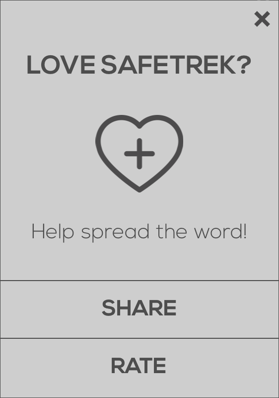
The user can then click SHARE or RATE to either share the app or submit a review to the app store. Clicking share opens another modal to select the sharing mechanism (e.g. email, Facebook, etc.).
The A/B Test
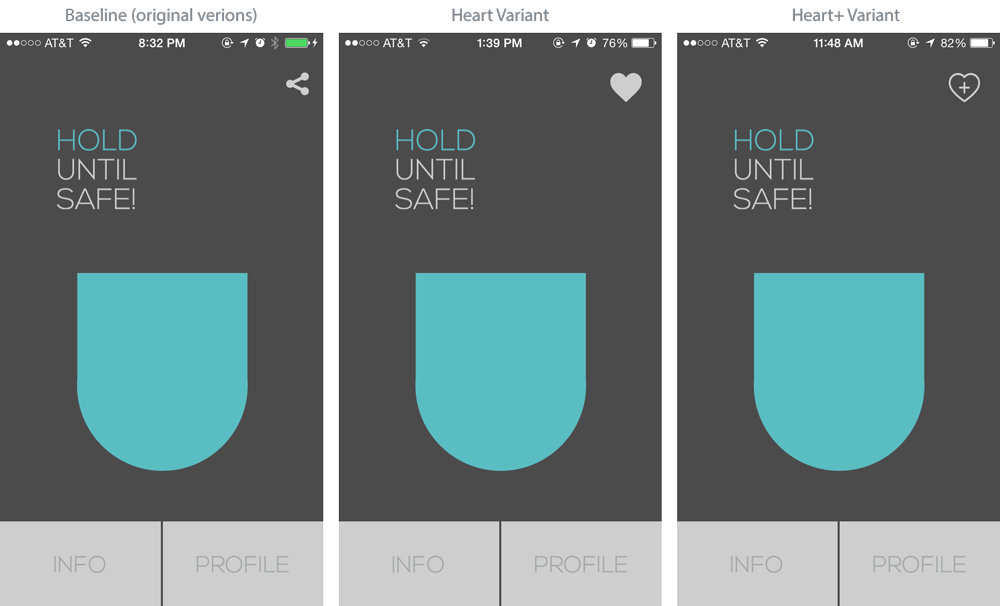
The team decided to test the traditional sharing icon against two others that they created–a solid heart and a heart with a plus sign inside.
![]()
![]()
The three variants of the app look like this:
In addition to tracking click rates on each icon, they also tracked further down the funnel to clicking of SHARE or RATE in the modal and the selection of sharing mechanism.
The Results
Both heart variants outperformed the baseline, but the heart with the plus in the middle increased clicks on the icon, share and rate buttons the most. With the heart+ variant, the rate button received 106% more clicks and the share button received 86% more clicks. The heart+ icon itself received 128% more clicks on iOS and 97% more clicks on Android.
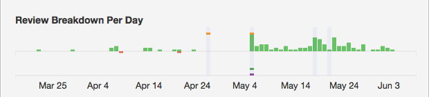
This change lead to more reviews in the iTunes app store in a month (May) than the app had ever received in its seven months since launching (October – April).
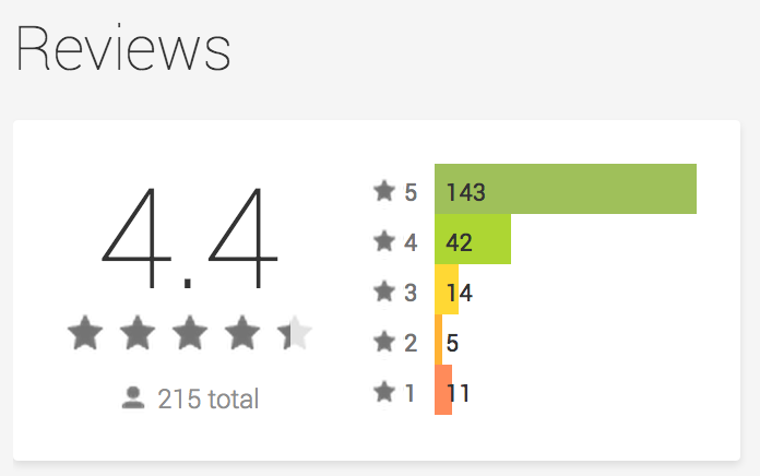
The Safetrek team hypothesized that the change led to more clicks simply because users are unfamiliar with the heart icons. Perhaps users thought they were adding contacts that could be called in the case of an emergency in addition to or instead of the police. It was a concern that this confusion would lead to a negative impression of the app but this in fact didn’t happen. The conversion rate between clicking the icon and clicking the SHARE or RATE buttons remained steady (i.e. about the same percentage of people who saw the pop up modal clicked one of the calls to action regardless of which icon they saw to open the modal). Additionally, the ratings in the store continued to be extremely positive.
SafeTrek proves that creating high-impact tests does not have be a daunting endeavor. Making tests such as this can be easy, and getting started with Apptimize is free.
Thanks for
reading!
More articles you might be interested in:
Case Study – Clever Lotto
The App Clever Lotto is a German app that allows users to manage their lottery entries easily. Through the app, users can enter multiple lotteries and track the winning numbers without having to travel to a physical store. If users...
Read MoreCase Study – Paktor
The App Paktor is an innovative mobile dating app targeting the Asia market that emphasizes simplicity and ease of use. With Paktor, finding a match is as simple as a swipe and a click. Users securely register for Paktor with...
Read MoreCase Study – Chord Shaker
The App ChordShaker is an iOS App that makes learning guitar chords fast and easy. The app starts by teaching the user simple chords, then helps him/her combine them with a variety of songs. Learning the chords is free as...
Read More