Glassdoor Boosts Registration 8% with 01 Apptimize Mobile A/B Test
The App
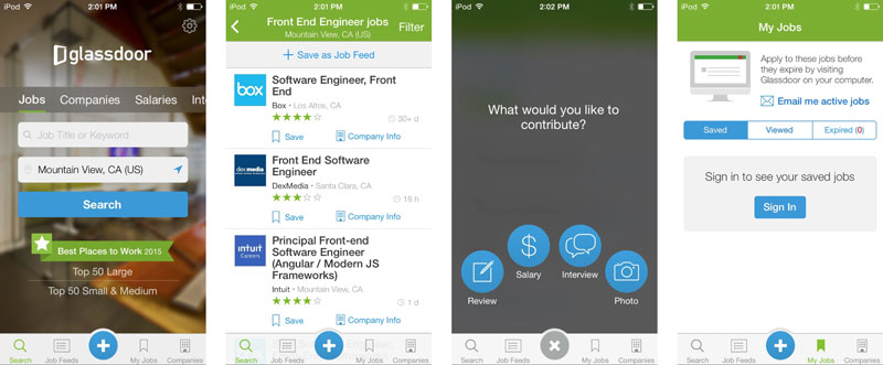
Glassdoor is well known for being a premiere resource in helping people find a job and company they love. Salary reports, company reviews, interview reviews and questions, and benefits reviews are all available, as well as millions of job listings via the site and mobile apps. Glassdoor has proven to be an invaluable tool for job hunters all over and helps make sure they’re well informed about any company.
Glassdoor’s mobile app allows users to search for and apply to jobs, save interesting job listings to view or apply to later, and helps users research companies, salaries or interview information at any time.

The Problem
Job seekers have unlimited access to the millions of job listings on Glassdoor, but users are asked to become a Glassdoor member by signing in and contributing content to the community in order to gain access its company reviews, salary reports, benefits reviews, interview reviews and questions and more. Basically, Glassdoor requires that its members contribute to the community in order to benefit from the information others have provided. Without this user generated content, there would be no Glassdoor.
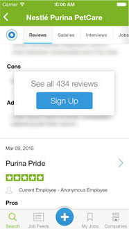
Therefore, the product team at Glassdoor wanted to make sure that they were getting as many individuals to sign in and contribute as possible. To help reach these goals, the team hypothesized that tweaking the call to action at the gate could be a key change. The original popup looked like this:

The team wanted to test out a few different variations of copy, as well as a new format for the pop up. They hypothesized that either the new pop-up layout or the more value-packed CTAs would help entice more users into signing in or contributing content.
The Mobile A/B Test
Glassdoor decided to test what copy/setup would work best with its signup strategy, and crafted a few different variants to see which would perform best.
Variants A, B, C, D, and Control respectively:

The team tested various messaging and UI setups that they thought would be effective in improving their metrics. The control had the statement “See all 434 reviews” followed by a CTA button saying Sign Up. They created 4 variants, trying out different combinations of new copy or formatting changes.
The Results
The team had an inkling that a straightforward call to action such as “sign up” would probably perform better than one that asked for more complex action on the part of the user. They were right.
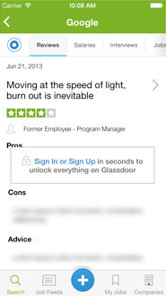
The winning variant:

Variant C (shown above) changed the formatting and modified the copy, increasing their conversions by 8%. This made sense to the team, as it emphasized both the speed and ease of creating an account, whilst also providing a the largest value proposition by saying that they’d be able to unlock “everything on Glassdoor,” which was the most specific in terms of benefit to the user. Using Apptimize, Glassdoor was able to greatly increase their KPIs with ease and gave them confidence that they made the best call.
Meanwhile, Variant D, which stated, “Add your review or salary to unlock everything on Glassdoor,” performed the worst by far, decreasing signups by 51.48%. After analyzing the test results, the team believes that this was because this copy implied that users would have to take an additional step after signup to gain full access to Glassdoor’s information.
Thanks for
reading!
More articles you might be interested in:
The Registration Test Results Netflix Never Expected
This post is adapted from Anna Blaylock’s talk at Manifesto SF. “Come on Netflix. Why can’t I browse titles before I sign up?” It’s a sentiment that many Netflix visitors have expressed at one point or another. And by many,...
Read MoreApptimize Webinars to Help You Plan Your Next A/B Test
Whether you’re just getting started with mobile A/B testing or you’ve been testing since before it was cool, knowing what to test next is sometimes a challenge. That’s why we’ve set up two webinars to give you some ideas based...
Read MoreA/B Test Images Without Programming
Did you know that the Visual Apptimizer not only allows you to change copy and buttons without programming but you can also change images on the fly? This means you can swap out images in your app without having to...
Read More