10 Ways to Increase User Retention w/o Building Costly New Features
There isn’t a mobile team I’ve talked to yet who doesn’t consider user retention one of their top priorities.
When you think of increasing user retention though, most often what comes to mind are cost or time expensive features like:
- Gamification
- Push notifications
- VIP Programs
- Email Campaigns
- Customer Support/Success
Adding new “retention features” such as gamification or push is sexy. You get to add new functionality to your app and experiment with a completely new realm of ideas.
They’re exciting, fun, and oh yeah….require a whole lot of time and/or money.
You either spend a whole bunch of sprints building and maintaining these OR spend large chunks of time and money evaluating and buying them.
And that’s assuming they work well for your userbase.
Now I’m not saying you shouldn’t add these to your app. They’re oftentimes worth the time and effort they require.
But you could more easily compound small retention gains into massive growth by simply identifying key UX changes in your app.
Find the Actions that Correlate with User Retention
Your first goal should be to figure out the core actions that are highly correlated to retention, the Aha! Moment. You can either run a regression or follow our simple 6 step framework (which is reliant on basic access to your analytics data).
What we’re looking for here is to figure out what actions users take that increase the likelihood that they’ll retain. It’s a model that has been used by a lot of the most notable products including Facebook, Netflix, Slack, Twitter, Linkedin, and quite a few more.
Here are a few examples:
Once you understand your app’s Aha! Moment, you can shift the curve up by focusing on driving users toward the behaviors that make up the Aha! Moment.
Once you’ve completed this step, the goal is now to drive users to the Aha! Moment as quickly as possible. However, if we look at the user retention data for apps, that’s not always easy…
Focus First on D1-D3 Retention
“The best way to bend the retention curve is to target the first few days of usage, and in particular the first visit. That way, users set up themselves up for success.”
– Andrew Chen, Supply Growth, Uber
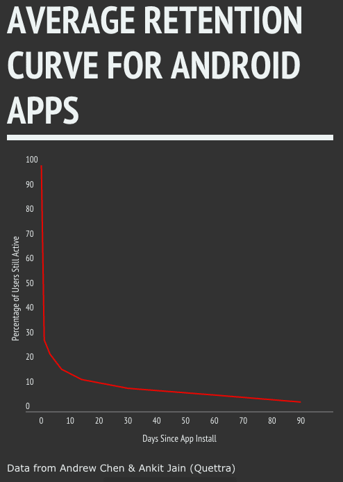
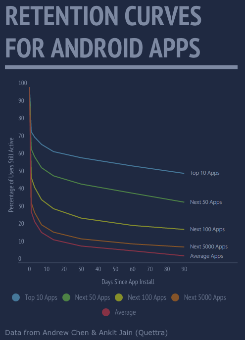
Since 77% of the average app’s users drop off within the first three days, targeting Day 1 – Day 3 retention will affect the highest segments of users and maximize returns. In other words, you need to improve user onboarding.
Notice in the graph below that while the general curve shapes stay the same, the main difference between top apps and the average one is their D1-D3 retention.
A 17% gain in D1 retention results in 42% more users on day 30 and a 226% gain on day 90.
So you know the what (Aha! Moment) and you know the when (Day 1 – Day3). Now let’s talk about how to shift that retention curve up..
Drive Users to Core Actions
Our goal for user onboarding should be to get users to the Aha! Moment as quickly and efficiently as possible. Once you’ve identified it, all you have to do is follow the Fogg Behavioral model for driving user behavior.

The Behavioral Model basically states that if you increase motivation, increase (user) ability, a trigger such as a CTA or button is more likely to work.
Instead of this nebulous cloud of “best practices”, “growth hacks”, or other techniques you’ve read about in blogs, it gives you a strong framework for how to impact user behavior.
Shifting the retention curve up boils down to a few simple steps:
- Find the core actions that are highly correlated with user retention (the Aha! Moment)
- Increase user motivation to complete the actions
- Make it easy for users to complete the ability
This doesn’t necessarily mean bulldozing everything out of the way and dropping them as close as possible to the Aha! Moment, that would be silly (unless we have data to show why).
( *Ahem* a good way to isolate data on how a change affects users is through A/B testing)
Using this framework, we can make UI and UX changes that don’t require huge efforts and compound their effects for massive growth. But what do these changes look like in practice?
Increasing User Ability
If we know that specific actions are highly correlated with retention, we want to focus on taking users there rather than other less high value actions. The most effective in-app changes you can make are to increase user ability.
Increasing user ability is all about making it as simple and easy as possible for a user to complete an action or actions. You can also think of it as decreasing friction.
Here are some ideas we’ve seen in action:
1. Reduce the # of Steps
One prime example of this? Mobile Onboarding screens.

While often considered a best practice, many companies we’ve worked with have used A/B testing to determine that the extra swipes do more harm than good.
Vevo for example found that removing their onboarding screens increased their logins by ~10%, without affecting core app usage numbers. Removing the extra steps brought users closer to the core actions in their app: watching videos and creating playlists.
2. Reduce the Cognitive Load
Cognitive Load – The total cognitive load, or amount of mental processing power needed to use your [app], affects how easily users find content and complete tasks.
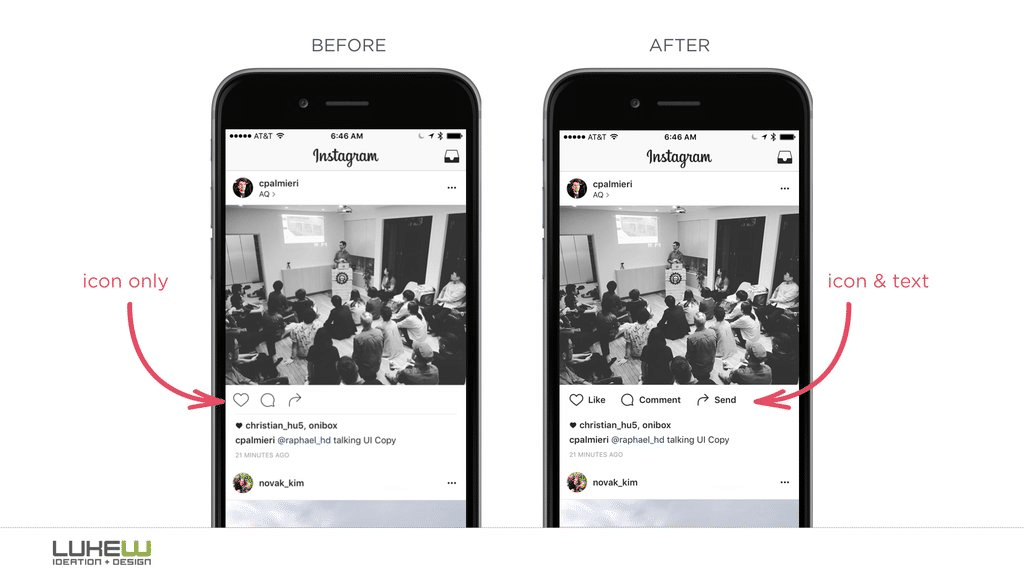
One of the simplest changes you can make is to decrease the cognitive load by explaining icons more clearly. One notorious example is the hamburger menu. Even today, it’s a commonly confused UI icon that could be easily improved with just a simple change:
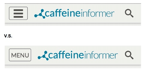
Adding a label to icons (while admittedly not as slick) is actually an important usability change you should consider. Most icons aren’t nearly as good at conveying their purpose as you’d think.
Even Instagram’s new app has made the shift to emphasize clarity over aesthetics.
One really cool use case for our WYSIWYG is the ability to change, move and hide UI elements like icons, text, images and buttons without re-submitting to the app stores. This makes changes such as the ones above low cost and high impact.
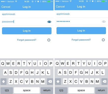
3. Get Your Logins In Order
One of the biggest usability culprits on mobile is completing registration or sign up forms. Mobile keyboards are notoriously difficult to type on, especially when inputting complex passwords.
You can greatly increase user ability with just one small change: allowing users to see their passwords while they type. This allows them to verify that they’re entering information correctly, making it far easier to complete the process.
If that technique isn’t exactly what you’re looking for, you should check out our post on 5 different methods to validate user identities, without causing a headache.
4. Map the UI to Thumb Zones
It seems like a trivial detail, but moving the controls to easily reachable areas of the screen for one-handed operation can make your app a whole lot easier to use. Small wins like this can really add up matter (as we’ll explain below).
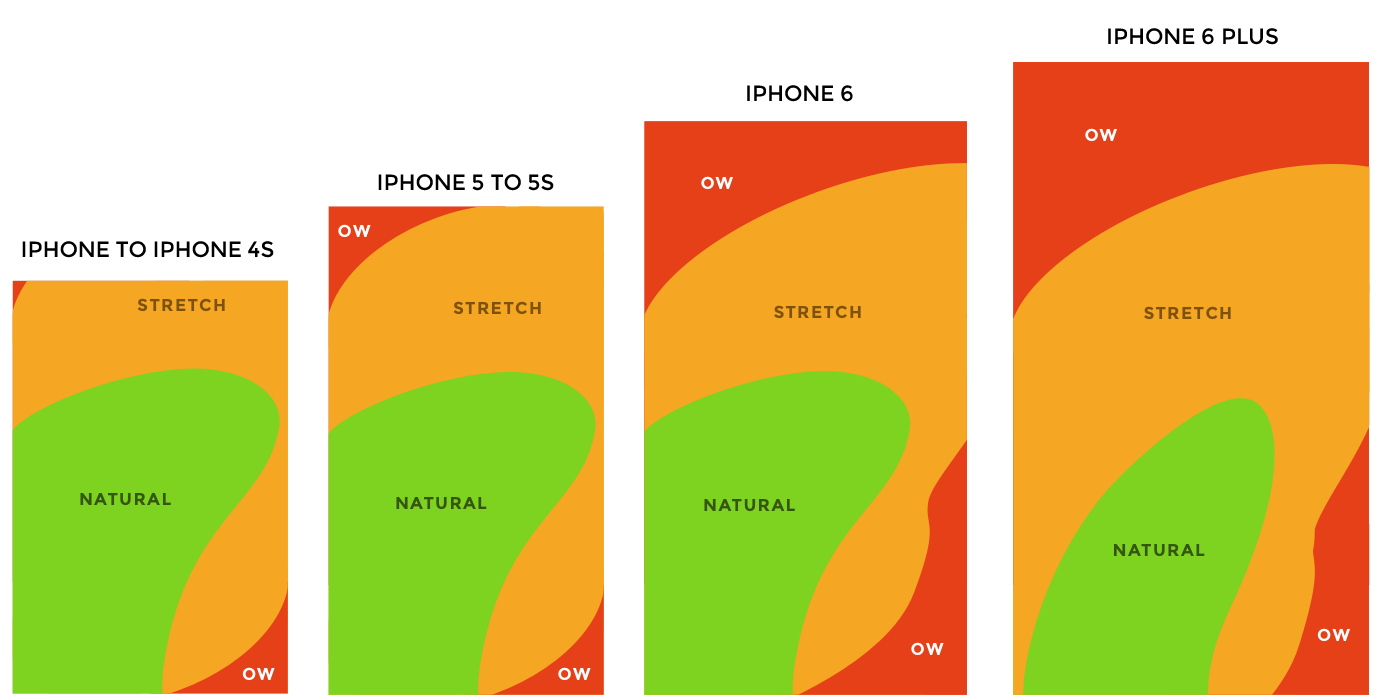 Image via scotthurff.com
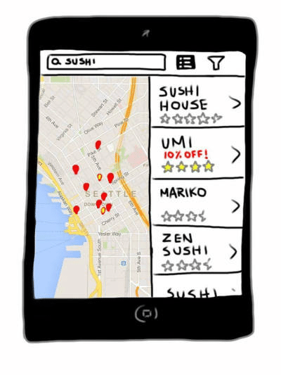
5. Refine Your Homescreen Layout
Choosing how you display results on a feed or homescreen can have huge impacts. Simply tweaking the # of such results (like we tested with HotelTonight) or choosing whether to display content in a list, map, or grid view can make it much easier or more difficult for users to get the information they need quickly.
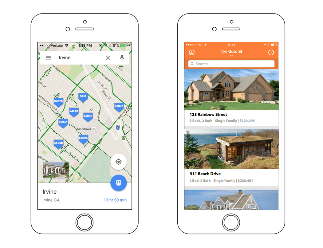
When we tested 2 different homescreen layouts with one of our customers, we were able to determine that for their audience, a list view (as opposed to a map view) of search results provided a far better user experience. The list variant ended up with 15% more core actions than the map view.
6. Make CTAs Clear and Easy to Find
Adding a persistent CTA in the right contexts does a great deal for Groupon. Unlike most apps, the team has made a CTA viewable from pages where a customer is likely to make a purchase.
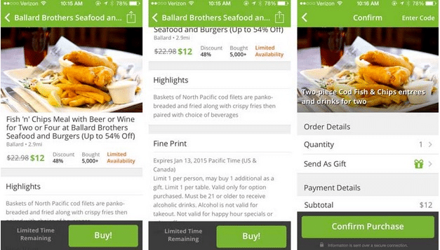
Doing so increases the likelihood that a user is able to complete the action.
7. Reduce Decision Fatigue
If you’re trying to drive users to the Aha! Moment, focus your app on that. If you have too many CTAs or features to try out, users may start experiencing decision fatigue.
Decision fatigue is the tendency of individuals to make poorer decisions than they normally would after being subjected to repeated decision making
For mobile apps, providing too many choices and too much information at once can cause users to feel overwhelmed.
Pick the core path you want to lead users down and eliminate distractions.
8. Prioritize Responsiveness
78% of users expect mobile apps to load as fast as -or faster than- a mobile website, as well as near immediate responses to any action they take.
Unlike on web, mobile users want to get tasks done quickly, as they’re often on the go. Whether they’re commuting to work, or checking their phone at a party, people mobile users easily become disengaged by any number of distractions.

Focus on increasing speed and users are more likely to stick with a task.
Techniques to Increase Motivation
With increased motivation, users are more likely to take actions that are highly correlated with user retention (if you direct them correctly).
Unfortunately, the majority of user motivation is developed outside of the app using marketing techniques including ASO, copywriting, advertising, etc.
However, there are still a few things product and marketing teams can do in the app itself.
Ideas for Increasing Motivation
- (New) App Features
- Social Proof
- Copywriting
- Surprise and delight
- Marketing/Advertising
- Demonstrating Use Cases
We won’t dig into a lot of the techniques on building new features here, but if you’d like to learn more you can check out our whitepaper specifically on increasing in-app user motivation.
9. Copywriting
Most teams are understandably skeptical about how much simple text can move KPIs, but you may be surprised. In our experiments with quite a few customers such a Glassdoor. For them, playing with the copy and layout actually increased their conversions by 8%.
For another customer simply changing the text from “Find Your Friends” to a generic “Get Started” actually doubled the click-through rate.
A simple takeaway that both teams mentioned: focus on the benefits without implying extra work for the user.
In both case studies, copy that mentioned additional work such as “find your friends” or “sign up in seconds” were actually worse at converting than something that focused on value with little implied work such as “Get Started.”
10. Surprise and Delight
Introducing variable rewards that surprise and delight users can be a huge motivation booster to complete a task. Rather than utilize gamification or other loyalty programs, variable rewards produce way higher levels of dopamine in the brain.
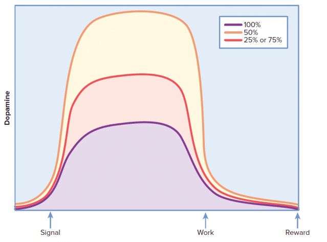
Overall, this leads to much stickier apps tied closely with habits. You can harness this principle to give that extra boost to help motivate users to complete an action.
One of our customers, a restaurant reservation app, knew that adding a special deal would significantly increase conversions. However, they weren’t sure where in the flow would work best. They originally hypothesized that placing them in the search results would increase booking rates.
However, a quick A/B test invalidated the hypothesis.
The team found that while the restaurant page views increased, bookings actually decreased. After some user tests, they concluded that users felt the deals compromised the editorial integrity of the app by pushing promoted content.
In the follow up text, they used a variable reward tactic. Instead of placing promotions in the results, they added it to the individual restaurant pages. This acted as a variable reward that gave users extra incentive to book.
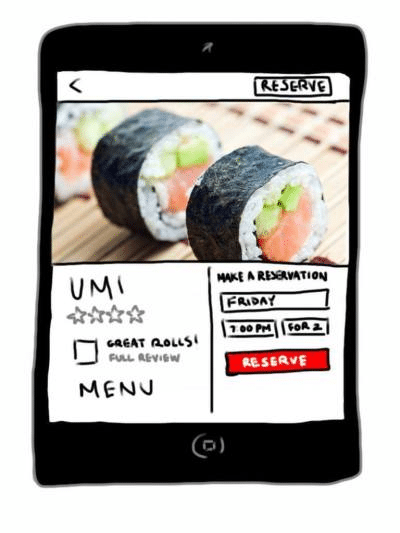
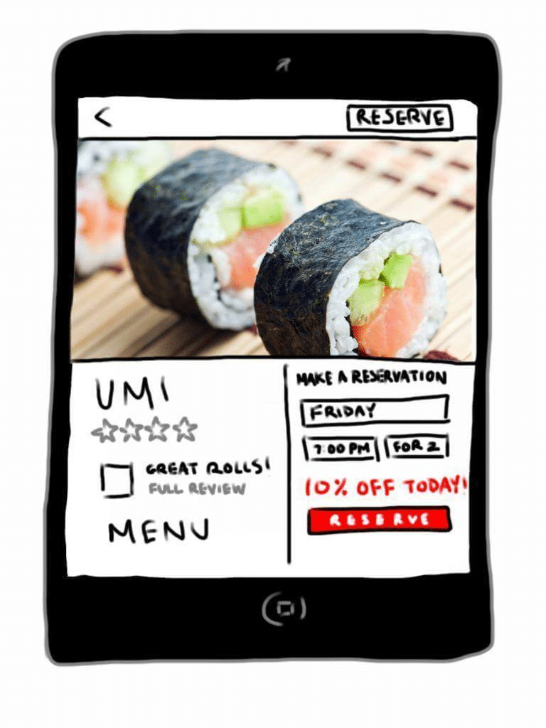
The result was an astounding 28.1% increase in bookings, their core metric.
Small Gains Compound Into Big Wins
While not nearly as exhilarating as adding a new feature, making smart UX changes can have a massive effect on growth and user retention. If we focus on making small changes that affect key metrics, the wins quickly add up.
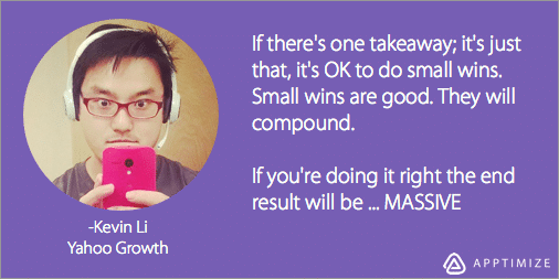
“It’s okay to do small wins. Small wins are good, they will compound. If you’re doing it right the end result will be massive,” says Kevin Li of Yahoo! Growth. And they would know.
Through a series of 122 A/B tests, Li and his colleague Sergei Sorokin were able to compound small, incremental wins into a 1000% increase in their KPI (which also sent Yahoo to the #5 spot in the App Store Charts).
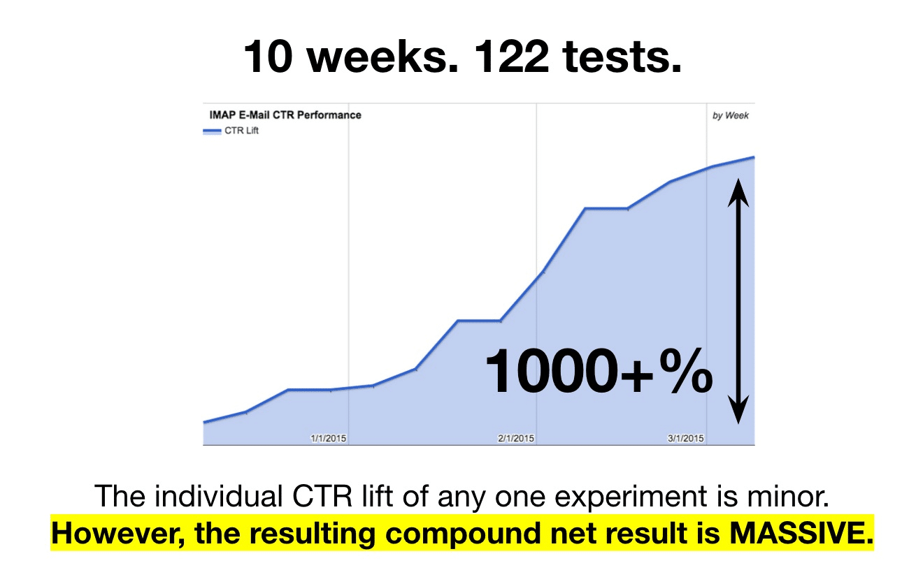
The same idea applies when making improvements to retention. Identifying even small opportunities to increase retention will compound over time.
Tracking the Effects
Using the techniques and framework outlined above, you and your team can start to devise similar tests to incrementally increase retention rates.
While these changes should be a priority on your roadmap, it shouldn’t derail whatever large launches you have on your roadmap.While you’re spending time implementing the big wins such as gamification, adding small compounding wins to your roadmap will have profound effects as well.
Just be sure to track the effect of each change. You want to know what changes are really causing the big increases, whether they’re large new feature projects, or the sum of small changes.
Thanks for
reading!
More articles you might be interested in:
3 Ways the Top Health & Fitness Apps Have Great User Retention
Product leaders are increasingly realizing that simply acquiring users isn’t enough for their mobile apps. In order to form lasting connections, you need to focus on user retention: demonstrating the value of your product as a means to earn loyal users...
Read MoreA Primer on Mobile User Retention
Solid mobile user acquisition channels? Check. Onboarding? Could use some tweaking. User retention? …..needs work. If you’ve got decent traction for your app already, retaining mobile users likely is your top objective. Yet retention is often this nebulous term everyone...
Read MoreWebinar: A/B Testing User Flows, New Features, and Algorithms
What are some A/B tests to perform to improve your app’s user flows? How can you roll out new features while reducing risk? How can you provide app users with the content they want? Watch the recording of our webinar...
Read More