11 Things Every Mobile Product Manager Needs to Know
By now, you’ve heard a great deal about the importance of being mobile.
You know that it’s not about just having an app. It’s about understanding key differences and challenges of the platform and how to overcome them. Learning from the best apps in the business, we’ve put together a list of key insights that have helped them reach the top.
Whether you’re a seasoned mobile veteran or an industry newbie, here are the 11 things you need to know to succeed on mobile.
1. The differences between a mobile website, a hybrid app, and a native app.
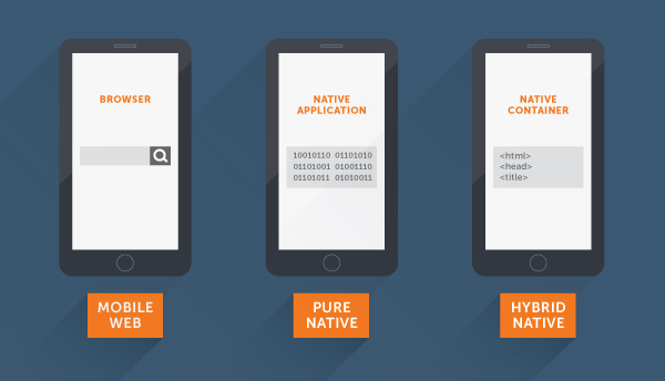
The first thing mobile teams need to understand without a shadow of a doubt is the differences between a mobile website, a hybrid app, and a native app. While each has their advantages and disadvantages, the clear winner for an amazing mobile experience are native apps.
If you look at the top charts in any vertical, you’ll find that the overwhelming majority of them are native mobile. This is because a native mobile app sits directly on users end devices, allowing the fastest response time and the ability to take advantage of all the features of a smartphone.

A native application is a program that has been developed for use on a particular platform or device and sits directly on the end users’ devices. These are typically downloaded through the app stores (App Store, Google Play, etc.) and don’t necessarily require web connectivity to use. The main advantage of native applications is that it is optimized for a certain operating system and has access to hardware devices.

Mobile websites refer to the browser-based internet services from mobile devices. These can be accessed through a mobile phone’s browser app (Chrome, Safari, Android Browser, Firefox, etc.). These are a great solution if you’re looking to provide mobile-friendly content to a wide audience. If you’re looking for more in-depth engagement and retention, however, a mobile app is the way to go.

While hybrid apps have a few distinct advantages over native mobile apps, they’re generally regarded as a sub-par solution. In theory, they sound great. Hybrid apps give you the benefits of app store distribution, without having to go through the app store each time you want to update. However, as Facebook discovered, “when it comes to platforms like iOS, people expect a fast, reliable experience and our [hybrid] iOS app was falling short,” said Jonathan Dann a Software Engineer at Facebook.
Additional Reading:
Why Mobile First May Already Be Outdated – Intercom Blog
Facebook’s Jonathan Dann on Why They Switched to Native Mobile
2. The Pros and Cons of Android vs iOS
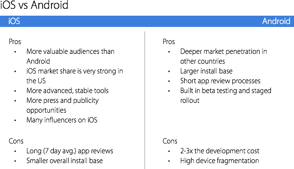
One classic debate is whether it’s better to launch on iOS or Android first. If you’re serious about mobile, you should be doing both. Regardless of which is the better one to start with, it’s important to know the benefits and limitations of both platforms.
One of the biggest differences between the two platforms is fragmentation. Due to the openness of the Android platform to device manufacturers, there are tremendous amounts of Android OS versions + device combinations to support. With 24,093 distinct devices, making sure your app works across the entire spectrum of combinations becomes an incredibly time-consuming problem.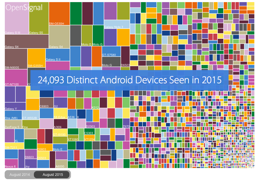 Original image via OpenSignal
“Building and releasing on Android costs 2-3x more than iOS. This is due to a multitude of reasons: less sophisticated tools, generally more cumbersome APIs, fewer exposed advanced features, enormous QA issues brought on by fragmentation, etc. The rough rule of thumb is for every iOS engineer you actually need two Android engineers—or twice the development time” – Steve Cheney
The biggest disadvantage of iOS is the Apple App Store review process. Due to their strict control of the review process, being agile on mobile can be a huge challenge. (See #7) By contrast, Google Play app reviews are far less rigorous, with the process typically only taking a few hours.
Additional Reading:
The best new apps are all going iPhone first – Andrew Chen
Quora: Should I start on Android or iOS for a mobile app?
Android vs iOS: Which platform to build for first?
3. How Mobile Users Are Fundamentally Different Than Web Users
There are 2 key differences between mobile users and web users that every mobile product manager absolutely must know for a successful product:
- Mobile Users are highly task-oriented
- Mobile users are easily disengaged
While they sound like banal platitudes, these two statements hold key insights into why so many mobile apps aren’t connecting with users.
Mobile Users are highly task-oriented
When mobile users unlock their phones, they’re looking to accomplish a task and accomplish it quickly. If they’re hungry, they might want to look for a nearby restaurant. If they’re bored, they may seek a distraction such as surfing Instagram. If they’re about to get on a flight, they may want to check in. Wherever the use case is, there’s always one commonality: they are seeking to accomplish a clear goal. This contrasts greatly on web, where users are more often seeking to learn or explore.
Mobile users are easily disengaged
Most web users are settled into a relaxed environment, such as a cubicle at work, a desk at home, or a coffee shop. During these sessions, users are less likely to get distracted than they are when using a mobile device. When users whip out their smartphones, they’re often in between tasks or on the go. This means that they’re much more likely to disengage by a multitude of distractions, whether it’s changing transportation, an interrupting co-worker, or shifting gears into the next task.
It’s vital that mobile teams account for these distractions and make completing users tasks as quick and efficient as possible. On mobile, it’s even more vital to decrease the number of steps, clicks, taps, or blockers as possible to help increase the likelihood that users will achieve their goals without being distracted.
You need to help users achieve their goals quickly and efficiently.
Oftentimes what successful web companies will do to achieve “mobile presence” is create an app stuffed with all the features available on their website. The result is oftentimes poor ratings and low levels of user adoption. This method doesn’t address the fundamental differences of mobile users and instead make it harder for users to accomplish their goals due to cluttered UI and slower processing speeds.
A Successful Model
Let’s take a real-life example of a company that is highly successful on both web and mobile: Starbucks. Starbucks understands very well the 2 key differences we highlighted above, and it shows in their differing approaches on web and mobile.
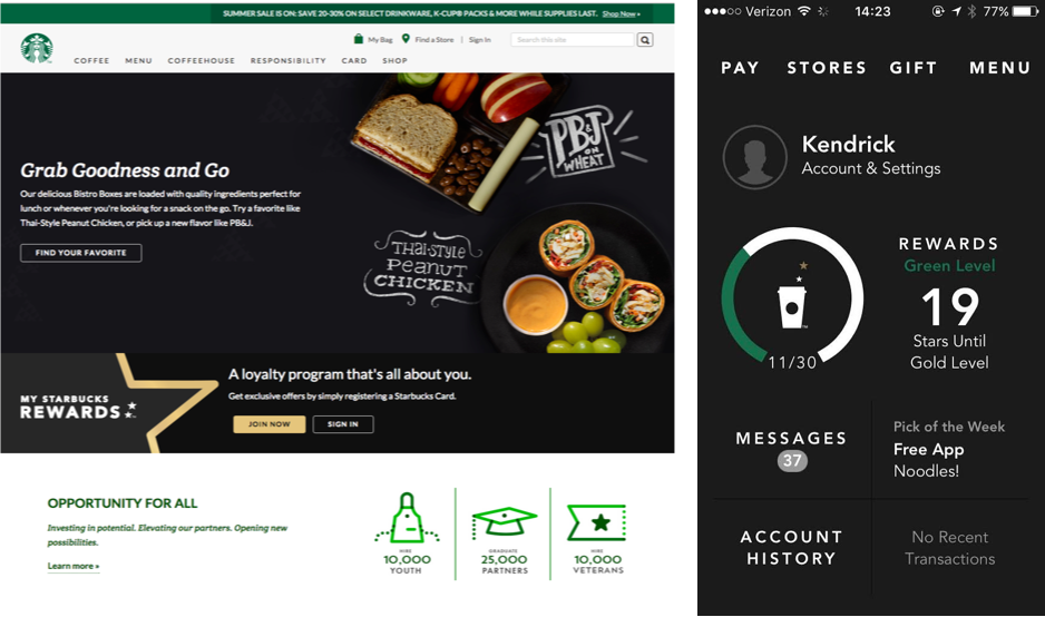
Starbucks’ website is designed to allow users to explore and familiarize themselves with the brand. There, they talk about everything from their coffee, charity programs, their new product announcements, and also allow users to sign up for rewards programs. Their entire website is focused on educating users on what they’re all about.
On mobile, the focus is completely different. Starbucks knows that its mobile users want to accomplish a task and want to accomplish it quickly. As a result, they’ve selected only a few core options for their users: pay/use your gift cards, locate a store, purchase a gift card, and view the menu. All of these tasks are centered around allowing a user to quickly and efficiently satiate their coffee or food cravings and quickly get on their way.
Unlike the website, they’ve removed extraneous features and exploration options because they know that they’ll clutter the UI or distract users from what they really want to do.
Additional reading:
Mobile Purpose Paradox – Nielsen Norman Group
4. A Solid Understanding of Standard Design Guidelines

The Android Design Guidelines and iOS Human Interface Guidelines are some of the best resources to reference when building or iterating on your app. They provide general best practices and help products create an app that conforms to accepted standards. Familiarize yourself with these to understand how mobile design/interaction is changing, or simply how to build a useful and beautiful app.
Additional Reading:
Android Design Guidelines
iOS Human Interface Guidelines
The Ultimate Guide to Hamburger Menus and Their Alternatives
5. Why Top Apps Use an MVP Model for Mobile Iteration
The top teams don’t invest unnecessary time and effort into untested changes. Instead, they make simple versions (minimum viable products or MVPs) of a feature and then test them early on to see their effects. You’ll find that the top mobile teams like Dropbox, Uber, Lyft, HotelTonight, Facebook, Trulia, and many others all use the MVP model to make small, iterative changes to their app every few weeks.
In a release, it can be hard to directly correlate changes you make with user behavior, due to a variety of confounding factors. Oftentimes, we have a tendency to build out full features without really understanding how each component is going to affect and drive user behavior.
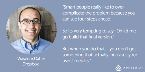
Making small iterative changes and A/B testing them will reveal a direct cause and effect relationship between your change and user behavior—something that’s incredibly difficult to see in a large release. This allows you to validate your ideas by seeing whether users respond positively or negatively, as well as help avoid assumptions. Keep the scope simple.
Additional Content:
Dropbox’s Waseem Daher Shares Why They Make Small, Iterative Changes
How HotelTonight Uses A/B Testing to Optimize Their App
6. Why Teams Use Release Train Schedules

We collected data from the top 10,000 apps in the App Store and found that the top 100 apps release 3x more frequently than the rest. Why? Because short release cycles allow teams to:
- Learn quickly from users using MVPs
- React quickly to changes in the market
- Relieve a lot of pressure and uncertainty for mobile releases
Instead of doing a feature-based shipment (i.e. shipping a release based on when a feature is completed and QAed), release train schedules are schedules of planned releases that (like a train schedule) happen at regular, pre-planned intervals, regardless of whether or not features are finished and ready to go. Whether it’s just bug fixes or an app overhaul, the release is still pushing forward according to preplanned dates.
Additional Reading:
Facebook’s Release Train Schedules
Lyft Explains How to Get Your Release Train Going
7. The Constraints of the Mobile App Stores
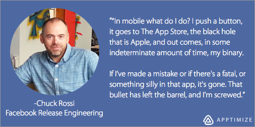
As we mentioned above, some of the biggest blockers to mobile app success are the app stores. Whenever a mobile team wants to release an update, they must submit a new version of their app to the stores, where they are vetted and then released to users. There are 3 major problems with this system of updating and deploying changes to users.
- An App Store review takes an average of 7 days to complete
- You release to your entire user base in one swoop
- You can’t roll back to a previous state
Due to these constraints, mobile teams tend to move slowly, shipping large releases every few months instead of small, iterative changes like mentioned in #5 above.
Shipping large updates in this manner is like reverting back to the days of shipping boxed software. Instead of validating ideas and changes, mobile teams try to guess what users will like and invest time and resources in it before testing.
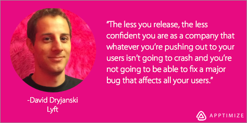
The other issue that arises is your team’s decrease in confidence that they’ll be able to quickly deal with any major bugs. Due to the fact that you can’t revert to a previous state, teams have to submit an entirely new version if they want to fix anything in the code. With the long review process, it becomes very difficult to respond quickly.
Additional Reading:
Mobile app startups are failing like it’s 1999- Andrew Chen
8. Feature Flagging
Like we mentioned earlier, one of the most frustrating constraints of the app stores is the inability to revert back to a previous state. But what if you could roll it back? Feature flagging is a development technique used to “turn features of your application on/off at a moment’s notice.”
Feature flagging is surprisingly underutilized on mobile, especially given that it’s the industry that needs it the most.
Companies like Uber utilize feature flagging in their apps because they conform to the rules of the app store but still give the company granular control over releases. Using feature flagging allows them to dogfood their app, do staged rollouts, set up for A/B testing, and rollback features at will. It also allows them to release to very specific groups of individuals, such as users in the UK running a specific version of the Android OS. This suddenly removes some of the biggest hurdles when developing on mobile, allowing teams to develop and push forward with confidence.
Note: While Google’s Play Store allows teams to do staged rollouts, they don’t give you the ability to deploy to targeted groups or give you the ability to roll back changes.
Additional Reading:
Flipping Out – Utilizing Feature Flags at Flickr
Mobile Feature Flagging at Lyft
Feature Flags for iOS and Android
9. A Step By Step Formula for Optimization

Smart teams know that growth is all about the process, not the results. That’s why having a process for continually optimizing and improving your app is so vital. Utilizing a formula to methodically identify and release high-value changes is how teams compound small wins for massive growth.
The first step is to identify optimization opportunities in an app to better serve users. This can be done using a variety of techniques that we’ll talk about in #10. Once those opportunities are identified, define the metrics by which you will measure progress. Then, form a hypothesis about how to increase those metrics.
A lot of less mature mobile teams stop at this point and spend months developing a new feature then release it to all their users. The top mobile teams validate their hypotheses before spending too much time or releasing an untested change on their entire user base. Instead, they build an MVP and A/B test it on a small percentage of their users to see its effects. Only after it has been tested and validated do they deploy it to all of their users.
Additional Reading:
Yahoo! Growth On Why You Need to Use Testing
10. Methods for Discovering Optimization Opportunities
Trying to figure out what the high impact improvements in your app would be is not always easy. Here are the techniques we’ve seen work best across leading apps to gain both qualitative and quantitative data to hone in on high-value improvements.
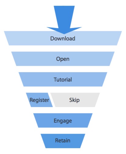
For quantitative data, look to your analytics platform. Setting up mobile conversion funnels will allow you to see exactly where in the funnel your users are dropping off. Using this, you can gauge where improvements need to be made.
To get a deeper understanding, seek qualitative data through user testing or user feedback. With user testing, you can observe as users walk through your app, determining where they’re not understanding or behaving as you expect them to. Similarly, surveys can give you great insights about where people are experiencing pain points.
Additional Content:
Pinterest’s Growth Engineer – Using Mobile Conversion Funnels
Setting Up Conversion Funnels for A/B Testing – Amplitude Blog
Webinar Recording – Start Increasing Your App Usability in Just 5 Days
11. App Discovery Methods
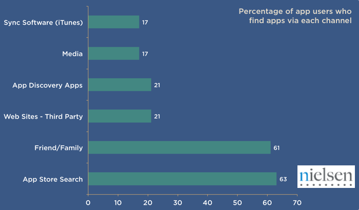
There are two major methods of getting your app discovered: through the app stores and through social sharing. Each of these methods can bring in a huge influx of users, so it’s important to understand how each one drives discovery.
The first and biggest distribution channel is through the app store, one of the largest discovery channels available. That’s where App Store Optimization comes in. Like SEO, app store optimization is all about increasing the searchability of your app to increase the likelihood that users looking for your solution will find it. With ASO, it’s all about optimizing your title and keywords to target the correct audience. Moz has a great guide to app store optimization on their website.
The second most important discovery method is social sharing through friends and family. According to a report by Ofcom, 77% of mobile users say they’ve downloaded an app that they heard about through word of mouth. By contrast, less than 20% of users say they’ve downloaded an app because they saw it advertised or read about it in the media.
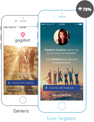
This implies that social proof is one of the most important aspects to consider in getting users to adopt your app. Leveraging social proof using techniques such as deep linking can help increase the odds that users will download and engage with your app.
Additional Reading:
The Inbound Marketer’s Guide to Mobile – Moz
Mobile Deep Linking 101 – Branch Metrics
Want to learn more about how to engage and retain your users on mobile? We’ve put together an ebook on how to create a mobile strategy that actually works. Check it out below!
Thanks for
reading!
More articles you might be interested in:
Growth Hacking for Mobile Product Managers
Mobile product management is taking the PM world by storm. As more companies make the transition to mobile, PMs everywhere are expanding their knowledge to encompass a new set of tools that can be applied directly to mobile products. Although...
Read MoreHow Effective Is Your Mobile Product Team?
This is a guest post by Ashley Sefferman of Apptentive Today, there are over 50,000 apps added to the app stores each month, and a whopping two-thirds of all apps see fewer than 1,000 downloads over the course of their...
Read MoreHow to Gain and Engage Mobile Users
Is paid user acquisition the only way to get substantial users in this mobile ecosystem? Why even pay for downloads if those users don’t stick around? What are the best ways to create virality? Apptimize CEO, Nancy Hua, speaking at...
Read More