Mobile Growth Without Crashing: 23 Ways to Improve User Retention

Mobile retention rates have reached a historic low—at just 23% across all industries.
Many mobile product managers use this number as a crutch. If most of the industry can’t even keep a quarter of their users, surely their 30% or 40% retention rate is acceptable.
But a few other hair-raising stats help us put this low retention rate in perspective. Like the fact that 60% of iOS apps don’t make developers a profit. Or that the average user engages with less than 5 apps on a daily basis. That means that in order to achieve any semblance of mobile growth, you need to have a better retention rate than the majority of apps on the market. Here are 23 ways to improve user retention:
When Flatlining is a Good Thing
Mobile product managers often think it’s fine to have high churn as long as they can keep up user acquisition. Some users might leave, but the larger userbase is growing as new users subscribe.
This assumption can sink your app.
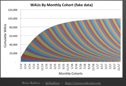
That’s why it’s so important to double down on your retention numbers. Break down your userbase into acquisition cohorts—groups of users that signed up for your app at the same time—to get more accurate insight into your retention. You’ll end up seeing something like the graph below. While your overall Weekly Active Users (WAUs) might be on the up, over time, churn will cause growth to plateau, and then ultimately tank your product.
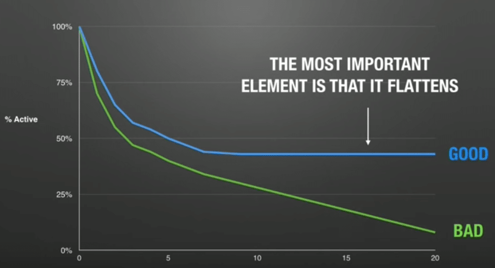
According to HubSpot’s expert marketer Ben Ratner, the only way to achieve growth is to get that retention curve for every monthly cohort of users to flatten. This means that once users learn how to use your product and get to that Aha! moment, they’re no longer in danger of churning.
 [source]
As a result, your acquisition efforts won’t be spent helping you sustain a userbase. Rather, they’ll help you grow your userbase consistently. Your product will have traction, because there are users out there that recognize its long-term value.
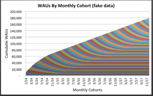
So your retention objective is to get that curve to flatten, and get it to flatten fast. This means:
- creating value with a great product and UX
- getting the maximum amount of users to see it ASAP through outreach.
Here are 24 tactics to get your retention curve to flat-line, quick.
1. Nail the Presentation
You’ve gotten some positive feedback from your customers, and you know you have a solid product. If your retention curve still isn’t flattening, the next thing to look out for is a UI issue. You’re not guiding your users to their Aha! moment—the moment when they find value—fast enough.
To increase the number of users that your product appeals to, you need to make it easy to use from the get-go. The more intuitive the UI, the less steep the learning curve, and the more users are compelled to stick around because they discovered value. Here’s how to make your UI more intuitive for a better customer experience, sooner.
2. Be Different, but not too different
Radical UI changes are often what causes an app to flop. New features like Google+’s Circles set out to reorganize online relationships—in literal circles. Meanwhile Nokia and Microsoft tried to create “Live Tiles” to challenge Apple’s App Store.
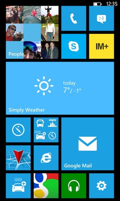
Users have basic expectations for what mobile apps look like and how they work. They expect a left hand navigation bar on a news app, a shopping cart on the top right of any retailing app, etc. The trick is making your UI satisfy those expectations, without making your app look like every other one out there.
This is what Raymond Lowey calls the MAYA (most advanced, yet accepted) principle, which says that you basically have to innovative within reason. Create the best possible user experience, not create something groundbreaking just for the sake of it.
3. Introduce Features in Order of Importance
You might be excited about all the new features you can offer a user, but they’re still learning the swing of things. They don’t need to learn how to schedule a post, set their alarm clock, and send a message to their coworkers all at once! Lost-item tracking app XY mutes the entire screen and guides users only through one key feature their first time in the app.
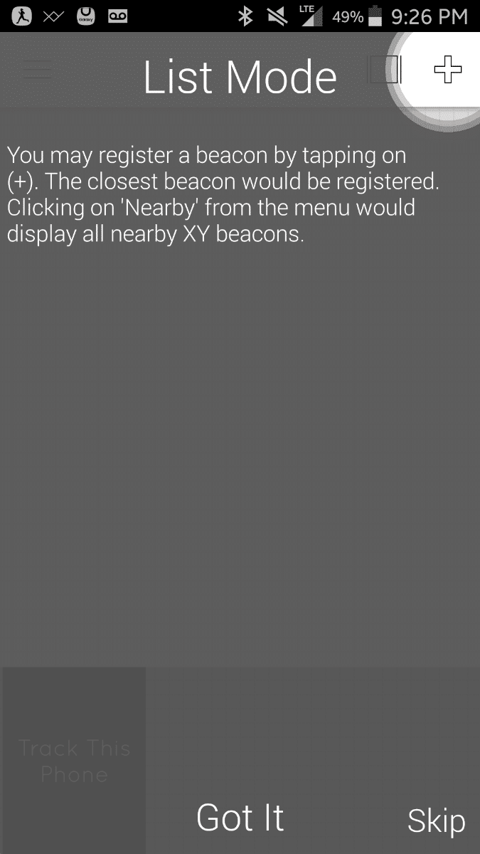
Avoid decision fatigue by running your users through one new work flow per visit. Any features that are tied to the core-value of your product should be prioritized and explained in-app, and supplementary less-important features should be recommended based on user behavior.
4. Label navigation buttons clearly
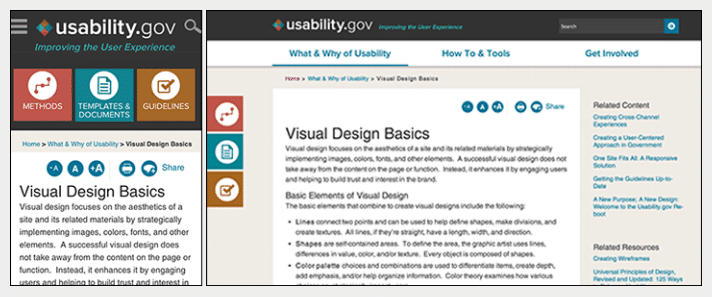
Snapchat can get away with a swipe-right, swipe-left architecture, but few others have. This navigation hasn’t caught on yet as the norm and is far from intuitive. Users can’t be expected to perform an arbitrary action to get to a core part of your product. Label navigation buttons clearly so that users don’t have to think twice about getting where they need to ASAP—even on day 1.
As noted by Aurora Bedford of the Nielsen Norman Group, Usability.gov only uses unlabeled icons on their webpage (on the right). In their app (on the left), it’s critical for them to include labels so that the user knows a)that they’re clickable and b) where they lead.
5. Architect for accessibility
As far as accessibility goes, the general rule is: every screen should be accessible within 2-3 clicks. But Steve Krug, a usability expert behind the famous book Don’t Make Me Think, actually begs to differ. He says that as long as every click is mindless and unambiguous, then the number of clicks doesn’t matter.
So it’s not about the quantity of clicks but the quality. Navigating between two screens with one click that’s hard to find is much worse than three clicks that will obviously take you where you need to go.
6. Don’t underestimate Discoverability
Along the same lines, make sure nothing is hidden or hard to get to. And this goes beyond UI mistakes—even the beloved hamburger menu has been known to keep important features hidden from users.
Your core features should be visible and available front and center on your app. Otherwise, no matter how sticky they are, users are going to forget all about them.
7. Suggest features in context
New features can be game-changers in the evolution of an app. Kayak was first developed as a simple flight price comparison app. But in recent years it’s their extra features—maps, flight-tracking and itinerary management—that put it on the market.
But a feature’s success largely depends on how many people actually use it. You can try your luck with an email that might not get opened, or a push notification that will just get deleted. In order to ensure adoption, you have to tell users about your feature in context.
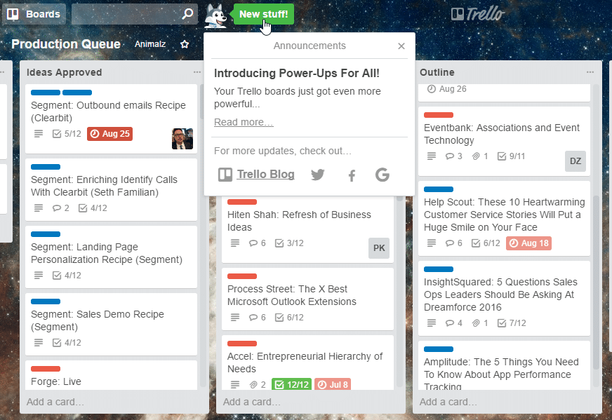
Tools like Appcues let you just drop in a Javascript snippet, adding onboarding and feature adoption to your app in minutes. You can make feature recommendations where they’ll pack the biggest punch, without having to bother your dev team.
Actively Seek Feedback
Users can leave your app for a slew of reasons, whether it’s a bug, UX issue, or a new product on the market. But users stay only for one reason: they love your product. Ask your long-time users what has compelled them to stick around. Then you can optimize all new users’ journeys and get them to the best parts of your platform, faster.
8. Crowdsource feature suggestions with Trello
You so often hear feature suggestions, whether it’s from your team, your customers, or your mother, that it feels impossible to decide on what to build first. But this doesn’t mean you should ignore them all—you just need a system for prioritizing.
When help desk software company Groove started noticing a low interest in their new features, they decided to change strategies. The CEO reached out to hundreds of users and asked for feature requests. Once they started noticing patterns, they set up a Trello board.
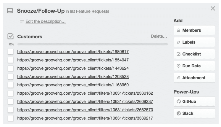
Once a certain feature has enough requests, they would just go ahead and build it. This strategy ensured that every adjustment to the product would be well-received, increasing the value of the product one happy customer at a time.
9. Survey Power Users
Your power users will give you the greatest insight into what you’re doing right and where you could improve. They’re users that have gotten to know your platform inside and out and depend on it for their day-to-day.
If you’re already using an analytics platform, dig deeper by reaching out to your top users. Find your most active users based on overall time spent in-app, and reach out to them to learn about why they love your app and how they rely on it every day.
10. Use NPS surveys to find lovers and haters
NPS (Net Promoter Score) surveys are known for being one of the best indicators for growth across all industries. They’re simple two question surveys. The first question asks users to rate how likely they are to recommend the app to a friend, and the second part asks some version of “Why?” Base the ratings on the ten-point scale.
Here’s how the Net Promoter Score is calculated:

Tools like Apptentive let you add an NPS survey to your app to get an idea of what users really think about your app. You can learn why your best users would recommend it and make product modifications to highlight your most beloved features.
11. Watch users learn your app with usertesting
While it may be easy to get feedback from your users, you often don’t get the whole picture. They tell you the obvious stuff—how it fits into their work day, what they love, what’s missing. But a user experience consists of much more than that. Little bits of friction can add up and cause a user to be frustrated and leave your app without ever explaining why.
To find those bits of friction you need to take a close look at a real person interacting with your product. You can use a service like UserTesting, and select testers who fit your buyer persona. They record the user working through your app and mark the places where they were tripped up.
12. Use mobile heatmaps to see what’s catching users’ attention
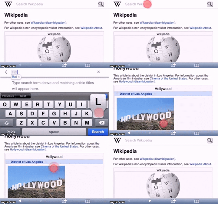
An alternative to user testing is using mobile heatmaps. Tools like Appsee let you record how your real users interact with your app. You can’t learn why a user exits out of a screen the way you can with user testing. But heatmaps offer insights into your real userbase, instead of a team of test subjects.
Build Lasting Relationships
To get users to see the value of your product sooner, it’s tempting to get your app in front of them any way you can. Good mobile product managers leverage email, push notifications, and in-app messages in tandem. But one too many emails often is the tipping point that gets your app deleted. At best, all of your outreach will be ignored, and at worst you’ll even cause users to churn.
If you reach out tactfully, however, you’ll be able to maintain a great relationship with your users and earn their trust. Here’s how to keep up contact without overdoing it.
13. Segment emails based on behavior
The difference between spam and great email campaigns is relevance. Rather than making the same suggestion to all your users, make suggestions based on behavior. This might mean asking for a rating after a customer used your app to order a book, or suggesting a scheduling feature once a user joins a team.
Twitter could send an email that suggests adding a profile photo to all new users. Instead, it sends three suggestions via email that the particular user has yet to do. This way a user won’t be pestered with information they already know. Rather, they get useful relevant advice that’s immediately actionable.
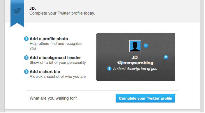
To send only useful and relevant emails to your users, use a targeting email platform like Customer.io. It allows you to segment your users based on behavior to customize drip email campaigns.
14. Use push notifications as an extension of product
60% of users disable push notifications. Push notifications are powerful because they’re sure to get information in front of users. But with great power, comes great responsibility. If you don’t use push wisely, your users will opt-out with a bad taste in their mouth. To avoid this, use push notifications as an extension of your product.
Think about a calendar reminding you of an appointment, or a messaging app pushing notifications. These seem perfectly normal and non-intrusive. In fact, they feel almost necessary. According to Pinterest’s John Egan, you have to tie your push notification to your value prop. Make push be part of the app experience, so that users aren’t put off by the random and intrusive push update.
15. Help users in and out of your app with content
The value of great onboarding and feature adoption is apparent. But there’s more ways to teach your users to succeed than through in-app walkthroughs. If you can create an educational hub around a topic that you and your staff are experts in, you’ll build brand awareness and make users more excited about using your app.
Wistia CEO Chris Savage is the first to admit that video hosting is boring to write about. But learning how to use video effectively, isn’t. That’s why they’ve created an entire “learning” section on their site.

Visitors can read about anything from VR to how to manage company culture, or watch fun videos on how to make an impact with video. It’s not always directly related to their product, but the positive impression it leaves encourages new users to stick around.
16. Build repetition by setting expectations
However you choose to engage with your users, you have to set expectations. When it’s unexpected, one push notification a week can be disruptive, but a daily email—when anticipated—can be a welcomed part of anyone’s day.
Language-learning app Busuu has mastered the art of the push notification. They use notifications as virtual flashcards, helping users work on their desired language.
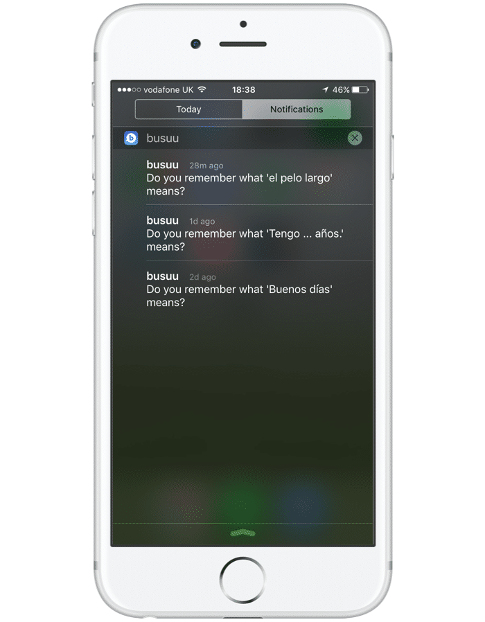
By offering users little bits of value daily, Busuu sets the user up to expect push notifications. This reinforces Busuu’s value on a daily basis and increases the stickiness of the app.
17. Surprise and delight with variable rewards
Rewards platform Kiip makes engagement ads that are 14x more effective than banner ads. Their secret? They reward users randomly after purchases. This instills goodwill into the user and makes them more likely to return the favor in the future.
The psychological principle of reciprocity says that people feel inclined to give back and repay generosity. But it goes deeper than that—rewards inspire positive impressions only in addition to an already great product experience. As CEO Brian Wong says, “We want you to use that running app because you want to use a running app, not because you want the reward.”
Increase Points of Contact
Retention is a problem you’re never going to “solve.” For as long as you have a mobile app, you should be looking to increase retention.
Nir Eyal’s famous hook model illustrates the importance of external triggers—ways of nudging the user when they’re not using your product to go back into the app.
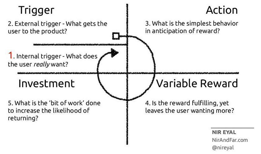
To get a user to the point of no return, the app has to become a crucial part of the user’s routine. But the only way to build routine is by constantly guiding the user back into interaction with your product. This is done through external triggers that bring the app front of mind.
18. Use push to positively reinforce behavior
Users can’t get fed up with a notification that delivers value and makes them feel good about themselves. Sprig is a delivery service for ordering healthy food. If you give a dish a high rating, they’ll send a push notifications to tell you next time it’s available.

Use push to reinforce behavior you want the user to continue. This way they’re motivated to act on the same impulse that drove them to the action in the first place.
19. Email summaries for insight
As it turns out, we’re all closet narcissists. People love talking, hearing, and learning about themselves. That’s why insights and summaries of users’ behaviors aren’t just valuable to you—they’re valuable to users too.
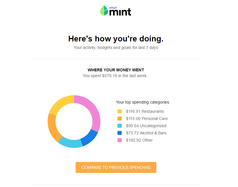
External triggers only work if they are curiosity-piquing. Finance-tracking app Mint sends users spending reports once a week and tempts them to learn more about their spending habits with their CTA.
Pinpoint Product Problems
It’s easy to put on blinders when it comes to actual product problems. You’ve created it from scratch and can’t bear the thought that it was all for naught. Not to mention product problems are the hardest to find, the most time-consuming to fix, and the biggest red flags that something is going terribly, terribly wrong.
But these problems will surface sooner or later, and you certainly don’t want it to be later, once you’ve spent most of your budget on designers and marketing. Here’s how to make product adjustments before they turn into larger issues.
20. Dogfood your product to help Q&A
Top apps with millions of downloads go great lengths to make sure they find bugs before their users do. In fact, leading Hong Kong game developers at Animoca dogfood their apps by testing on 400 different devices.

Not every mobile app company can test across all devices, nor do they need to. Asking your staff to QA your new feature on test devices is never going to yield the best results. They’re not accustomed to the functionality of the device itself, so they’re less likely to spot UX problems.
That’s why many companies, such as Facebook, use feature flags. It’s a way of giving employees early access to the features on their own devices, and then make it available slowly to a larger audience. Then, you can make small changes or rollback without having to redeploy.
21. Prioritize USER FEEDBACK with NPS surveys
There are two factors you have to consider to make the most valuable improvements to your product: priority and focus. You want to make product improvements in your biggest problem areas first, and then move on to less-vital areas. This way you can make the most impact with the least time spent.
Use NPS as an indicator for which features require the most urgent attention. After you ask your users the big question—how likely are they to recommend the feature to a friend—follow up with “why.”One way of doing so is using verbatims—Atlassian’s system for focusing on NPS feedback.
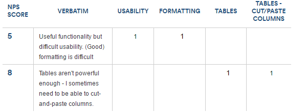
They organized feedback into categories and prioritized feedback by number of complaints. The system you use to handle user feedback in product development can be just as simple—what’s important is to have a process.
22. DEBUG quickly with Tracking software
The unfortunate truth of SaaS is that it’s incredibly difficult to cover all our bases. Apps will crash, there will be compatibility issues, and there will bugs that got past your QA team. Even big-time apps like Slack experience outages.
What separates the good from the great is the turnaround time. How quickly can you deploy and affect the least amount of user experiences? Here’s what you can do to ensure that problems get dealt with ASAP.
- Use issue-tracking software. Tools like Rollbar let you just drop in a few lines of Javascript and get insight into bugs and malfunctions from their dashboard. You can be alerted in real-time so you can deploy fixes ASAP.
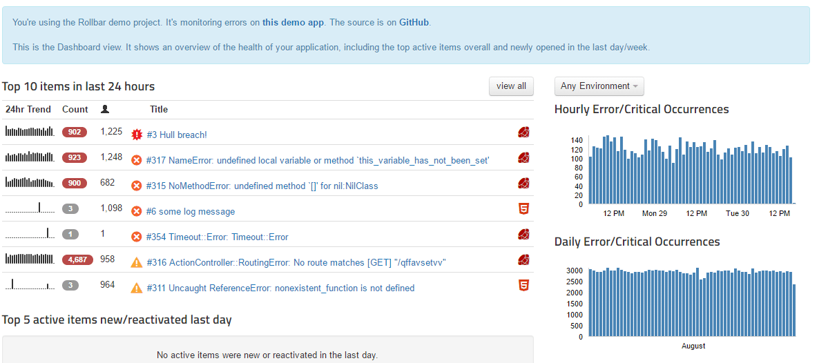
- Know about your crashes. You shouldn’t rely on your customers to complain when your app malfunctions. Use a crash reporting SDK like Crashlytics. It enables you to learn about crashes, but also helps you spot bugs based on analytics.
23. Use ticketing software for diagnosing issues
Not all product issues are code issues, and your users will be the first to let you know. Sometimes a part of the platform doesn’t behave as expected or as it used to, so you need to have a reliable method for addressing and prioritizing issues.
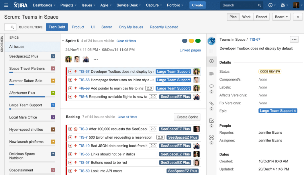
Use JIRA as a two-for-one. It serves as a ticketing software for customer service and as an agile tool for software-development. This makes it easy for a service team member to escalate a problem and turn it over to the dev team if it’s deeper than what they can handle. It also lets you customize your workflow so that issues can be appropriately prioritized.
24. Have a surge-ready customer service team
78% of consumers change their mind about an intended purchase due to a terrible customer service experience. Truth is, nobody wants to give business to a company that ignores them or treats them poorly.
Munchery has mastered their customer service strategy by employing four full-time customer service agents and 12 flex agents—agents who have roles in the company on top of customer service. This way, Munchery always has the bandwidth to deal with a surge of tickets when necessary.
Make sure your reps are human and responsive to keep your users from writing off your app after one hiccup.
Retention is For Now and Forever
Product managers are so keen on acquiring users that they often treat retention as an afterthought. But while acquisition is critical for startups, retention is dire. Retention is what ensures that your product has actual value and is poised to achieve sustainable growth.
Should you successfully flatten your retention curve, you’ll not only secure the health of your product, but you’ll start saying the payoff instantly. Acquisition will become easier, customers will grow happier, and revenue can increase upwards of 25%. If that’s not a great reason to refocus your efforts on retention, we don’t know what it.
Thanks for
reading!
More articles you might be interested in:
Mastering Mobile App Growth Through Engagement and Retention Strategies
Encapsulating a new wave of innovative strategies, Growth Hacking was undoubtedly one of the leading buzzwords of 2017. By merging creative and analytical methods, product leaders and marketers have used Growth Hacking to reference methods that aid the virality of...
Read MoreWhy Mobile Growth Is Actually About App Retention: How Optimizing In-App Experience Leads To 2x Faster Growth
Trying to grow your active user base is a lot like trying to fill up a leaky bucket. The bigger the hole, the faster you have to add more water and the more time and resources you have to spend...
Read MoreA Primer on Mobile User Retention
Solid mobile user acquisition channels? Check. Onboarding? Could use some tweaking. User retention? …..needs work. If you’ve got decent traction for your app already, retaining mobile users likely is your top objective. Yet retention is often this nebulous term everyone...
Read More