Results
Once your experiment has been running for a while, you’ll start seeing data collecting on the Results page as your users see variants. Here is a quick guide on how to:
Interpret Results
Below is a sample of results on the Overview tab. At a glance, you can see the number of participants, and how each variant performed for each goal.
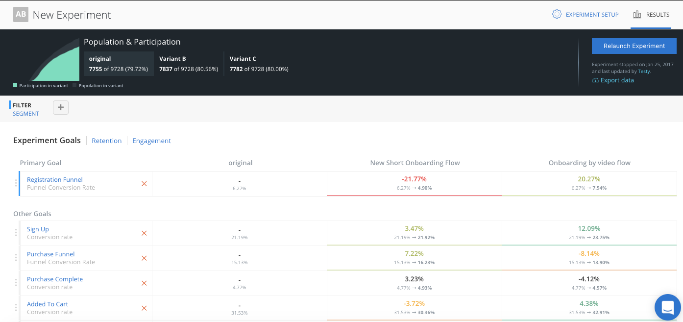
The top table shows the experiment population, participants and participation rate.
An experiment’s population is the count of all users who could participate in this experiment.
An experiment’s participants is the number of users who actually participated in the experiment, that means they navigated to the part of the app where the experiment is and either saw the ‘original’ or one of the ‘variants’.
The participation rate is the ratio of participation/population.
Experiment results only consider the experiment participants, as they are the users in an experiment’s population who have actually seen one of the experiences being tested.
Results are organized as a series of goals. A goal is an event or sequence of events (called a funnel) that tell you about your users’ behavior. For example, Did they sign in? Did they add something to their cart and make a purchase? A great experiment will have goals that show the user behavior changes driven by the differences in experience between the experiment’s ‘original’ and the ‘variant’.
Adding a Goal
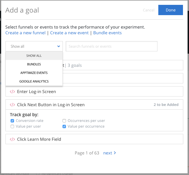
If you do not have any goals added to your experiment yet, add a goal by selecting the “Goals/Funnels” tab and clicking “Create Goal”. A goal is composed of events, either single event or a series of events combined into a funnel. An event can be an Apptimize event setup using our visual editor or API methods, or an imported event from other analytic platforms like Google Analytics, Amplitude, Flurry, Localytics, Mixpanel and Omniture (Adobe Marketing Cloud). We highly recommend that teams write hypotheses that contain a primary goal before running each experiment. The hypotheses could be as simple as, “if successful, variant should increase goal metric by X% because Y”.
Results Details
In the cell at the intersection of each variant and goal, we are showing four data points: lift, impact, trajectory, and significance.
The first number is the lift which is a percentage that shows how much higher or lower the variant is compared to the original for that specific goal.
The second line of numbers shows the impact of the variant compared to the original for that goal. In other words, it’s the raw change in conversion rate from the original to the variant.
The color of the box shows the trajectory. Green indicates the variant performed higher than the original for that goal, and red means lower.
Lastly, the darkness of the color signifies how statistically significant that difference is based on a binomial distribution. A white box means the statistical significance is below 80%. A light green or light red means the significance is between 80% and 95%. A dark green or dark red means the difference between the variant and the original is statistically significant at the 95% confidence level.
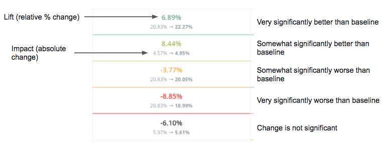
Note: the performance of the original variant, or control, for each goal is not compared to anything by default. Each variant is compared to the original variant.
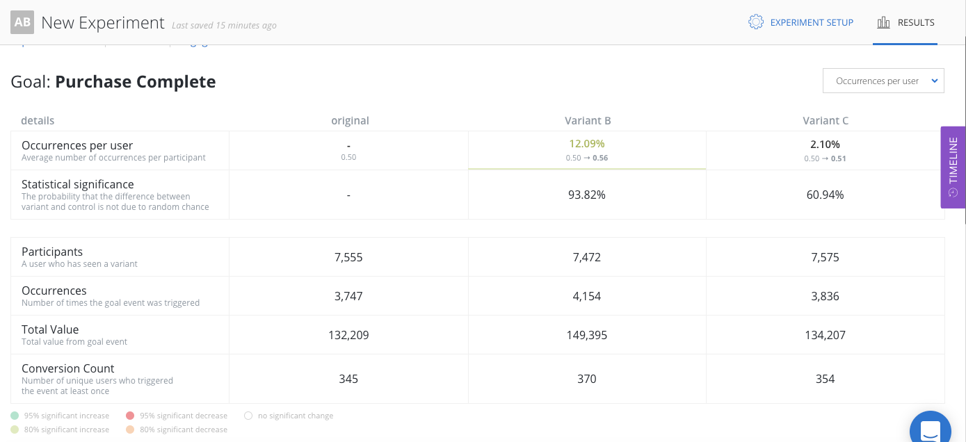
If you click on any goal on the Experiment Goals view, you’ll see a detailed view on goal. The top section of the detailed view is a table showing the performance of all variants for the goal. The table displays lift, statistical significance, goal metric, number of participants, number of participants that converted and total count of times the goal was triggered. If the goal metric has values associated with it, the total value will also be available.
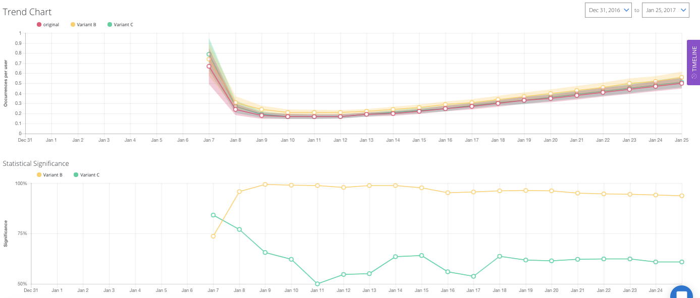
The bottom section of the detailed view on goals has time-series line charts showing how the goal metric has changed over time. The top line chart shows the goal metric of each variant. The shaded area around the line graph are error bars that represents the 95% confidence interval of the tracked metric for the specific variant.
In general, the smaller and less overlap confidence intervals have, the more confident you can be with the results. The bottom line chart shows the statistical significance over time. Since statistical significance can change over time based, we recommend that you only call experiments once minimum sample size is reached and statistical significance level has stabilized.
A glossary of terms are defined here.
Analyze Funnels
If you select a funnel as a goal, the results dashboard will display conversion data for each step of the funnel.
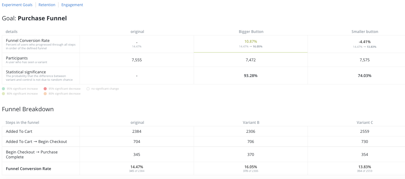
Above the two tables, you will see the chain of events for this funnel. The first table shows the results for the entire funnel, from beginning to end (Add To Cart to Purchase in this example). The second table shows the conversion rate of each step in the funnel chain. In this example, you can see that in the “Bigger Buttons” variant, users who have added items to their cart are more likely to make purchases.
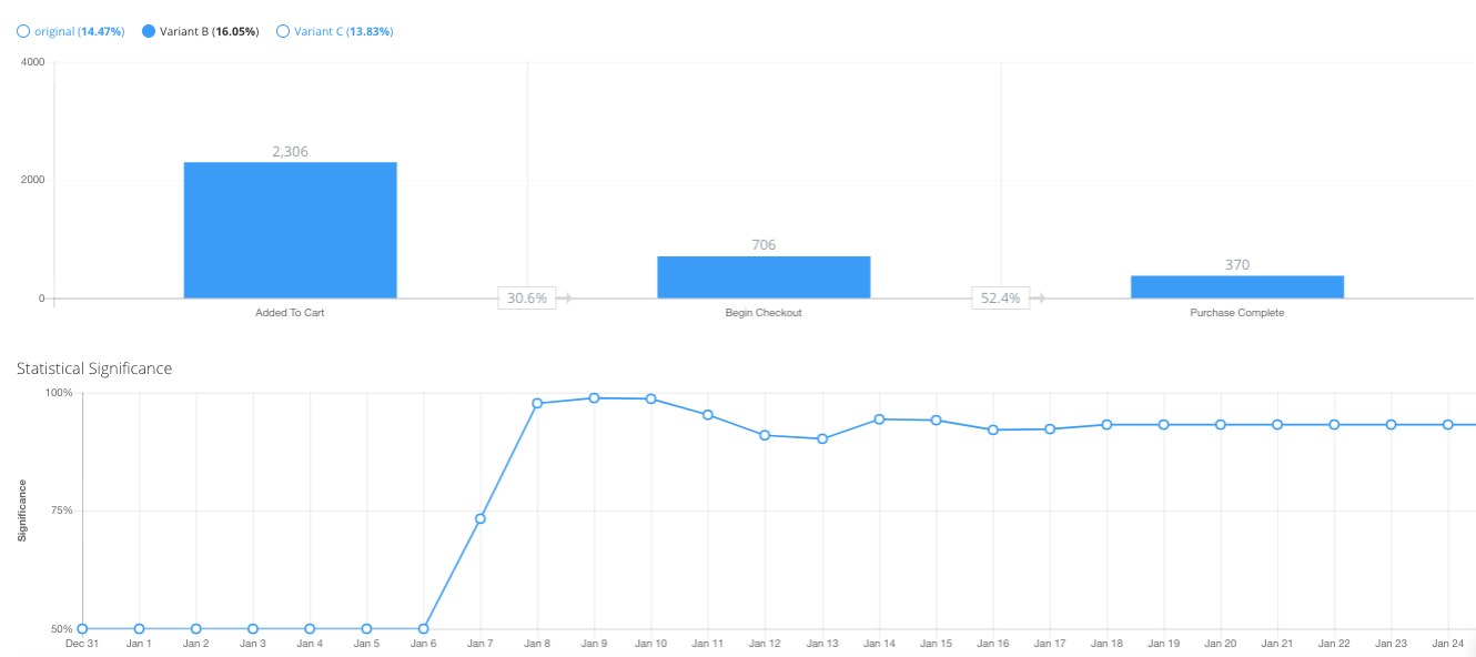
Below the data tables, there are a bar chart visualizing the drop-off of the funnel and the line chart representing the statistical significance over time. Select one variant and view its drop-off and statistical significance graphs.
Segmentation and Filtering
Apptimize results allow you to dive deeper into the data to understand more of what’s really going on. You can filter out factors that you know to be biasing your results or segment the data according to cohorts to see the differences in performance. Here is an example of how segmentation helped one customer catch a device specific bug.
You can segment and filter based on any of the attributes listed in Targeting.
Engagement and Retention
Apptimize tracks engagement and retention automatically for mobile platforms when using our native iOS or native Android SDK. Automatic engagement and retention tracking is not currently available for our other client-side SDKs (React Native and JavaScript). Without any action on your part, Apptimize tracks the:
Average number of sessions
Average number of screens viewed per session
Average time interval between sessions
Average session length
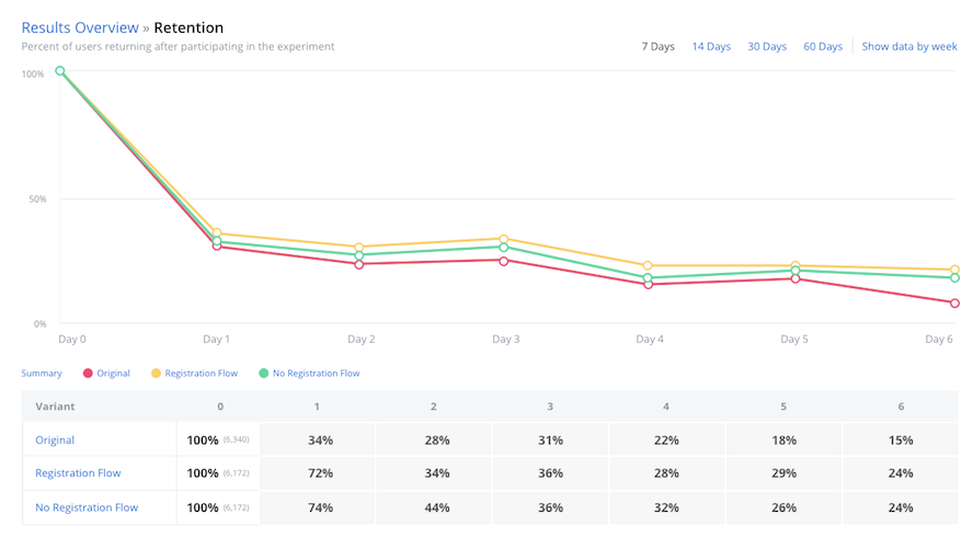
Cohort retention by experiment participation day or week
of all your variants. Simply click the “Engagement” or “Retention” tabs to see these results.
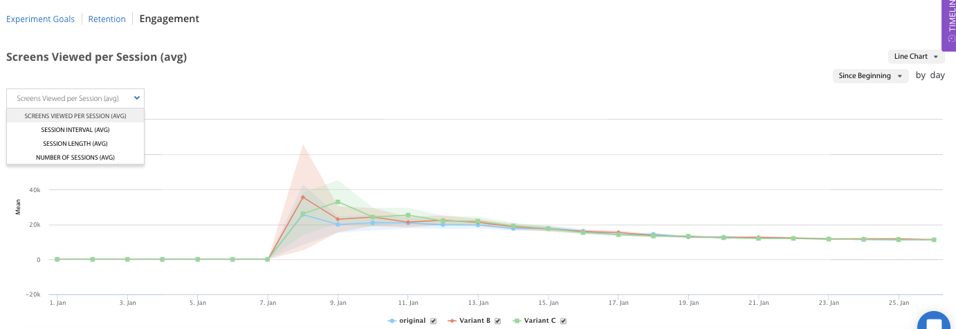
A session is when a user is in your app, specifically when your app is foregrounded to when the app is backgrounded. We measure the average session time per devices – how long the user had your app open for, as well as the average interval time between sessions.
The number of screens viewed per session does vary per platform. On Android this is the number of activities, popups, and fragments we measure during a session. On iOS it is the number of view controllers shown that we measure per session. Note that since this is how we measure screens view, it’s possible given how differently apps are designed that we overcount the number of screens viewed, however since in an experiment you’re measuring versus a control this doesn’t adversely affect your experiment results.
Apptimize computes retention by the industry-standard cohort retention methods. We cohort or group end users by the date they first participate in experiments. We then compute what percentage of the cohort returns to the app at specified time frame. Both day and week retention cohorts are available on the retention dashboard. The day and week cohorts are calculated on a rolling basis so that all users in the cohort have full 24 hours or full 7 days of time to return to the app and be considered retained.
Note
Server SDKs do not provide retention data, as there is no session-specific data to track user engagement.
Winning Segments
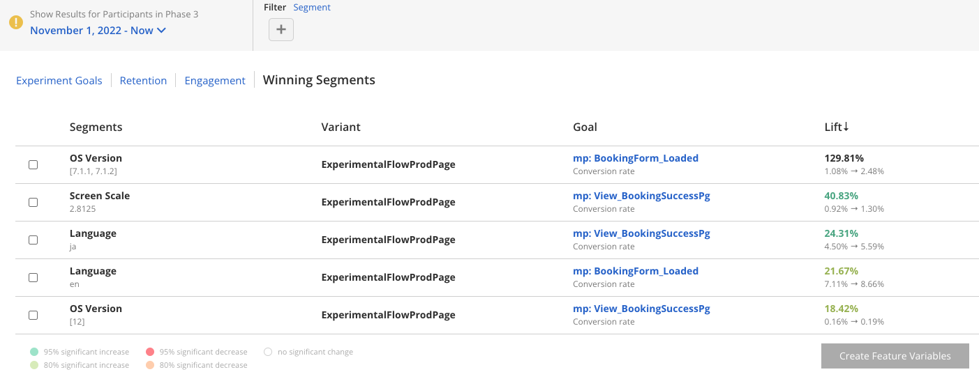
After running a Dynamic Variable experiment, you will see Winning Segments in the results dashboard:
Note
Because Winning Segments are converted into Feature Variables, they are only applicable to Dynamic Variable experiments.
To convert these segments to Feature Variables, select segments from the list, then click Create Feature Variables. Review your selections in the modal that opens and click Convert To Feature Variables:
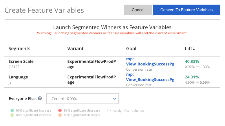
Once your feature variables have been created, we will end your existing experiment and replace it with the new feature variables you created. You will still be able to find your experiment in the Apptimize dashboard and view its results.
Note
Once you’ve created feature variables from your experiment, you won’t be able to re-run the experiment. Instead, stop the project, copy the original version, and relaunch the copy. This ensures that you will not have conflicting variables.
Why don’t I have any Winning Segments?
If Winning Segments is empty, it could be because of the following:
Your experiment does not have enough participants to reach significance. The more customers you track will increase significance.
You are not tracking any goals, winning segments will only appear if you have created goals. For more information, see: Details and Goals.
Stopping an Experiment
Knowing when to stop an experiment depends on how certain you wish to be that a variant is actually better than your current app version before pushing that variant out to all your users. 95% statistical significance is the scientific standard. This means that there is a 95% chance that the actual conversion rate for your variant is better than the actual conversion rate for your control. This is the same level of certainty the FDA requires for clinical trials of drugs. However, you might not require this level of certainty for every test. If a test has a low risk of greatly affecting your bottom line or if time is a pressing factor, you might conclude the test after reaching 90% or 80% statistical significance. Ultimately, it depends on how confident you need to be.
I keep waiting but my results are still not statistically significant. What should I do?
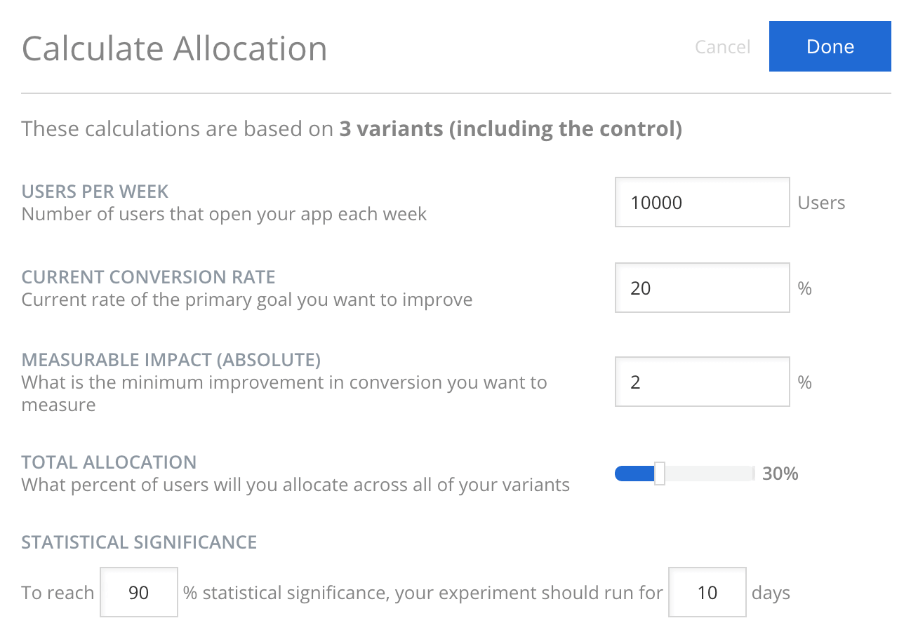
You basically have three options: 1) wait, 2) restructure your experiment, or 3) give up. If your experiment has been running for only a few days and has been gaining in statistical significance, it could be worthwhile to wait a little longer. Otherwise, you could consider restructuring your experiment to increase the percentage of users who see the experiment and/or reduce the number of variants. In the Targeting tab for the experiment, you can click the “calculate best allocation” tool to play with experiment restructuring of allocation, number of variants and desired statistical significance. If you try both of these tactics to no avail, there might actually be no real difference between your variants. In this case, it’s ok to stop and say that they are likely the same.
When is a good time to stop the experiment and interpret the results?
Even though statistical significance represents how certain you can be that variant is better than current app version (control), it is not enough to help you determine when to stop an experiment. This is because statistical significance (or p-value, which equals 1 minus statistical significance) assumes that you designed the experiment with a sample and effect size (size of change) in mind. If you continuously monitor the change of statistical significance, you are likely to see an effect when there is none. This is because statistical significance level could peak early (e.g. 95%) and decrease to a non-significant level (e.g. 60%) as more time passes in the experiment.
To prevent you from making a premature call on an experiment, we recommend that you estimate the required number of experiment participants to prove the minimum detectable effect on the goal metric of interest, at the confidence level that you desire. With the minimum participant number (sample size), you can then estimate how long an experiment takes to run. Apptimize offers a calculator to estimate the experiment length on conversion rate goals. You can also use another good free tool from Evan Miller to accomplish the same.
Estimating sample size is difficult because the direction of change or minimum detectable change (effect) are difficult to predict. A general good rule of thumb is to look for stable statistical significance trend. It is also great practice to actively monitor your “guardrail” metrics that indicate the health of the app and general user experience. In situations where variant set-up has bugs, you would need to stop experiment early regardless of statistical significance level.
For specific types of goals such as conversion rate, users may naturally need more time between their first participating in the experiment to when they actually accomplish the experiment goal. As an example, let’s say we have an e-commerce app whose users, on average, take about 3-4 days to consider whether to buy a specific product or not. If we set-up an experiment around releasing different types of new products to the user, we should at least wait for enough participants to join the experiment and also allow all participants to have at least 3-4 days in the experiment to check results.
Export Data
With the export data functionality, you can export both the experiment summary data and the user-level experiment data from the Results dashboard by clicking “Export data”.
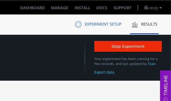
You will be presented with an option to download the daily experiment summary data or user-level data. In order to export user-level data, you will first need to set up an AWS S3 bucket to receive the file.
Once you have your AWS S3 bucket setup, you can export the user-level data, along with any Apptimize custom attributes you wish to include.
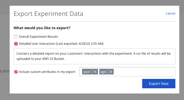
We will update your dashboard in the Experiment Results page to let you know if there was an error processing or if your file is ready. We will also send you an email once the file has been uploaded to your bucket.