16 Mobile Mistakes That Plummet User Retention Rates

“An app that’s retained by 30% of downloaders is considered ‘sticky,’” says Anindya Datta of Mobilewalla. While only 30% may sound like a paltry number, the unfortunate truth is that most apps actually perform much worse when it comes to mobile retention rates:
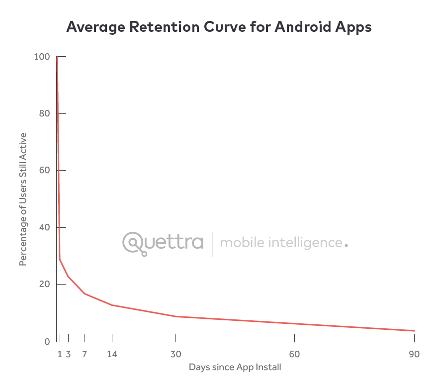
“We can see that the average app loses 77% of its DAUs within the first 3 days after the install.
Within 30 days, it’s lost 90% of DAUs.
Within 90 days, it’s over 95%. Stunning.
The other way to say this is that the average app mostly loses its entire userbase within a few months.” – Andrew Chen, Supply Growth @ Uber.
Oftentimes, we spend so much time on great marketing techniques such as App Store Optimization and marketing campaigns that we forget how vital having a strong product foundation is. If you don’t have anyone downloading your app, all other efforts seem futile. Yet as we can see from the data below, the apps who are truly successful have much more depth and more importantly, stronger retention rates than the rest of the pack.
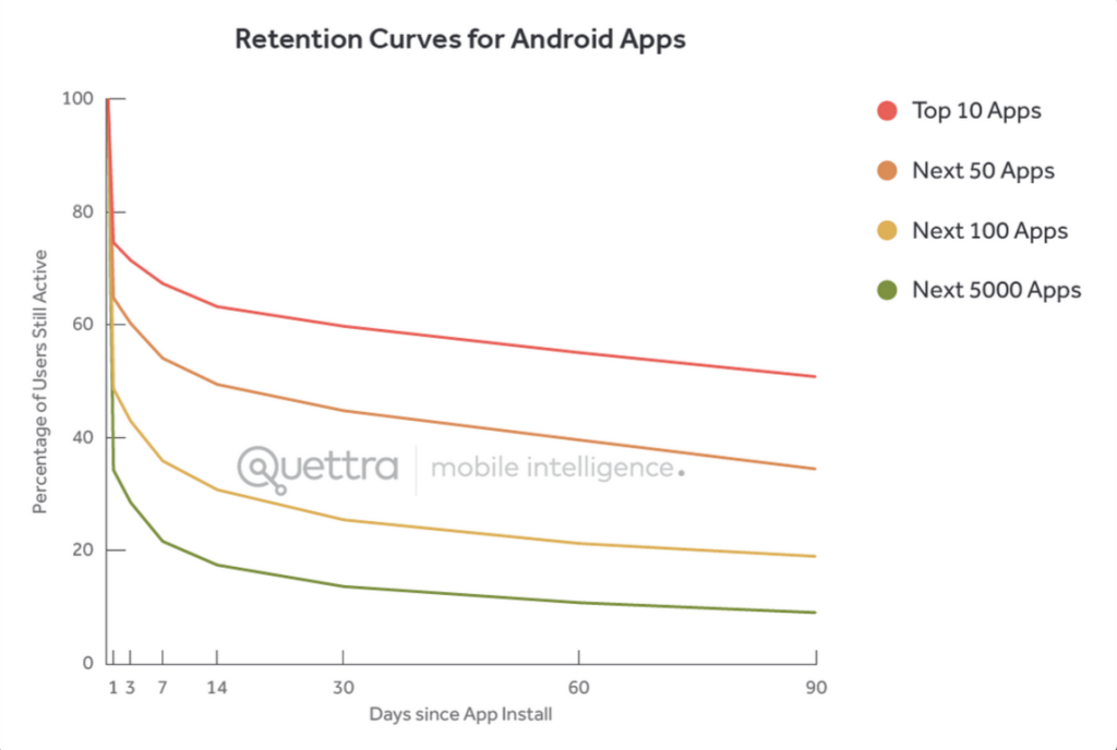
If you take a look at the follow up graph from Quettra’s data, you’ll see that the top 10, top 50, and top 100 apps perform significantly better when it comes to retaining users over the long term. This suggests that retention is one of the most critical factors to success in growing and maintaining an industry leading mobile product.
User retention goes much deeper than your typical marketing. It’s about whether you’re building a quality product that hooks in users and keeps them coming back. It starts with addressing user needs and concerns, then digging deeper into figuring out what really connects with your users. To help you with this process, we’ve compiled a list of 16 of the most commonly cited reasons as to why users are leaving your app.
Your App Doesn’t Convey Compelling Value
The biggest culprits when it comes to weak app retention are related to a lack of perceived value by users. According to a study by Localytics, 25% of users abandon an app (and never return) after just a single session. With low switching costs and a plethora of alternatives, mobile teams need to ensure that they’re conveying value early in the process to engage users enough to keep them from dropping off. Here are a few common mistakes:
1. Your app doesn’t excel at any one task.
Unlike web users, mobile users aren’t looking to explore or learn more about your brand. They download your app because they want it to help them achieve a task quickly and more easily than can be done on mobile web and faster than opening up a desktop. That’s the same reason why apps are so popular.
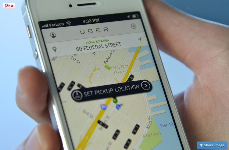
With mobile devices, we expect that each mobile app does one or two tasks extremely well, earning them a spot on our phones.
- Yelp does a great job of providing restaurant recommendations.
- Uber helps us get from point A to point B as fast as possible.
- Venmo helps us send money to friends quickly.
While they sometimes have additional functionality, we download them because each one helps us reach a specific goal. With mobile apps, it’s all about depth, not breadth.
2. Your app has too many features
Surprisingly enough, having too many features can oftentimes be a deterrent to mobile users. Why? It confuses them with too many choices. The best apps have clear calls to action and direct users toward core experiences by decreasing their options. This helps avoid decision fatigue as well as driving them to the high impact features that will hook them in.

This is a common problem because many apps take the web to mobile approach of trying to build out all their web features into mobile. Like we’ve noted before, mobile users are highly task oriented and easily distracted. Cutting your app down to the bare essentials will help drive the user behaviors you want and increase the likelihood that users engage and retain with the app.
If you must keep them, at least tuck the non-core functions out of plain sight.
3. Your app doesn’t have a strong onboarding process.
Onboarding is one of the most critical processes in the entire user experience. “If you don’t nail onboarding your developers may as well have been drinking beers instead of building those features that no one saw,” said CEO Nancy Hua. Those critical first moments of opening an app set the tone for the relationship between users and the app. If it doesn’t come across as beneficial, they’re going to be quick to delete it and move on with their lives.
Personalization is all the more important when you’re on the go. Mobile users want suggestions that are relevant to them and allow them to spend less time honing in on their search. Netflix knows and understands this better than most. They’ve spent huge amounts of resources building their product to ensure that they “tailor each member’s homepage to make it relevant, cover their interests and intents, and still allow for exploration of [their] catalog.”
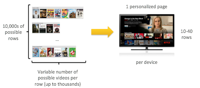
Netflix knows that not providing relevant content alienates its userbase and decreases both engagement and retention. With the limited time spent in each app, users who don’t see content relevant to their interests or goals are much more likely to leave. Make sure you’re gathering what user data you can to increase personalization and keep them engaged with variable rewards.
5. Users are irritated with push notifications
Speaking of irrelevant content, push notifications when done wrong can be one of the most annoying things about mobile. According to Robi Ganguly of Apptentive, push notifications are one of the top reasons for mobile users to uninstall an app. That’s not to say they’re not useful and valuable to users, but doing them incorrectly can have disastrous consequences.
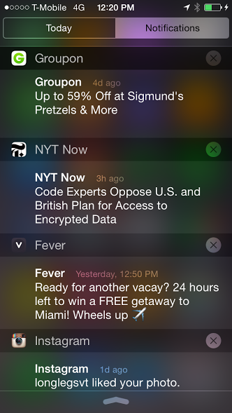
While push notifications, emails and other re-engagement tactics can marginally improve both engagement and retention rates, mobile industry leaders agree that “Bending the curve happens via activation, not notification spam,” meaning having a quality onboarding process will produce much better results.
The App Breaks User Flow
The next category of mistakes is all about breaking user flow. Flow, the mental state of full immersion in an activity, is ever important for task-focused mobile users. You want to make sure that they’re completing the key actions in your app to gain value and build habits that will continually engage them.
6. Your app keeps crashing
Only 16% of users will try a crashing app more than twice. If your product doesn’t function properly, users are going to leave. On iOS this isn’t a huge problem. There are only a few different combinations of iOS devices and versions that devs have to account for. Android on the other hand…
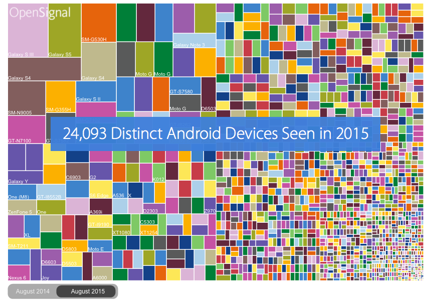
With such a mind boggling number of possible combinations, there’s no way you’ll be able to predict and solve them all. Instead, make sure you’re conducting extensive tests and doing staged rollouts in order to avoid any major crashes that are going to drive away users. Using feature flagging also ensures that you can respond immediately to crashes.
7. Your app is slow

I’m sure I’m not the only one who silently curses at the mobile telecom giants whenever I have a slow connection. When you’re on the go, few things are as frustrating as not being able to complete a simple task on a mobile app due to bad data. Having a slow app is just as bad and will oftentimes cause users to disengage or look for alternatives. Mobile users demand fast solutions to their needs, give it to them or face the consequences.
8. Your app asks for ratings at a bad time
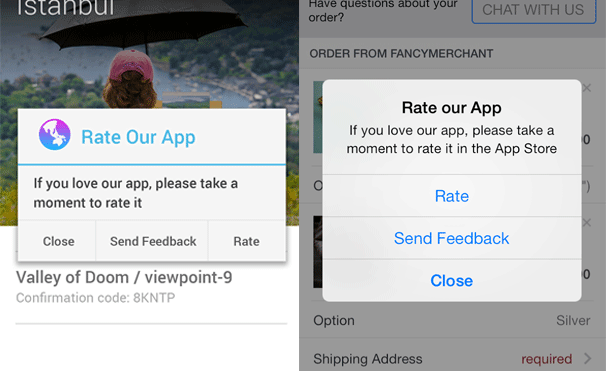
When users are in a state of flow, the worst possible thing you can do is break their flow for self-promotional purposes. Forcing them to disengage from the task at hand only irritates users and will can even drive them to negatively review your app.
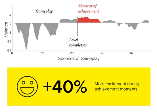
According to a study by IPG Media Labs, Users experience 40% more excitement during achievement moments. Instead of breaking user flow, wait until they’ve reached their goals or completed a task, then harness that increased excitement to increase engagement, retention, or just ask for a rating.
9. Users are forced to login without first receiving value.
The normal username/password login process on mobile is by far one of the biggest annoyances of the platform. For users, it can be incredibly difficult to type in complicated passwords using keyboards that were clearly built for leprechaun fingers.
While there are a multitude of more efficient, proven login solutions, you also want to be sure that you draw users in with a freemium model when possible. Unless you have the social clout and pull of networks such as Facebook and Twitter, you’re almost certainly going to have a large number of users drop off when it comes to a mandatory registration page. If you must break flow, make sure there is a clear benefit to signing up that is conveyed throughout the process.
10. Your app derails users with intrusive advertisements
Few things are as frustrating as clicking on an ad you didn’t mean to. With the decreased accuracy of stubby fingers vs a mouse, users are likely to click on ads even when they don’t mean to. While that may be beneficial in a monetary sense, it’s more likely to break user flow and frustrate them.
When they’re in a rush, navigating away from what they’re trying to do (and opening up a slow browser app) is just about the worst thing you can do. Once they’ve disengaged, they’re much more likely to leave or at the very least build up some negative feelings toward your app. Yes, ads and upsells have their place, but interrupting users during critical tasks is not the way to use them.
Invasion of Privacy
With the Xcode Ghost hack, Snapchat’s snafu about saving “deleted” pictures, or all this talk about companies appropriating personal user data, app security and privacy are more top of mind for users than ever before. Security concerns are one of the three core questions that users need answered before they further engage with your app.
11. Your app asks for unnecessary (or poorly explained) permissions.
Asking for permissions can be akin to pulling teeth. While they’re often important for app functionality, the amount of access users are prompted for can deter them from continuing. Axe unnecessary permissions and strategize how to prime users to accept the others. You can use techniques such as triggered permission requests or strategically planning the timing of permissions to increase the odds of users clicking “OK.”
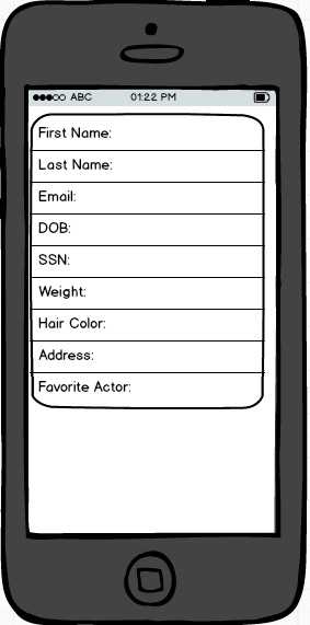
12. Asking for too personal of information upfront
Personal information is just that: personal. Unless you have a genuine need to collect user data (such as selling goods), collect as little data as possible upfront. If you really do need that data, you generally want to collect it later after users have already engaged and formed an opinion about your app, as well as make it as frictionless as possible.
The UX Needs Some Tweaking
Our goal on mobile is to help users complete a goal and complete it as quickly and efficiently as possible. Whether that’s making a purchase, checking off a to-do item, or distracting themselves, the user experience is even more important on mobile than it is on web. Our app needs to capture the short-term attention of users while minimizing the risk that they drop off before completing their tasks due to distractions.
13. It takes too many steps to complete a task
Mobile is all about speed and efficiency. Users want to complete their tasks quickly on-the-go. If it takes too long, the benefit of having a smartphone at their fingertips becomes negligible. That’s why so many companies have worked incredibly hard to cut down on any unnecessary steps.
HotelTonight tested out their checkout flow and pioneered their signature “3 taps and a swipe” checkout process. This allowed users to choose a hotel and book it as fast as possible. Groupon takes a slightly different approach, making sure to keep a “Buy!” call-to-action visible on all deal pages. This allows users to make a purchase easily, without having to go look for and use the add to cart and checkout buttons.
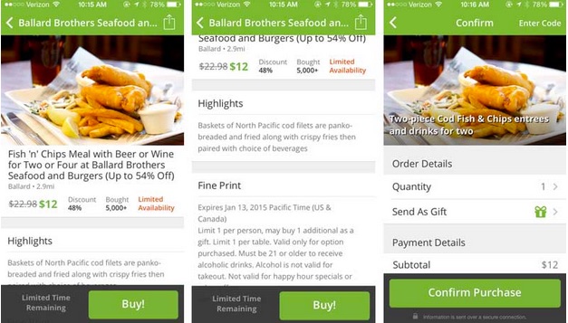
Check out our post to see some other checkout flows that some of the top apps are using. Each of these apps use A/B testing on different flows and processes to figure out which one drives the right user behavior. Maybe it’s something you should check out!
14. Your UI is too ahead of its time

If you need more than a moment to explain your UI, it might simply be too complicated. While it’s great to have a slick UI that power users will love, it’s far more important to be intuitive and useful. That’s why you need to be sure you’re following the MAYA principle. MAYA stands for most advanced yet acceptable. When it comes to design, “You can only raise the bar as high as your audience will let you.” Push boundaries when improving design, but utilize patterns that are familiar to your users to avoid confusing them.
Your App Needs to Be More Customer Focused
With over 1.5 million apps for each platform, competition in mobile is fierce. You want to make sure that your product is constantly improving and evolving to meet ever changing user demand. Else, chances are high that someone else is going to swoop in and steal your users.
15. You don’t update and improve your app often enough
We did a study of the top 10,000 apps in the App Store and found that the top 100 apps release 3x more frequently than the rest. Mobile powerhouses like Facebook and Pinterest go even faster, iterating at 10x the rate of others. They’re able to constantly improve and provide a better take on what users want through testing and striving for perpetual advancement.
In addition, there are a lot of non-obvious reasons you want to release and iterate quickly, as Lyft’s David Dryjanski (Creator of Lyft Line) shared with us in a previous post.
16. Not addressing user issues
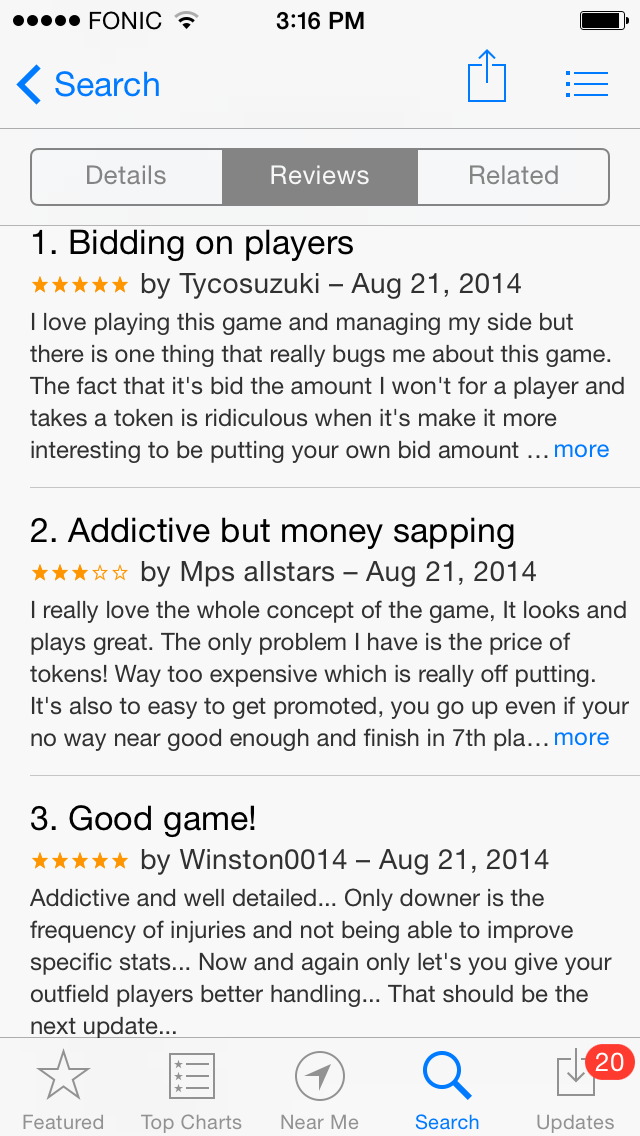
App and Play Store reviews are some of the best places to get qualitative feedback about your app, but more importantly, they’re where your customers go to be heard. You want to make sure that you’re taking this information into account when working to improve your app. If users needs are consistently not met, they’re likely to look for another solution.
Wrap Up
When you’re trying to improve your app you should focus first on the basics. Make sure you’re eliminating friction points and building a product that actually engages your users. Having a strong onboarding process can help you show all the amazing value that users will get out of your app and get them engaged quickly.
“Bending the curve happens via activation, not notification spam…the best way to bend the retention curve is to target the first few days of usage, and in particular the first visit. That way, users set up themselves up for success”. – Andrew Chen, Supply Growth @ Uber
To learn more about onboarding, check out our ebook below on the 3 Questions Your Mobile Onboarding Needs to Answer. In it we dive into the most important things you need to address in order to drive user engagement and improve your user retention metrics.
Thanks for
reading!
More articles you might be interested in:
How to Create Habit-Forming Mobile Apps
How do you ensure that your app is captivating and retaining users? Habits. In comes the ‘Hooked Model.’ The ‘Hooked Model,’ developed by Nir Eyal, is a four-step process built on basic principles of behavioral psychology that can be used...
Read MoreA Primer on Mobile User Retention
Solid mobile user acquisition channels? Check. Onboarding? Could use some tweaking. User retention? …..needs work. If you’ve got decent traction for your app already, retaining mobile users likely is your top objective. Yet retention is often this nebulous term everyone...
Read MorePersonalizing Mobile User Onboarding
Feel like going to the Giants game at the last minute? Gametime is an app that let’s do just that and buy last minute tickets with just two taps on your phone. It avoids the hassle of printing or picking...
Read More